The network for creativity
Join 1.25M professional creatives like you
Connect with clients, get discovered, and run your business 100% commission-free
Creatives on Contra have earned over $150M and we are just getting started
Back to feedPost

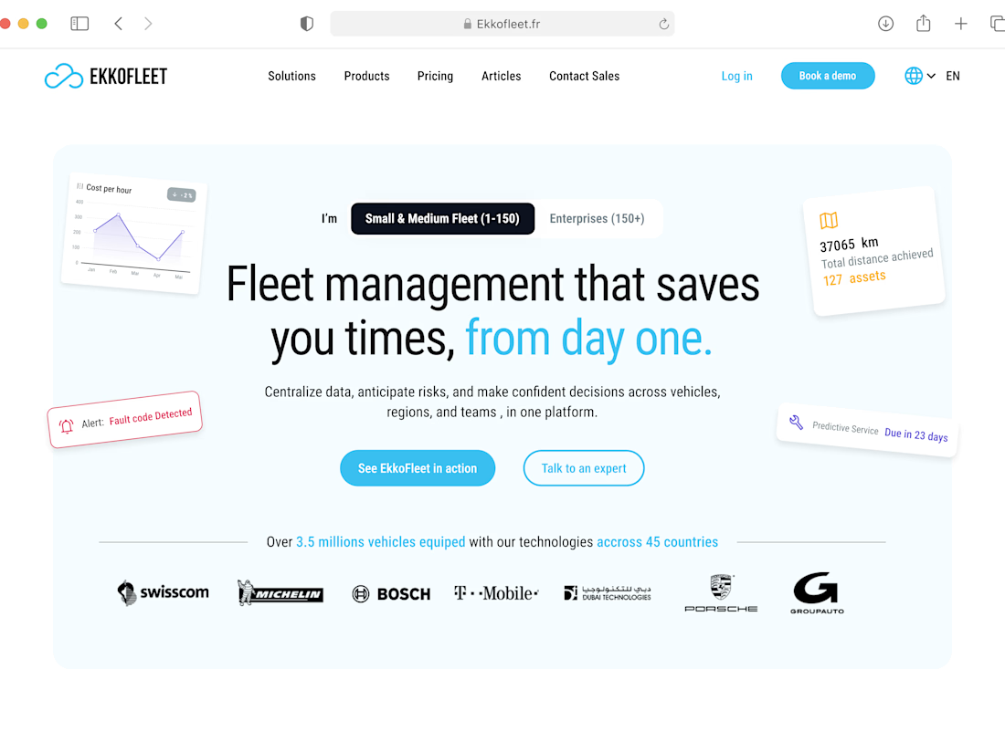
Excited to share Ekkofleet, a fleet management platform I designed and built in Framer.


The network for creativity
Join 1.25M professional creatives like you
Connect with clients, get discovered, and run your business 100% commission-free
Creatives on Contra have earned over $150M and we are just getting started







Related posts

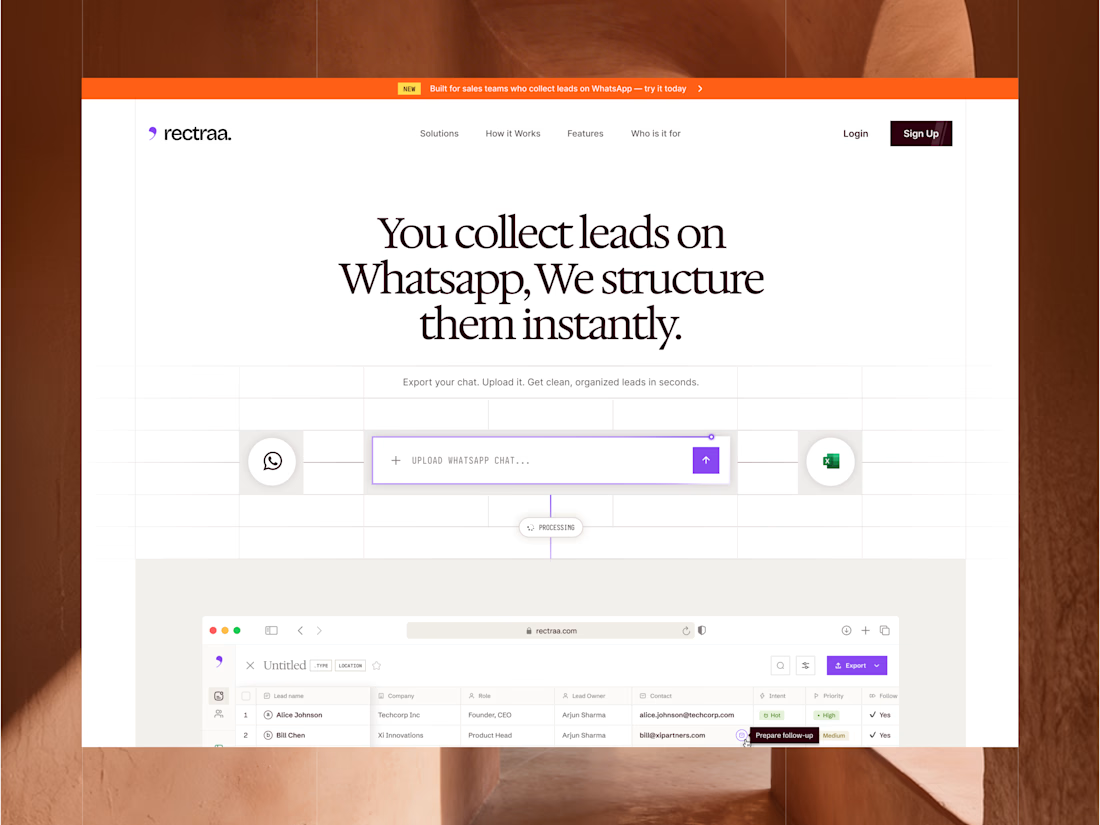
Rectraa helps sales teams extract, classify and organize leads collected through WhatsApp. I designed and developed its marketing website to explain the product clearly, demonstrate its workflow and encourage visitors to try it.
Project information:
Role: Website Designer & Framer Developer
Scope: Website strategy, UI design, responsive design and development
Tools: Figma and Framer
Deliverable: Responsive SaaS marketing website


High end design


Turning complex AI workflows into a calm, monochrome experience, brought to life with motion. We'd love to hear your thoughts!


Great idea 🎉🎉