The network for creativity
Join 1.25M professional creatives like you
Connect with clients, get discovered, and run your business 100% commission-free
Creatives on Contra have earned over $150M and we are just getting started
Back to feedPost

Case Study: GarageManStore Automotive Shopify Redesign
Redesigned the homepage and storefront experience for GarageManStore, a used/recycled OEM European auto parts retailer (Mercedes, BMW, Audi, Porsche, VW).
What I did:
Full homepage redesign on a custom Dawn theme
Built a "Currently Dismantling" vehicle showcase section with live arrival-date metafields
Designed vehicle cards for both the homepage slider and vehicle search results showing key details, arrival date, and clear "View Details" / "View Parts" CTAs
Refreshed the brand logo strip and tightened mobile responsiveness across the store
Kept the whole build inside Shopify's theme editor structure (Liquid + Dawn OS 2.0) for long-term maintainability
Why it matters:
For a parts marketplace with tens of thousands of SKUs, the challenge isn't just "make it pretty" it's making complex, high-volume inventory feel navigable and trustworthy at a glance. The vehicle-card system gives shoppers a fast way to scan what's available before drilling into individual parts.
Video walkthrough of the store below.
#Shopify #EcommerceDesign #ShopifyDeveloper #WebDesign #AutomotiveEcommerce


The network for creativity
Join 1.25M professional creatives like you
Connect with clients, get discovered, and run your business 100% commission-free
Creatives on Contra have earned over $150M and we are just getting started



Related posts


Meet the Mental Reps squad!
We got a chance to bring these seven characters to life, including building a fully custom Shopify store for Mental Reps Co., a performance-psychology brand that teaches kids the mental game.
Each one lives in mentalrepsco.com
Big feelings, tiny monsters.


Love the concept and illustration style here. Making complex emotions friendly and tangible for kids is tough, but this squad nails it effortlessly. The branding looks super playful and clean!


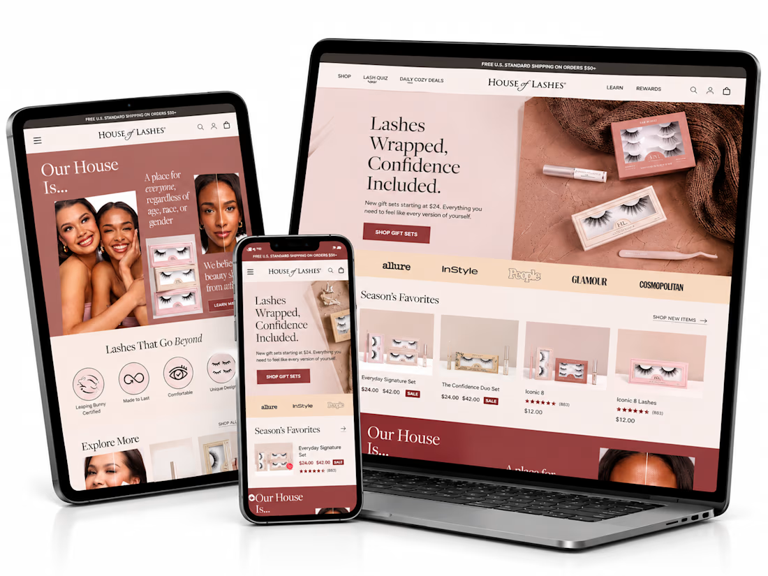
What if finding the perfect lash style was easier than ever? ✨
I’ve been exploring how a beauty eCommerce store can deliver a better shopping experience through thoughtful UI/UX design and conversion-focused strategies.
For this independent redesign concept, I explored a more engaging way to help beauty shoppers discover products, navigate collections, and make confident buying decisions.
A few things I focused on:
1. Clean, premium beauty storefront design.
2. Better product discovery and navigation.
3. Curated product collections.
4. A lash-finder quiz concept to guide shoppers.
5. Clear product presentation and shopping actions.
6. A responsive experience across devices.
My goal with this concept was simple: make the shopping journey feel effortless while keeping the brand visually engaging.
Because a beautiful store is great, but a store that makes shopping easier is even better.
Shopify founders and beauty brand owners: What's more important to you when designing a beauty store — visual experience or product discovery?
#Shopify #ShopifyDesign #ShopifyCRO #EcommerceDesign #UIDesign #UXDesign #ConversionOptimization


This is amazing. I would love to see more of your designs

Designed a new website in Shopify for ES Beauty Lab.
The menu is built around skin concerns, so shoppers get from the homepage to the right range in one tap, and the free-shipping threshold sits in the header.
Do you organise your Shopify menu by product type or by problem solved?
esbeautylabshop.com


To your question: by problem solved. Shoppers know their skin concern before they know product names, and the close-up face circles make the choice instant. I'd add a small product type filter inside each concern page.