The network for creativity
Join 1.25M professional creatives like you
Connect with clients, get discovered, and run your business 100% commission-free
Creatives on Contra have earned over $150M and we are just getting started
Back to feedPost


We made a Visual Guide to GSAP Easing — an interactive reference we designed and built for the motion community.
It covers the entire GSAP easing vocabulary: 24 eases grouped by family, each with a live runner and copy-paste code, a side-by-side race mode, and a full equivalence map across Webflow, GSAP, Penner, and CSS.
Explore the guide: https://easing.milkmoonstudio.com/


The network for creativity
Join 1.25M professional creatives like you
Connect with clients, get discovered, and run your business 100% commission-free
Creatives on Contra have earned over $150M and we are just getting started



Related posts

Creating landing page in clickfunnels with motion graphic on the icons and some graphics about trading chart


Design Agency Website
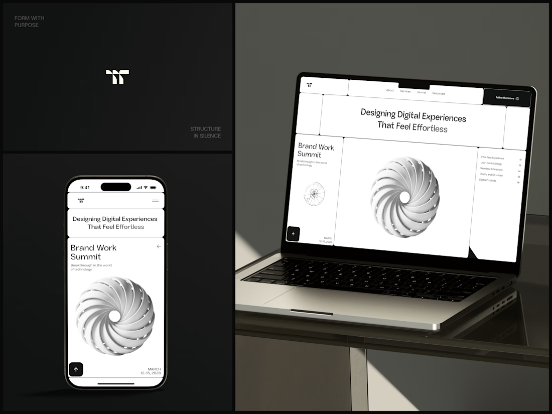
Only one cell on this homepage is black.
The rest of the page is a grid of rounded white cells: the headline, an event card, a white 3D spiral and a list of services. The black one, top right, holds the "Follow the future" button and stands out against all that white.
On the phone, the cells stack into a single column. The navigation folds into a menu icon, and the event card and spiral merge into one cell.
The headline reads "Designing Digital Experiences That Feel Effortless", so the grid has to look organized before anyone reads a word.
Designed by the Hue & Machine team.
#DesignAgency #WebDesign #AgencyWebsite #LandingPage #BentoGrid #MinimalDesign #UIDesign #ResponsiveDesign #MobileDesign #FigmaDesign



Looks cool

Day 12 of 60-days-collecting-awesome-motion-design-references
I am gathering cool references for my own work as a Motion Designer, and I thought it would be nice to share them with the Community as I go.
Recently saw this animation made by Illo.tv for Bloomberg; it is a really great example of abstract design, particularly for an always complicated topic like data storage. I love the transitions and the illustration style they used!


