The network for creativity
Join 1.25M professional creatives like you
Connect with clients, get discovered, and run your business 100% commission-free
Creatives on Contra have earned over $150M and we are just getting started
Back to feedPost

Identity Exploration / RIGHT / 2025
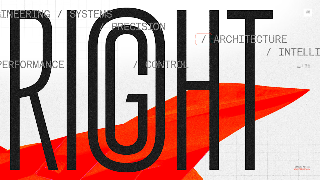
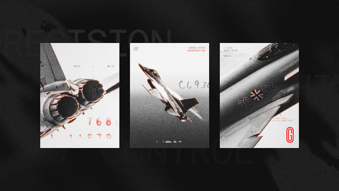
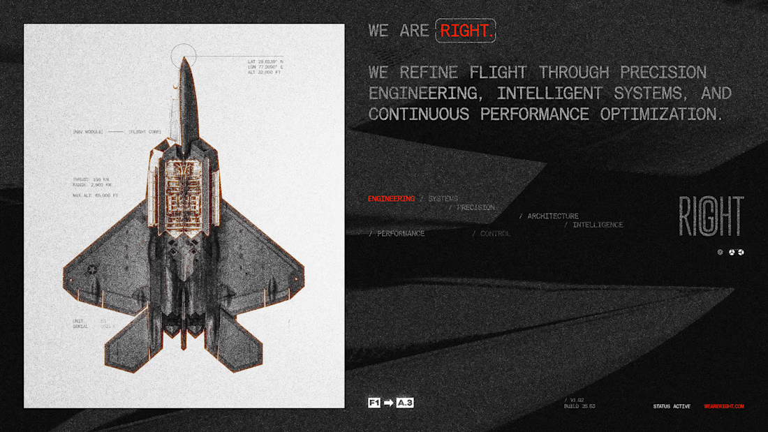
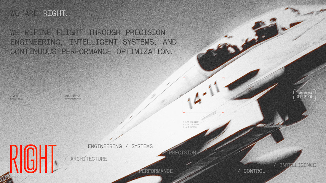
Explored a visual direction built around precision, control, and engineered performance.
The system draws from aerospace cues, combining technical typography, structured layouts, and high-contrast imagery to create a sense of clarity and intent.
A study in building a brand that feels exact, disciplined, and purpose-driven.
The network for creativity
Join 1.25M professional creatives like you
Connect with clients, get discovered, and run your business 100% commission-free
Creatives on Contra have earned over $150M and we are just getting started







Related posts

POLIDO — Brand Identity & Visual System
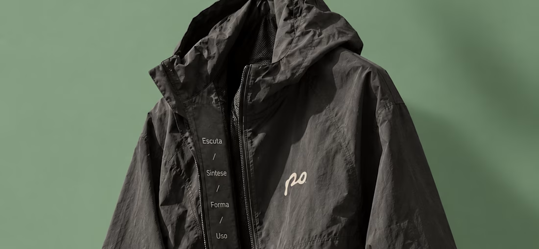
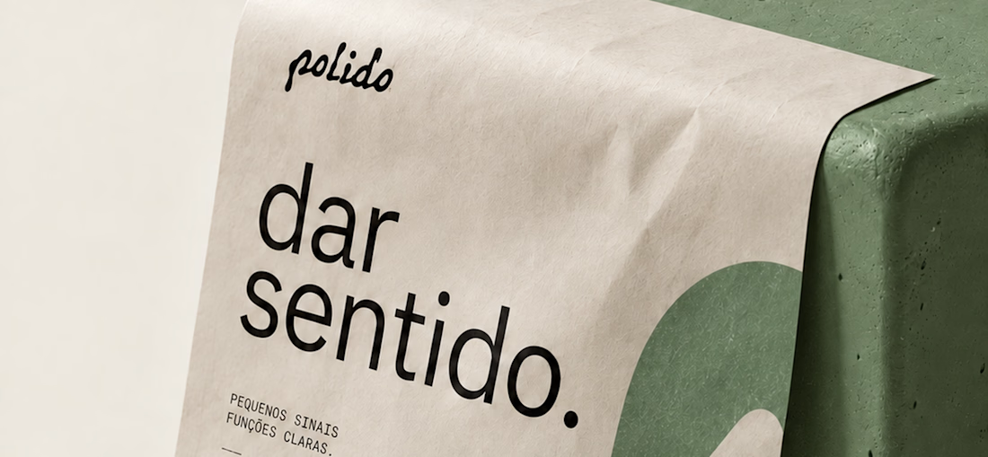
POLIDO is the visual identity of my independent brand design practice, shaped by a process of listening, synthesis, form, and use.
The identity brings together a hand-drawn signature, restrained typography, tactile materials, and a palette of warm paper, graphite, and Basil green.
From printed matter to apparel and physical applications, the project explores how a consistent visual language can adapt to different materials and contexts while maintaining its character.
Scope: Brand Strategy, Visual Identity, Art Direction, and Mockup Design.



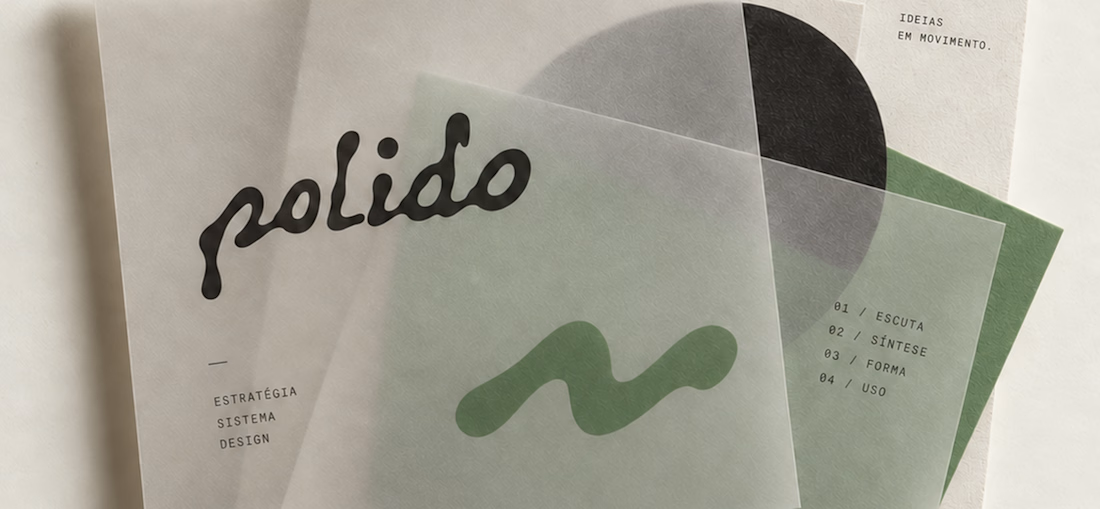

The contrast between the handwritten "polido" and the clean sans is perfect. Feels very editorial and high-end but still human. Super well put together.

Xoto brand identity and logo design for a B2B data intelligence and analytics platform. Built on Intelligence in Motion: a 45° angle and an X that turn data into direction.
Visual identity and brand system for SaaS and tech.
Visit full case study: https://www.behance.net/gallery/254709921/Xoto-Brand-Identity-Data-Intelligence-Branding

That mint is doing serious work. Never thought I'd want an analytics tote bag, yet here we are.
I created a brand identity concept for Velora, an AI productivity platform. I explored the logo, colors, typography, and how the brand could look across a website, mobile app, and everyday products. I wanted everything to feel consistent, modern, and easy to recognize.

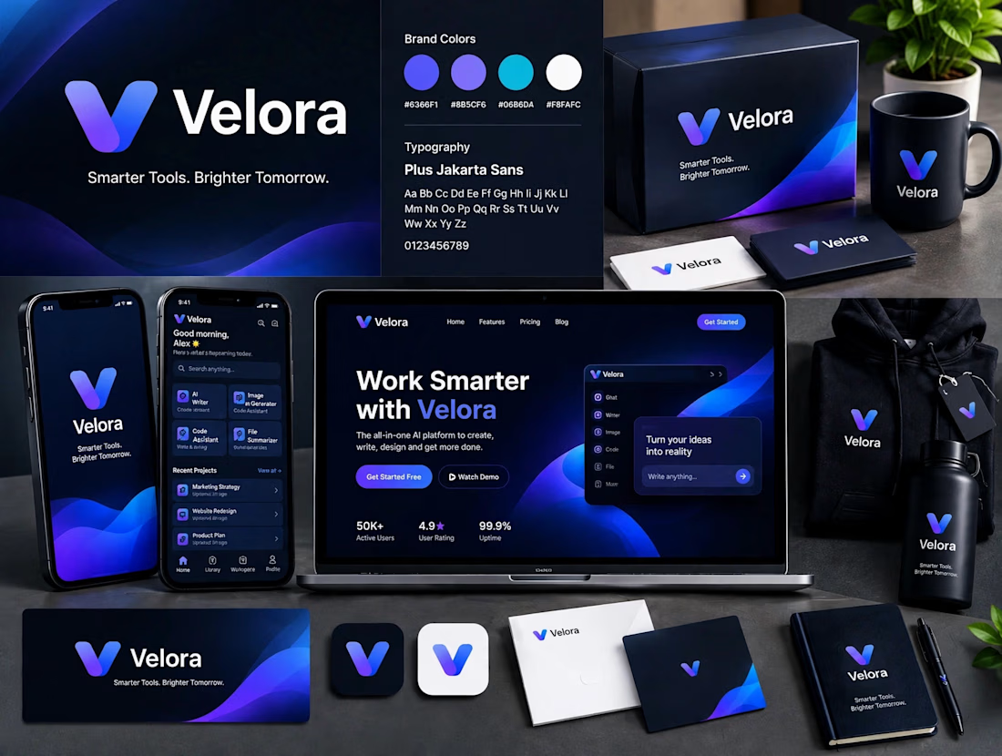

The blue is perfect for this. I’ve seen so many AI brands do boring black/white but this gradient gives it energy. And Plus Jakarta Sans was a great choice, keeps it friendly.