The network for creativity
Join 1.25M professional creatives like you
Connect with clients, get discovered, and run your business 100% commission-free
Creatives on Contra have earned over $150M and we are just getting started
Back to feedPost
Law Firm Web Design | Webflow Design
A modern law firm website concept designed to create a strong, credible, and professional digital presence for legal professionals.
Law firm websites can easily feel outdated, overly formal, or difficult to navigate. The goal was to create a design that communicates trust, authority, and professionalism while still feeling modern and visually engaging.
I developed a bold navy and blue visual system with strong typography, structured content sections, and a professional hero composition. The layout gives immediate attention to the firm's identity while keeping the primary call-to-action highly visible.
The design focuses on clear visual hierarchy, responsive structure, intuitive navigation, and conversion focused CTA placement to make it easier for potential clients to understand the firm's services and take the next step.
The interface combines a professional legal aesthetic with modern Webflow style design, using strong contrast, clean spacing, prominent typography, and carefully positioned visual elements to create a polished experience.
Focus Areas
Law firm website design
Webflow development
Professional UI/UX
Responsive layout
Conversion focused CTA
Legal industry branding
Modern visual hierarchy
Trust focused user experience




Amazing design
The network for creativity
Join 1.25M professional creatives like you
Connect with clients, get discovered, and run your business 100% commission-free
Creatives on Contra have earned over $150M and we are just getting started

Challenges
View all


Related posts


Just launched Lamplight - Best @framer Template for Psychologists & Therapists
Remix Link: https://framer.link/tj4w3W3
A calm, editorial website template with 2 CMS-powered concern pages, a journal, and FAQs copy that actually sounds human.


Amazing!


People don't read the homepage.
They scan it for 3 seconds and leave.
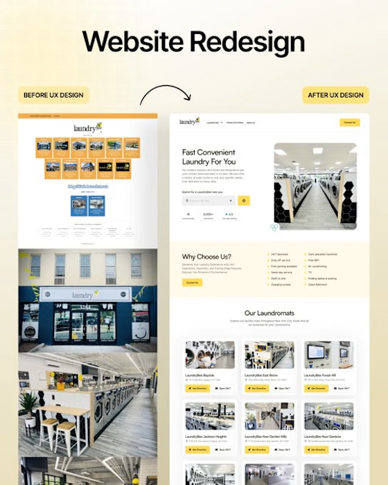
So we deleted 70% of Laundrybee’s homepage content.
• Less copy.
• Conversion-focused headline.
• Visible hero section.
• One clear CTA.
• Double the white space.
• Showcased their offers and USP.
Result?
Visitors don't leave confused.
They get what they want and come back.
What's the one thing you fix first on a homepage redesign?

❤️❤️❤️❤️

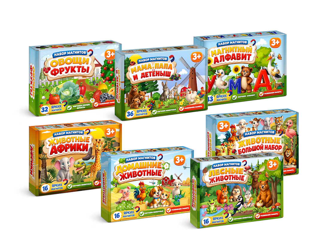
MagnoToys — Multi-SKU Children's Educational Packaging System
Design and systematic structural layout of a multi-SKU packaging line for children's magnetic educational games. I developed the unified brand grid, managed consistent color-coding across 5 different product variants, and created production-ready vector dielines with precise bleeding and folding lines.


Cool!