The network for creativity
Join 1.25M professional creatives like you
Connect with clients, get discovered, and run your business 100% commission-free
Creatives on Contra have earned over $150M and we are just getting started
Back to feedPost


People don't read the homepage.
They scan it for 3 seconds and leave.
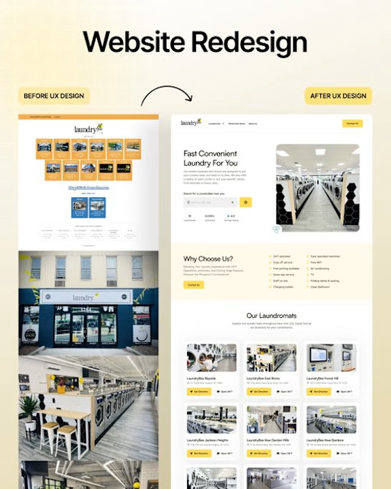
So we deleted 70% of Laundrybee’s homepage content.
• Less copy.
• Conversion-focused headline.
• Visible hero section.
• One clear CTA.
• Double the white space.
• Showcased their offers and USP.
Result?
Visitors don't leave confused.
They get what they want and come back.
What's the one thing you fix first on a homepage redesign?




❤️❤️❤️❤️
The network for creativity
Join 1.25M professional creatives like you
Connect with clients, get discovered, and run your business 100% commission-free
Creatives on Contra have earned over $150M and we are just getting started





Related posts

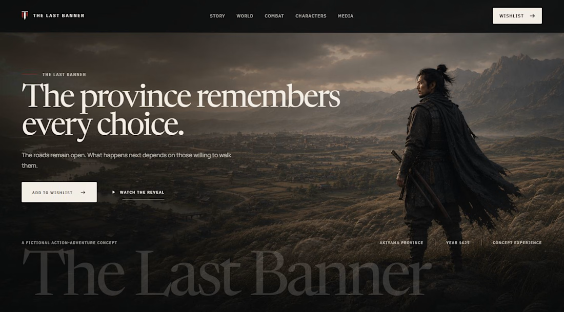

A Japanese cinematic gaming tone is hard to hold in a single CTA section. Which parts did you build in Webflow and Framer, and where did ChatGPT help?

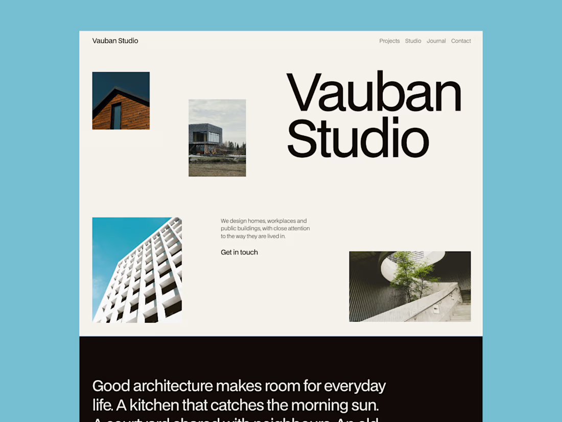
Meet my latest website template, Vauban, tailored for architecture studios.
Built around an editorial grid and Swiss typography, it puts projects at the center while giving the studio itself a clear presence.
Available as a Framer template.
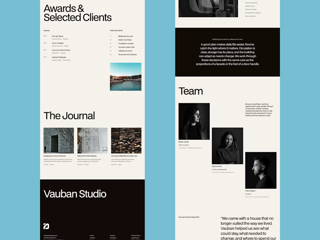
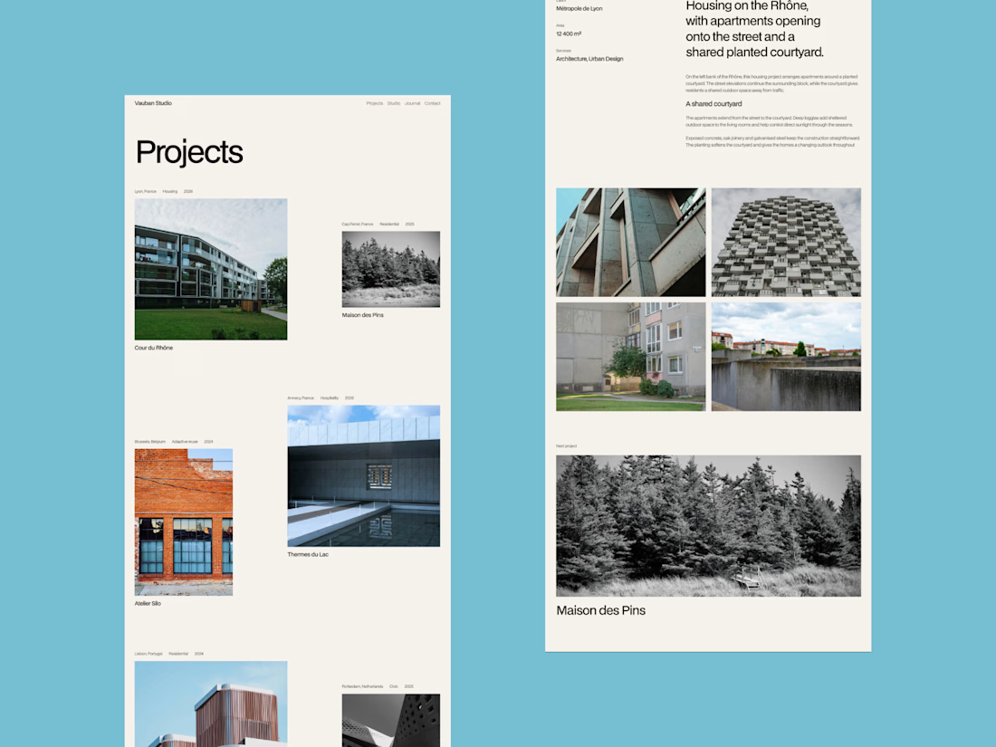

That blue background around the grid is a bold choice. Makes the photography pop.

Swiss-inspired web design exploration. Which one would you go with?
11 voted
37%
19 voted
63%
30 votes
Closed

expanded for user convinience