The network for creativity
Join 1.25M professional creatives like you
Connect with clients, get discovered, and run your business 100% commission-free
Creatives on Contra have earned over $150M and we are just getting started
Back to feedPost

Recently completed a concept for Paymatrix, an AI-powered fintech SaaS platform 📊
The idea: bring revenue, expenses, financial data, analytics, and AI-powered insights into one clear financial workspace.
The challenge was making complex financial data feel simple and actionable.
I focused on the dashboard, data visualization, financial workflows, and AI insights to help businesses understand what’s happening and make better decisions.
Full case study: Paymatrix on Behance
Would love to hear your thoughts on the direction. 👀
The network for creativity
Join 1.25M professional creatives like you
Connect with clients, get discovered, and run your business 100% commission-free
Creatives on Contra have earned over $150M and we are just getting started

Challenges
View all


Related posts

Designed a dashboard concept for tracking net worth across every asset type — stocks, crypto, property, pensions, funds, cash, and liabilities — all in one place.
Instead of the usual pie chart or bar graph, the centerpiece is a dial: a single, glanceable gauge showing where your wealth actually sits. Behind it, a quiet grid of every asset category fades in and out of visibility, reinforcing that everything's accounted for even when it's not the focus.
Dark UI, a single confident green accent, and a lot of negative space — built to make a genuinely overwhelming task (seeing your entire financial picture at once) feel calm instead of cluttered.


wow the animation feels super smooth, what is this animation for?


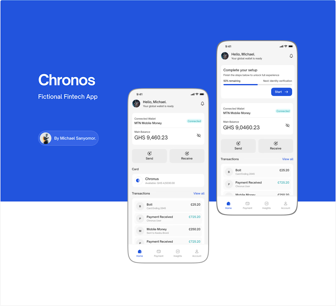
The vivid blue and compact task hierarchy give Chronos a confident fintech feel, while the paired device views make the key flows easy to compare. The balance between utility and polish is really strong.


Some designers are obsessed with removing friction. Usually, they’re wrong.
When it comes to high stakes fintech "invisible" is a bug, not a feature.
We designed the Tithe onboarding with a mandatory slide to confirm. One second of friction to ensure a lifetime of trust.
Don't just make it fast but rather feel right.
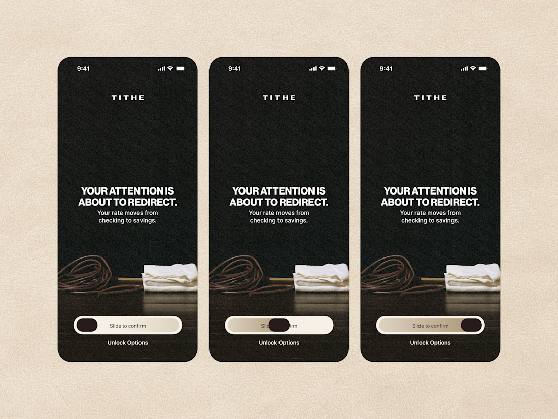

The slide-to-confirm is a nice touch. For financial decisions, that extra moment of intention makes sense.