The network for creativity
Join 1.25M professional creatives like you
Connect with clients, get discovered, and run your business 100% commission-free
Creatives on Contra have earned over $150M and we are just getting started
Back to feedPost
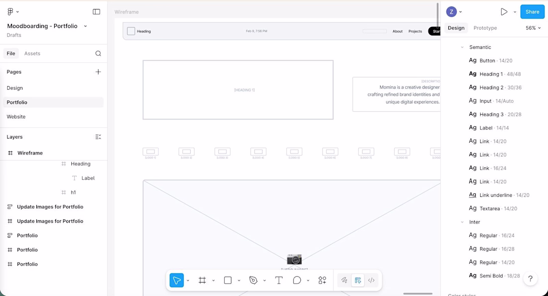
𝐃𝐚𝐲 2 ✅ 𝐓𝐲𝐩𝐨𝐠𝐫𝐚𝐩𝐡𝐲 & 𝐋𝐚𝐲𝐨𝐮𝐭 𝐥𝐨𝐜𝐤𝐞𝐝 𝐢𝐧.
And honestly? Picking the right fonts felt just as important as picking the colors yesterday.
Because typography isn’t just how your words look. It’s how your words feel.
After going back and forth I landed on
Playfair Display for headings elegant, editorial, carries weight without shouting. It has that classic sophistication that matches the black & white direction perfectly.
Inter for body clean, highly readable, gets out of the way and lets the content breathe. Together they create exactly the contrast I was after. Personality in the headlines. Clarity in the details. 🖤
Then came the layout.
This is where it stops being a vibe and starts being a structure.
I mapped out every section what comes first, what comes next, how someone moves through the page. The wireframe is rough but intentional. Every block has a reason to be where it is. No decoration yet. Just bones. And good bones are everything. 🏗️
Tomorrow is where it gets exciting
High fidelity. Real design. The page starts looking like something. ✨
(Day 2 of 4 building my portfolio webpage live from scratch. Catch up from Day 1 if you missed it!)
The network for creativity
Join 1.25M professional creatives like you
Connect with clients, get discovered, and run your business 100% commission-free
Creatives on Contra have earned over $150M and we are just getting started
Related posts
Looks amazing!

You're certainly an inspiration on being productive & creative, man!
Just joined Contra and created my profile!
I already love the website and can't wait to build some amazing projects!
Please take a look at my recent designs, from creative visually striking poster design, to whole brand identity, UI and UX design and more!
I promise you won't be disappointed!
Nice work
Trending
Claude
Claude has entered the design space. How are you using Claude Design?
Contra University
Learn from expert creatives how to earn more using next-gen AI tools.
creativeaiflow
Creative AI workflows are evolving. What tools do you use, and what are their strengths and weaknesses?
portfolioreview
The best portfolios tell a story, not just show a grid. Share yours for feedback.
freelancerlife
Freelancer life is wins, pivots, and everything in between. What’s yours right now?