𝐃𝐚𝐲 4. ✅ 𝐈𝐭’𝐬 𝐝𝐨𝐧𝐞.
I’m sitting here staring at the final file and honestly. I don’t know whether to cry or celebrate. So I’m doing both.
4 days ago I opened a blank Figma file.
No direction. No structure. Just an idea that had been living in my head for way too long.
And today that idea is a complete, polished, handoff ready portfolio.
Let me be honest with you for a second.
I have been a UI/UX designer for a while now. I have designed for clients. I have built design systems. I have handed off files that went on to become real products used by real people.
But designing for yourself hits differently.
There’s no brief. No client feedback. No one to validate the decisions. Just you, your taste, your standards and the brutal honesty of a blank canvas staring back at you.
Every decision was mine to make and mine to own.
The black and white direction when everyone around me was reaching for color palettes and gradients, I chose restraint. Because sophistication doesn’t need noise.
The single page layout no endless clicking, no getting lost. One scroll. One story. Start to finish.
The light, clean aesthetic letting the work breathe. Letting the typography lead. Letting the whitespace do what whitespace does best.
None of these were accidental. Every single decision had a why behind it.
That’s what separates design from decoration.
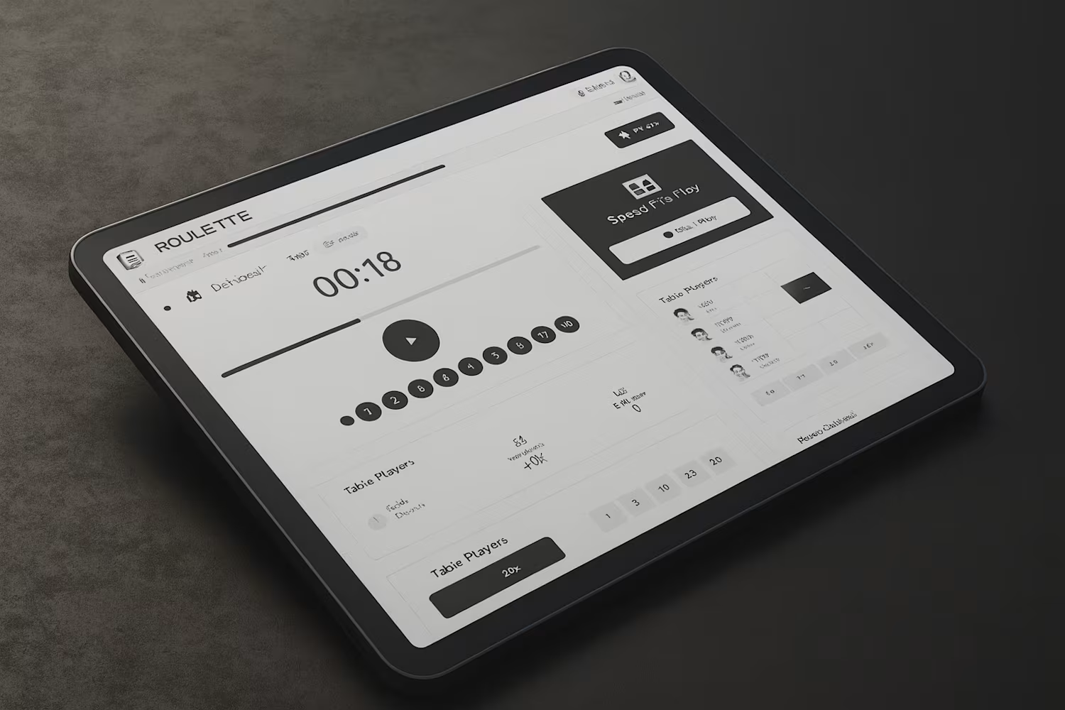
The logos and images you see in the file right now? Dummy placeholders for now.
Real project images, actual case study visuals and the final logo are all being swapped in soon. The structure, the design, the layout all final. The content just needs its finishing touches.
Because a designer knows you don’t wait for perfect content to finalize a perfect design. You ship the design and fill in the real pieces after. ✅
What’s next?
The portfolio page is done but a portfolio without case studies is like a book with a beautiful cover and blank pages inside.
So that’s where I’m headed next. Deep diving into my best projects, breaking down the process, the decisions, the problems and the solutions.
To everyone who followed this journey every like, every comment, every DM asking “when’s Day 4 dropping” thank you. 🙏
You made building in public feel less scary and more exciting. This is exactly why I started sharing.
See you in the next chapter. 🚀
0
21
𝐃𝐚𝐲 3 and I didn’t expect to feel this way about it.
I planned to design section by section. Take it slow. Be methodical. Instead I just kept going. Because when the colors are right and the typography is right and the layout is right. Designing stops feeling like work. It starts feeling like the design is pulling you forward.
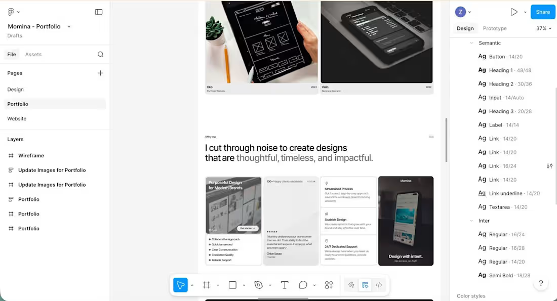
By the end of the day. The entire portfolio page was done. 🤍
One single page. No jumping between pages, no extra clicks. Just a smooth, intentional scroll from top to bottom. Light, clean, white backgrounds letting the typography and the work breathe.
Every spacing decision mattered. Every font size. Every section transition. Nothing was left to chance.
Because I kept reminding myself one thing throughout the entire day.
“𝑻𝒉𝒊𝒔 𝒊𝒔𝒏’𝒕 𝒋𝒖𝒔𝒕 𝒂 𝒑𝒐𝒓𝒕𝒇𝒐𝒍𝒊𝒐. 𝑰𝒕’𝒔 𝒕𝒉𝒆 𝒇𝒊𝒓𝒔𝒕 𝒑𝒓𝒐𝒋𝒆𝒄𝒕 𝒆𝒗𝒆𝒓𝒚 𝒑𝒐𝒕𝒆𝒏𝒕𝒊𝒂𝒍 𝒄𝒍𝒊𝒆𝒏𝒕 𝒘𝒊𝒍𝒍 𝒋𝒖𝒅𝒈𝒆 𝒚𝒐𝒖 𝒃𝒚”
So I treated it exactly like a client project. With the same care. The same attention. The same standard I would hold myself to for anyone paying me for their brand.
A little final polish is still left the kind only you notice but can’t ship without fixing. The spacing that’s almost right. The detail that bothers only the designer’s eye.
Tomorrow it’s done. The complete portfolio. Start to finish. Built in 4 days.
Day 4 reveal dropping tomorrow don’t miss it. ✨
2
44
𝐃𝐚𝐲 2 ✅ 𝐓𝐲𝐩𝐨𝐠𝐫𝐚𝐩𝐡𝐲 & 𝐋𝐚𝐲𝐨𝐮𝐭 𝐥𝐨𝐜𝐤𝐞𝐝 𝐢𝐧.
And honestly? Picking the right fonts felt just as important as picking the colors yesterday.
Because typography isn’t just how your words look. It’s how your words feel.
After going back and forth I landed on
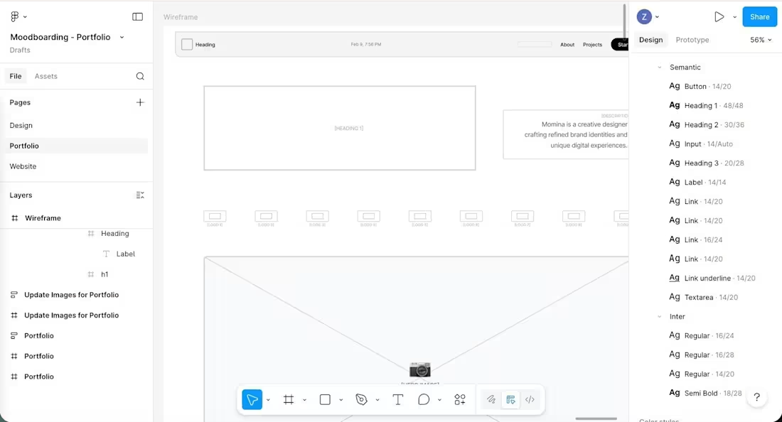
Playfair Display for headings elegant, editorial, carries weight without shouting. It has that classic sophistication that matches the black & white direction perfectly.
Inter for body clean, highly readable, gets out of the way and lets the content breathe. Together they create exactly the contrast I was after. Personality in the headlines. Clarity in the details. 🖤
Then came the layout.
This is where it stops being a vibe and starts being a structure.
I mapped out every section what comes first, what comes next, how someone moves through the page. The wireframe is rough but intentional. Every block has a reason to be where it is. No decoration yet. Just bones. And good bones are everything. 🏗️
Tomorrow is where it gets exciting
High fidelity. Real design. The page starts looking like something. ✨
(Day 2 of 4 building my portfolio webpage live from scratch. Catch up from Day 1 if you missed it!)
1
33
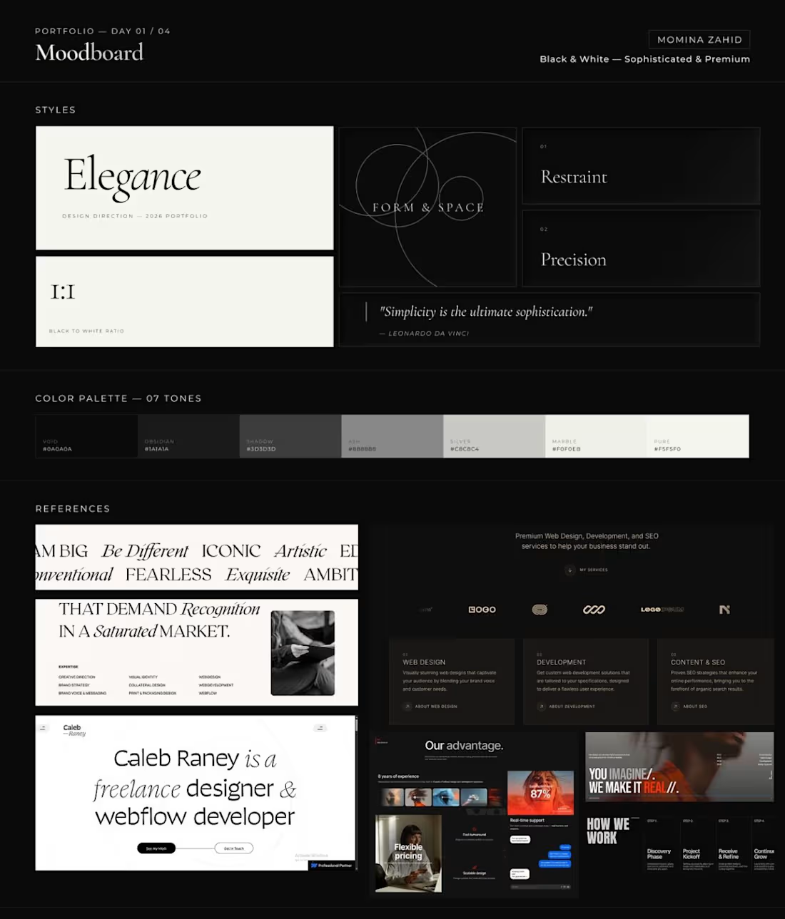
Day 1 ✅
𝗠𝗼𝗼𝗱𝗯𝗼𝗮𝗿𝗱 & 𝗖𝗼𝗹𝗼𝗿𝘀 𝗱𝗼𝗻𝗲.
And honestly? This is where it all starts to feel real. Before I opened Figma, I sat with one question
How do I want someone to feel the moment they land on my page?
Not what they should see. Not what’s trending. The feeling.
I went through warm tones, cool palettes, gradients, muted neutrals. An hour deep and nothing felt right. And then it clicked.
“The most sophisticated spaces in the world don’t need color to make a statement.
Luxury fashion. Editorial design. Premium architecture. They’ve always lived in black and white.”
So that’s my direction. No accent color. No “pop.” Just pure, intentional monochrome because restraint is the design decision. 🖤🤍
Here’s what 𝗗𝗮𝘆 𝟭 gave me:
•Color Palette - 7 tones from Void (#0A0A0A) all the way to Pure (#F5F5F0). Every shade earns its place.
•Moodboard references:
Editorial layouts, premium web design, bold typographic energy. The vibe is clear.
The foundation is set. Everything from here gets built on top of this.
Tomorrow: wireframes and layout. Where the structure comes to life.
(Day 1 of 4 — building my portfolio webpage live. Follow along so you don’t miss a step.)
0
29
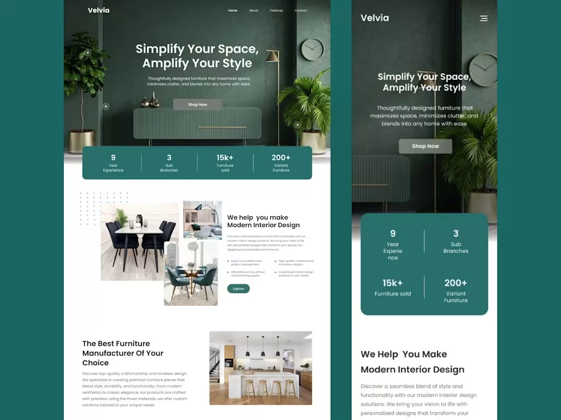
Excited to share one of my recent projects a responsive website UI design for a modern furniture brand, Velvia!
Thoughtfully designed layouts, smooth navigation, and a style that reflects the brand’s ethos: "Simplify Your Space, Amplify Your Style".
Always a pleasure bringing great products to life through design!
1
1
56
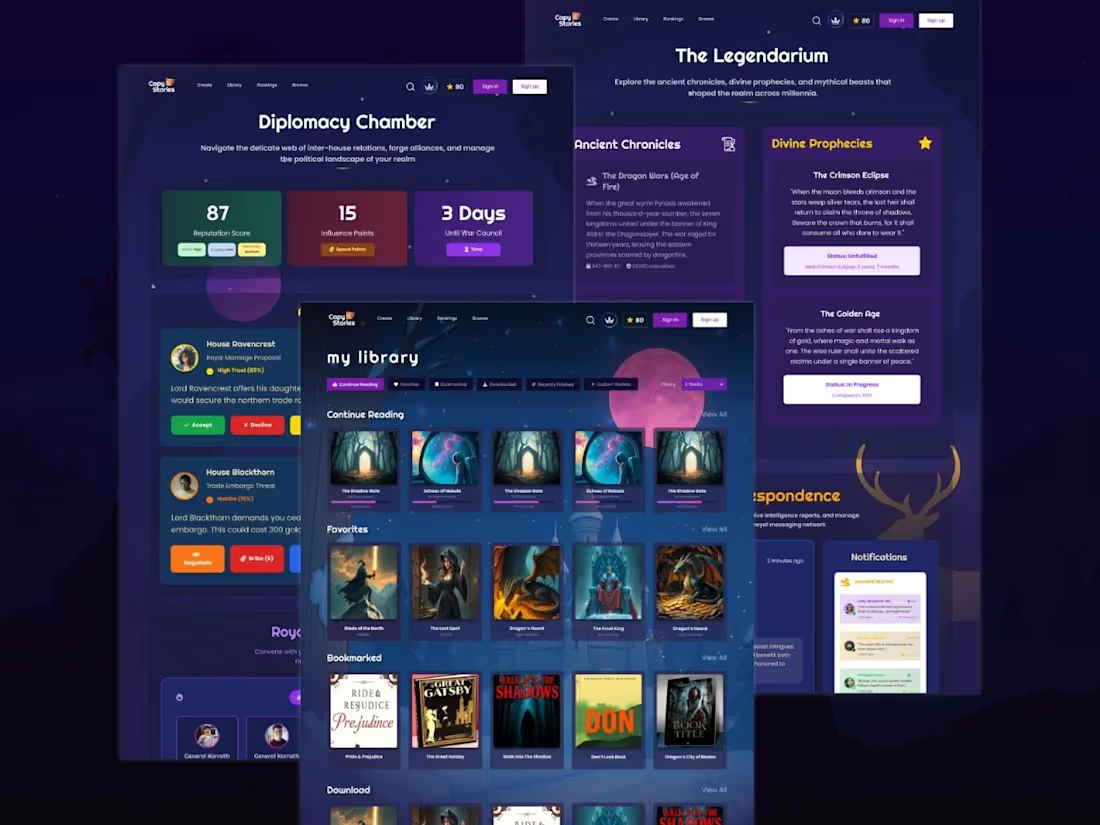
Sometimes, design isn’t just screens, it’s a story waiting to unfold. 🪄
Sharing another one of my projects, designed with a hint of game-inspired style and a world of stories, alliances, and imagination for users to explore
1
42
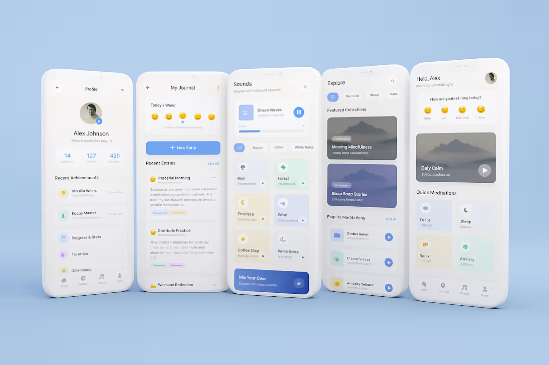
Meditation App design
1
1
49
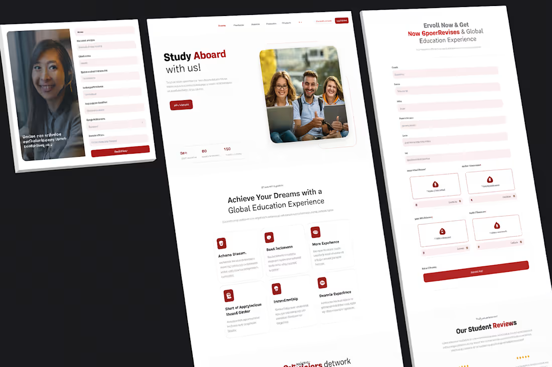
Educational Web design
1
37