The network for creativity
Join 1.25M professional creatives like you
Connect with clients, get discovered, and run your business 100% commission-free
Creatives on Contra have earned over $150M and we are just getting started
Back to feedPost


88 followers and counting! 🚀 A huge thank you to everyone who has supported my work on this platform so far.
If you are a founder looking for fresh brand strategy, or a fellow creative interested in packaging design for CPG and lifestyle brands, make sure to hit follow. There is plenty more design work coming soon. Let's build standout brands together! 🤝


Great work, keep it up!


Haha, this post did the job 😄 Congrats on the growth!
The network for creativity
Join 1.25M professional creatives like you
Connect with clients, get discovered, and run your business 100% commission-free
Creatives on Contra have earned over $150M and we are just getting started

Challenges
View all


Related posts


A look at the identity we designed for Vetti, a dog health monitoring brand.
There’s a lot of data behind a product like this but the person using it just wants to know their dog is okay.
That’s the balance in the design with a connected dot system that feels precise and warm colors and photography that keep it close to what people care about.
Also, an excellent excuse to spend far too long choosing dog photos.


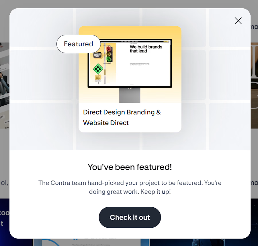
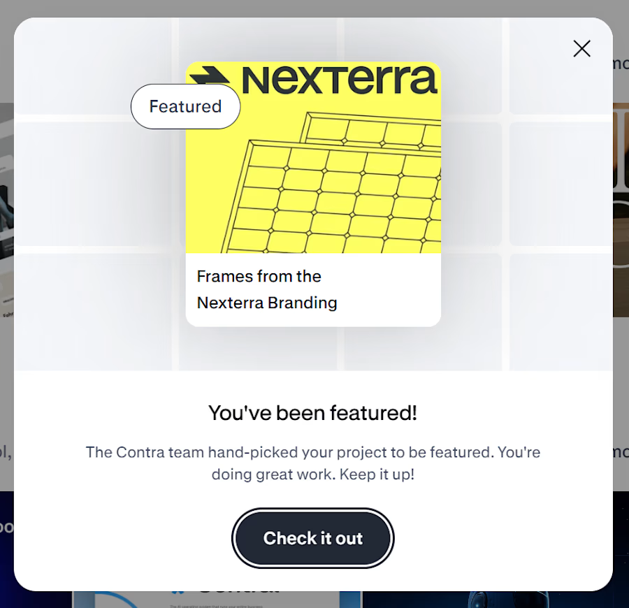
Woke up to these messages today 🤩
Never really thought my first features on Contra would feel this reassuring. Seeing both Direct Design and Nexterra get picked by the Contra team honestly means a lot.
There’s always that little doubt when you put your work out there, wondering if it’s good enough, if the right people are seeing it or if you’re moving in the right direction.
So this was a really nice reminder to keep going and keep making things I believe in.
Thank you to the Contra team for noticing the work and for the little bit of encouragement I didn’t know I needed. 🫶
More to come. 🌠


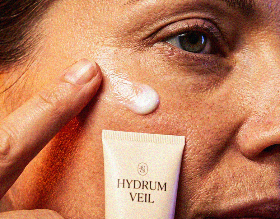
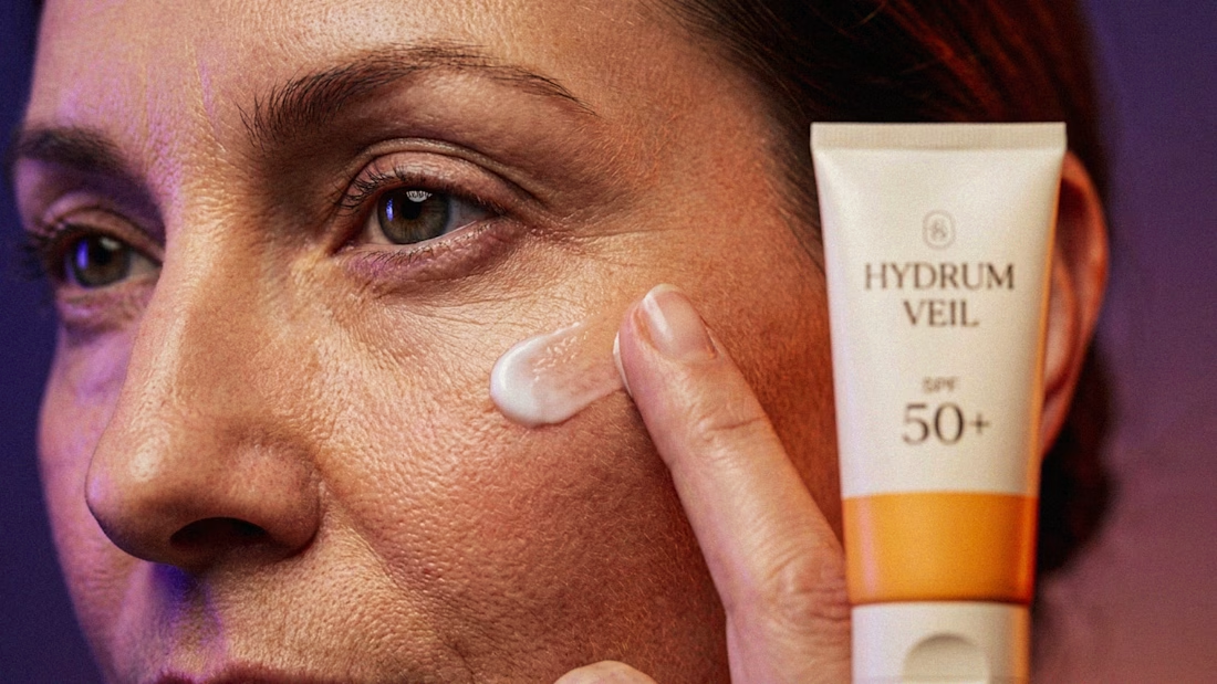
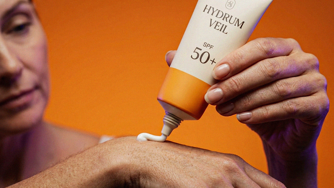
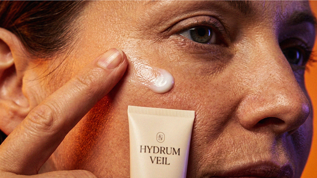
I Just Created HYDRUM VEIL 🔥
HYDRUM VEIL is a skincare brand built around a premium SPF 50+ sunscreen, developed as a complete brand identity, packaging design, and seasonal advertising campaign.
The project explores a question most seasonal beauty work gets wrong: how do you make a limited-edition campaign feel festive without making it feel cheap?
Instead of stacking decorative props, the campaign holds a strict visual system - vivid pumpkin orange, deep twilight violet, warm cream, and restrained black and lets a single product carry every frame.
Drop your replies in cmnts.....!!!!! 🙌
branddesignertastetestBrand DesignGraphic DesignPackaging DesignAdobe IllustratorAdobe PhotoshopClaude