The network for creativity
Join 1.25M professional creatives like you
Connect with clients, get discovered, and run your business 100% commission-free
Creatives on Contra have earned over $150M and we are just getting started
Back to feedPost

Netflix survived because it recognized a behavioral shift early.
That same pattern is happening again today.
Search behavior is changing rapidly through AI systems and conversational discovery.
People increasingly ask:
AI assistants,
chatbots,
recommendation systems,
and intelligent search engines directly.
Which means businesses must start asking new questions:
Can AI systems understand your business?
Is your digital presence structured properly?
Are you discoverable beyond traditional search engines?
Are you building visibility for the next internet shift?
Adaptation has always separated surviving companies from forgotten ones.
hashtag#ArtificialIntelligence hashtag#Netflix hashtag#BusinessStrategy hashtag#AI hashtag#Technology hashtag#DigitalTransformation hashtag#Innovation hashtag#FutureOfWork hashtag#BrandStrategy hashtag#Leadership hashtag#Entrepreneurship hashtag#SearchEngineOptimization hashtag#AISEO hashtag#BusinessGrowth


The network for creativity
Join 1.25M professional creatives like you
Connect with clients, get discovered, and run your business 100% commission-free
Creatives on Contra have earned over $150M and we are just getting started



Related posts

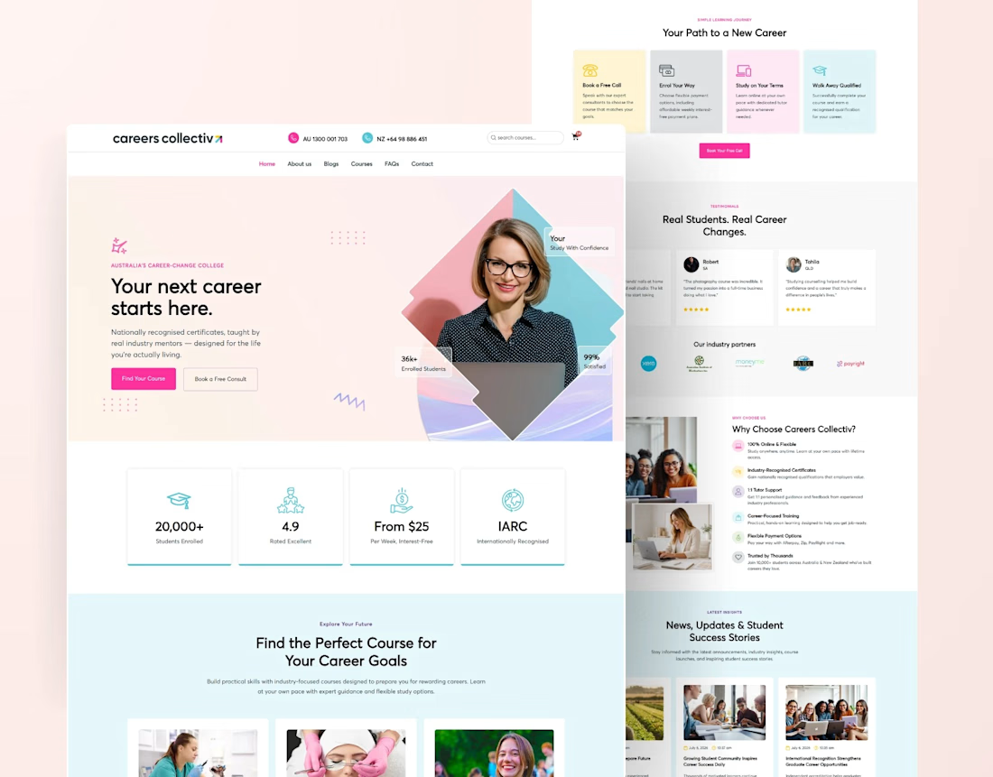
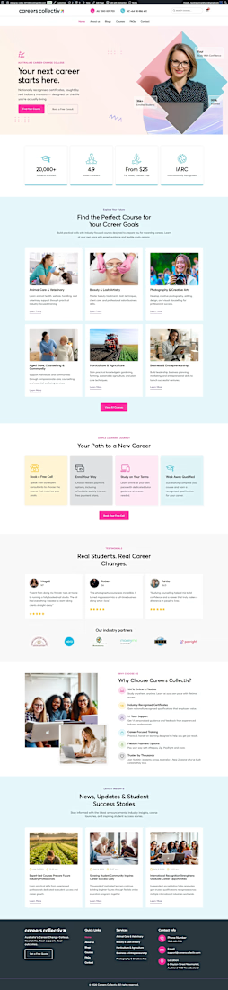
Educational College Website | Modern Kajabi Web Design
This project was about turning a college's online presence from a digital brochure into something that actually enrolls students. They needed a website that loaded fast, guided visitors naturally, and made the leap from "I'm interested" to "I'm applying" feel obvious.
Built on Kajabi, so the whole thing runs in one system: no clunky add-ons, no plugins fighting each other, no inflated maintenance.
What went into it:
Modern, mobile-first design that reflects identity
Clear program and course pages that answer questions before they're asked
A streamlined admissions funnel from first visit to application
pages, all built to convert, not just to look pretty
The part I care about most: it performs. Every section exists to move a prospective student one step closer to saying yes.
If your school, academy, or education brand is living on a dated site, that's my lane. Let's build yours.





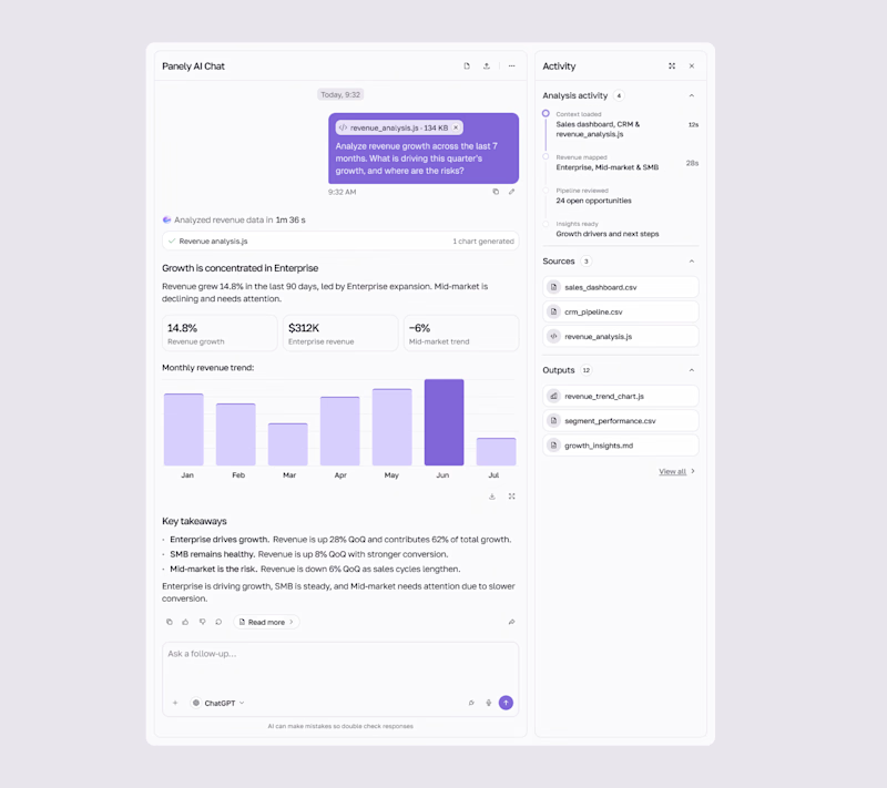
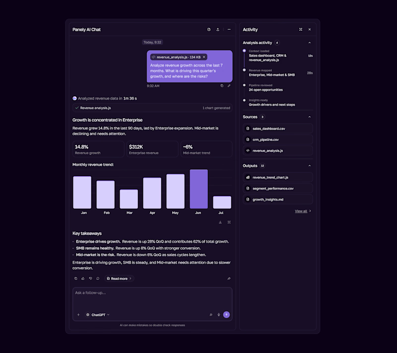

I'd pick Light for an analysis tool, the charts and sources read better on a pale surface and the violet bars still pop. Dark works as the night option. Is the sources panel on the right open by default?

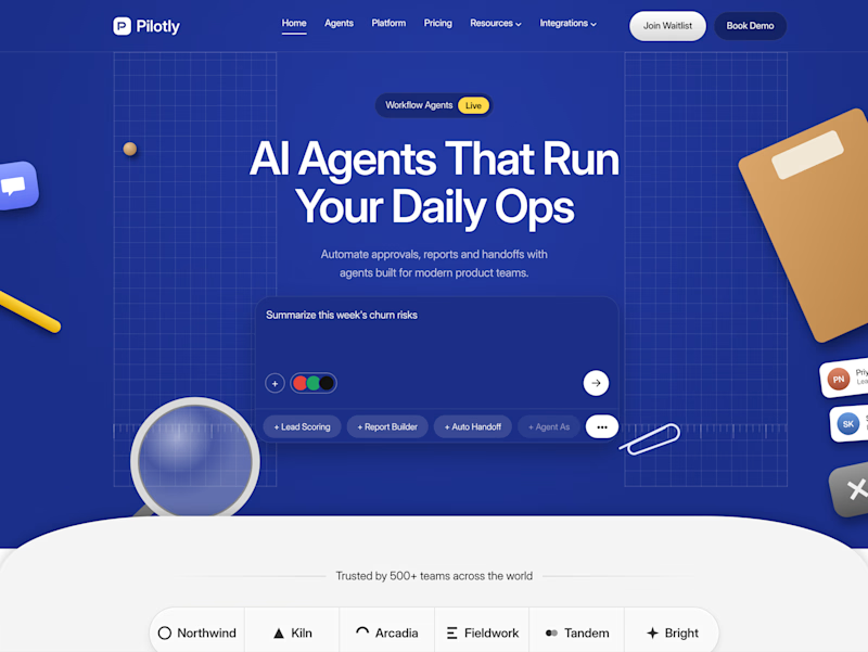
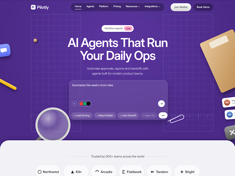
Testing two color directions for Pilotly, an AI agent platform for product teams.
Which direction would you pick for an AI automation product?

3 voted
100%
0 voted
0%
3 votes
Closed
I'd pick Violet Desk. Blue is what every SaaS uses, violet stands out and still says AI, and the orange sticky notes pop more against it. Does the hero chip row under the headline work on mobile?