The network for creativity
Join 1.25M professional creatives like you
Connect with clients, get discovered, and run your business 100% commission-free
Creatives on Contra have earned over $150M and we are just getting started
Back to feedPost
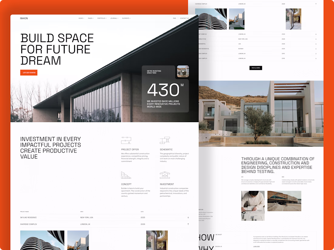
Inhion – Premium Real Estate & Architectural Investment UI/UX Concept
Project Description:
Design Overview:
Inhion is a high-end, editorial-inspired web concept designed completely in Figma for premium architectural investment firms. The core mission of this project was to move away from generic templates and build a conversion-focused interface that speaks directly to institutional investors and ultra-high-net-worth stakeholders.
🎯 The Business Problems & UX Solutions
1. Problem: High Bounce Rate Due to Lack of Instant Trust
The Reality: Corporate investors leave a platform within 5 seconds if they don't see immediate proof of authority and scale. Generic layouts fail to create an impact.
The UX Solution: I structured a high-authority hero section that prominently displays a dynamic "$430M+ Invested" metric next to a clean video-trigger module. This instantly builds institutional credibility and captures trust the moment the page loads, drastically reducing bounce rates.
2. Problem: Data Overwhelm & Cognitive Fatigue
The Reality: Real estate and investment sites are notoriously cluttered with messy grids, heavy text walls, and chaotic lists. Investors get frustrated trying to find key asset details like locations or development dates.
The UX Solution: I designed a highly structured, scannable Editorial Grid Table (THE OAKRIDGE ATRIUM, BAREWOOD RESIDENCES). By stripping away unnecessary visual clutter and utilizing strict baseline negative space, it lowers cognitive load, letting busy stakeholders evaluate portfolio data in a single glance.
3. Problem: Beautiful Design with Zero Lead Conversion
The Reality: Many luxury architectural websites prioritize aesthetics but make navigation a nightmare, resulting in high traffic but zero business inquiries.
The UX Solution: This interface balances a high-end, asymmetric visual hierarchy with clear functional reliability. The "LET'S GET STARTED" call-to-action is strategically isolated with bold contrast, guiding the user’s eye naturally down the conversion funnel and transforming passive visitors into high-value leads.
🛠️ Figma Technical Execution (Developer-Friendly)
Pixel-Perfect Auto Layout: The entire UI is built utilizing Figma’s advanced Auto Layout, responsive constraints, and component properties, making it 100% developer-friendly and ready for seamless frontend translation.
Clean Typographic Hierarchy: Used high-contrast editorial typography balanced with crisp data sheets to ensure premium brand positioning without sacrificing core functionality.
The network for creativity
Join 1.25M professional creatives like you
Connect with clients, get discovered, and run your business 100% commission-free
Creatives on Contra have earned over $150M and we are just getting started
Related posts
Your product launch, visualized like a NASA mission.
FlowCast is an AI-powered product launch command center built entirely with Google Stitch — designed for founders, growth operators, and startup teams who need real-time launch intelligence in one place.
5 fully animated, interactive pages:
Launch Dashboard — live metrics, animated score ring, momentum feed
Launch Countdown — cinematic timer with GO LIVE trigger
Audience Intel — world heatmap, persona breakdown, sentiment arc
Content Command — AI draft generator with viral score probability
Settings — profile, integrations, notification toggles
🔗 Live Prototype: https://flowcast-mission-control-507808598152.europe-west2.run.app/
How I used Stitch:
Started from a blank canvas. Used streaming generation to build all 5 pages, in-place AI edits to fix and animate components without breaking existing layouts, and native HTML canvas motion for all animations — arcs, count-ups, pulsing maps, ghost cursor, and ripple effects. Exported directly to a live deployment link.
What makes it different:
Every metric moves. Every number counts up. Every page breathes. FlowCast doesn't just show you launch data — it makes you feel the momentum.
Nice buddy, Mobile UI's amazing
Project Title
Stitch Playground
Created by:
Diana D. (UX/UI Designer)
Intro
I created "Stitch Playground" an interactive learning experience that helps Stitch users turn your rough interface ideas into clearer more useful prompts.
This project is designed for people who have an idea for an interface but are not sure how to get started in Stitch. Instead of simply telling users to “Write me better prompts,” Stitch Playground shows them how a vague request can become a stronger design brief by adding the right context: What the interface is, who it is for, how it should feel, what sections it needs, and what visual styles Stitch should follow.
The goal of my project was to make prompt writing feel easier, more approachable, and fun for Stitch users.
What I Built:
I built Stitch Playground in Stitch as a clean interactive experience that helps Stitch users get started easily.
What it includes:
A bold clean interactive landing page introducing Stitch Playground
Motion design in the hero and footer (new Stitch features)
A prompt-learning interactive component based on clearer design direction (Inspired by Vincent's Stitch prompting blog post)
A before-and-after comparison showing how vague prompts become stronger Stitch prompts
An interactive prompt builder for turning rough ideas into more complete prompt structures
A prompt deconstructor concept for understanding what makes a prompt more useful
A starter library of reusable prompt examples for dashboards, blogs, entertainment experiences, and portfolios
How I Used Stitch:
I used Stitch as a creative partner to explore, shape, and refine the experience and ideas from a rough concept into a polished finalized experience.
The starting idea was simple: create a guide that helps people prompt Stitch better. From there, I used the Stitch workflow to think through the page structure, content sections, visual style, and interactive learning moments. The project became both a prototype and a teaching tool: it demonstrates how stronger prompting can lead to clearer interface direction.
I focused on the same process the experience teaches: starting with a broad idea, then refining the design by adding clearer context, visual direction, specific sections, and more intentional interface details.
How This Connects to the Stitch Workflow:
Stitch Playground is built around the idea that better prompts create better starting points.
The experience encourages users to move beyond one-line requests like “make a landing page” and instead describe the product goal, audience, style, layout, content modules, and interaction patterns. This makes the design process feel less random and more collaborative.
I also wanted the project to reflect how Stitch can fit naturally into a real creative workflow: ideating, refining, comparing versions, and turning prompt structure into interface structure.
Stitch Features / Workflow Highlighted:
This project highlights Stitch as an (amazing) interface builder that helps users move from idea to interactive product faster. It also emphasizes prompt-based iteration, structured design direction, and using Stitch as a collaborative design partner.
I used new features presented on Stitch's X last week, such as motion and experimented with the Netify connection, Figma export and Google Studio import. I also added a restriction of 4 prompts per day to ensure my webpage does not get abused.
Feedback on Stitch:
Stitch is incredibly POWERFUL, not just for developers but for designers too. You can easily get started with a simple prompt in Stitch to create something truly amazing.
Why I Built It:
I wanted to make something helpful for the Stitch community. Thank you team. I am so happy to have found this product.
Start Playing in your Stitch Playground >
- Diana
Genius!
Designed a complete company profile for VVIBE, focusing on a clean visual identity, brand storytelling, and a professional presentation that reflects the brand's modern and premium positioning.
Wow, i so much love this
Challenges
View allTrending
Claude
Claude has entered the design space. How are you using Claude Design?
Contra University
Learn from expert creatives how to earn more using next-gen AI tools.
creativeaiflow
Creative AI workflows are evolving. What tools do you use, and what are their strengths and weaknesses?
portfolioreview
The best portfolios tell a story, not just show a grid. Share yours for feedback.
freelancerlife
Freelancer life is wins, pivots, and everything in between. What’s yours right now?
