The network for creativity
Join 1.25M professional creatives like you
Connect with clients, get discovered, and run your business 100% commission-free
Creatives on Contra have earned over $150M and we are just getting started
Back to feedPost
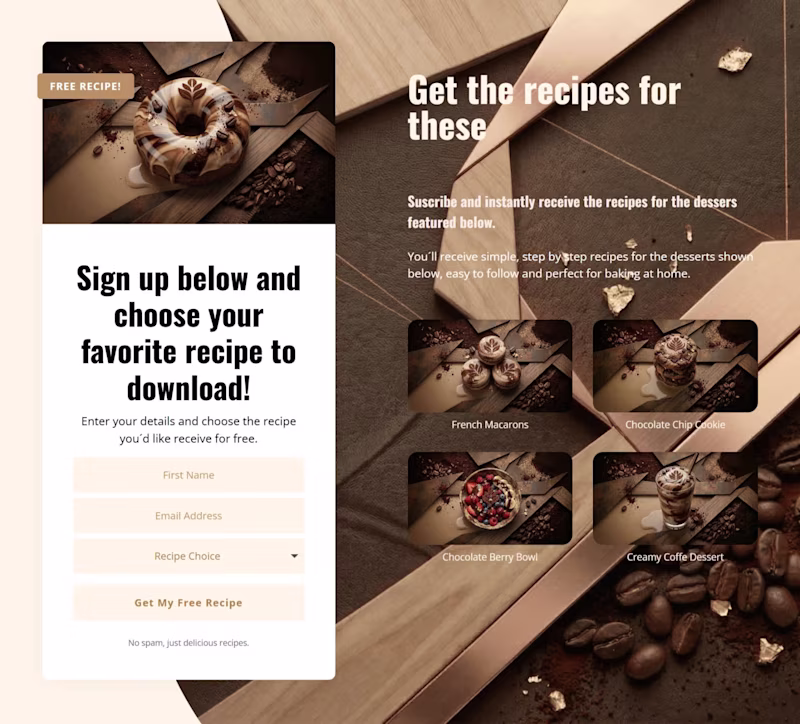
Taste Test

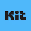
A client asked me to design a landing page for an email marketing campaign where people subscribe to get free bakery recipes.
Same layout.
Same copy.
Same flow.
Only the visual style changes.
Pink: playful dessert vibe.
Coffee: warmer bakery feel.
Which one would you ship?
4 votes
Ends in 1d

Pink feels more fun and attention-grabbing perfect for a free recipe campaign. Coffee is cozy, but might not convert as well at first glance.

Good point, pink probably wins on first glance attention, which can matter a lot for sign-ups.

I’d probably go with the coffee brown. It feels warmer and fits the bakery vibe really well.
That was my initial thought too, the warmer palette feels more aligned with the product.
Would be interesting to A/B test and see which one actually converts better.
Yeah, that would be interesting to see. Sometimes the data surprises you.

The current visuals look like it was made for the brown color!
Good catch, the visuals definitely lean toward the brown palette, interesting trade-off there.

Coffee Brown feels more authentic to the bakery brand. The warm tones make you want to actually bake something!
That’s a great way to put it!, the warm tones definitely make it feel more authentic and bakery-like.
The network for creativity
Join 1.25M professional creatives like you
Connect with clients, get discovered, and run your business 100% commission-free
Creatives on Contra have earned over $150M and we are just getting started
Related posts

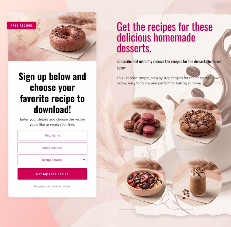
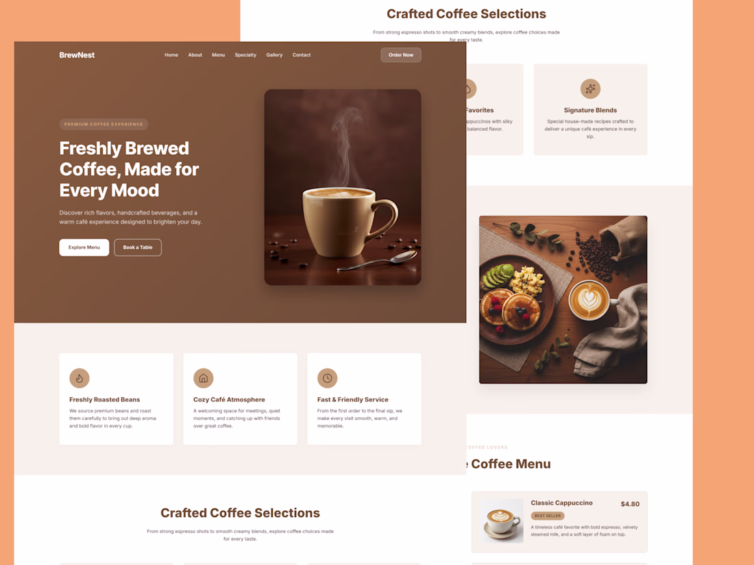
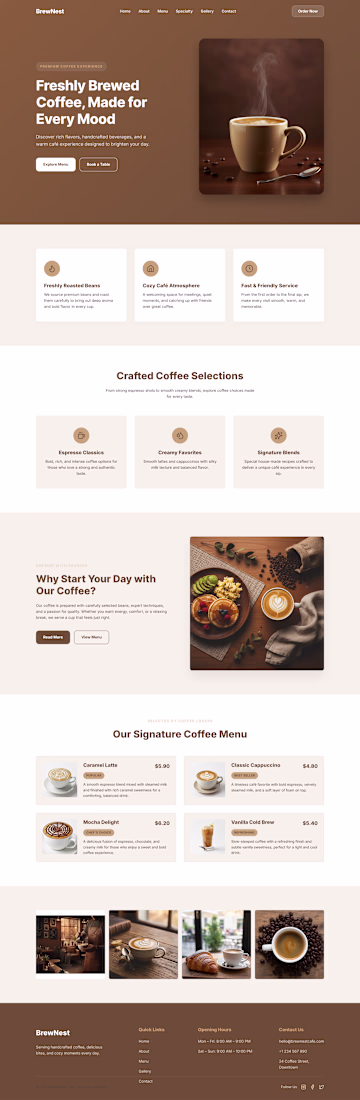
I designed a modern and elegant coffee shop landing page UI for a fictional café brand called BrewNest. The goal was to create a warm and inviting digital experience that reflects the comfort and richness of a real café atmosphere.
The layout focuses on clear hierarchy, warm brown color tones, and minimal UI elements to guide users smoothly from discovering the café to exploring the menu and booking a table.
Key sections include:
• Hero section with strong visual storytelling
• Feature highlights (fresh beans, cozy atmosphere, fast service)
• Crafted coffee selection categories
• Coffee menu cards with pricing
• Image gallery for brand atmosphere
The design emphasizes usability, readability, and emotional connection, making it ideal for café, restaurant, or coffee brand websites.
Tools Used:
Figma / UI Design System


Great work premium look

Exploration for Naliko Creative — a forward-thinking creative studio blending bold editorial aesthetics with modern digital clarity.
A refined serif takes the lead, paired with a warm, cinematic red tone to create a strong and expressive visual identity. The layout balances elegance and impact, combining large-scale typography, curated imagery, and a clean grid system to reflect confidence and craft.


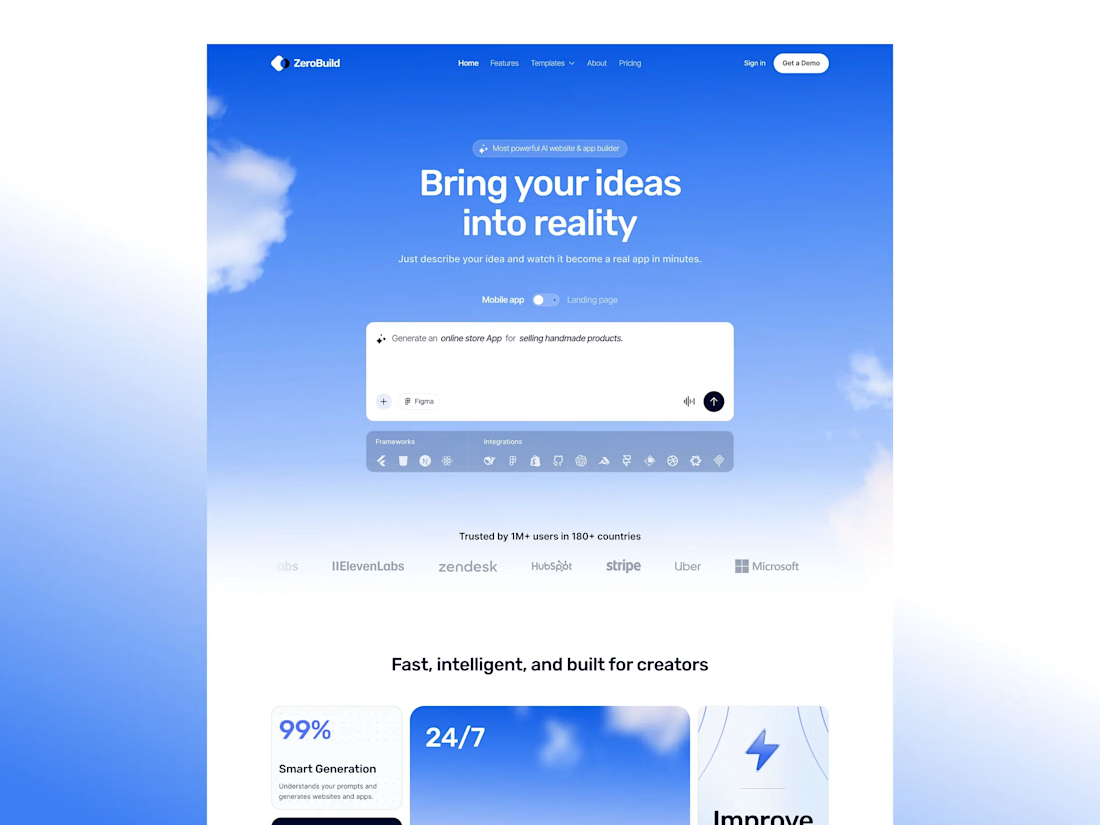
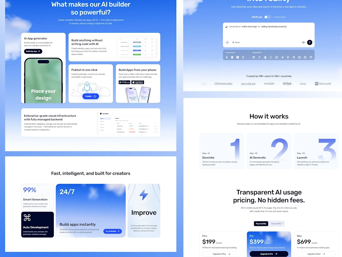
Web & App Builder Website Design for AI Company


Good job


Trending
aivideo
AI video tools are moving at warp speed. Which ones are you experimenting with?
returntonature
Spring is a reset for creativity. What’s inspiring you outside the screen right now?
aidesignflow
AI tools are redefining design work. What's your current workflow?
freelancerlife
Freelancer life is wins, pivots, and everything in between. What’s yours right now?
allthingsmetal
Metal is having a design moment – from chrome to gates and grates. What designs are you forging?