The network for creativity
Join 1.25M professional creatives like you
Connect with clients, get discovered, and run your business 100% commission-free
Creatives on Contra have earned over $150M and we are just getting started
Back to feedPost

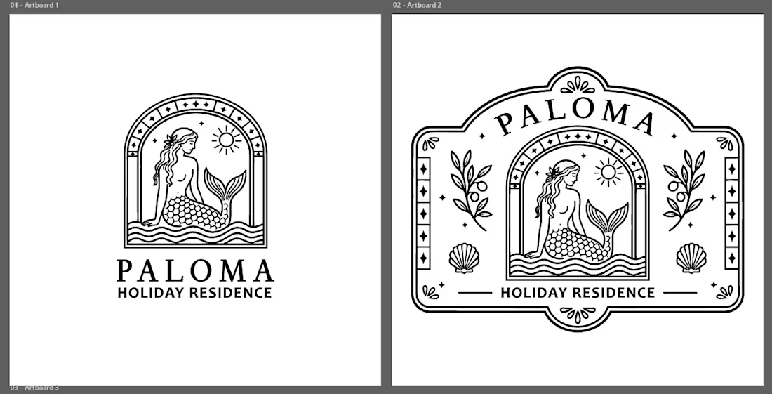
Paloma: A logo exploration for a Mediterranean holiday residence.
The brief was calm, warm, coastal, and refined, so I explored a graphic style inspired by Mediterranean ceramic tiles, vintage seaside emblems, and old residence signage.
I wanted the logo to feel like a place with memory, not overly polished, not generic, but still clean enough to work as a proper brand mark.
The final direction brings together arched Mediterranean forms, a mermaid symbol, sea motifs, and delicate coastal ornamentation, then refines everything into a clean vector logo system.
Still exploring the identity, but this direction feels close to the world Paloma should live in.
Which version feels stronger to you ? the compact mark or the horizontal emblem?
The network for creativity
Join 1.25M professional creatives like you
Connect with clients, get discovered, and run your business 100% commission-free
Creatives on Contra have earned over $150M and we are just getting started







Related posts


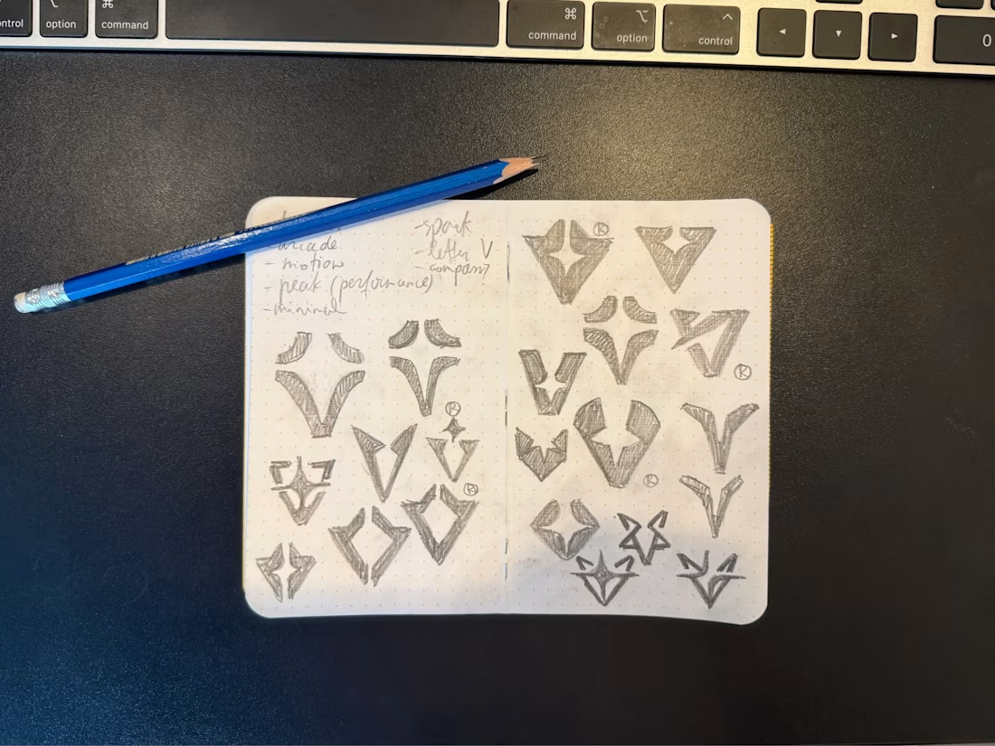

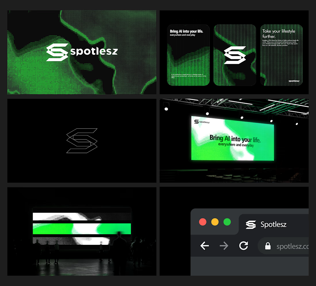
Branding identity completed for Spotlesz in just few days!




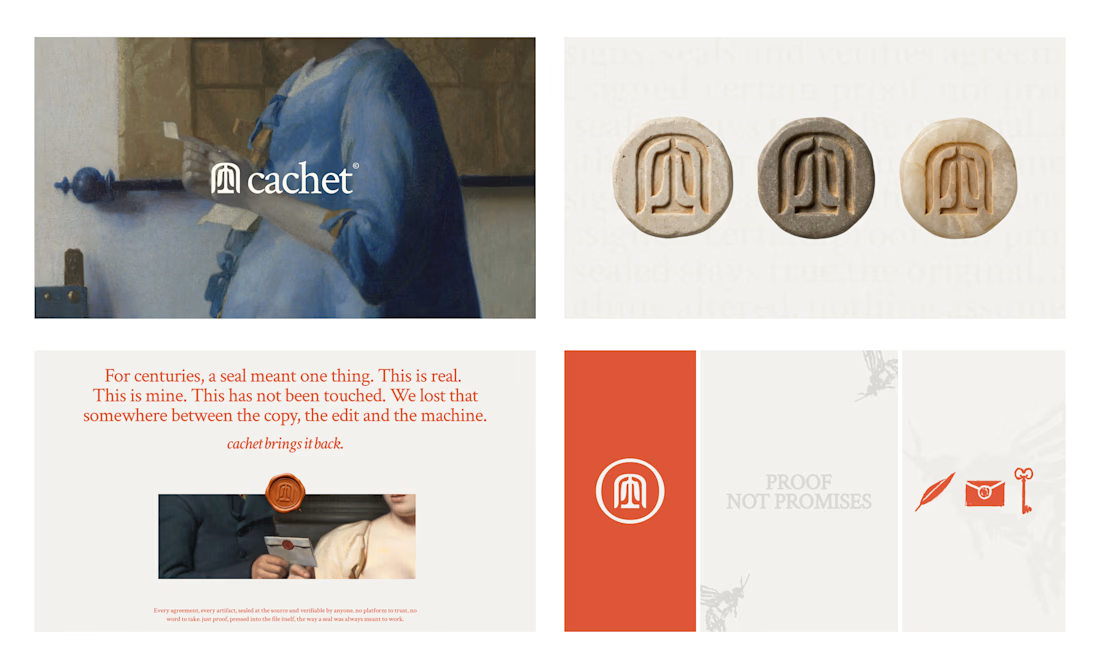
Cachet brand exploration.
Exploring patterns, textures, materials and hand-drawn illustrations

That's interesting I like it that's really unique ❤️❤️🎉🎉