The network for creativity
Join 1.25M professional creatives like you
Connect with clients, get discovered, and run your business 100% commission-free
Creatives on Contra have earned over $150M and we are just getting started
Back to feedPost


AUDIQUE — A Sound-Inspired Brand Identity.
Recently, I had the opportunity to develop a logo and complete branding concept for AUDIQUE, a sound-focused brand.
The creative direction was built around simplicity, movement and the visual language of sound. I developed an abstract geometric symbol inspired by audio waves, paired with clean rounded typography and a vibrant orange-to-coral colour palette.
The objective was to create an identity that feels modern, recognizable and versatile while maintaining a distinctive visual personality.
From the initial concept to the final visual direction, every element was designed to work together as one cohesive identity.
Looking for a logo designer who understands your vision?
I'd love to learn about your business, understand your goals and turn your ideas into a meaningful visual identity.
What do you think of this AUDIQUE concept? I'd love to hear your feedback!
For branding inquiries, feel free to send me a message.
The network for creativity
Join 1.25M professional creatives like you
Connect with clients, get discovered, and run your business 100% commission-free
Creatives on Contra have earned over $150M and we are just getting started



Related posts

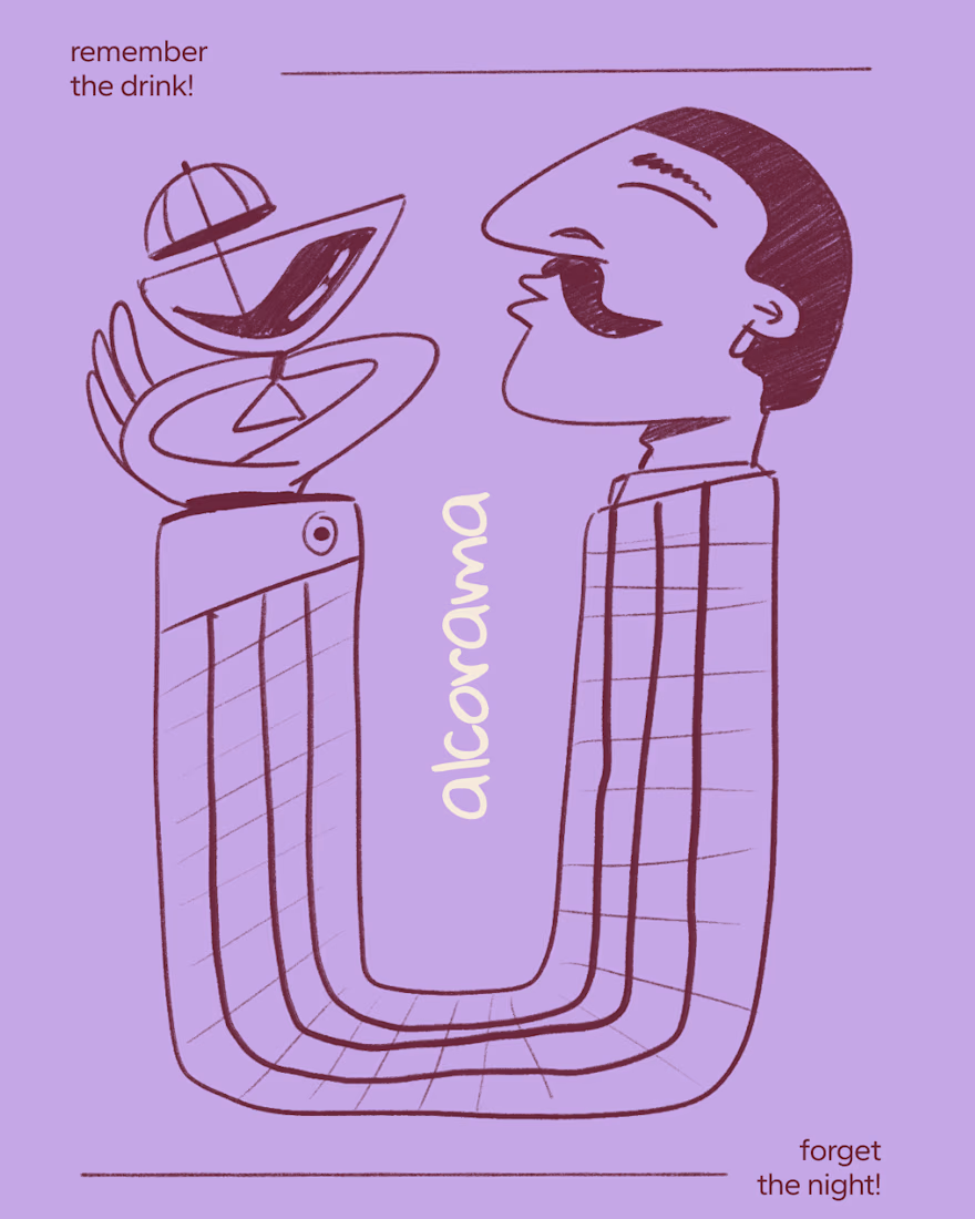
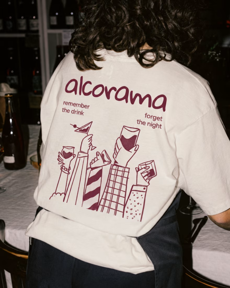
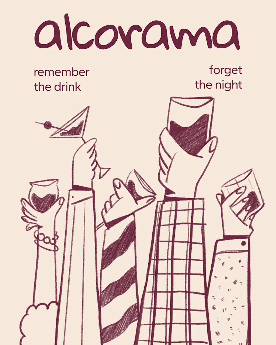
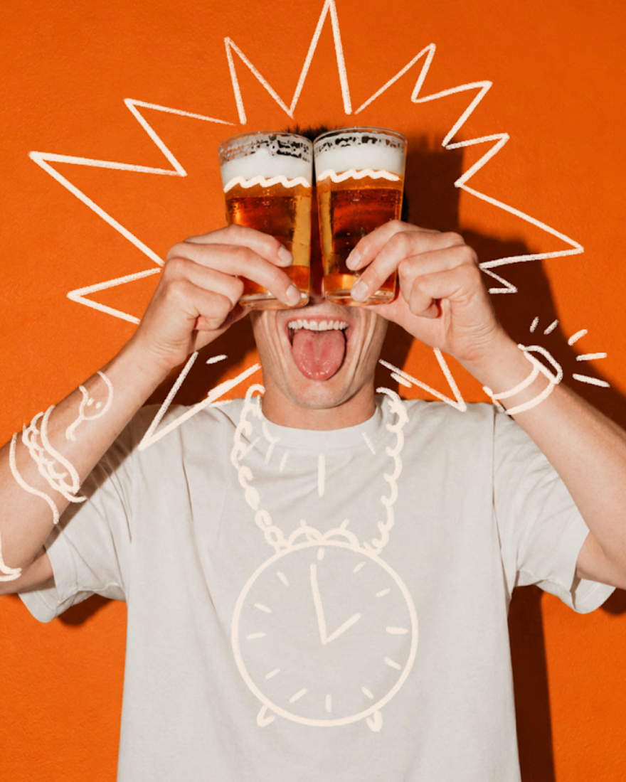
Final direction picked! I love when brands use custom illustration as the main way to communicate with their audience.
Direction discovery should not take more than one week and it should be full of personality! Ready to upgrade your brand?

Amazing work!

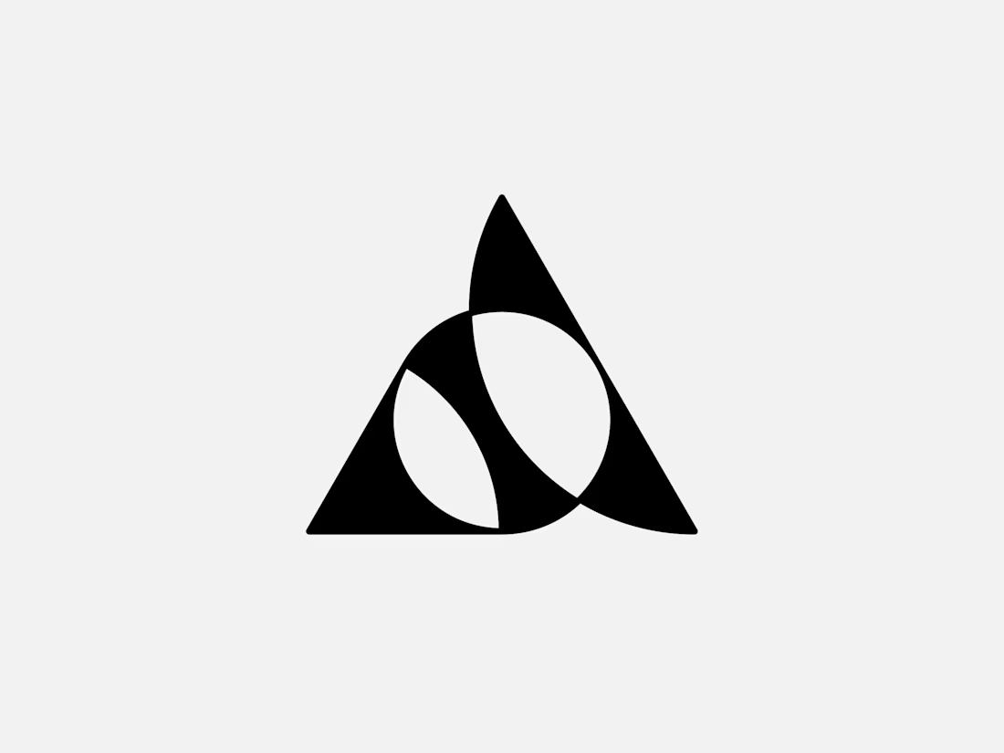
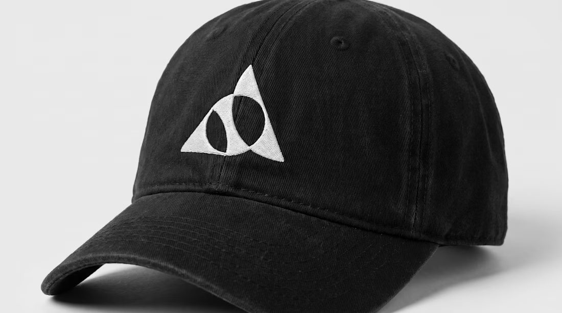
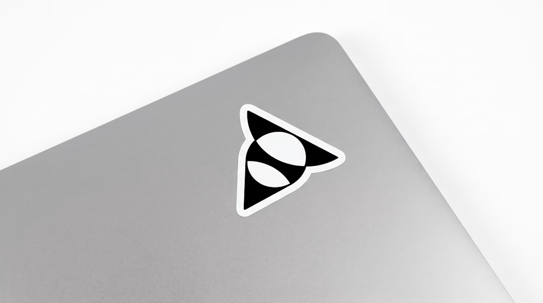
Exclusive premade abstract triangle A logo.
One buyer, full copyright transfer.
A triangle, a circle, and one sweeping curve forming a stylized letter A with two leaf-like shapes in negative space. Built for AI companies, tech startups, fintech platforms, and architecture studios.
Available now: https://brandforma.com/work/abstract-triangle-a-logo-for-sale
Design by Bohdan Harbaruk // Brandforma Studio


TOP!!


This year we've done brand identities for companies in AI, pet health and car rental.
Before you ask a studio for a rebrand, write down the actual mismatch. Something like “enterprise buyers read us as a side project”. Then note where you've seen it, like lost deals or sales feedback.
A named mismatch is something a designer can scope.