The network for creativity
Join 1.25M professional creatives like you
Connect with clients, get discovered, and run your business 100% commission-free
Creatives on Contra have earned over $150M and we are just getting started
Back to feedPost

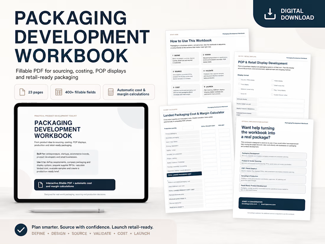
Launching a product is expensive enough without discovering packaging, sourcing or fulfillment problems after production starts.
I put together a 23-page interactive Packaging Development Workbook to help founders and small businesses organize the entire process before those problems become expensive.
It covers product and packaging requirements, supplier RFQs, quote comparisons, domestic vs. overseas sourcing, POP/retail displays, sampling, production approvals, quality control, fulfillment, logistics and retail readiness.
It also includes 400+ fillable fields and checkboxes plus an automatic landed packaging cost and margin calculator, so it can be completed digitally and reused for different projects.
I built it around the same types of real-world decisions I’ve dealt with in packaging, printing, sourcing, production, ecommerce and fulfillment.
Available now on my Contra profile.


The landed packaging cost + margin calculator is the part worth the most. We ship handmade lamps from Pakistan to the UAE, UK and US, and the landed-cost math is the one thing nobody hands you a template for before you price DDP. Good to see it treated as a spreadsheet problem instead of a surprise.
The network for creativity
Join 1.25M professional creatives like you
Connect with clients, get discovered, and run your business 100% commission-free
Creatives on Contra have earned over $150M and we are just getting started
Challenges
View all


Related posts

One brand, very different variety products. 👀
BASYX is one of my favorite projects because the packaging had to work across categories, from skincare to food, while still feeling like one cohesive brand.
That’s the fun challenge of multi-product brands: creating a visual system flexible enough to grow without losing its identity.

wow amazing


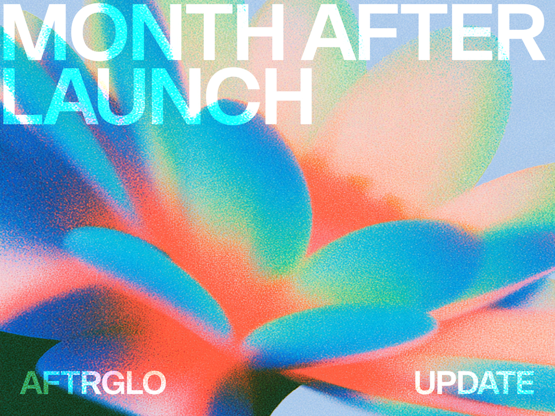
aftrglo has been live for a month ✨
It's a browser-based tool with animated templates I'm building for designers and creatives who want to present their work online with motion, without having to do it from scratch.
Pick a template -> add your visuals -> play with the settings -> export
Here's what's happened in the first month:
• People are using the thing I made. Aaaa 🥹
Seeing aftrglo in other creatives' posts and projects has been such a joy.
• The feedback is coming in.
People are sharing their impressions, ideas, and wishes. I'm learning how aftrglo fits into their creative process.
• That feedback is helping it grow.
We've spotted a few bugs together, and I've been making fixes and updates along the way.
• The editor is getting a new look.
I've redesigned the controls to make the interface feel calmer and easier to navigate.
• Of course I made more templates 👀
Four new templates and updates to existing ones. More possibilities, while keeping the process simple.
Something that once felt like a distant little dream is now helping creatives with their work. They've told me, and I'm still taking that in.
I’m making it myself, while balancing a full-time job and a life I want to be present for. Progress happens in the time I have, and I’m proud of how it’s growing
Still very much in love with building this ✨

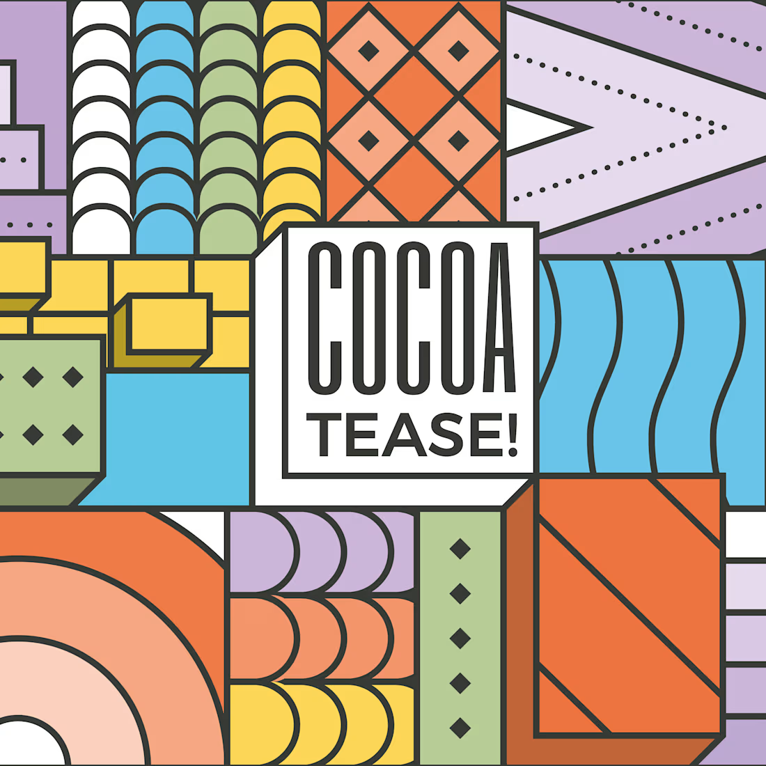
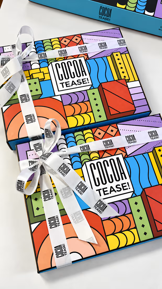
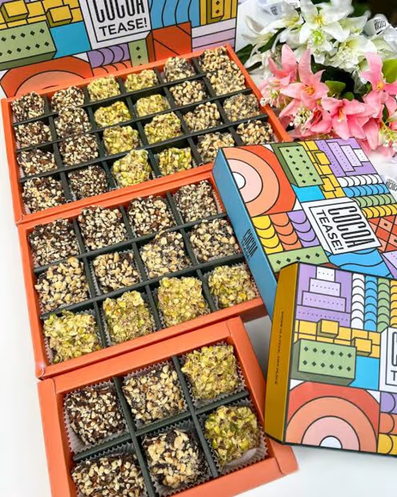
Brand & packaging design for Cocoatease! 🍫
•
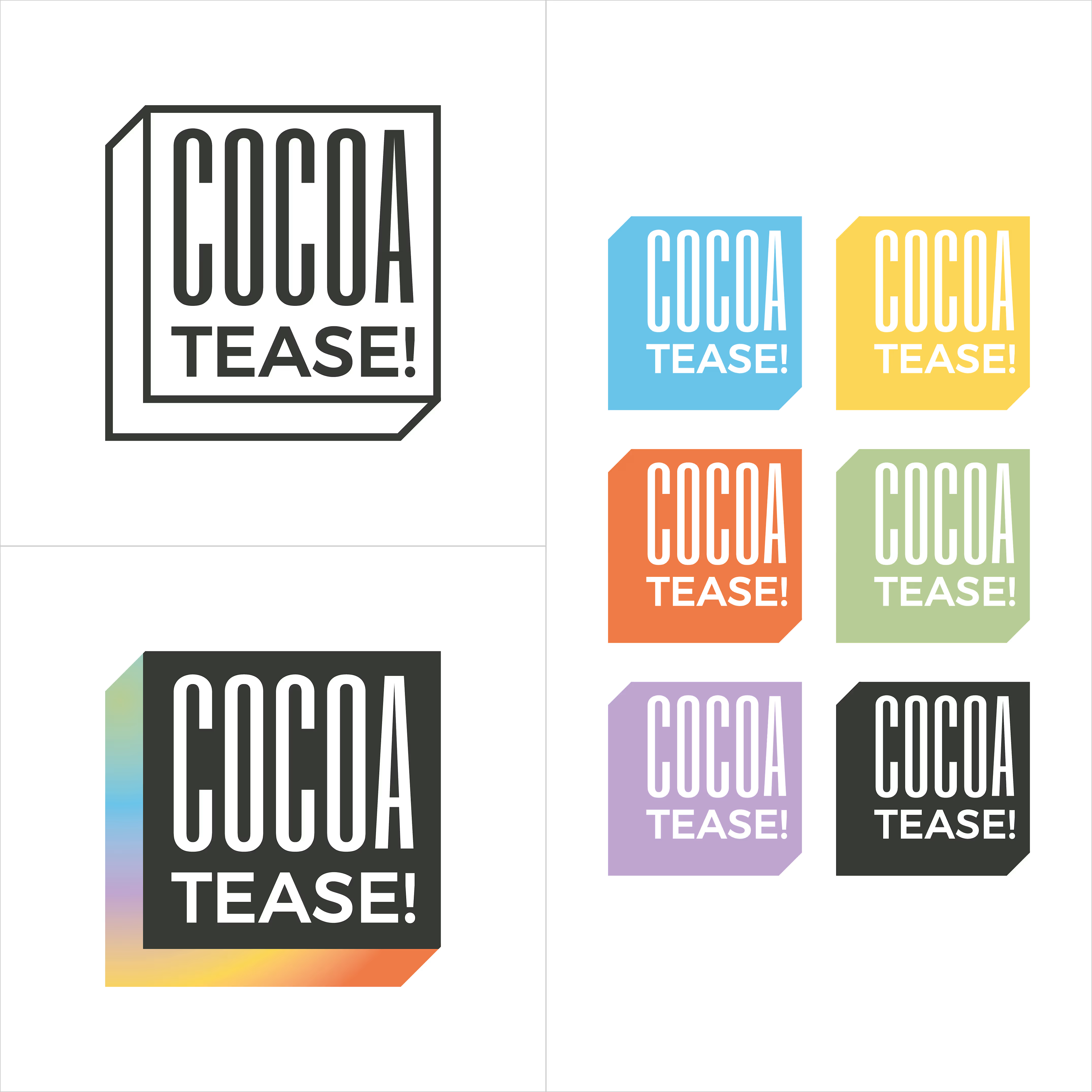
A chocolate company at heart, Cocoatease! is a dessert brand that aims to “tease your palette”. This unofficial tagline prompted the idea of a button for the logo…a visual way of saying “push for a treat”.
•
While a logo is usually designed first, the packaging was conceptualised first to meet growing demand. That pushed us (wink wink) to create a bunch of colour variations to match it.
•
Logo design, logo symbol, branding, brand design, visual identity design, packaging, packaging design, colour palette, typography