The network for creativity
Join 1.25M professional creatives like you
Connect with clients, get discovered, and run your business 100% commission-free
Creatives on Contra have earned over $150M and we are just getting started
Back to feedPost

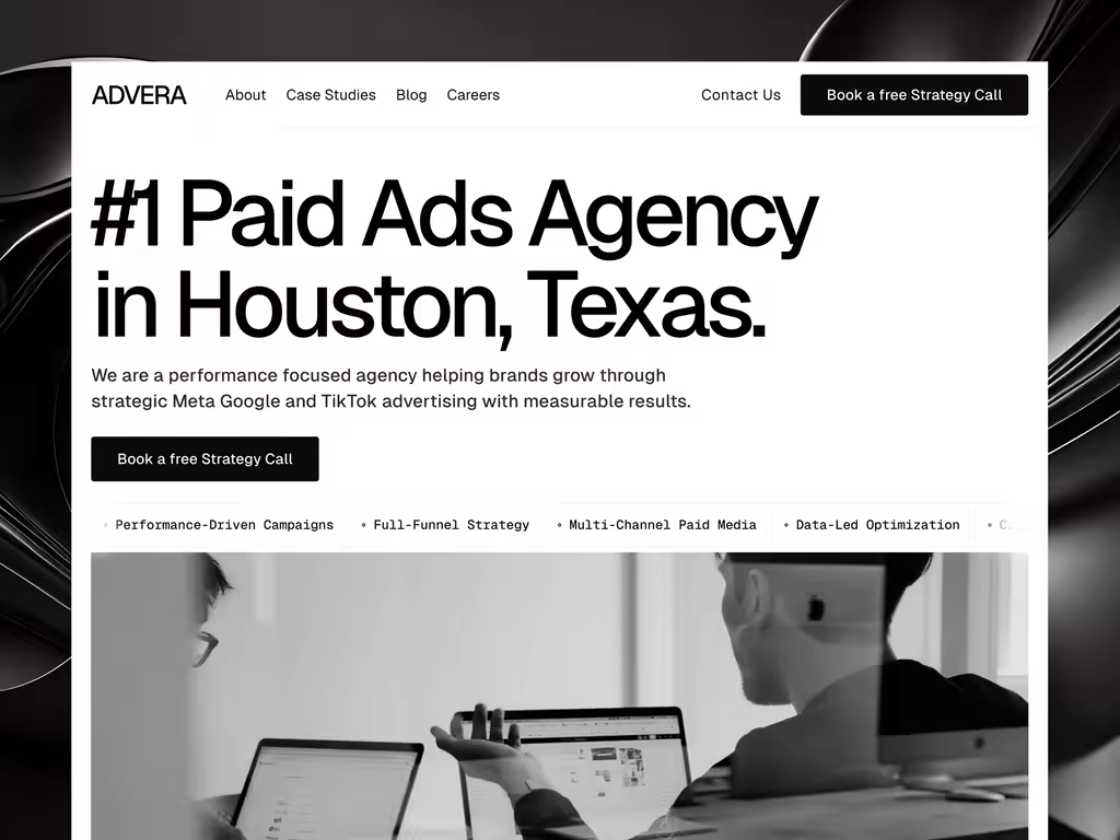
What would a potential client understand about your marketing agency in 3 seconds?
When someone lands on your website, they shouldn't have to figure out:
What you do?
Who you help?
Why they should care?
What to do next?
Your hero section needs to answer those questions quickly.
That's why ADVERA's hero focuses on:
Clear positioning + strong visual hierarchy + a clear CTA.
A beautiful website is great.
A website people understand is better.
Go to your website and give it the 3-second test.
If it's not immediately clear what you do,
This ADVERA template can give you a stronger starting point.
Built specifically for performance, growth, digital, advertising marketing agencies
Grab it here: adveraagency.framer.website
#MarketingAgency #DigitalMarketingAgency #AdvertisingAgency #PerformanceMarketing #MarketingConsultant #AgencyOwner #AgencyWebsite #FramerTemplate #Framer #WebDesign #DigitalAgency #MarketingStrategy
The network for creativity
Join 1.25M professional creatives like you
Connect with clients, get discovered, and run your business 100% commission-free
Creatives on Contra have earned over $150M and we are just getting started

Challenges
View all


Related posts

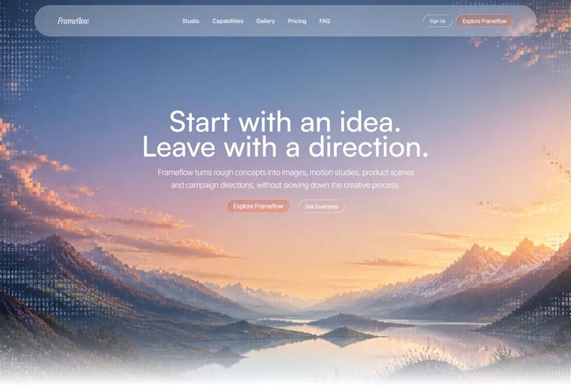
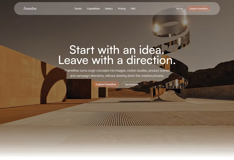
Explored two different visual directions for the same SaaS landing page.
The structure stays consistent, while the imagery, mood and art direction shift the overall brand feel.
Interested to know which direction feels stronger.

11 voted
73%
4 voted
27%
15 votes
Closed

Woww... What a precious design priyansh bro.😍 💯 🔥 🎉

Great renovations. Weak website?
Meet Remoda - a modern Framer template built for remodeling brands. Showcase the transformation. Win the next project.
Framer preview: https://remoda.framer.ai/
DesignToCodes preview: https://designtocodes.com/product/remoda-framer-home-remodeling-website-template/
#remoda #framer #framertemplate #framercommunity #homeremodeling #renovation


The warm orange direction fits the renovation category nicely, and the before/after framing makes the value proposition instantly clear. The structured service flow feels especially suited to homeowners who need confidence before reaching out.

Check it out
ALETRA's website used to behave like a website.
Clean, contemporary, technically advanced. Sections followed sections. It showed capability, but not enough character.
The question became: how does a creative studio prove branding, web design and cinematic storytelling before anyone opens a case study?
The answer was not another interface. It was a world.
aletra.co is now a sequence of rooms. Instead of scrolling down a page, you move through them. Architecture creates chapters. Light sets the mood. A butterfly crosses between spaces, because not everything powerful has to be loud.
Ten chapters. Eight rooms. One story.
AI accelerated the making. Creative direction decided what was worth making.
Walk through it at aletra.co. The full case study is on Behance, link in bio.
#WebDesign #ImmersiveWebsite #ArtDirection #BrandWorld #3DDesign #InteractionDesign #CreativeStudio #Webflow #HospitalityBranding #Berlin #ALETRA


How simple but amazing motion!
Great job. 👍


