The network for creativity
Join 1.25M professional creatives like you
Connect with clients, get discovered, and run your business 100% commission-free
Creatives on Contra have earned over $150M and we are just getting started
Back to feedPost


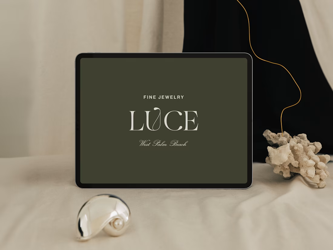
Introducing LUCE, a fresh chapter in four generations of fine jewelry.
Earthy greens, expressive typography, and thoughtful packaging bring warmth and personality to a brand rooted in heritage.
I worked with LUCE across brand strategy, visual identity, packaging experience, and full Shopify website design and development, bringing every detail into one cohesive world.


Nice work It looks premium ❤️

NEAT


Those earthy greens with the typography feel so fresh for a heritage jewelry brand. Lovely work


Four generations of jewelry heritage is the kind of brief that rewards restraint, and the earthy greens plus expressive typography read like a brand that knows it doesn't have to shout. Packaging is where identity usually gets tested in the real world — seeing the tactile finish...

Brand, packaging and the Shopify site from one person is why it all feels like one world. Congrats on the launch.

looks great


Amazing

Beautiful branding! ✨ LUCE feels like a perfect blend of heritage and modern luxury. The earthy palette, elegant typography, and thoughtful packaging create a distinctive identity that feels timeless and premium. 👏

Lovely connection between heritage and the Shopify experience!

The packaging-to-storefront thread is the part most identity projects drop. For a four-generation jewelry house, did the heritage story make it onto the product page itself, or does it live on a separate About page? Curious what the PDP carries.

Beauty

Amazing work
The network for creativity
Join 1.25M professional creatives like you
Connect with clients, get discovered, and run your business 100% commission-free
Creatives on Contra have earned over $150M and we are just getting started

Challenges
View all




Related posts

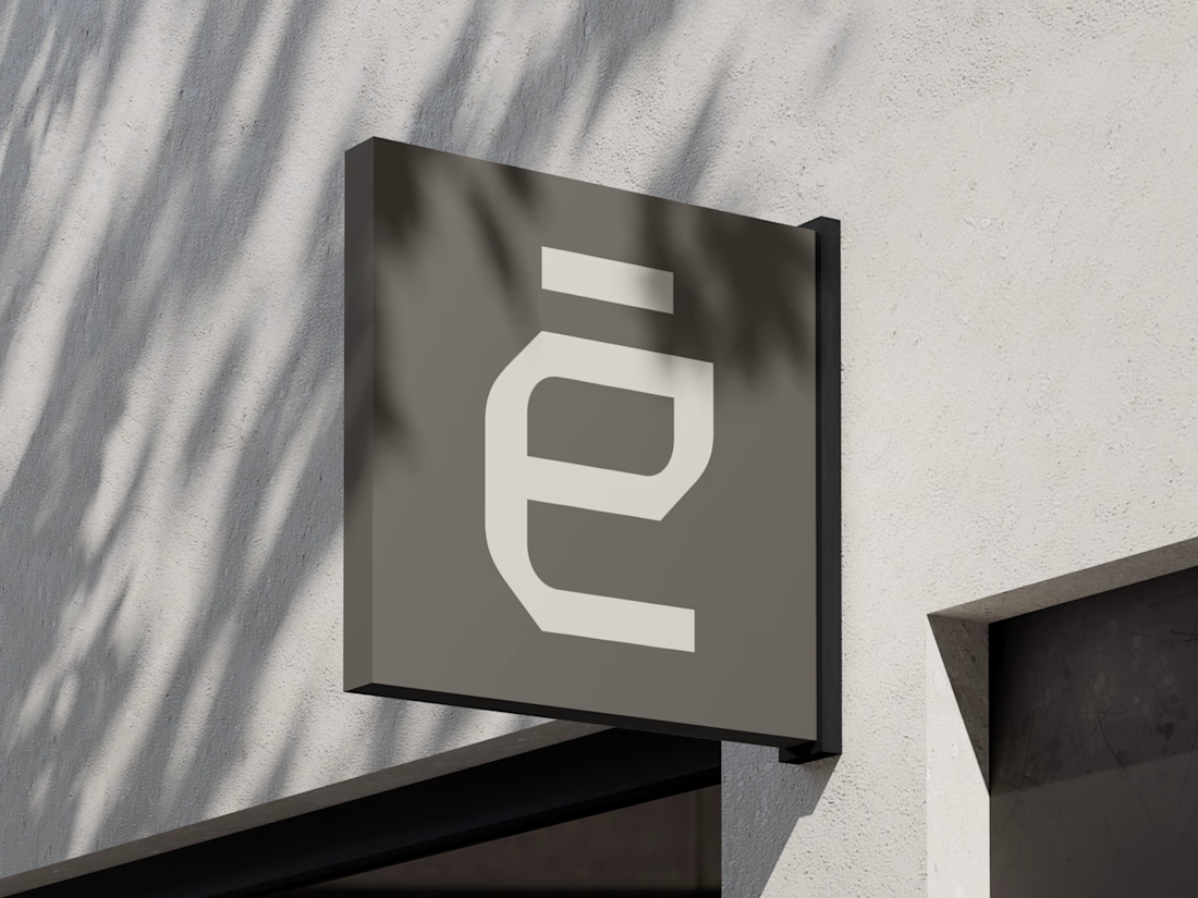
What if construction felt as clear as the space it creates?
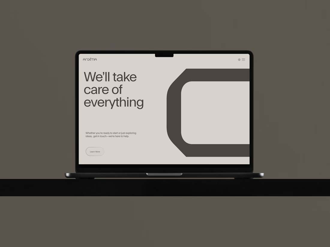
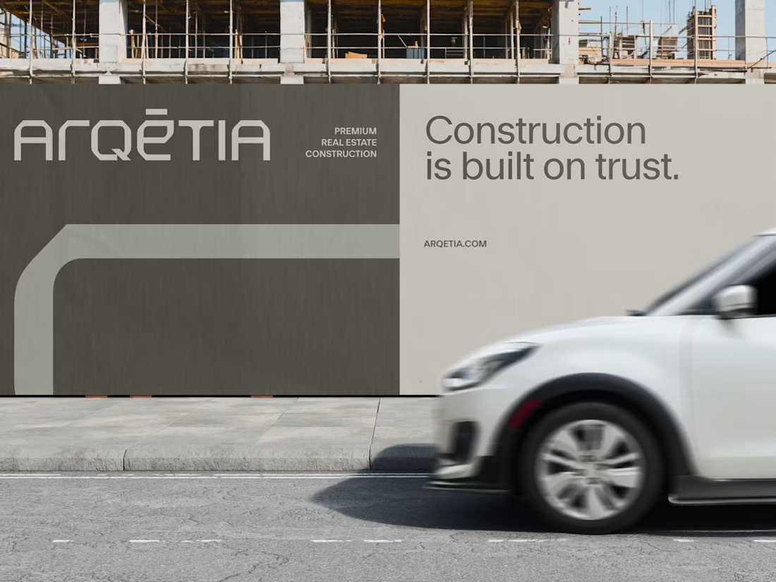
For Arqētia, we built a visual identity around one of the industry's most important client needs: transparency. A direct response to the uncertainty often associated with construction, from unclear processes and budgets to timelines and decision-making.
The concept makes transparency tangible, translating it into a visual system that feels open, structured and precise.
check it out

Very clean identity work


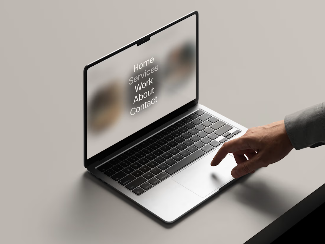
Web Design for Contra Labs — an extension of the Brand Identity we created.
Translating the visual language, principles, and character of the identity into a cohesive digital experience.


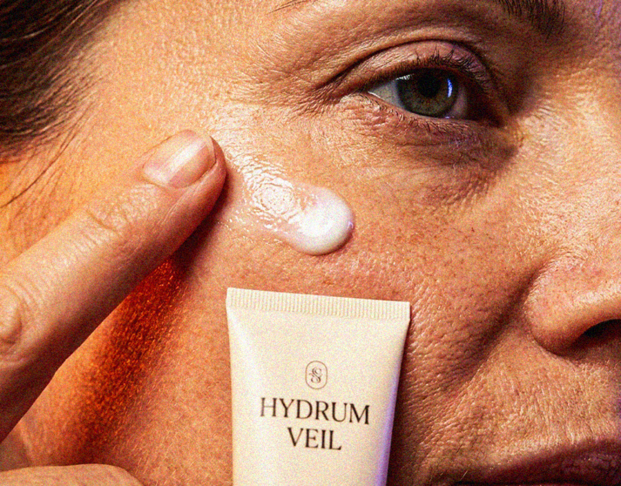
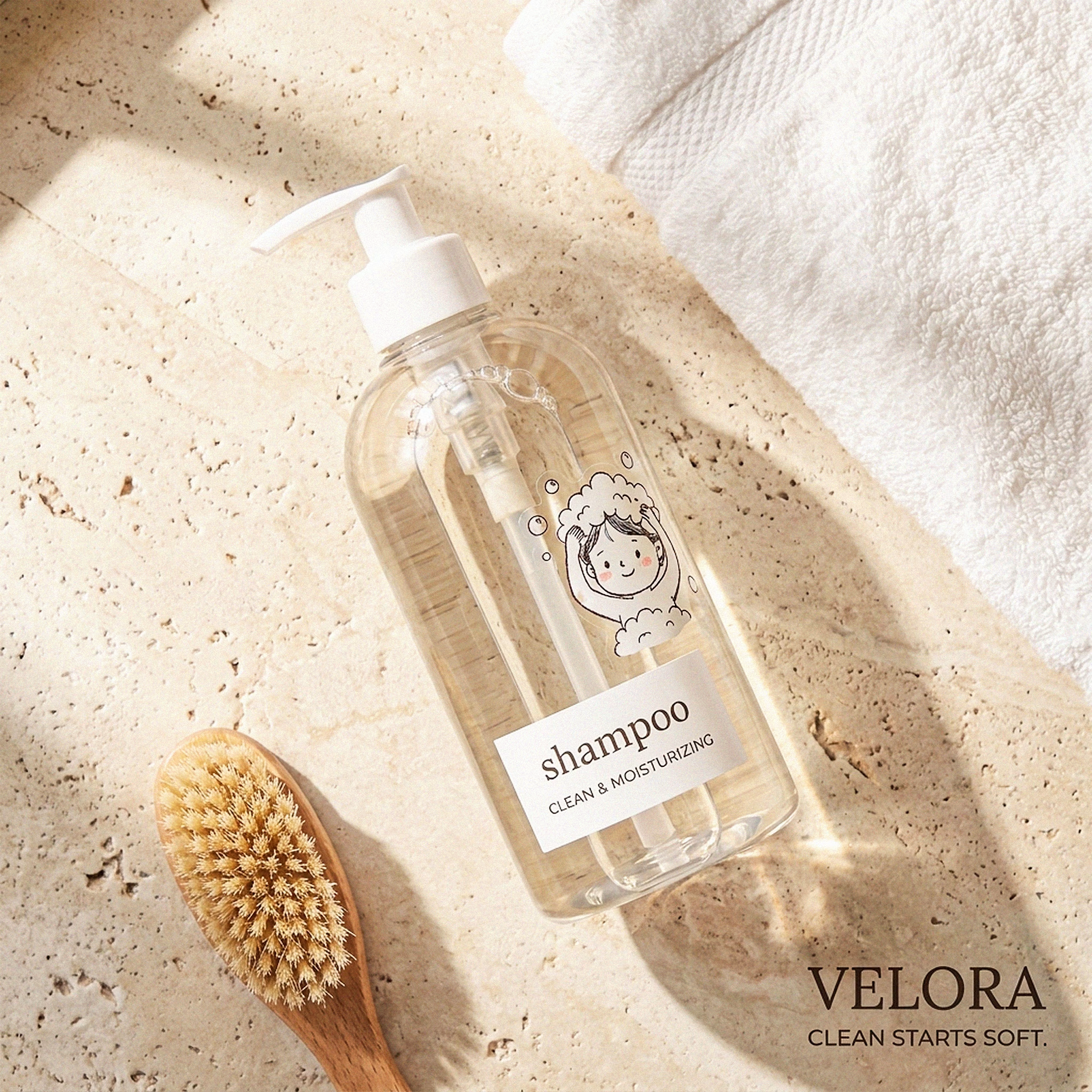
My Top Featured Projects on @Contra Labs 🔥
⚡| NEXVOLU
⚡| HYDRUM VEIL
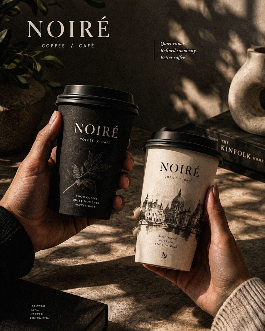
⚡| NOIRÉ
Each project explores a different direction, but the goal stays the same: build brands that stand out.
Which project is your favorite?
Drop the name below 👇



These are 🔥 Mine are all fav 🙌
Congo for Featured on @Contra HQ & @Contra Labs ... 😍


