The network for creativity
Join 1.25M professional creatives like you
Connect with clients, get discovered, and run your business 100% commission-free
Creatives on Contra have earned over $150M and we are just getting started
Back to feedPost

Developing style frames is a critical part of pre-production for brand animations.
Animation isn’t just movement — it’s clarity, perspective, and immersion. Style frames build that foundation.
This is where you intentionally arrange elements to guide attention, communicate value, and stay true to the brand’s identity. It’s where design meets psychology.
Using hierarchy, contrast, color, and emphasis, you direct focus to what matters — the CTA, key benefit, the emotional hook.
Style frames also set the tone. They shape perception before anything moves. And perception drives connection.
Don’t skip them.
You don’t just want videos. You want assets that drive results — and strong style frames make that possible.
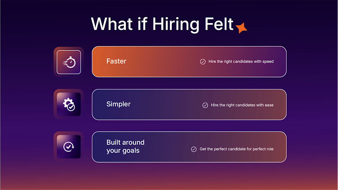
Here’s a snippet of a style frame I’m currently building for a brand.

The network for creativity
Join 1.25M professional creatives like you
Connect with clients, get discovered, and run your business 100% commission-free
Creatives on Contra have earned over $150M and we are just getting started








Related posts


A logo reveal created in Blender, where simple geometric shapes come together to form the Geisleris Studio identity.


Nice

⚽ ONE KICK. THREE BRANDS. ONE ANIMATION.
What if one animation could tell three completely different brand stories — without rebuilding it from scratch?
Introducing ONE KICK, my third entry for the SVGator Animation Template Challenge on Contra. 🚀
The idea was simple: Build once. Design to change.
I created a football-inspired animated template that transforms across three distinct brand identities while keeping the same core motion, timing, and animation structure.
🟠 FIZZA — Bright, playful, and full of personality.
🟢 STRYKA — Bold, energetic, and performance-driven.
🔵 MATCHDAY+ — Dynamic, modern, and built for matchday excitement.
What's behind the concept?
One reusable animation system featuring seven scenes, adaptable branding, customizable text, colors, logos, and visual assets — designed to make brand personalization faster and easier.
From the opening kick to the final branded call-to-action, the goal was to show that great motion design doesn't have to be created from zero every time.
Where it shines: Sports campaigns, promotional ads, social media content, product launches, and animated brand storytelling. The template is designed for creators who want polished motion while keeping the freedom to make it their own.
The challenge I set myself: Could one animation feel like it was custom-made for three completely different brands?
The showcase is my answer.
3 BRANDS. 1 TEMPLATE. 0 REDRAWS.
Built with SVGator. Designed for reuse. Made to work again.
Would love to hear which identity you think works best! 👀
@SVGatorApp #svgatorchallenge #SVGator #Contra #DesignChallenge


The animation is so amazing!


Which feels more established to you?
22 voted
30%

52 voted
70%

74 votes
Closed
