The network for creativity
Join 1.25M professional creatives like you
Connect with clients, get discovered, and run your business 100% commission-free
Creatives on Contra have earned over $150M and we are just getting started
Back to feedPost

I always used border-radius without thinking too much about it.
Then I learned why products like Apple, Figma, and Linear don't use regular rounded corners everywhere.
A normal rounded corner creates a tiny visual bump where the straight edge meets the curve. You probably won't notice it at first, but once you do, it's hard to unsee.
That's where the squircle comes in. Instead of forcing a perfect circle into the corner, it gradually transitions from the straight edge into the curve. The result feels smoother, more natural, and surprisingly more premium.
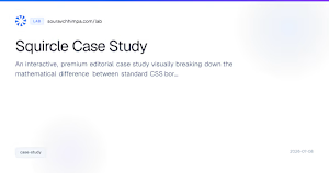
I wrote a small case study explaining the difference with interactive examples.
Read it here: https://www.souravchhimpa.com/lab/squircle-case-study
souravchhimpa.com
Squircle Case Study — Weekend Lab | Sourav Chhimpa
An interactive, premium editorial case study visually breaking down the mathematical difference between standard CSS border-radius and C² continuous squircles in UI design.
The network for creativity
Join 1.25M professional creatives like you
Connect with clients, get discovered, and run your business 100% commission-free
Creatives on Contra have earned over $150M and we are just getting started
Related posts


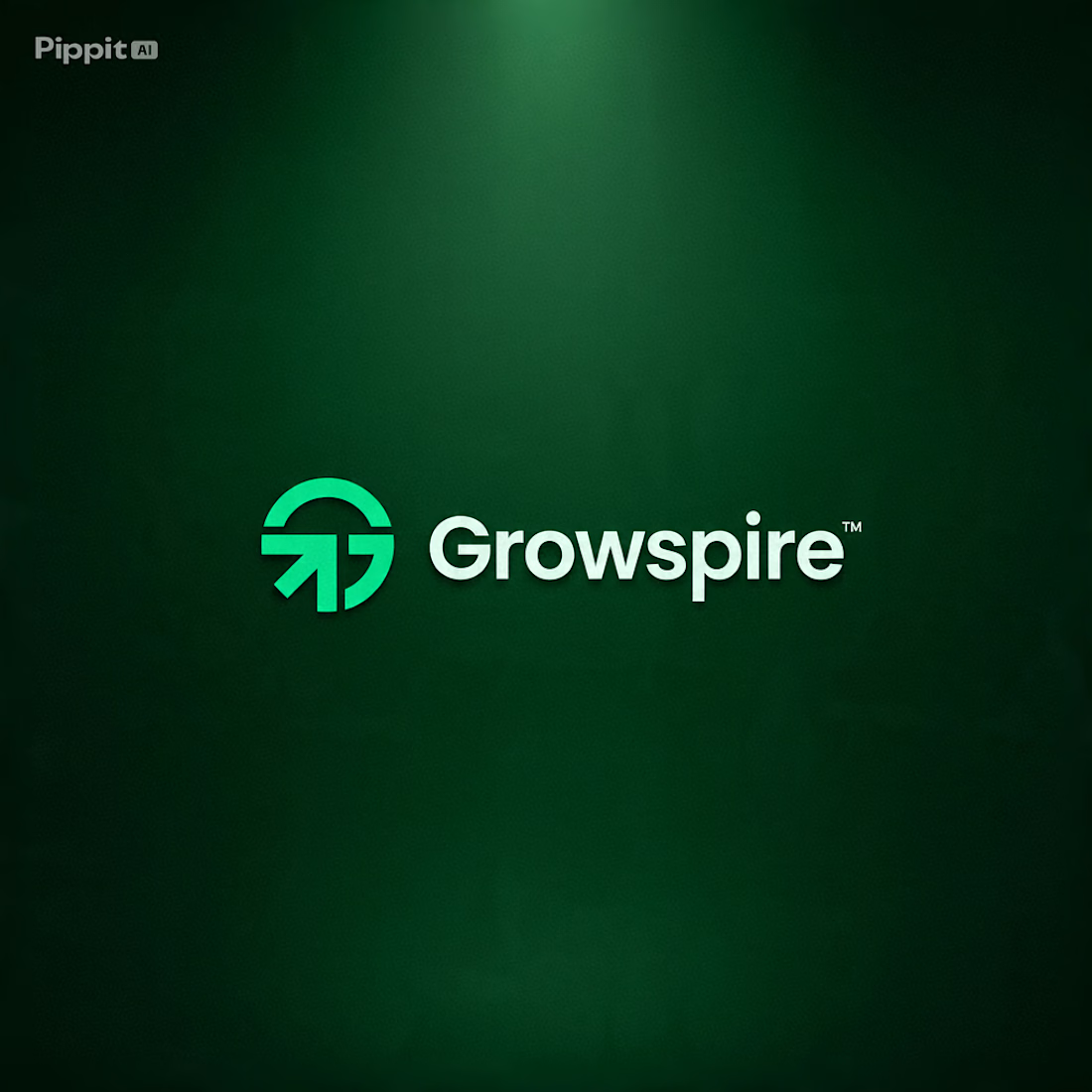
How do you design a brand that represents growth… without relying on the usual leaf or tree icon? 🌱🤔
That's the creative challenge I explored with Growspire.
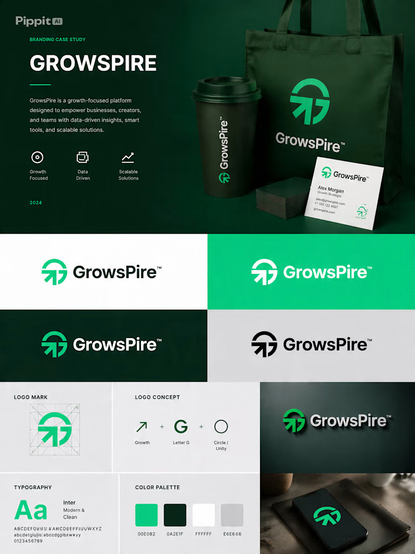
Growth is often visualized through plants, but I wanted this identity to feel more strategic, modern, and future-focused rather than predictable. Instead of following common symbols, I focused on upward movement, clean geometry, balanced proportions, and a minimal mark that communicates ambition, progress, and momentum.
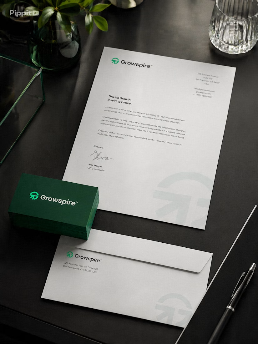
Every curve and angle was carefully refined to create a logo that feels timeless, scalable, and instantly recognizable across digital and print applications.
This is more than just a logo—it's the foundation of a brand built to inspire confidence, innovation, and long-term growth.
I'd love to hear your thoughts... If you had to communicate growth without using a leaf, what symbol or concept would you start with? 💬🌿


lovedit!

Behind every great product is a scalable design system. 🎨✨
A glimpse into the Figma file that powers consistent, production-ready digital products—built with reusable components, design tokens, auto layouts, variants, and organized libraries for faster collaboration and seamless development.
#DesignSystem #Figma #UIUX #ProductDesign #UIDesign #UXDesign #ComponentLibrary #DesignTokens #AutoLayout #DesignOps



Travel Made Effortless ✈️
A premium travel booking UI exploring cinematic close-up visuals, glassmorphism, and subtle neon accents to create a modern, immersive mobile experience.
Tools: Figma
💚 Feedback is appreciated!
#UI #UX #Figma #MobileApp #TravelApp #ProductDesign #Glassmorphism #DarkUI #Dribbble #UIDesign








Trending

Claude
Claude has entered the design space. How are you using Claude Design?

Contra University
Learn from expert creatives how to earn more using next-gen AI tools.
fifaworldcup2026
The World Cup is here and the whole world's watching. How are you designing for the world stage?
creativeaiflow
Creative AI workflows are evolving. What tools do you use, and what are their strengths and weaknesses?
freelancerlife
Freelancer life is wins, pivots, and everything in between. What’s yours right now?