The network for creativity
Join 1.25M professional creatives like you
Connect with clients, get discovered, and run your business 100% commission-free
Creatives on Contra have earned over $150M and we are just getting started
Back to feedPost
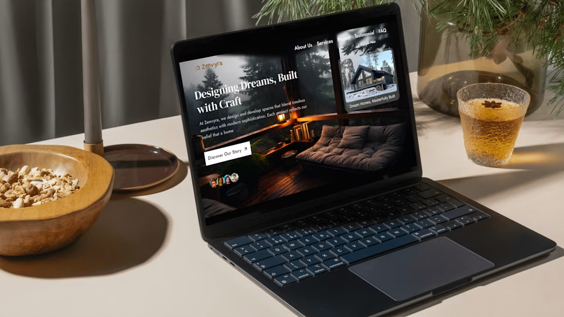
Something I've been building for months is finally live.
Zenvyra — a luxury real estate Framer template that turns a blank canvas into a full agency website in hours.
Built for architects, agencies & property studios who refuse to look average.
Live link in: https://zenvyrahouse.framer.website/
#FramerTemplate #WebDesign #RealEstate #Framer



Looks Good

Thank you 😊

Liking what I'm seeing!
The network for creativity
Join 1.25M professional creatives like you
Connect with clients, get discovered, and run your business 100% commission-free
Creatives on Contra have earned over $150M and we are just getting started

Challenges
View all


Related posts

Experimenting with my components to create something special for you :)
A: Hero section created using Dither Engine
B: Pricing section created using Halftone Engine
Which one would you pick? 👀
👇 A or B ?
2 voted
67%
1 voted
33%
3 votes
Closed

Going with B on this. The halftone texture on the pricing section gives it personality without distracting from the conversion goal. Dither on the hero is cool but feels like it competes with the headline.

AI based memory rewinder app. Which design is better as Homescreen?
7 voted
88%
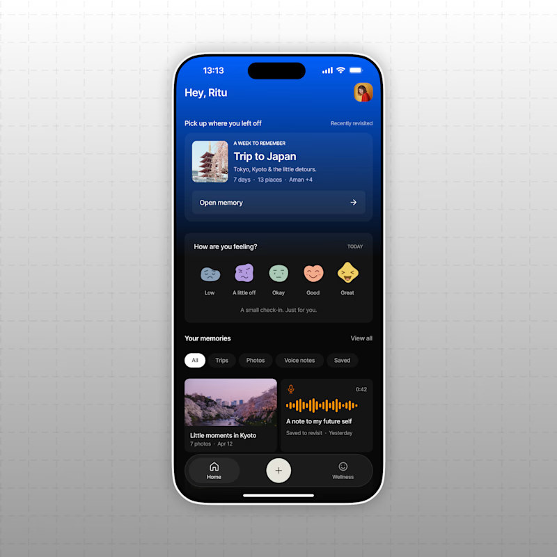
1 voted
12%
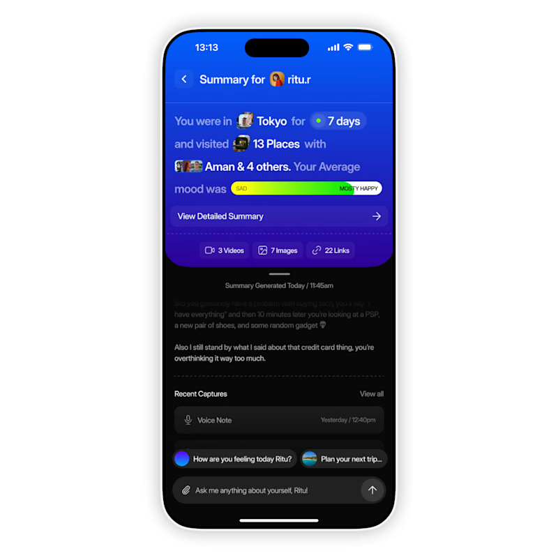
8 votes
Closed

The mood-capture direction feels more distinctive to me—the layered cards give the memory context real personality. I’d keep the summary drawer as a quick-glance fallback for returning users.

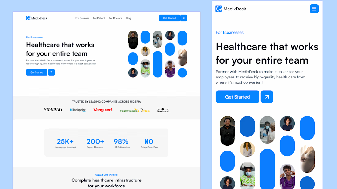
I design some of the cleanest landing pages.
This is for an healthtech company.

Great Job, Daniel