The network for creativity
Join 1.25M professional creatives like you
Connect with clients, get discovered, and run your business 100% commission-free
Creatives on Contra have earned over $150M and we are just getting started
Back to feedPost

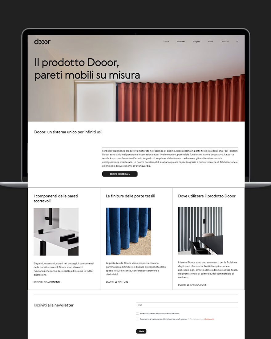
Website designed for Dooor, an Italian company specialized in textile doors. The client asked for a very clean website with a very clear organization. They liked geometry and order, so the website is minimal on purpose and it clearly showcases a clean and simmetrical grid.


The network for creativity
Join 1.25M professional creatives like you
Connect with clients, get discovered, and run your business 100% commission-free
Creatives on Contra have earned over $150M and we are just getting started






Related posts

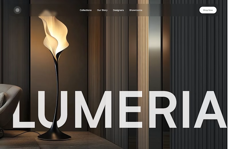
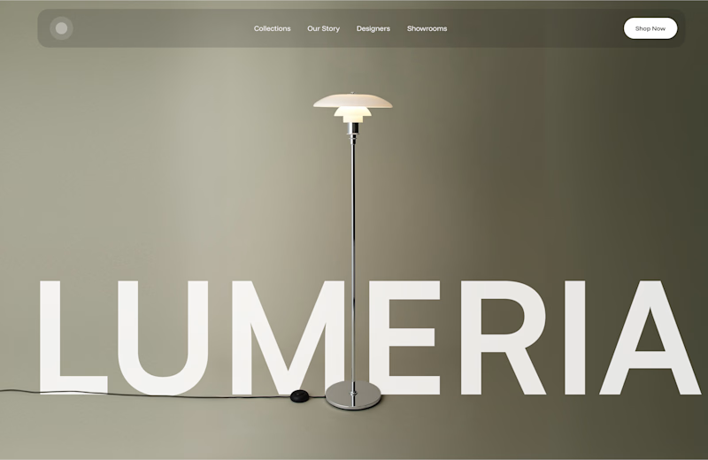
A little design exploration for practice ✨
This time, I’m working on a concept for a lighting brand.
Which direction do you prefer?
74 voted
70%
31 voted
30%
105 votes
Closed

Atmospheric, for a lighting brand it feels almost unfair not to show the product actually doing its job in a real room. The minimal version reads more like a furniture catalog to me. Is Lumeria leaning toward a specific price point or market that would push this one way or the other?

🚀 3D Animated Product Website — Built for a Client
Recently designed and developed this interactive 3D website for a client’s product, combining modern UI/UX with smooth animations and an engaging user experience.
✨ 3D Product Animation
✨ Smooth Interactive Experience
✨ Premium UI/UX
✨ Responsive Design
🔗 Live Demo: https://www-juicydrop.netlify.app/
Have a product or business that needs a modern 3D animated website?
📩 Feel free to reach out — I’d love to work on your next project.
💬 What do you think of the design? I’d love to hear your feedback!
#3DWebsite #3DAnimation #WebDevelopment #WebDesign #UIUX #FrontendDeveloper #FreelanceDeveloper #Contra


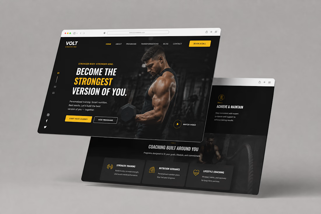
Volt Coaching — Fitness Coaching Website Design
Description
A bold website design concept for Volt Coaching, created to give the brand a strong, energetic digital presence while making its coaching programs easy to explore.
The design combines a dark visual direction with bold typography, yellow accents, strong imagery, clear navigation, and prominent calls to action to create an engaging experience for visitors looking to start their fitness journey.