The network for creativity
Join 1.25M professional creatives like you
Connect with clients, get discovered, and run your business 100% commission-free
Creatives on Contra have earned over $150M and we are just getting started
Back to feedPost

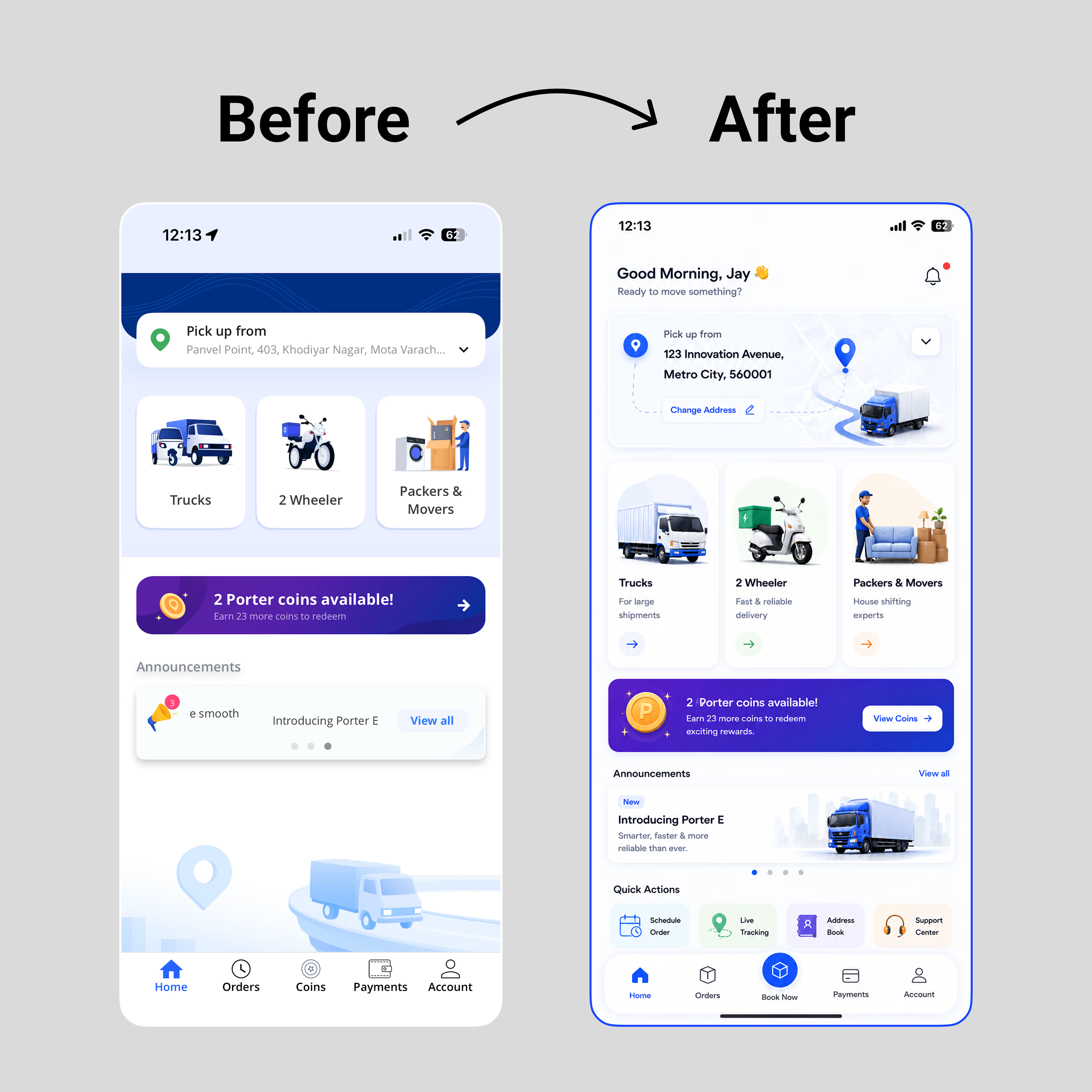
Before → After: Porter Home Screen
I redesigned Porter's home screen to make the experience cleaner, easier to navigate, and more user-friendly.
My focus was on:
- Improving visual hierarchy
- Creating a clearer booking flow
- Making service options easier to scan
- Reducing visual clutter
- Improving spacing and readability
- Building a more consistent interface
Good UX isn't about adding more, it's about making every interaction feel effortless.


Cool🧡
Thank You!

Wow! Neatly done ✅
Thank You!

The focus on reducing visual clutter sounds great—how did you decide on the new visual hierarchy for the service options?
Thanks! I prioritized the most-used services first and used spacing, typography, and card hierarchy to make the booking flow feel more intuitive. 😊


Thank You!

Sharp!
Thank You!
The network for creativity
Join 1.25M professional creatives like you
Connect with clients, get discovered, and run your business 100% commission-free
Creatives on Contra have earned over $150M and we are just getting started
Related posts

Not everything I build lives in Framer.
This one's a code project: I rebuilt Payy's React marketing site — a stablecoin payments company — from the front-end up. New typography system, a reusable motion foundation (scroll reveals, animated stats, page transitions), a handful of custom components, and a footer with proper parallax. All hand-written, no UI framework doing the heavy lifting.
I ran the whole build through Claude Code, which is where 15 years of front-end experience actually pays off — I'm not prompting and hoping. I know what good motion feels like, how to keep things performant and accessible, and where the real work is. The AI moves fast; the engineering judgment is mine. I also work fluently with MCPs like the Figma MCP, so I can pull straight from design files into clean, accurate code.
If you've got a Figma design that needs to become a real, performant site — in React, not just Framer — that's squarely my lane. Happy to talk through what you're building.

Clean UI👏


Template #3 coming along nicely. Almost finished all pages design and animation prototypes.
For some reason I am still doing most of prototyping not directly in framer but directly in claude code


Cool 😍








So cool! That aesthetic truly matches my latest project: BOCA DE SINO





Trending

Claude
Claude has entered the design space. How are you using Claude Design?

Contra University
Learn from expert creatives how to earn more using next-gen AI tools.
fifaworldcup2026
The World Cup is here and the whole world's watching. How are you designing for the world stage?
creativeaiflow
Creative AI workflows are evolving. What tools do you use, and what are their strengths and weaknesses?
freelancerlife
Freelancer life is wins, pivots, and everything in between. What’s yours right now?


