The network for creativity
Join 1.25M professional creatives like you
Connect with clients, get discovered, and run your business 100% commission-free
Creatives on Contra have earned over $150M and we are just getting started
Back to feedPost

Most AI dev tools brand themselves like the future arrived yesterday. Neon, robots, "10x" everywhere. Engineering buyers read that as hype.
ORGN is a unified environment for secure, AI-driven software development. The brief: look like the thing serious teams build on.
We started with the name. ORGN is Origin, the point on an axis that coordinates come from. That became the whole system. A bracketed origin mark, geometry that extends from it in every direction, one controlled band of spectrum on black, and nothing else.
"Build on any axis" is the positioning, the visual logic and the product promise in five words. That's what happens when strategy comes before the logo.
Brand identity, guidelines and launch surfaces by Bright Studios.


the color band pops on the black screen. how did you pick it?

The brand asset consistency is insane here. is this a real product?

One of the best designs I’s seen today. Really solid work 👏 Stripping out AI hype to build a sleek, grounded system for engineering teams is top-tier positioning.

Starting with the strategy before jumping into the visuals clearly paid off here. The minimalist approach definitely cuts through the usual noise in the dev space

The restraint is doing the strategic work here. ORGN feels engineered rather than decorated, which is exactly what a security-conscious buyer needs before reading a feature list. I am curious whether the same proof-over-hype principle carries into the product UI.

Restraint is such an underused move in the AI dev tools category, everyone else is reaching for neon and glow. How did the client react the first time you showed them something this quiet next to what their competitors are putting out?

Naming it ORGN then building the whole visual system from what origin actually means geometrically is clever strategy. The brand earns its look.

The origin-point idea gives the identity a rule that can extend beyond a logo. “Build on any axis” connecting the geometry to the positioning is especially coherent. I’d be interested to see how that rule translates into documentation and product onboarding, where engineering teams spend their time.


Great work🔥👏👏

Starting from the name and building the whole visual system out of "origin" is a good discipline check. Too many dev tool brands just default to neon gradients because that's what the category looks like right now.

I like it!

Love this direction. Making an AI product feel credible and established instead of overly futuristic is such a smart choice. The restraint actually makes the brand feel more premium and trustworthy

Incredible work on the graphics!
The network for creativity
Join 1.25M professional creatives like you
Connect with clients, get discovered, and run your business 100% commission-free
Creatives on Contra have earned over $150M and we are just getting started











Related posts


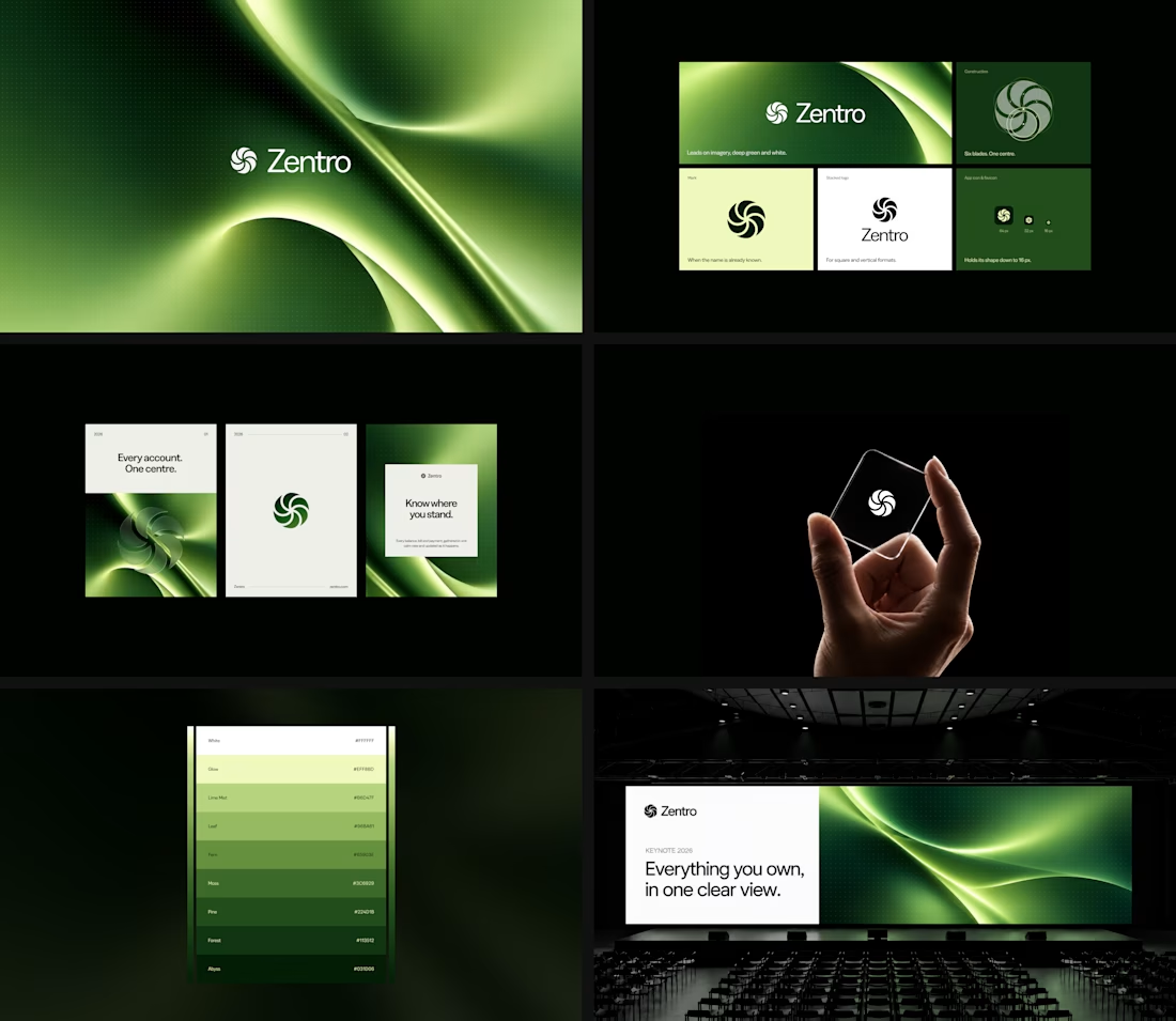

Clean and confident work! The green gradient with the mark feels very modern for fintech - trustworthy but not boring. The app screens look really polished. Curious how you landed on this mark, does it represent growth / movement?


Today I’m sharing something a bit different from packaging. This is the brand identity I designed for ALVA Industries, a Norwegian company developing electric motor technology.
I wanted it to feel modern and clear, but not too cold or impersonal. It’s a technical field, of course, but I think there’s still room for some character.
What do you think?

Incredible branding kit 🔥🔥🔥🔥
Great job Roberto❤️❤️

AI Automation SaaS Website Design
AUTONIX is a modern AI automation SaaS website concept designed to help businesses streamline workflows, automate repetitive tasks, and manage AI agents more efficiently.
The design combines a clean, minimal interface with bold typography, futuristic visuals, interactive UI elements, and a seamless user experience. From AI-powered task automation to real-time productivity insights, every section is designed to communicate the value of intelligent automation in a clear and engaging way.
This project explores how thoughtful UI/UX design can make complex AI technology feel intuitive, accessible, and easy to use for modern businesses.
Services: SaaS Website Design, UI/UX Design, Landing Page Design, AI Product Design.