The network for creativity
Join 1.25M professional creatives like you
Connect with clients, get discovered, and run your business 100% commission-free
Creatives on Contra have earned over $150M and we are just getting started
Back to feedPost
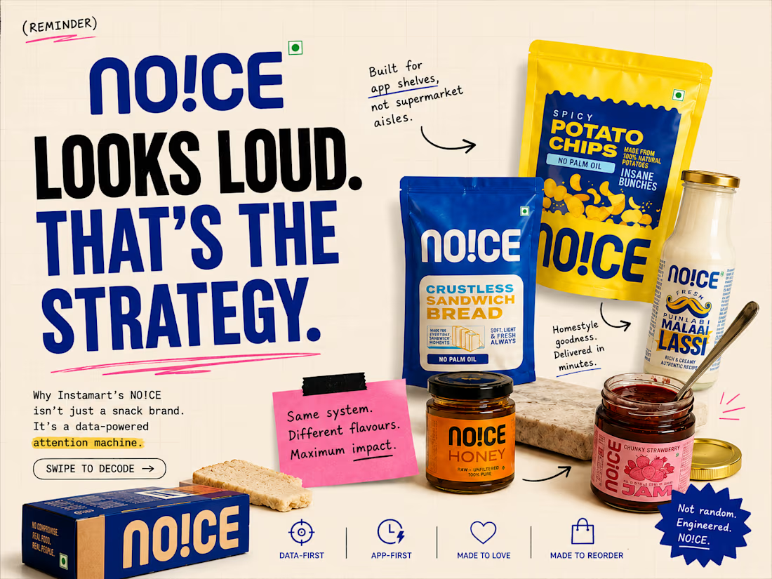
Most FMCG brands are designed for supermarket shelves.
NO!CE feels like it was designed for the scroll.
Fast recognition.
Loud colour blocking.
Big flavour names.
Instant dopamine on a tiny screen.
What looks playful on the surface is actually a very sharp quick-commerce strategy underneath.
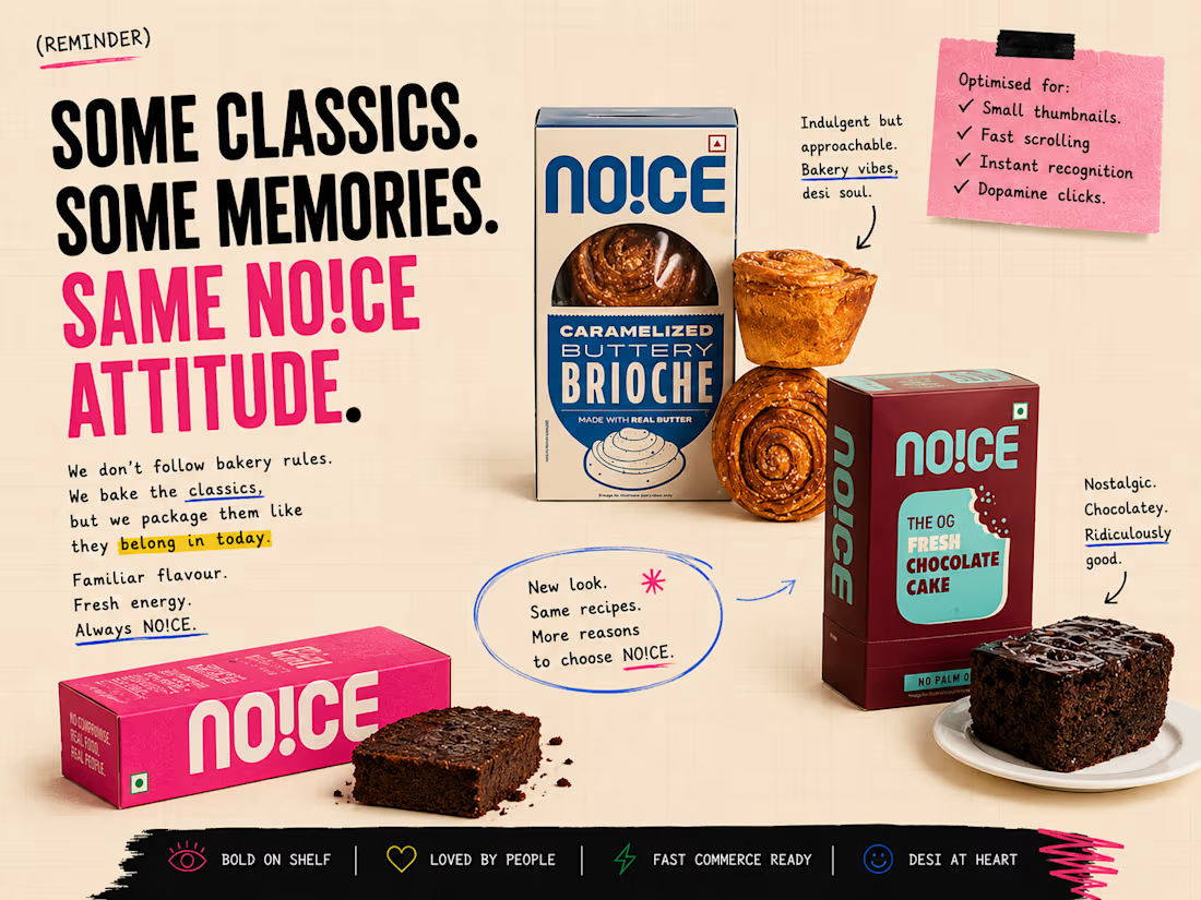
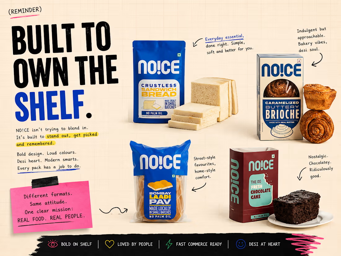
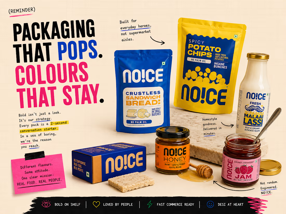
This carousel explores how NO!CE uses:
• Bold visual contrast
• Desi nostalgia
• Shelf-breaking colour systems
• Instamart-first thinking
• Packaging built for impulse, not browsing
A fun little breakdown of a brand that understands modern attention better than most.

Nice work.

Thanks!
The network for creativity
Join 1.25M professional creatives like you
Connect with clients, get discovered, and run your business 100% commission-free
Creatives on Contra have earned over $150M and we are just getting started







Related posts


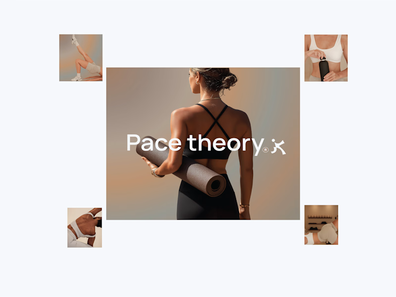
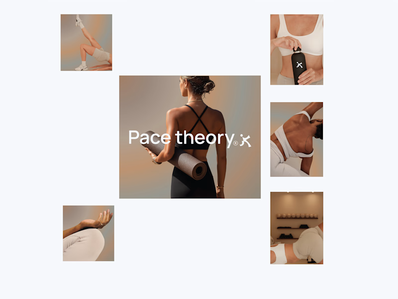
Working on a new brand project: Pace Theory. ✦
Exploring two different directions for the visual identity and brand presentation.
Which variation do you prefer — Left or Right? 👀
I’d love to hear your thoughts on the layout, composition, and overall brand feel.
Drop your pick in the comments 👇

5 voted
33%
10 voted
67%
15 votes
Closed

Left variation is more practical ❤️
great job Shivan🔥🔥

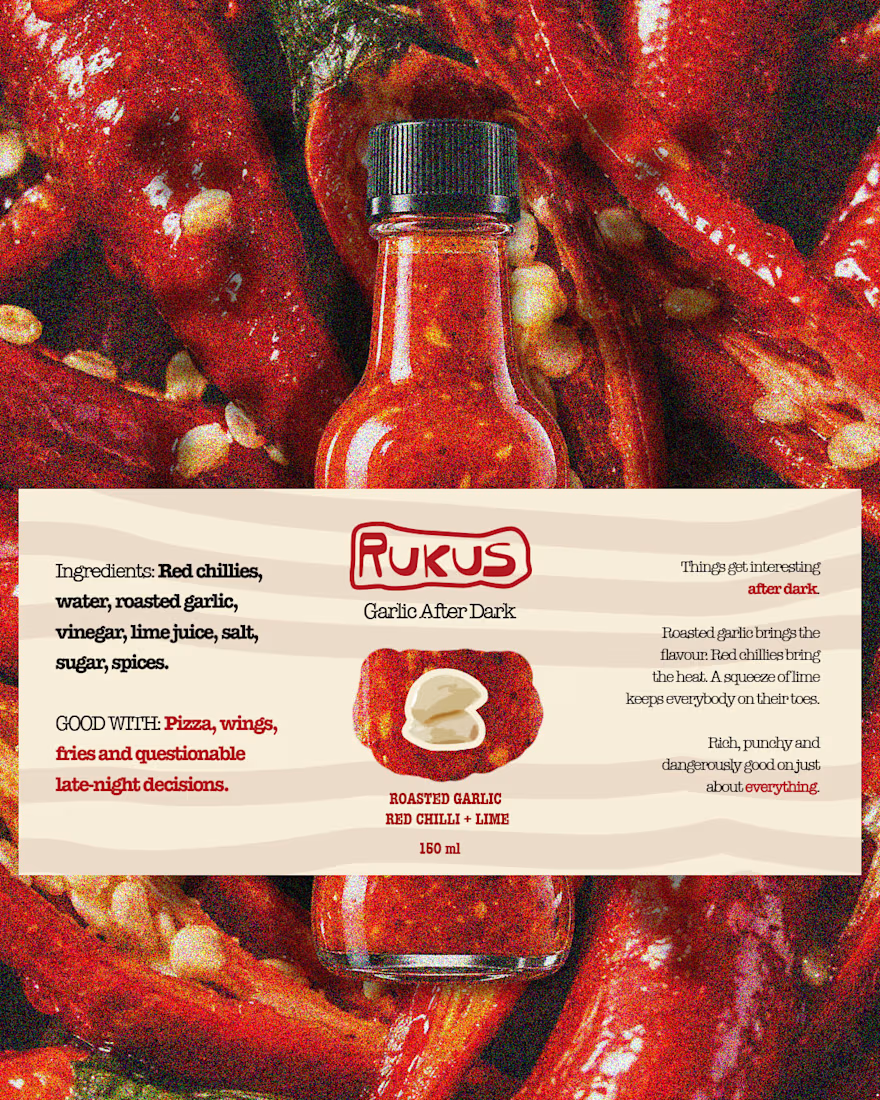
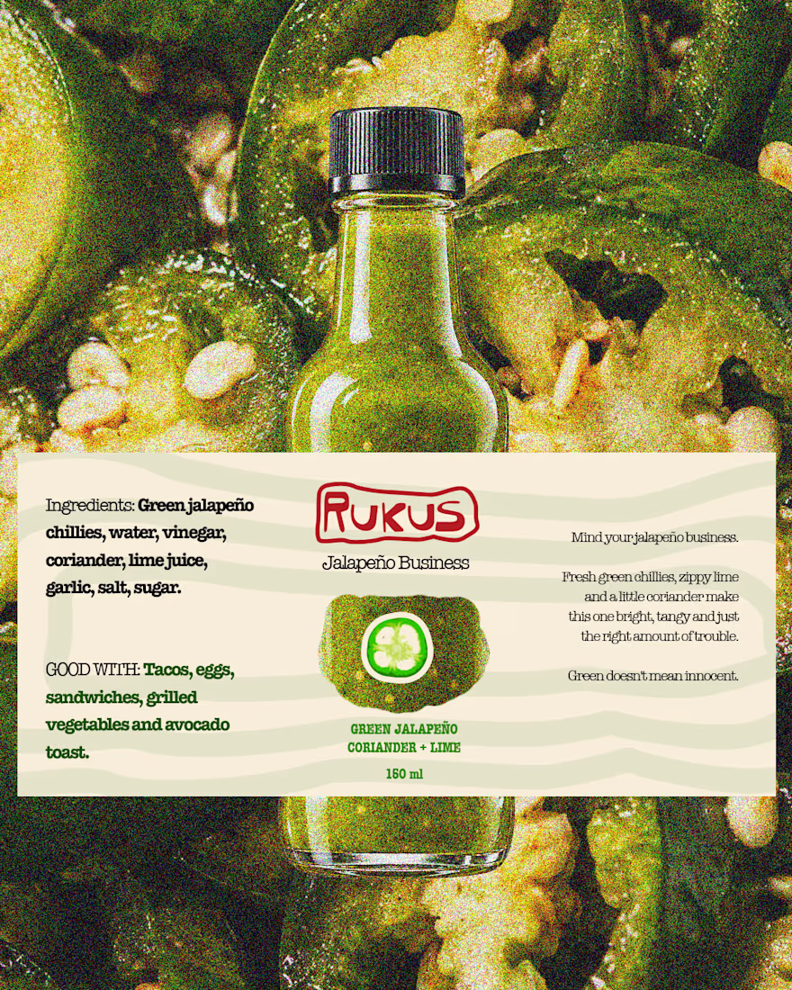
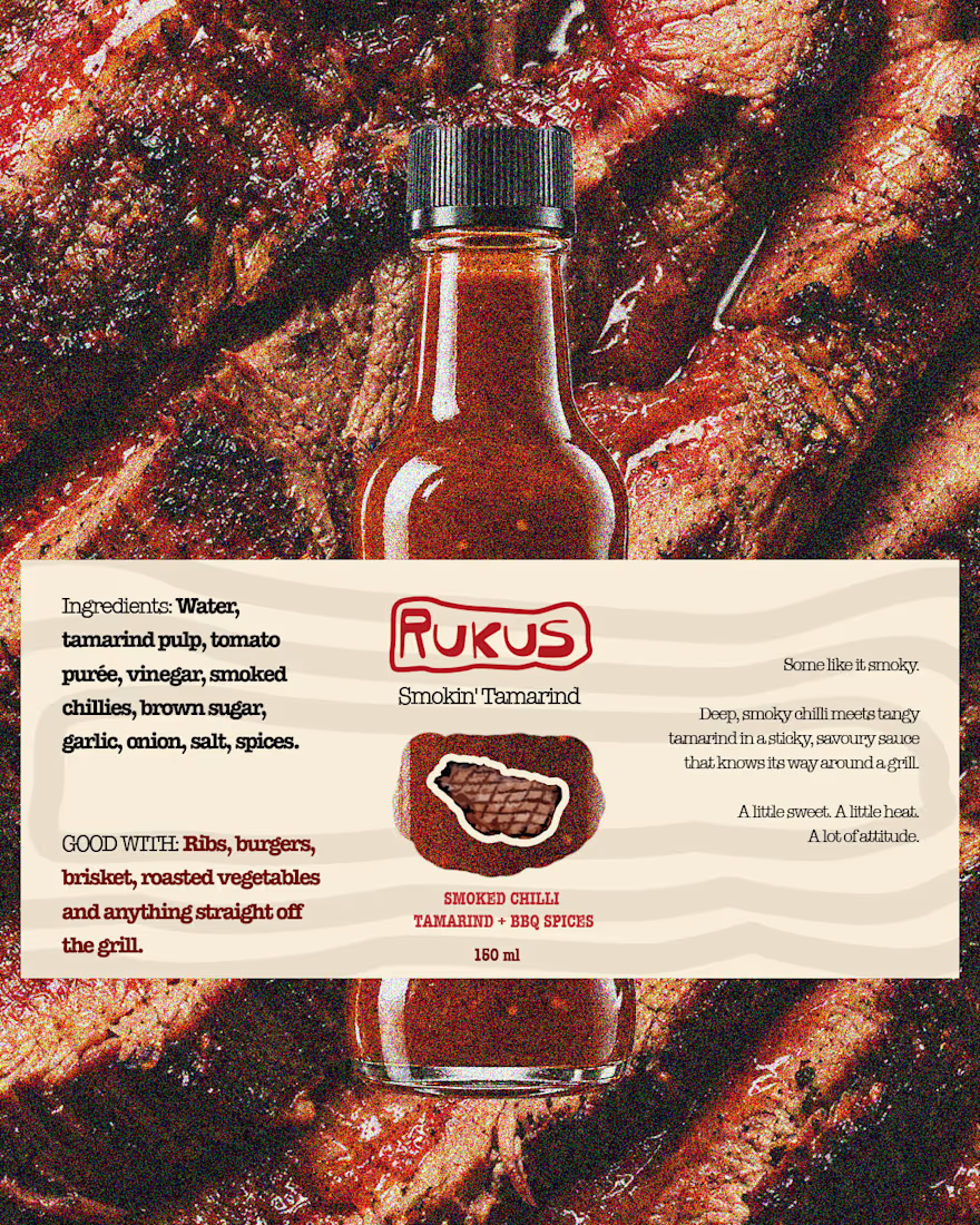
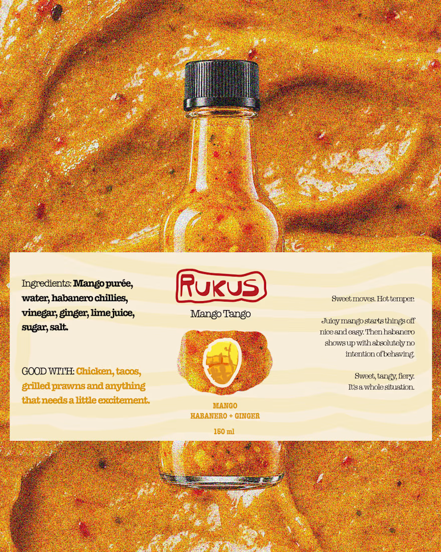
Packaging with personality.
A look at our packaging design work for Rukus, where bold visual expression meets thoughtful brand application.
Designed to stand out, build recognition and bring the brand's personality to life beyond the logo.
Design by StudioKagure.
#PackagingDesign #BrandDesign #VisualIdentity #StudioKagure

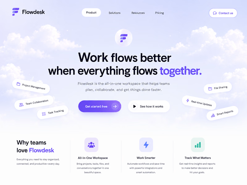
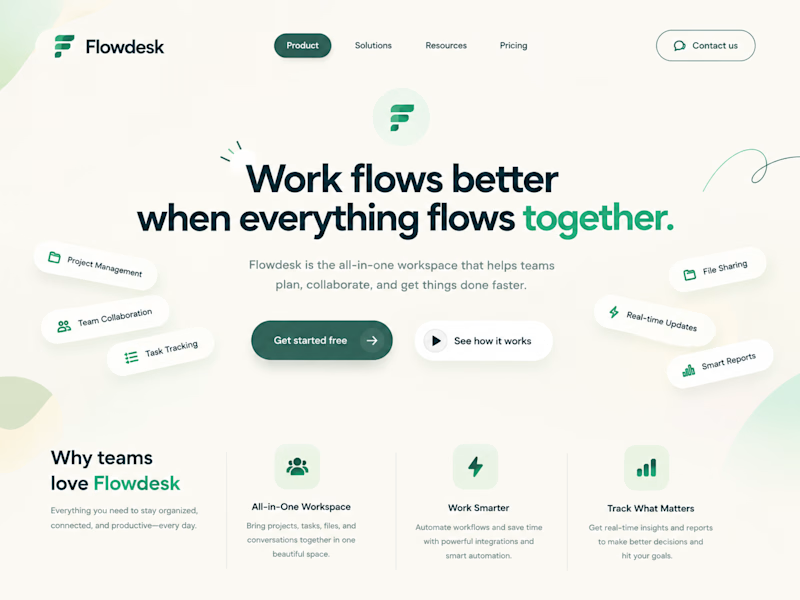
One SaaS header, two personalities.
Color changes how a product feels before anyone reads a word.

6 voted
86%
1 voted
14%
7 votes
Closed


Both work well, but I’d go with Modern. The stronger colors make the SaaS brand stand out more.