The network for creativity
Join 1.25M professional creatives like you
Connect with clients, get discovered, and run your business 100% commission-free
Creatives on Contra have earned over $150M and we are just getting started
Back to feedPost
Taste Test

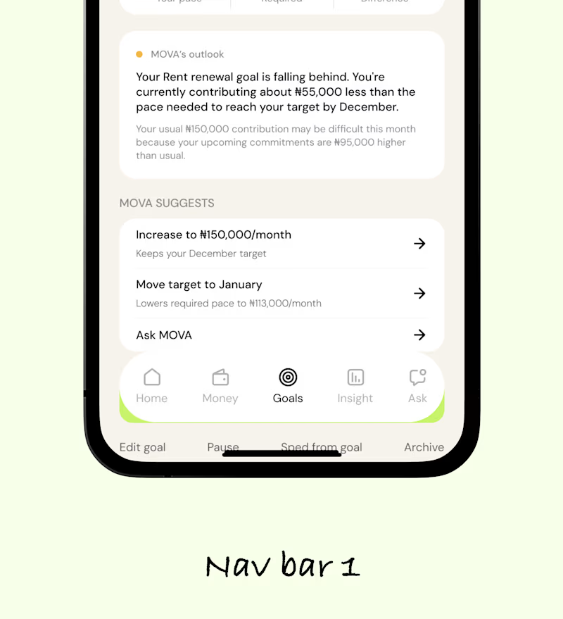
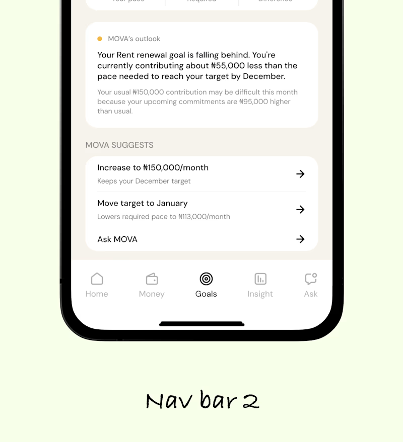

The first direction feels more immediately scannable to me—the stronger grouping makes the goal hierarchy easier to parse at a glance.


Nav Bar 1
The network for creativity
Join 1.25M professional creatives like you
Connect with clients, get discovered, and run your business 100% commission-free
Creatives on Contra have earned over $150M and we are just getting started





Related posts

Two color directions for an AI governance explainer. A draft AI use policy becoming the questions nobody can answer yet.
20 voted
77%
6 voted
23%
26 votes
Closed

blue for sure 💯

i create a 3D cube component for a Framer website to add creativity. which one is better dark or light? Check the live preview here
22 voted
51%
21 voted
49%
43 votes
Closed

Snap to the position in the last will feel more real

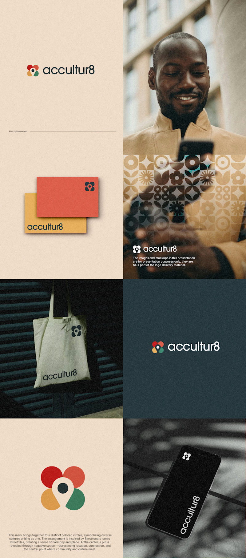
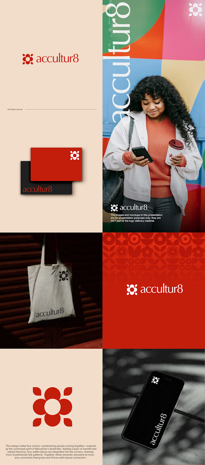
The client really liked Barcelona typical floor tiles, so I presented these logo options. Which one you liked the most?
4 voted
13%
26 voted
87%
30 votes
Closed

Love option 2, which one do you like most ?