The network for creativity
Join 1.25M professional creatives like you
Connect with clients, get discovered, and run your business 100% commission-free
Creatives on Contra have earned over $150M and we are just getting started
Back to feedPost

This is my portfolio website built in Next.js with a fully custom design.
It includes case studies, blogs, real user engagement, comments, likes, and a live dashboard system.
The network for creativity
Join 1.25M professional creatives like you
Connect with clients, get discovered, and run your business 100% commission-free
Creatives on Contra have earned over $150M and we are just getting started

Challenges
View all


Related posts

New website for Beer Zombies Brewing Co. 🍺🧟♂️
Designed to be bold, vibrant, and disruptive. This was a fun build because the BZ brand already has such a strong visual identity and personality. Oversized typography, aggressive motion, interactive effects, and a healthy dose of zombie aesthetics. 🤘
www.beerzombies.com


The oversized type and aggressive motion fit the beer-brand attitude perfectly, especially how the green palette carries from the hero into the product details.

My previous poll showed unexpected results (I am very grateful to everyone who took the time to vote and comment 🤍).
Now I am curious about your opinion on the color mode for this hero section. I definitely like a light theme. What about you?
By the way, I made a nice animation for this design. You can see it on my profile
28 voted
54%
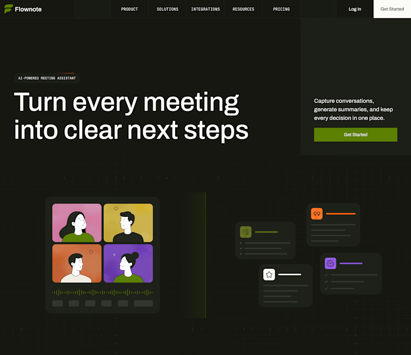
24 voted
46%
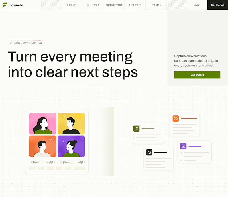
52 votes
Closed

To be honest the dark mode looks really good


Would you stop to look at these homes?
That’s what I enjoy about this design.
It makes browsing feel natural, even when you’re just there to check out the website.
Developed in Webflow.


Beautiful!