The network for creativity
Join 1.25M professional creatives like you
Connect with clients, get discovered, and run your business 100% commission-free
Creatives on Contra have earned over $150M and we are just getting started
Back to feedPost

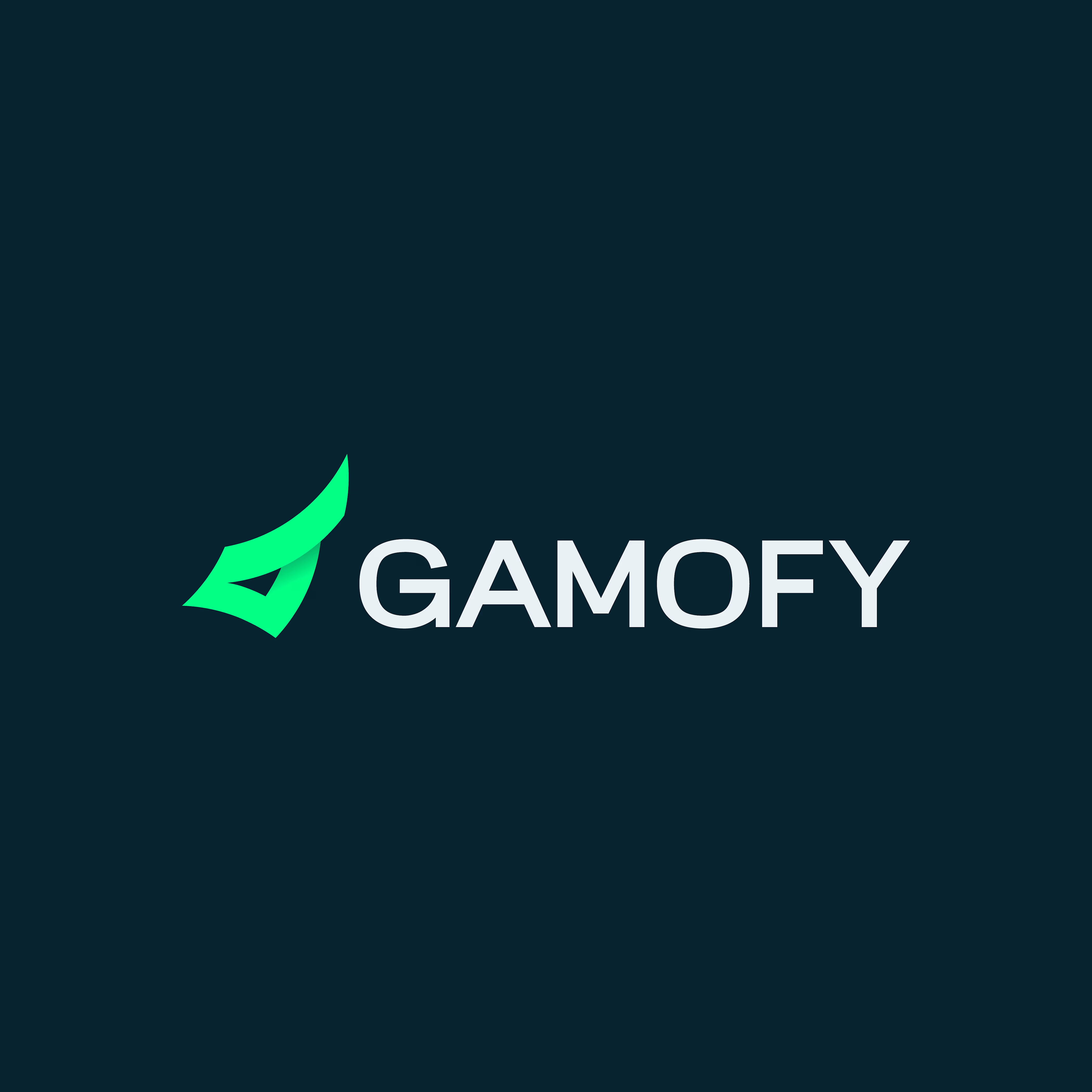
Gamofy is a concept brand for a gaming coaching platform. I designed the logo from scratch.
The symbol is a folded green shape that points upward, like a wing or an arrowhead. The fold and its small shadow add depth and suggest movement, which fits the idea of a player leveling up with a coach behind them. The bright green stands out against the dark navy background, so the mark has the energy of a game interface without looking like a typical esports logo.
I customized the wordmark to match. The G has a sharp cut inside the curve, and the A has a curved crossbar instead of a flat one. The rest of the letters stay wide and clean, so the name is easy to read at small sizes.


The network for creativity
Join 1.25M professional creatives like you
Connect with clients, get discovered, and run your business 100% commission-free
Creatives on Contra have earned over $150M and we are just getting started

Challenges
View all


Related posts


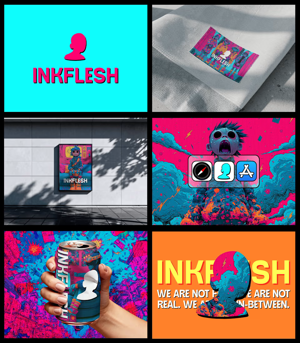
In my INKFLESH identity work, the wordmark runs off the can's curve and gets partly hidden behind artwork on posters. That crop asks the rest of the identity to carry more recognition. The mark has a job when the name is only partly there.


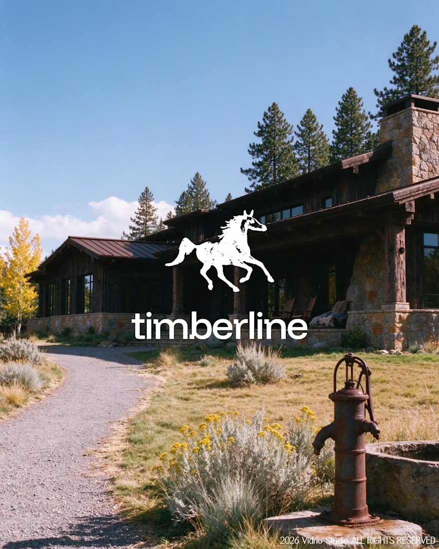
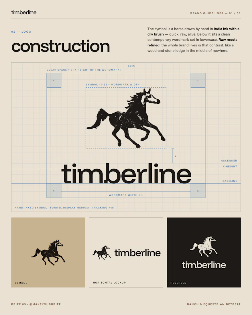
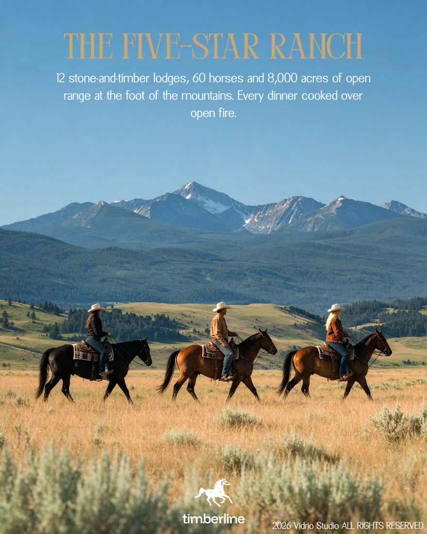
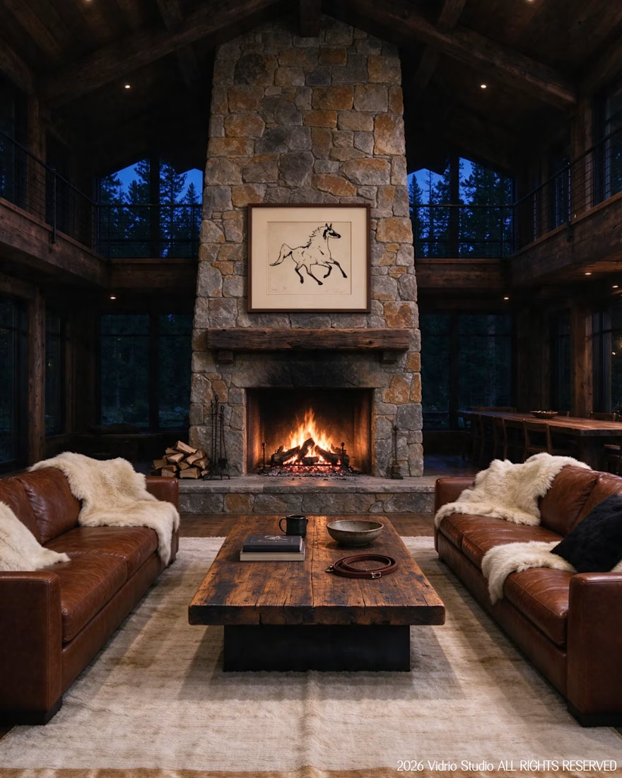
I worked on Brief 05 of the @makeyourbrief challenge: a brand identity for Timberline, a luxury ranch and equestrian retreat. I hand-drew the horse symbol with a marker, paired it with a clean modern wordmark and an earthy palette, and extended it into merch and lodge photography using AI under my own art direction, with retouching by hand.
Would you stay here? Tell me which image sold you.



That's really incredible great job Andreu❤️❤️

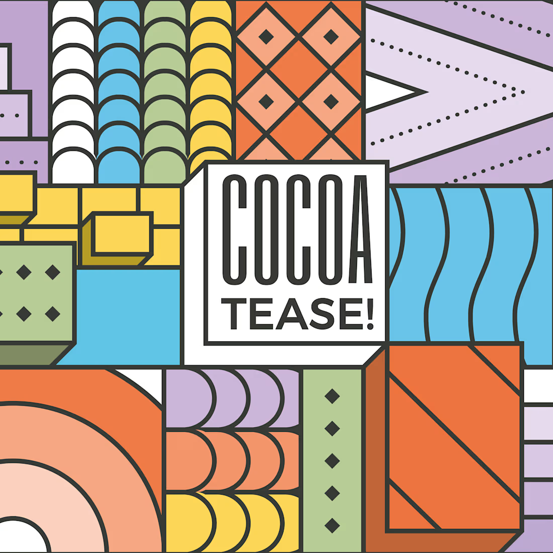
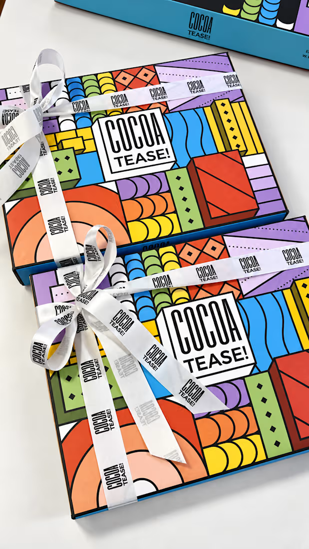
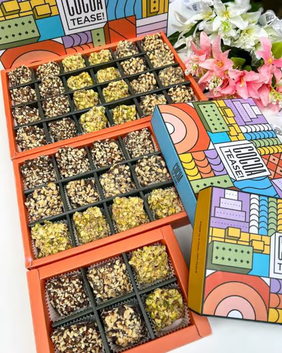
Brand & packaging design for Cocoatease! 🍫
•
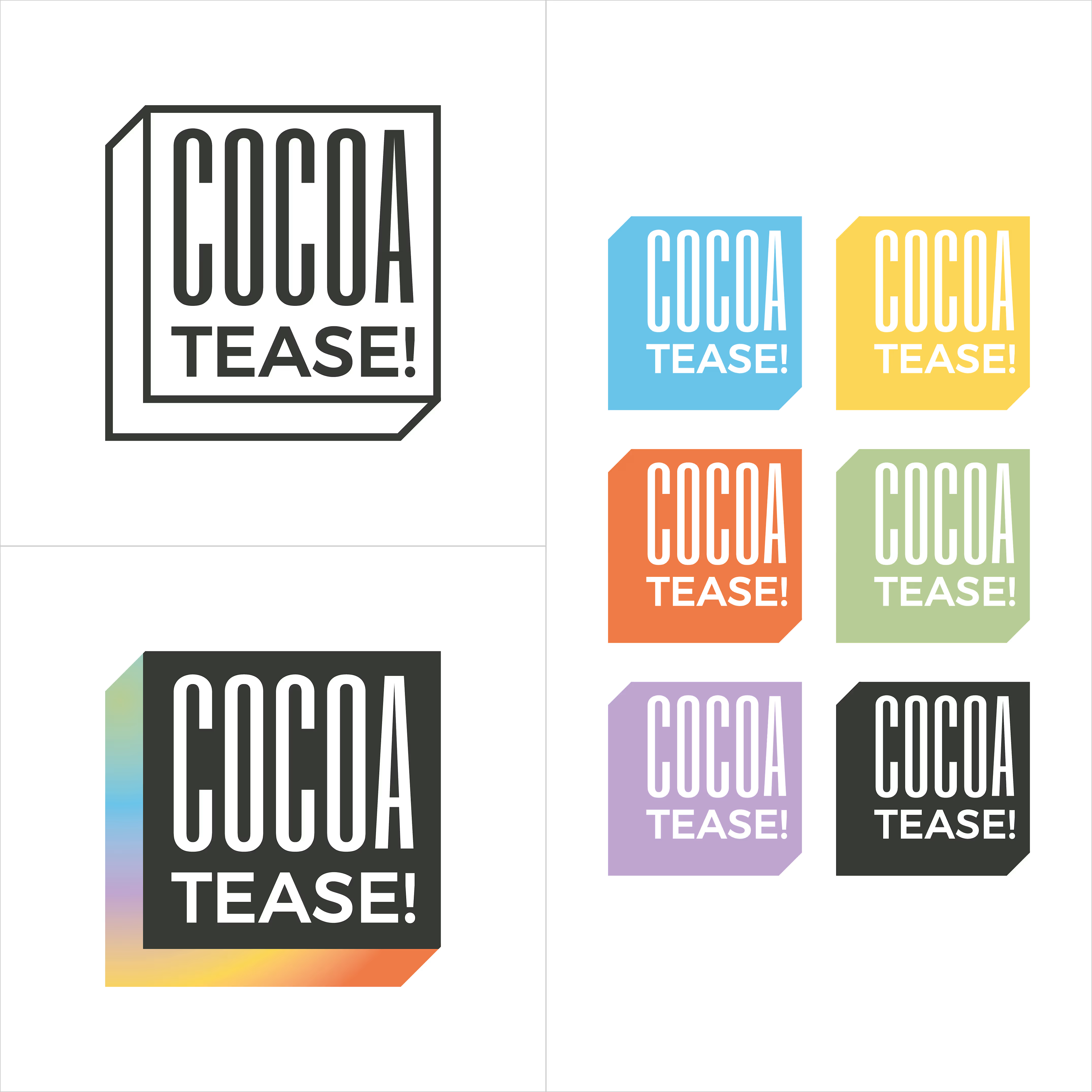
A chocolate company at heart, Cocoatease! is a dessert brand that aims to “tease your palette”. This unofficial tagline prompted the idea of a button for the logo…a visual way of saying “push for a treat”.
•
While a logo is usually designed first, the packaging was conceptualised first to meet growing demand. That pushed us (wink wink) to create a bunch of colour variations to match it.
•
Logo design, logo symbol, branding, brand design, visual identity design, packaging, packaging design, colour palette, typography
That's really incredible packing and brand design specially box cover design that's incredible ❤️❤️❤️