The network for creativity
Join 1.25M professional creatives like you
Connect with clients, get discovered, and run your business 100% commission-free
Creatives on Contra have earned over $150M and we are just getting started
Back to feedPost

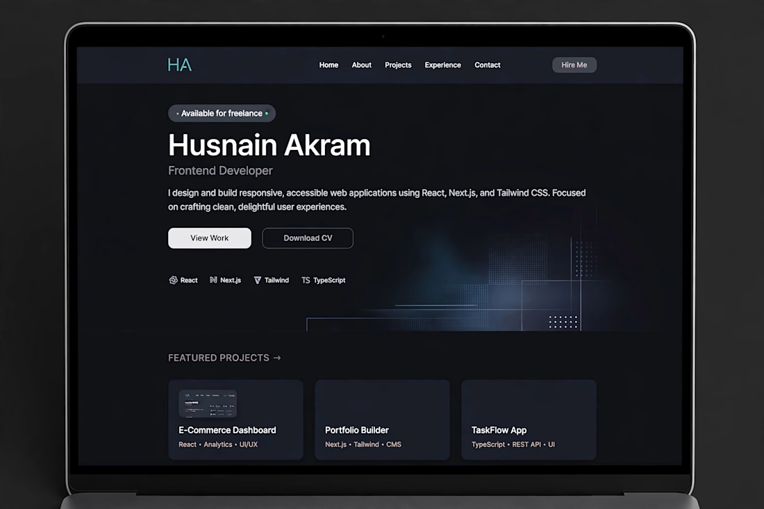
Personal Portfolio Website
Personal Portfolio Website designed and developed to showcase my skills, projects and experience.
Features:
Modern, clean and fully responsive design
About Me, Skills, Projects and Contact sections
Smooth scroll animations and hover effects
Contact form with validation
SEO friendly structure
Technologies: HTML5, CSS3, JavaScript, Bootstrap, Responsive Design.


The network for creativity
Join 1.25M professional creatives like you
Connect with clients, get discovered, and run your business 100% commission-free
Creatives on Contra have earned over $150M and we are just getting started



Related posts

Photographer Portfolio Website
"Capturing light, emotion, and the moments you never want to forget." That line set the tone, and the layout follows it.
The hero is one motion-blurred portrait washed in red. The photographer's name runs across the bottom in a condensed white face, so large the screen cuts it off. The photo keeps its soft focus, and the name still reads first.
Thin grid lines split the page into narrow columns, and the small copy sits justified inside them. The loose photo gets a strict structure to lean on.
A single round red button with an arrow sits right on the letters and marks where to go next.
Designed by the Hue & Machine team.
#WebDesign #Photography #PortfolioWebsite #EditorialDesign #Typography #UIDesign #ProductDesign #CreativeDirection #ResponsiveDesign #FigmaDesign


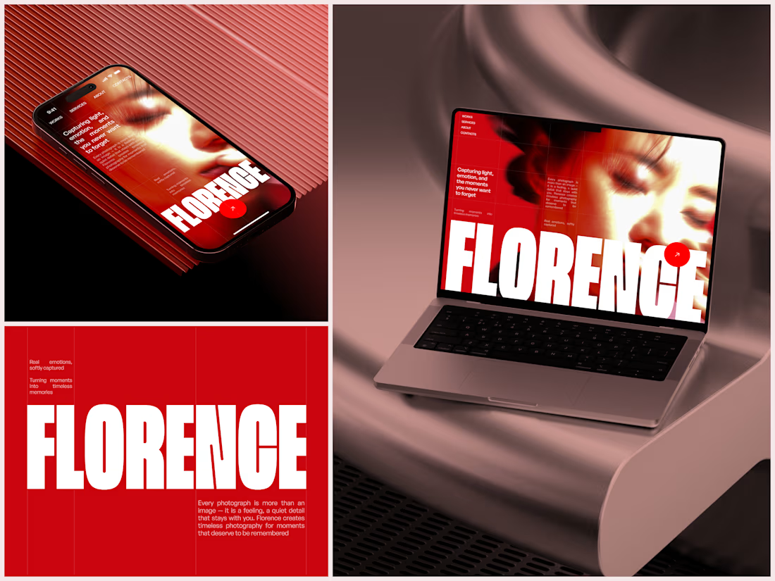

The heavy condensed white FLORENCE over the red portrait is bold, and keeping the same red across phone, laptop and type tile makes the case study read as one system. Did the red come from the photographer's own work, or was it your call?

A website hero and motion identity concept for Cycle.
The experience takes the viewer through seven historical eras in one continuous forward journey, while the logo, camera path and core composition remain consistent.
The concept explores how a static identity can become a living digital experience through motion, environment and interaction.
Workflow included Spline, Claude via MCP, Midjourney and SeaDance.
Available for brand identity, motion and digital design projects.


I fall in love, It is like Encarta, but 1000% better

Just launched: Faro, a luxury travel website template for Framer.
Travel agencies and tour operators do not sell with a checkout. They sell with conversation. So Faro is built around one goal: turn visitors into enquiries.
What makes it work
Cinematic flight-window hero that plays your video as visitors scroll
Enquiry-first pages: every button leads to your contact form, with no cart to set up
Tour packages with pricing cards, a comparison table, add-ons and FAQs
Destination and journey pages with itineraries, highlights and quick facts
What's inside
11 pages, including Home, Destinations, Journeys, About, Contact, Thank You, 404 and legal pages
2 CMS collections (Destinations and Signature Journeys) with sample content
Reusable components, color styles and text styles for fast rebranding
Fully responsive, with a mobile menu, Back button and Back To Top button
SEO-ready structure and a built-in documentation page
Design: deep navy, brass gold, Fraunces and Inter. Calm, premium and easy to edit.
Launch price: $39 through November 2026.
Live preview: [https://farotravel.framer.website/ ]
Get Faro on Framer: [https://www.framer.com/marketplace/templates/faro/ ]
I'd love your feedback. If you build with it, tag me so I can see what you make.

The airplane window opening on the hero says travel without a single stock photo, and the gold Start Planning button stays in the nav the whole time. Does that hero animation add noticeable load time on mobile?