The network for creativity
Join 1.25M professional creatives like you
Connect with clients, get discovered, and run your business 100% commission-free
Creatives on Contra have earned over $150M and we are just getting started
Back to feedPost

What are you building this week

Excerpts from this week. Designed a feature that lets schools send fee reminders directly to parents, with the ability to select and pay only what they can manage at that moment.
Simple idea. Real impact.
For parents, it removes the pressure of paying everything at once. For...


The network for creativity
Join 1.25M professional creatives like you
Connect with clients, get discovered, and run your business 100% commission-free
Creatives on Contra have earned over $150M and we are just getting started








Related posts


Fresh case study 🚀🚀🚀
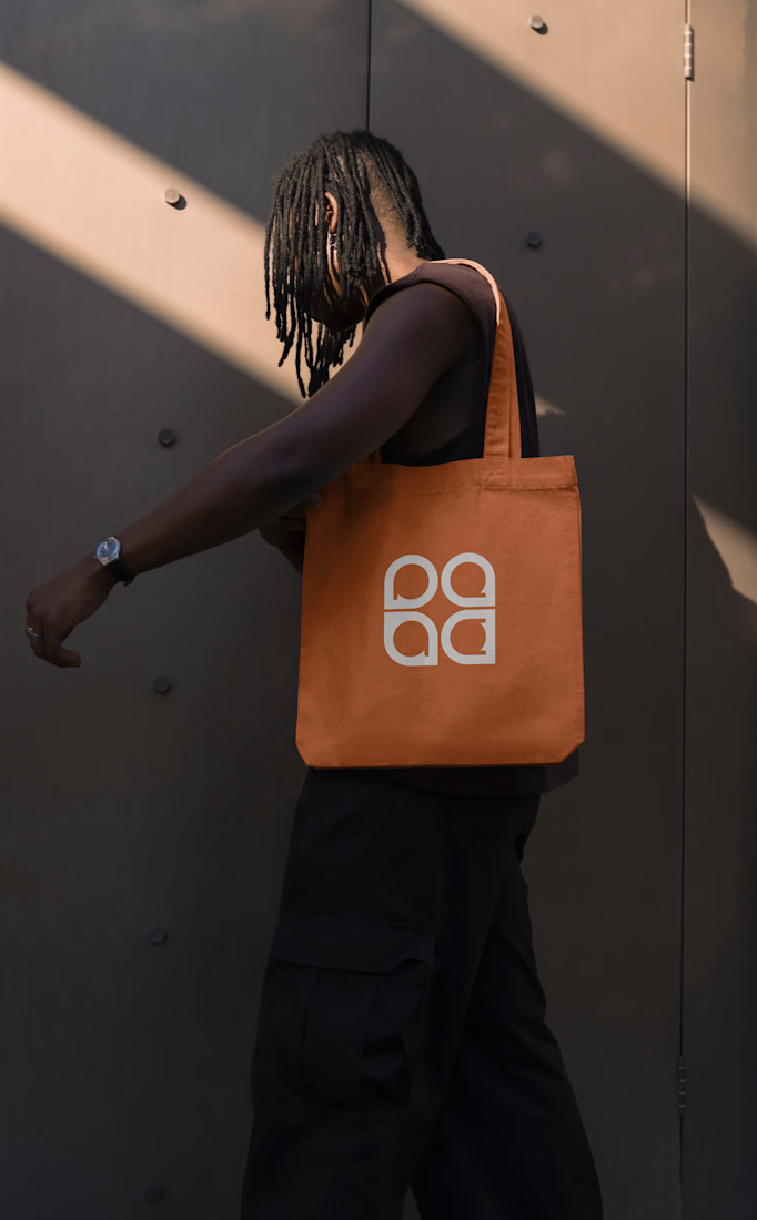
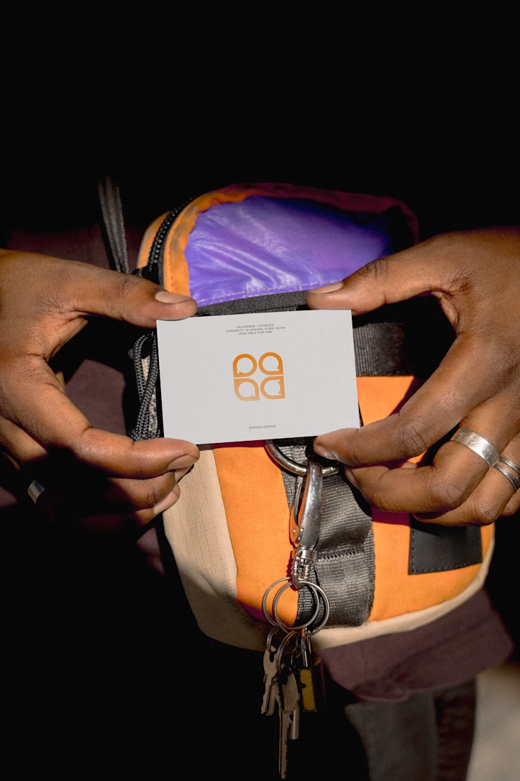
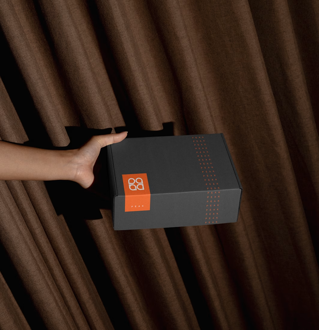
Brand identity for Peak, an all-in-one website builder for WordPress that I design and build. A four-letter mark, a warm paper-and-ember palette and one system that runs from the favicon to the packaging.


A four-letter mark that has to hold from favicon to packaging is a tough constraint. Did you draw one letterform first and build the other three from it, or design them together as a set from the start?


Beautyy

A product design project focused on creating a distinctive visual identity and a clear, professional presentation for the Agroxim brand.
Product and visual design
Layout and composition
Color palette and typography selection
Visual consistency and attention to detail
Preparing the final design for presentation
Tools & Software:
Adobe Illustrator · Adobe Photoshop · Adobe After Effect · Adobe Indesign
Focus:
Creating a visually appealing, professional design that communicates the brand's identity and helps the product stand out.


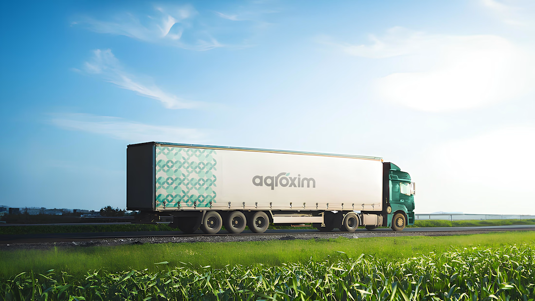
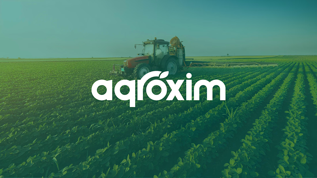

The agroxim wordmark sitting over that field photography is a lovely pairing, Sahib. Fresh greens really do the heavy lifting for an ag brand. Strong identity work.


