The network for creativity
Join 1.25M professional creatives like you
Connect with clients, get discovered, and run your business 100% commission-free
Creatives on Contra have earned over $150M and we are just getting started
Back to feedPost

I pointed Otto's product review at Otto's own website.
Otto is the AI command centre I'm building for product managers. One of its three reviews walks a product in a real browser and files what it finds. The new website was the obvious first test.
What held up and got fixed:
→ The flagship review's sub-heading was the same size as the section heading above it
→ "Also in otto" was a section heading drawn at card size
→ The trial card said "30 days" in its tag and "for a month" beneath it
→ Sign in appeared in the header and again in the hero. The second button now leads to the next page ("See how it works"), and Sign in stays in the header at every width
→ The sign-in button no longer greys out with no reason; pressing it names the empty field
Not everything made the cut. Some findings were duplicates, some were compliments filed as issues, and some were claims the page itself contradicts. I checked each one against the page before touching code, and added tests so the Sign in fixes can't quietly regress.
Lesson: an AI review is a list of leads, not a to-do list.
The clip scrolls the site as it is now: ottomated.netlify.app
The network for creativity
Join 1.25M professional creatives like you
Connect with clients, get discovered, and run your business 100% commission-free
Creatives on Contra have earned over $150M and we are just getting started
Related posts

IBT came to me with an AI-generated draft: one long page, every service in an identical card, stock people in suits, copy like "unparalleled efficiency"
IBT is a 30-year consultancy that turns messy processes into clear systems. The draft showed the opposite
An AI tool gives every block the same weight. Someone has to decide what an operations director should understand in the first scroll
So each section got one job: who IBT is, why them, the three solutions. Each solution leads to its own page and to an enquiry. Process Mining, their core offer, got the most care
The video shows both: the AI draft and the live site
AI saves you the first draft. Turning it into a site that sells the company is still the designer's job
The site is live at theibtgroup.com.

Giving every block the same weight is exactly the problem with AI drafts. Deciding what a 30 year consultancy should lead with is where the real design work happens.

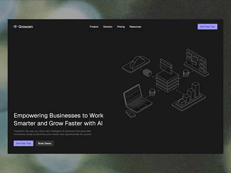
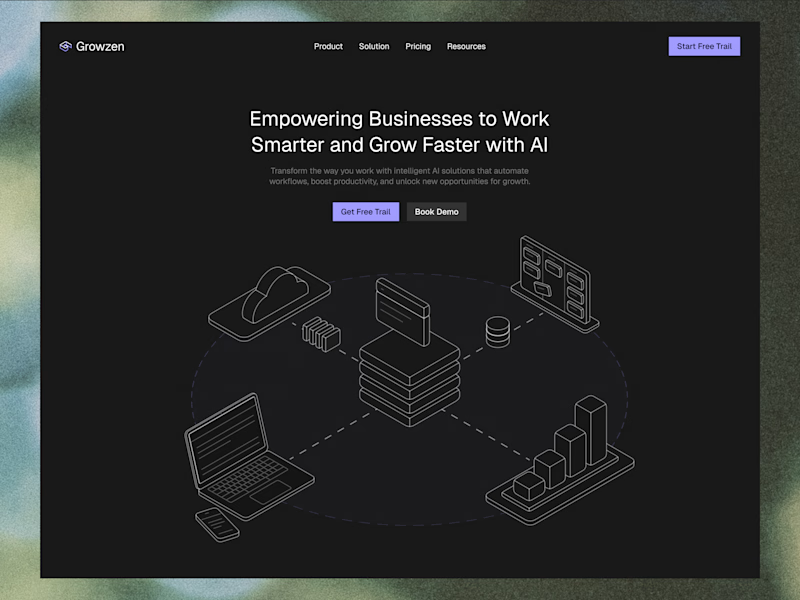
Designed a website concept for AI powered platform.
I wanted to give it a clean, minimal with a custom isometric illustration in the hero section.
Which version do you like better?
32 votes
Ends in 33m

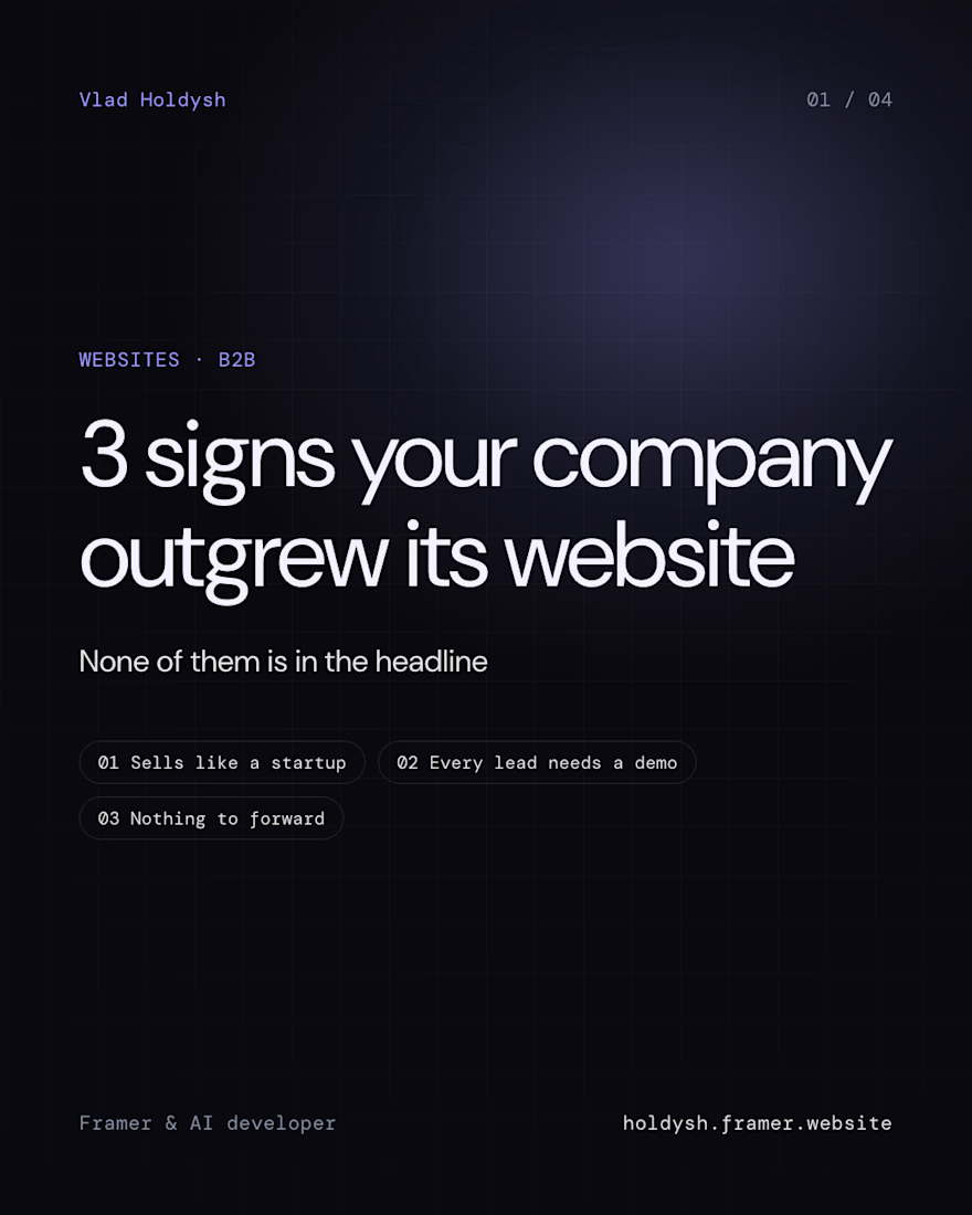
A company can outgrow its website while the site still looks fine
The signs aren't in the headline or the button. Any AI can fix those in a minute. They sit in how the company sells
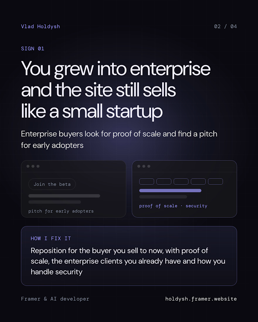
It grew into enterprise, but the site still sells like a small startup. Enterprise buyers look for proof of scale and find a pitch for early adopters
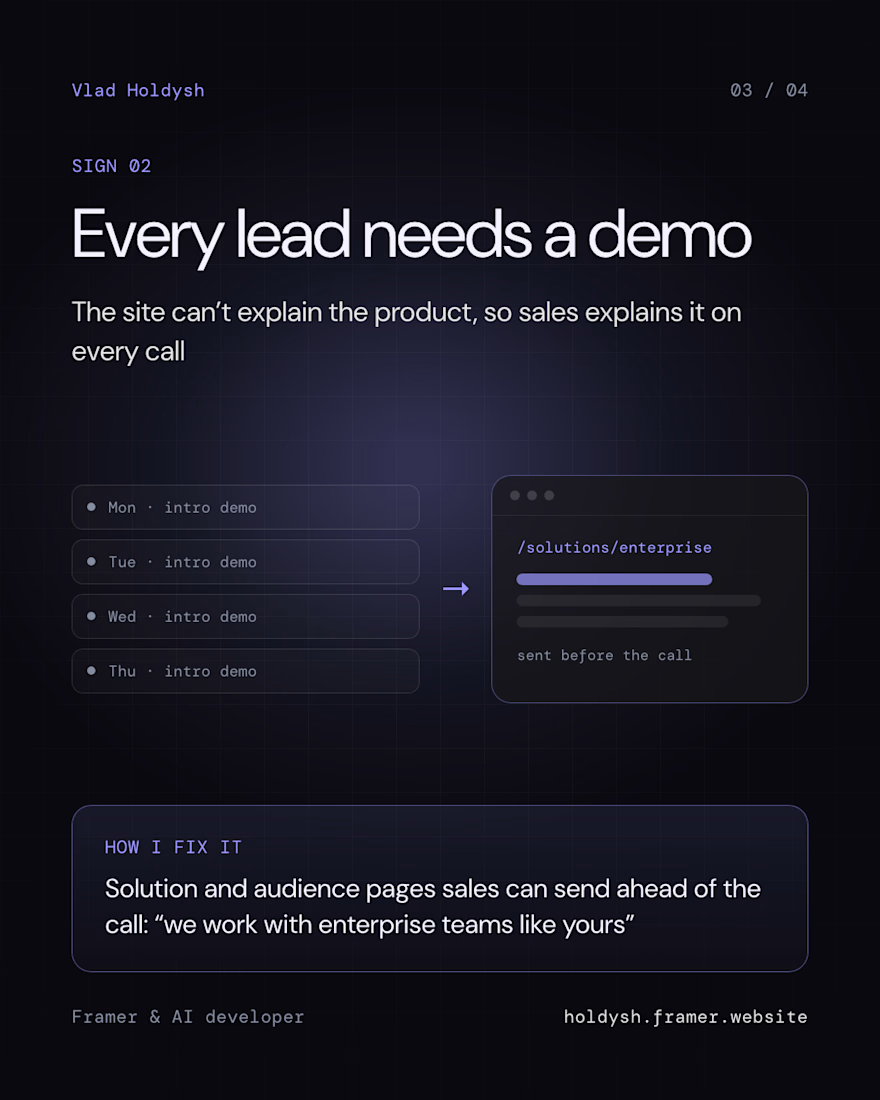
Every lead needs a demo. The site can't explain the product, so sales does it on calls. A solutions page or an audience page they can send ("we work with enterprise teams like yours") does part of that call for them
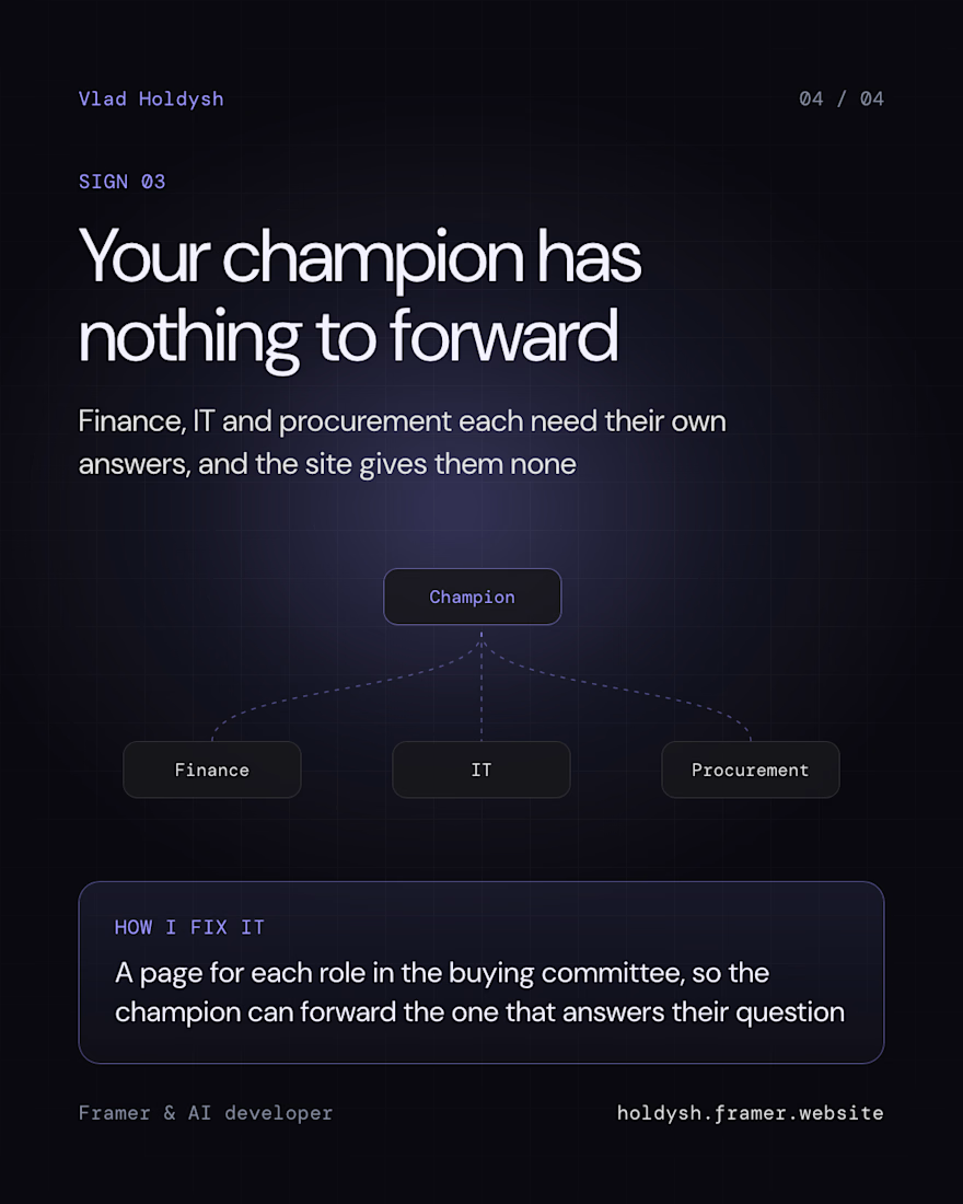
The champion has nothing to forward. Finance, IT and procurement each want their own answers, and the site gives them none
So a redesign starts with how the company sells now, and the visuals come after
Which of the three slows your deals down?

Great point that enterprise buyers look for proof of scale, not a nicer headline. The sales motion changing while the site stays the same is a really common gap.