The network for creativity
Join 1.25M professional creatives like you
Connect with clients, get discovered, and run your business 100% commission-free
Creatives on Contra have earned over $150M and we are just getting started
Back to feedPost
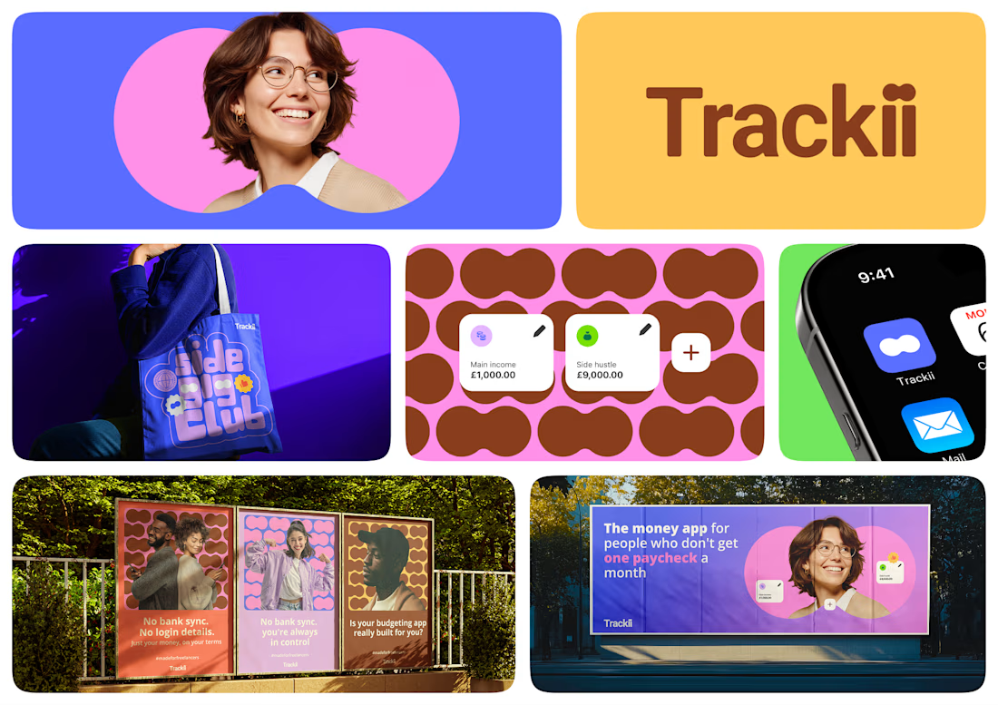
When it was time to work on the branding for Trackii, a personal finance app for multi income earners, I didn't want just any brand identity. Here's why.
One of Trackii's core messages is financial clarity. Making money is hard and boring. Saving money? Even harder. So I knew the brand had to do more than make sense, it had to be interesting. Not easy... interesting. Managing your money is a lifestyle. Watching your money grow? Big lifestyle (cos tbh, if your money finish, you dey on your own o).
That thinking shaped every decision: the colors, the image style, the font, the logo. Trackii needed to work as a whole, icon and wordmark, one system, not separate pieces bolted together. And I wasn't chasing the generic "agentic AI" look everyone's defaulting to. This was built for humans, by humans... (with humans, in case you were wondering).




Thank you, Acream

such fun design, both modern & nostalgic!
Thank you, Nicolette

I really like the use of color! It has character but is refreshing at the same time.
Thank you, Alexandra

Amazing work 🙌


I like it.
The network for creativity
Join 1.25M professional creatives like you
Connect with clients, get discovered, and run your business 100% commission-free
Creatives on Contra have earned over $150M and we are just getting started

Challenges
View all


Related posts


A look at the identity we designed for Vetti, a dog health monitoring brand.
There’s a lot of data behind a product like this but the person using it just wants to know their dog is okay.
That’s the balance in the design with a connected dot system that feels precise and warm colors and photography that keep it close to what people care about.
Also, an excellent excuse to spend far too long choosing dog photos.


Wonder -- Visual Expressions

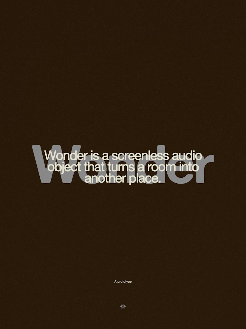
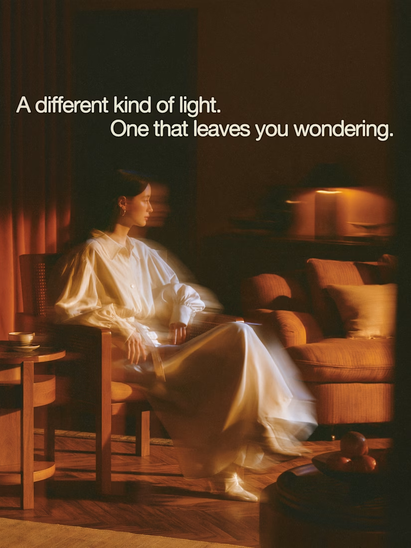


The restraint in the warm palette really lets the sound-object concept breathe—especially that shift from readable type to atmosphere.


Engaging website for a New York–based architecture and construction studio, balancing bold typography, immersive imagery and a minimal editorial layout.


