The network for creativity
Join 1.25M professional creatives like you
Connect with clients, get discovered, and run your business 100% commission-free
Creatives on Contra have earned over $150M and we are just getting started
Back to feedPost

PuerON is a functional beverage concept built around pu-erh tea, designed to bridge traditional tea culture with a contemporary lifestyle format.
The idea was to create a product that feels energetic and modern while it is healthy and have not sugar and coffee in it.
For the visual direction, I developed a bold identity system inspired by topographic patterns, damascus steel and organic flow structures — creating a sense of movement, energy, and altered states without relying on typical functional drink clichés.
beveragepackagingbeveragedesignfoodbeveragesAdobe IllustratorGraphic DesignDigital illustrationTypographyFigma


The network for creativity
Join 1.25M professional creatives like you
Connect with clients, get discovered, and run your business 100% commission-free
Creatives on Contra have earned over $150M and we are just getting started
Related posts

🍨 Meet MORA — artisanal gelato with a softer side.
Bold typography, creamy tones, and playful flavor-inspired packaging designed to make every scoop feel special.
Explore the full project on my Contra profile and let me know your thoughts!
#BrandIdentity #PackagingDesign #FoodBranding #GraphicDesign #BrandDesign

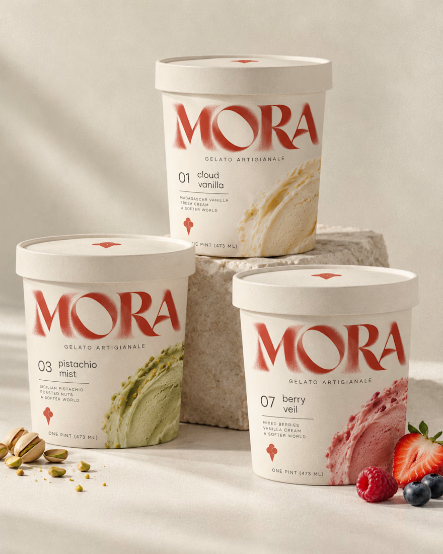
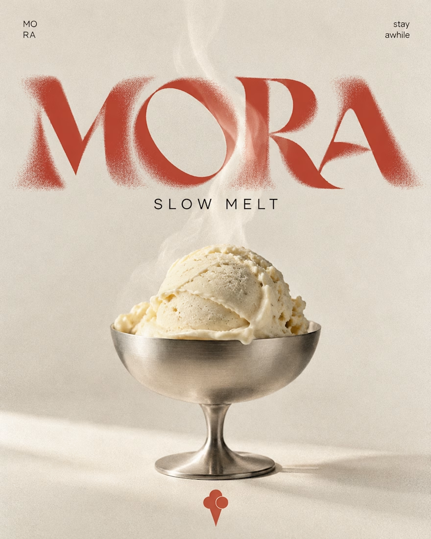
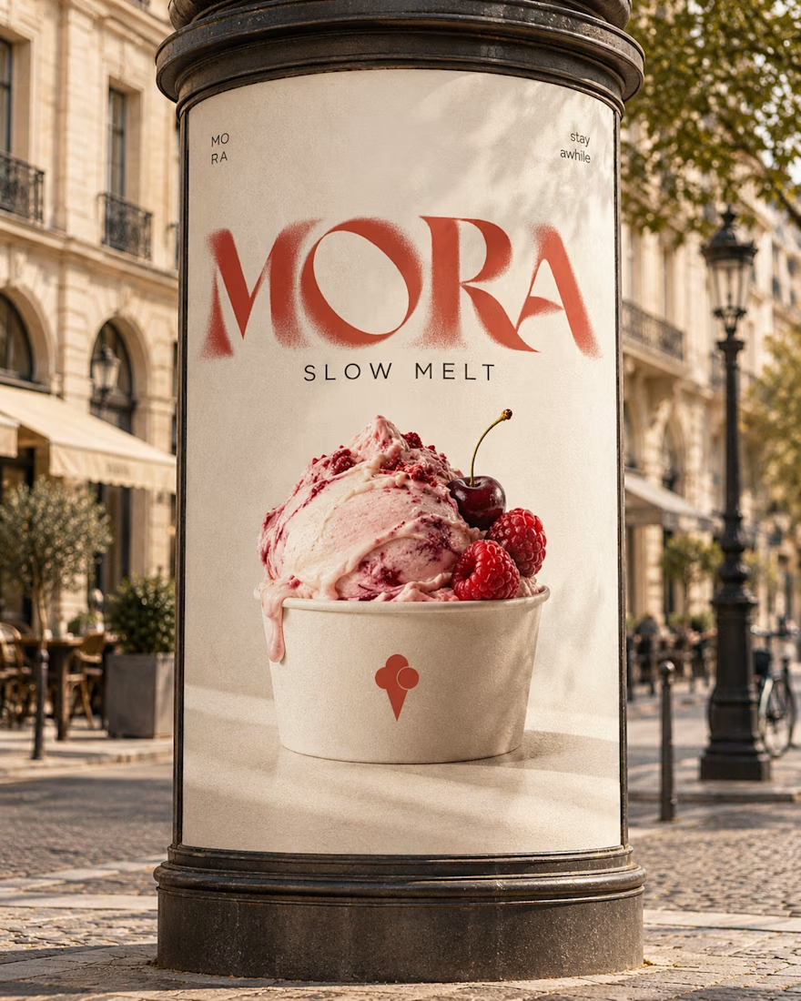

Love this MORA identity! 🍦 The bold typography against the creamy tones is such a perfect balance - feels artisanal yet playful. The flavor-inspired packaging with the watercolor smears for cloud vanilla / berry veil is a really nice touch, makes each scoop feel special as you...

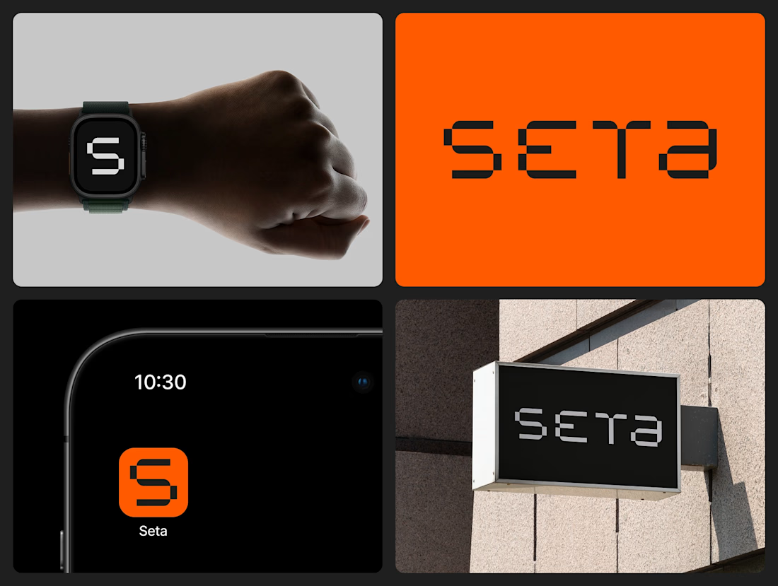

Cool branding


A fresh digital identity, a premium workspace designed for creative professionals.
From an elegant, editorial-style website to a functional mobile app for bookings and studio management, the goal was to make every interaction feel as refined as the space itself.
Clean layouts, timeless typography and a deep green palette bring the whole experience together.


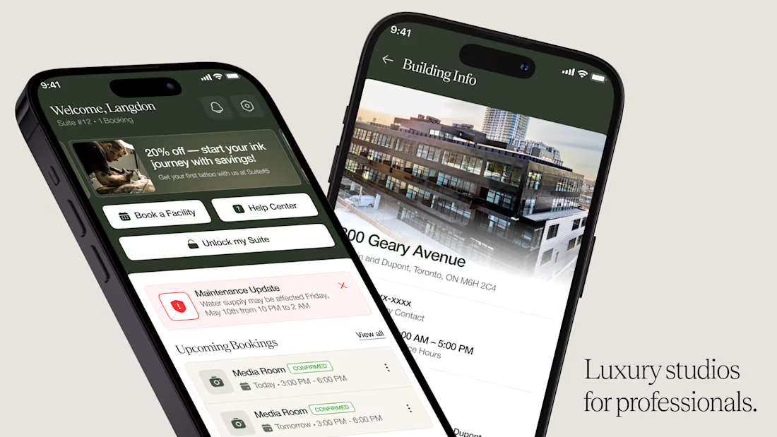
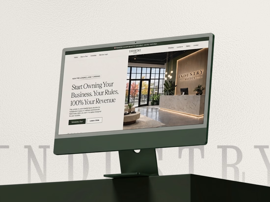
This looks super premium Kabir! Love how you carried the same refined, editorial feel from the website to the mobile app. The clean layouts and booking flow feel exactly like a high-end creative studio should - elegant but functional. The desktop + mobile mockups show the consistency really well. Great execution!