The network for creativity
Join 1.25M professional creatives like you
Connect with clients, get discovered, and run your business 100% commission-free
Creatives on Contra have earned over $150M and we are just getting started
Back to feedPost

I'm new here, I have a few projects in the pipeline so wanted to share something I worked on earlier in the year.
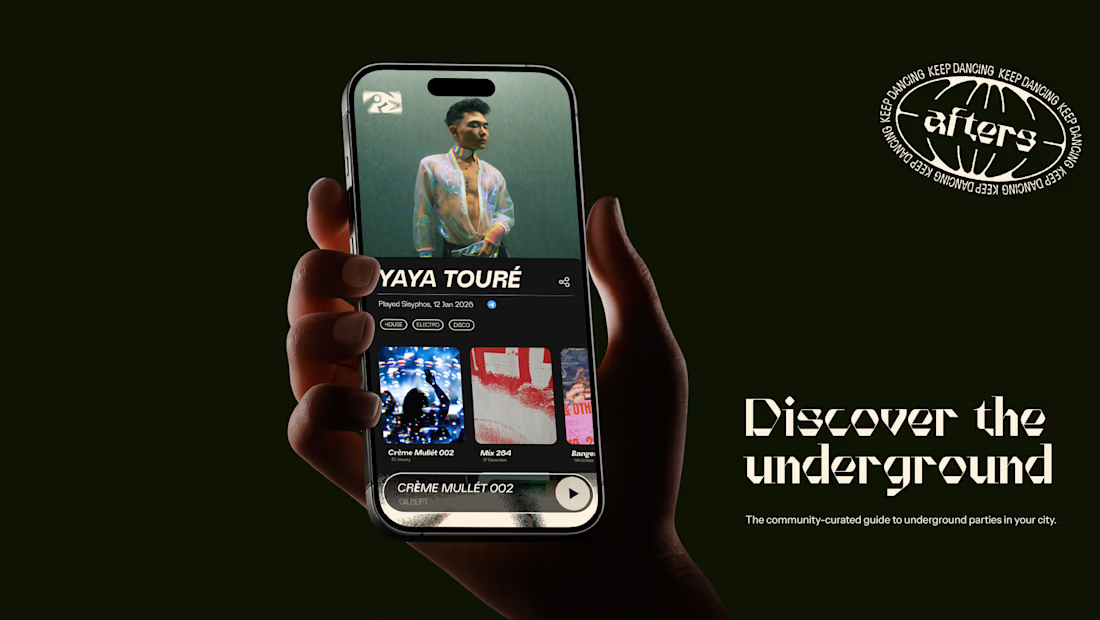

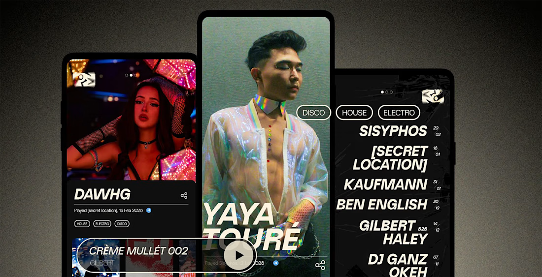
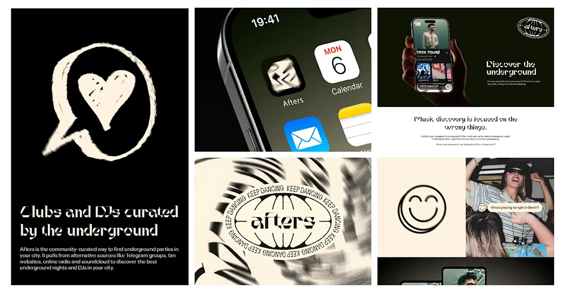
A brand that lives in the underground for the people who make it. I made the brand and strategy for Afters, from problem to concept to copy and creating the brand world.
I pulled from the culture and visual language of the scene to create a brand that feels like it's always existed, instantly building trust with the right people.


The network for creativity
Join 1.25M professional creatives like you
Connect with clients, get discovered, and run your business 100% commission-free
Creatives on Contra have earned over $150M and we are just getting started










Related posts

New case study is live.
Kallay Studios is a visual media company specializing in architecture, real estate, and commercial projects. The original brief called for a well-structured grid system to convey professionalism and a design-oriented approach. Inspired by the grid overlays commonly seen in video cameras, this element became central to the design system and is consistently showcased across various applications to reinforce the brand concept.
A more in-depth description can be found in the project case study.
Long story short, I had a blast developing this visual system and seeing how the concept blended well with the overall identity.

The camera grid concept works well.


Banner design for a Real Estate Broker in NYC


Impressive

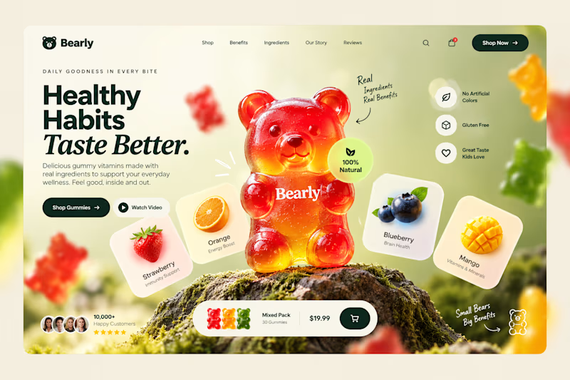
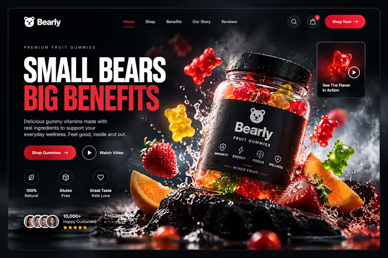
Which gummy brand would make you stop scrolling?
Two different directions for Bearly, a gummy candy brand concept.
One is bright, playful, and fruit-inspired. The other is bold, dark, and premium.
Same product, two completely different visual experiences.
Which one would you choose? Vote below! 👇
#BrandIdentity #WebDesign #UIUX #EcommerceDesign #Figma #DesignInspiration #ABTesting
9 voted
75%
3 voted
25%
12 votes
Closed

I will always love it playful cant lie