The network for creativity
Join 1.25M professional creatives like you
Connect with clients, get discovered, and run your business 100% commission-free
Creatives on Contra have earned over $150M and we are just getting started


The network for creativity
Join 1.25M professional creatives like you
Connect with clients, get discovered, and run your business 100% commission-free
Creatives on Contra have earned over $150M and we are just getting started








Related posts

MAE — Art Direction & Brand Visual Identity
A visual identity concept developed for MAE, built around the idea of “Controlled Energy — Movement in Contrast.” The direction explores the tension between individuality and constant movement, using a sharp central subject surrounded by blurred figures to create a strong visual narrative.
The Challenge
The goal was to create a visual language that felt distinctive, contemporary, and emotionally engaging without relying on excessive graphics or conventional branding. The challenge was to communicate movement and energy while keeping the brand feeling refined, minimal, and controlled.
The Solution
I developed an art direction centered around contrast — stillness vs. movement, focus vs. distraction, and individuality vs. the crowd.
The orange environment creates a bold visual signature, while the motion-blurred silhouettes represent the constant movement surrounding the individual. The sharply focused central figure becomes the visual anchor, communicating confidence, identity, and control.
The same visual language was then extended into the brand composition through minimal typography, logo placement, graphic symbols, and structured spacing, creating a system that can work across campaigns, social content, editorial layouts, and brand communications.
My Role
Art Direction · Brand Identity · Visual Concept · Graphic Design · Typography · Brand Composition
I was responsible for developing the visual concept, defining the art direction, establishing the graphic language, and translating the concept into a cohesive brand presentation.
Concept → Art Direction → Visual System → Brand Application
Logo DesignProduct DesignAdobe IllustratorAdobe PhotoshopAdobe Premiere ProBrand DesignVisual Designvisualidentity


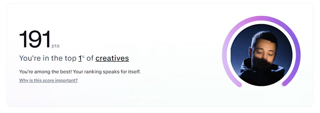


congrats, I'm at 283 and also wondering what the max is

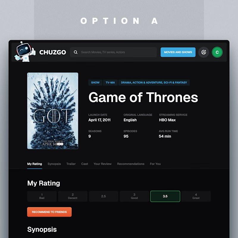
One of these show pages got a 5-star review from the client.
Which one would you rather land on?
11 voted
100%
0 voted
0%
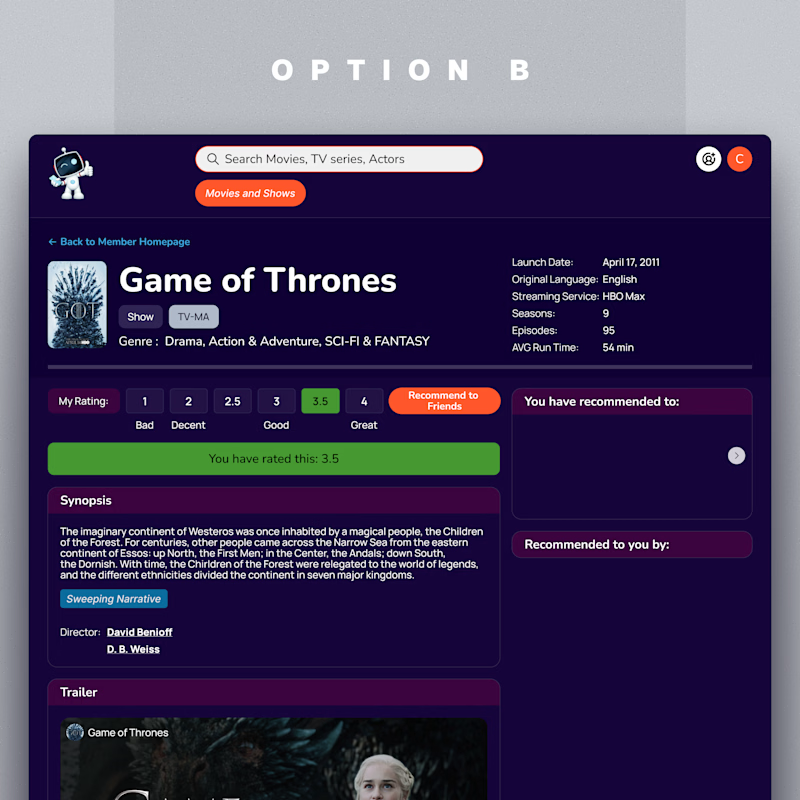
11 votes
Closed

A is better it's more attractive ❤️