
pro
Chris Hornak
I craft custom websites and SEO strategies that scale.
- 1x
- Hired
- 13
- Followers



Landforce: Website Redesign Concept
Landforce is a Pittsburgh nonprofit that pays people to train on real work: caring for the city's land and milling its fallen trees into lumber. I built a full website redesign concept for them, built in Next.js.
The homepage gives four audiences their own path: join the crew, hire a crew, buy wood or support the mission.
Behind it sit a lumber catalog with search and holds, a staff app for yard stock and a working inventory API, all built from Landforce's own facts and photos.
1
17
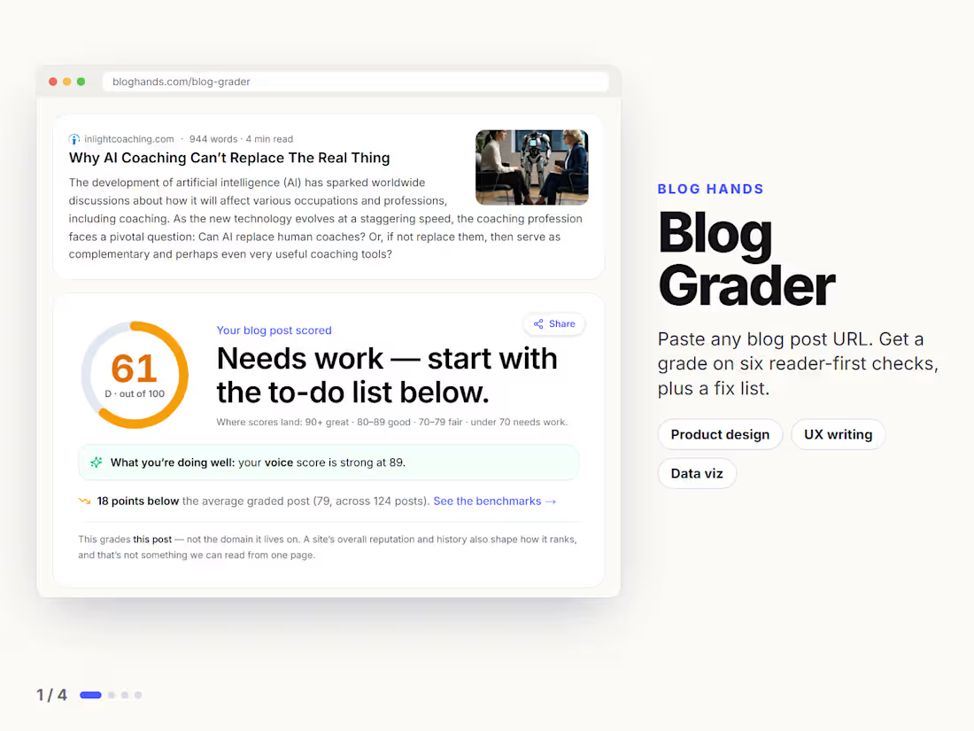
Blog Grader is a free tool I built for Blog Hands. Paste any blog post URL and it grades the post on six checks: Helpful, Findable, Readable, Quotable, Voice and Trustworthy. You get a score, a breakdown and a fix list, biggest wins first. No sign-up and no keyword to type.
1
1
107
What does a 40-year-old moving company's website need to prove in the first five seconds?
Don Farr has been moving Pittsburgh since 1982. Real trucks, real crew, real reviews. None of that showed up on their old site. It read like every other mover's template, buried under text instead of leading with proof.
So I rebuilt the landing page from scratch, in Next.js, with one goal. Get the trust signals above the fold instead of at the bottom.
The hero does the heavy lifting now. Real photo, real headline, the review count and star rating sitting right under the buttons instead of hidden in a footer. Two calls to action, not five. Call now or get a quote, nothing else competing for the click.
Below that, the stats block does what a testimonials page usually tries to do in three paragraphs. Years in business, crew size, fleet size, states served. Four numbers, no copy needed.
Services get their own grid instead of a wall of paragraphs. Local, long-distance, commercial, storage, junk removal, packing. Anyone scanning on their phone can find their situation in two seconds.
This is a concept rebuild. It's not live on their domain yet, the real site still runs the old design.
Swipe through for the full page, or watch the scroll-through video.
What's the first thing you look for when you're checking out a local business's site?
2
99
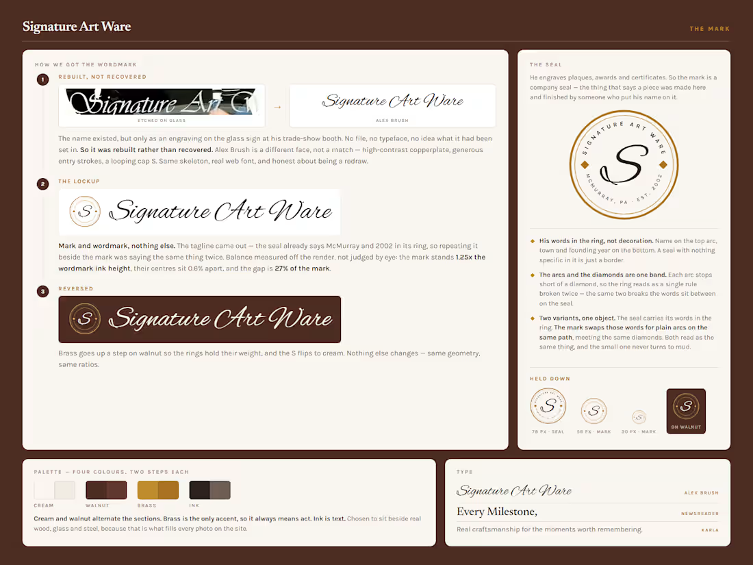
His logo existed in exactly one place. Etched into the glass sign at his trade-show booth.
No file. No typeface.
So I rebuilt it, and drew him a seal to go with it. His name on the top arc, his town and his year on the bottom.
John has engraved keepsakes in McMurray since 2002. On paper that is a trophy shop. It isn't. Look at the portrait he etched into glass.
So the work leads and the service list waits.
Every photo on the site is something he made.
What does your business have that nobody ever sees?
1
86