
Michael Adewuyi
I turn visitors to customers using high CVR landing page
Ready for work
Michael is ready for their next project!
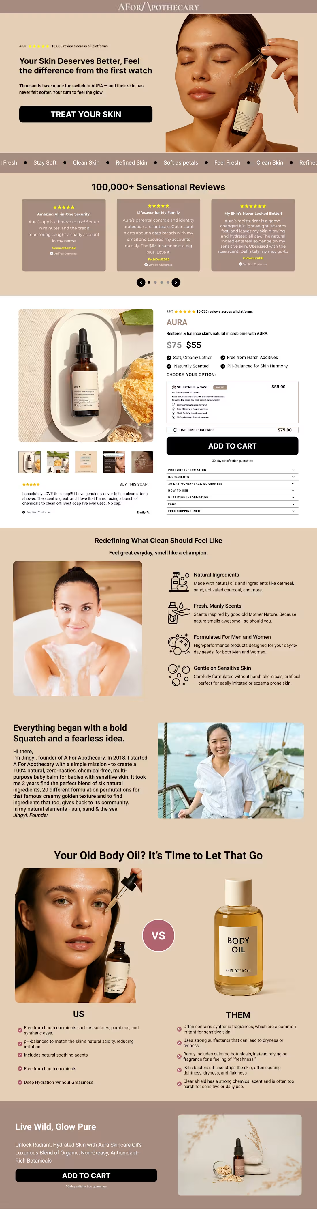
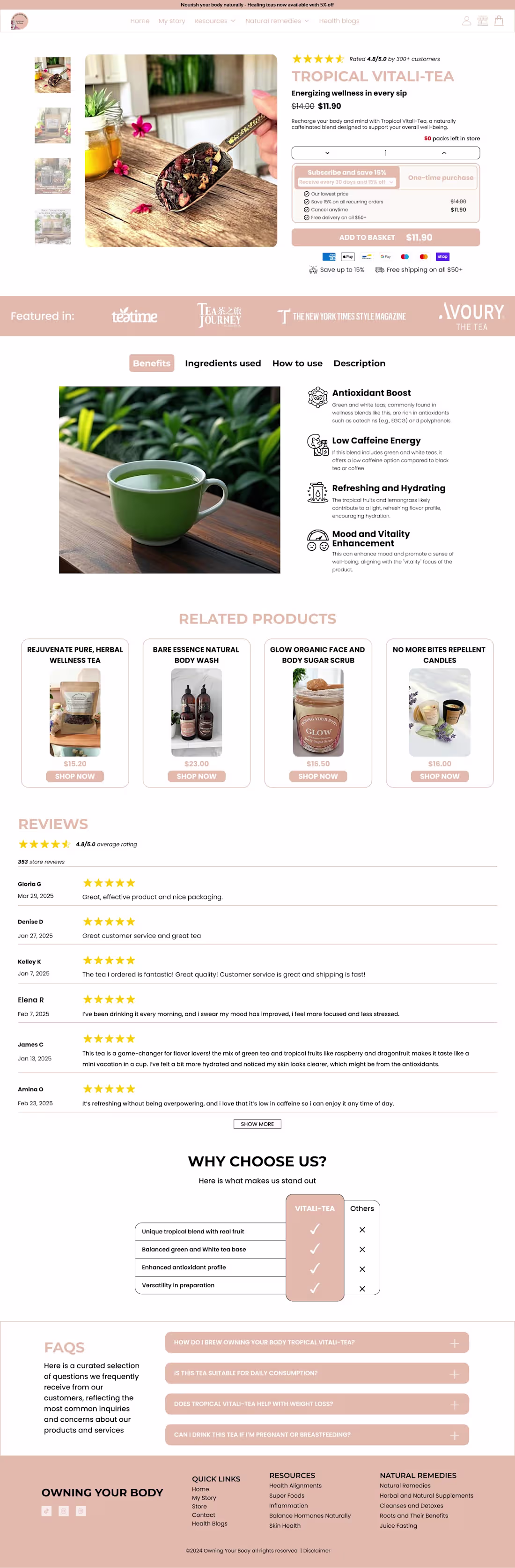
Your buy box shouldn't make people work to understand what they're buying.
Just wrapped this one up. Notice how everything flows—product benefits, social proof, flexible subscription options, all right where your eyes naturally land.
No hunting for info. No confusion about pricing. Just a clear path to purchase.
Been solving these conversion headaches for ecom brands all week. Sometimes it's the smallest fixes that move the needle.
2
29

Don't send all your traffic directly to your product page. Try advertorials.
Advertorials educate and build trust before the offer. When done right, they pre-sell the product, address objections upfront and reduce checkout friction.
The result? Higher conversion rates.
1
16
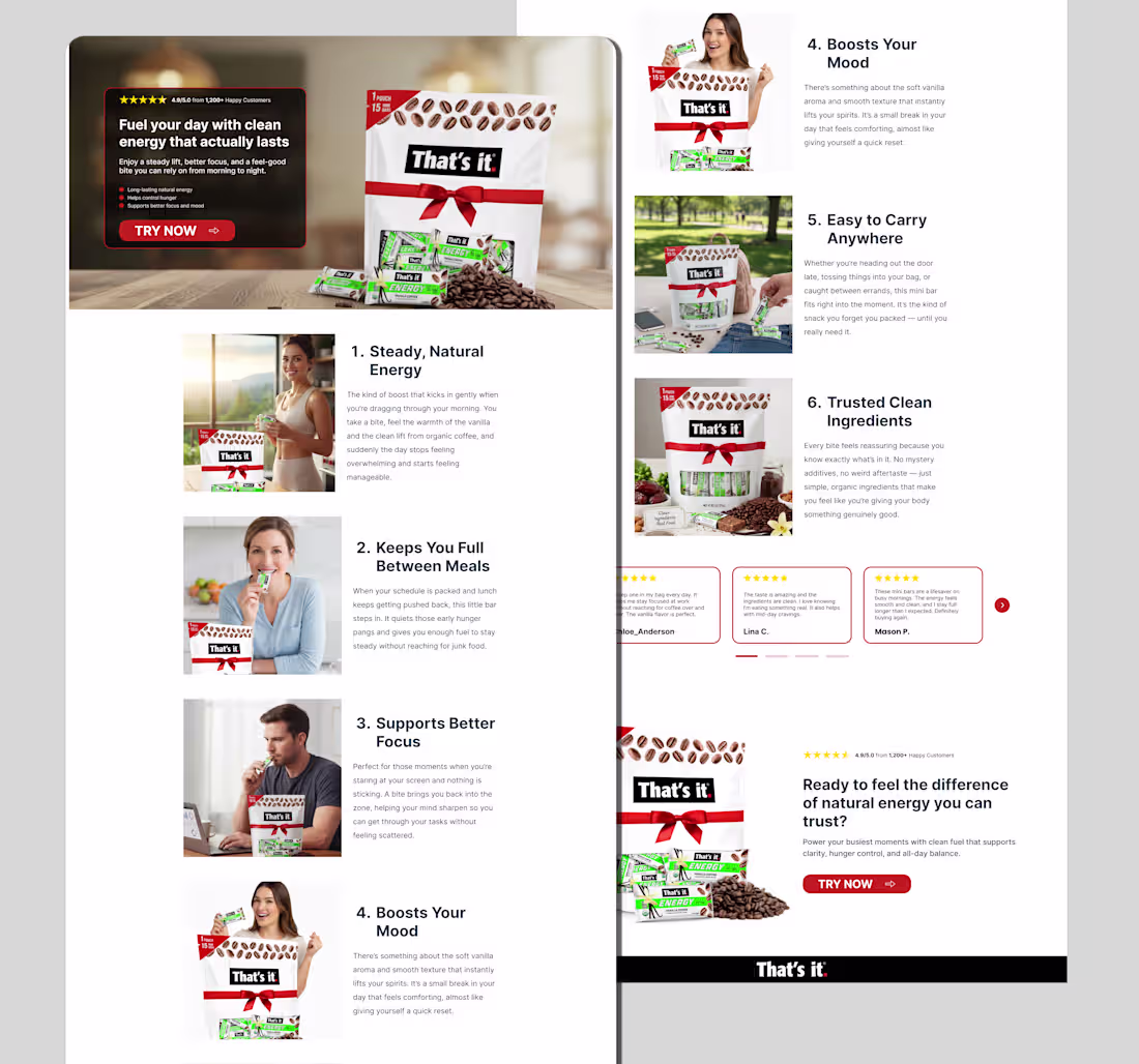
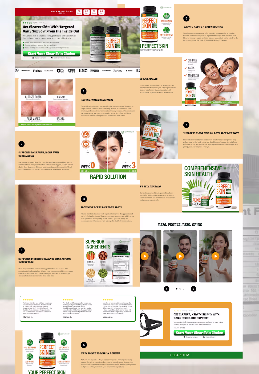
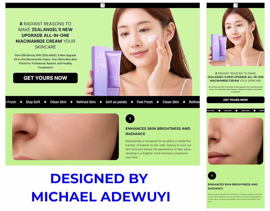
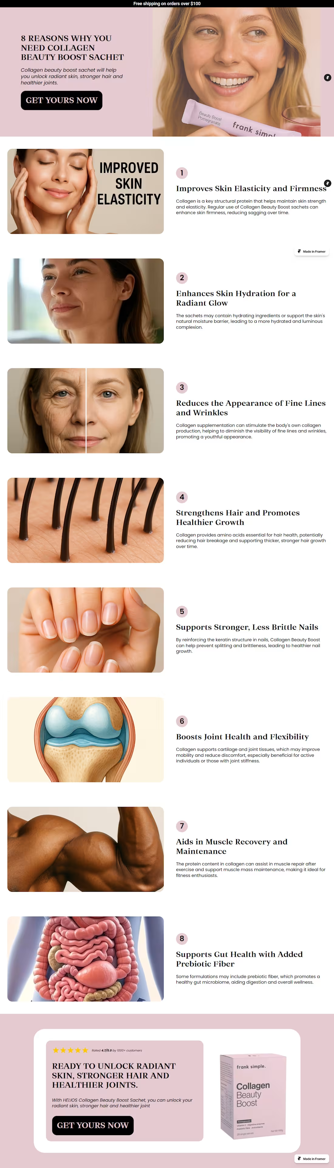
A good listicle page should itemize the benefits of using the product clearly and leading visitors to buy the product.
If you listicle page is not clear enough and does not lead visitors to purchase the product, then your listicle page is not functional.
DM to fix yours now
2
30
Brands love listicle pages because they make information easier to digest, keep readers engaged and highlight products in a natural way.
What are your thoughts?
2
8
277
Just dropped a fresh hero section design for mobile e-commerce!
On mobile, where users decide in seconds if they'll stay or bounce, a killer hero is non-negotiable. It hooks attention instantly, screams your value prop (flash sales, free shipping, hot deals), and builds urgency on a tiny screen.
With thumb-friendly CTAs like "Try Now," it drives fast actions—turning scrollers into buyers and slashing bounce rates.
Bottom line: A mobile-optimized hero boosts trust, engagement, and conversions like nothing else.
Does your site's hero deliver this punch?
1
4
525
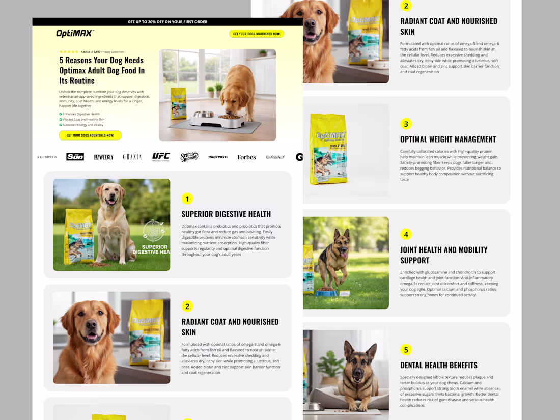
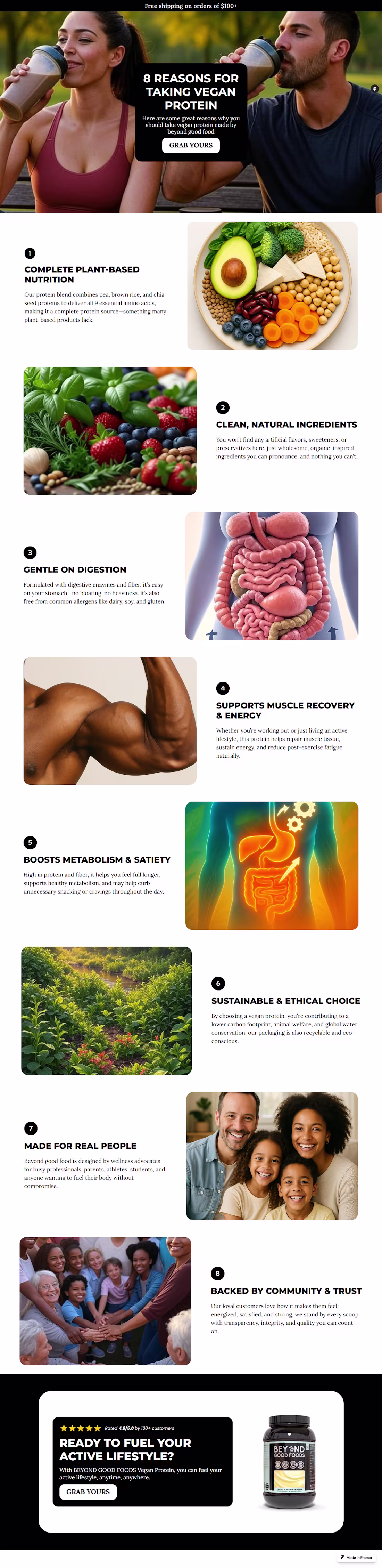
A listicle page designed when you have a set of specific audience in mind reduces bounce rate and keeps visitors hooked to you site.
Here is one I designed having fitness enthusiasts and athletes in mind as targeted audience.
Want to hook your targeted audience? Slide into my DM
2
389
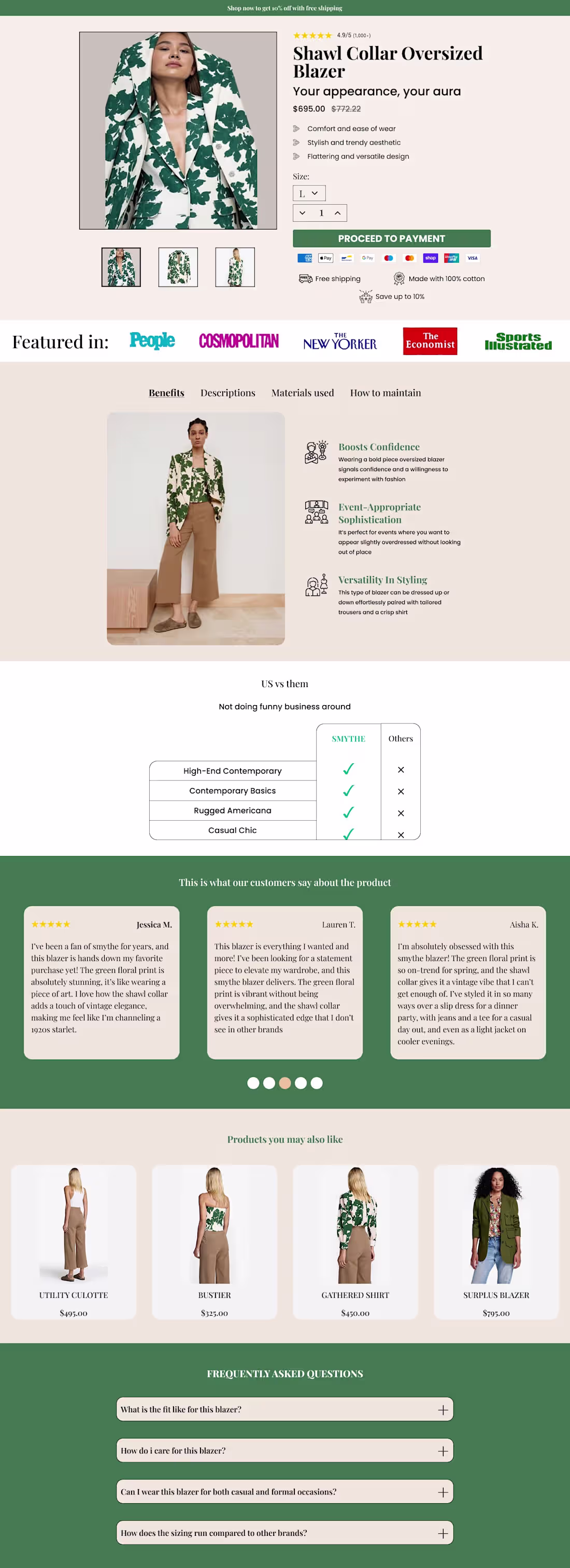
A landing page drives buyers around the product to understand the usefulness of the product and make them feel the product is for them.
I designed this landing page for students as the targeted audience.
A LP designed without having specific audience in mind is just a page.
1
12
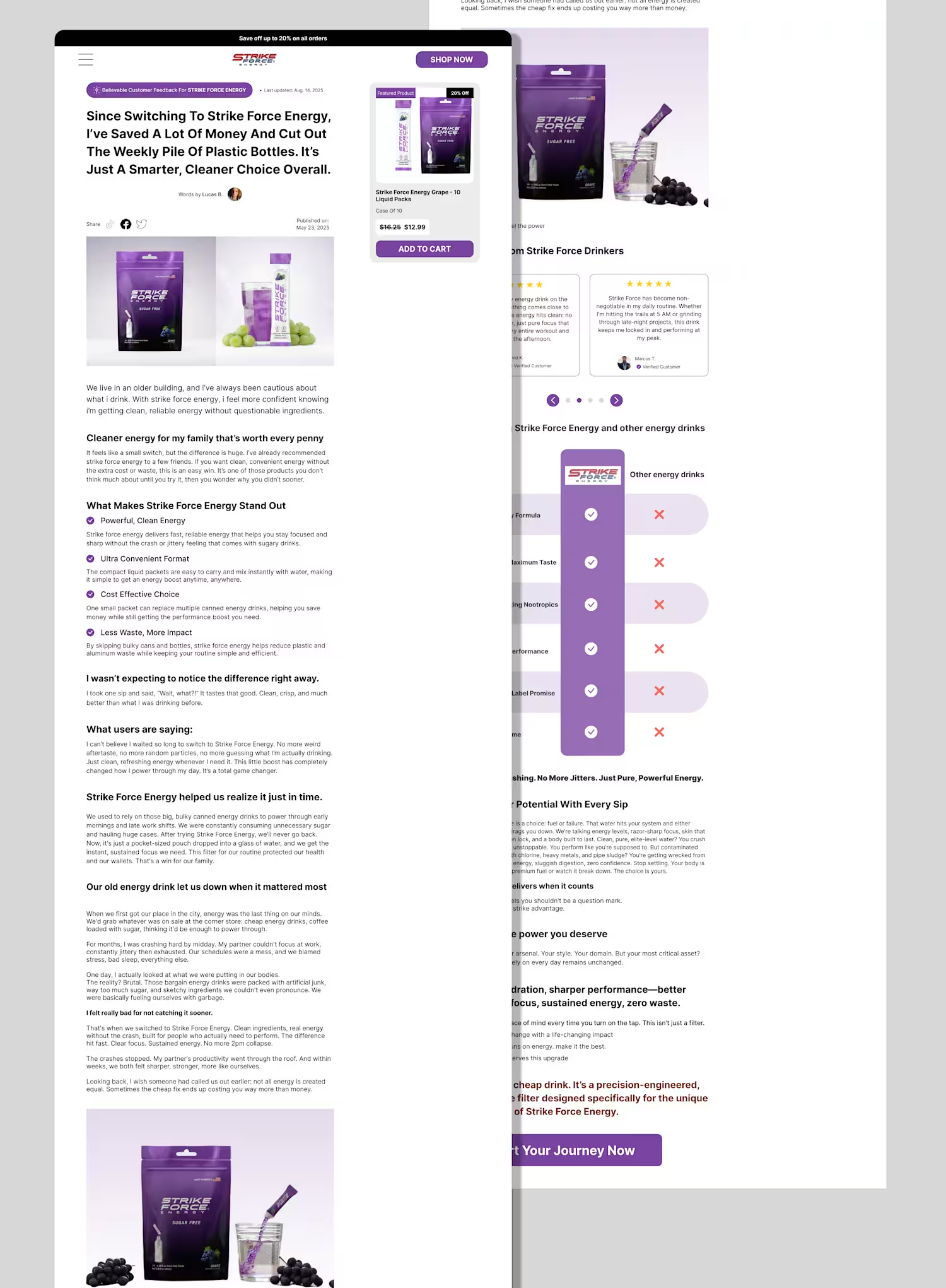
If you're an ecom brand struggling with conversion of cold traffics from your ads, try an advertorial page.
An advertorial page warms up traffics, educate them about the product, tell a real story of how the product changed someone's life and pulls emotions to drive sales.
1
65
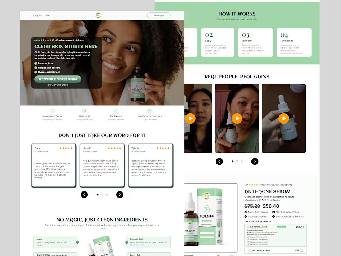
Most wellness brands lose sales before checkout even opens.
I redesigned this e-commerce page to solve 3 conversion killers:
❌ No social proof → ✅ Strategic testimonials with verified badges
❌ Confusing value prop → ✅ Scannable benefits + clear hierarchy
❌ Trust barriers → ✅ Empathy-first storytelling that converts browsers into buyers
Good UI/UX isn't about looking pretty. It's about making your customers feel understood and ready to buy.
Need a designer who gets conversion psychology? Let's talk.
2
87
This listicle page to warms up cold traffics, turns clicks into buyers, builds trusts and credibility fast and increases conversion rate.
It is better than regular PDP because it reveals to browsers why they should use the product.
2
6
598
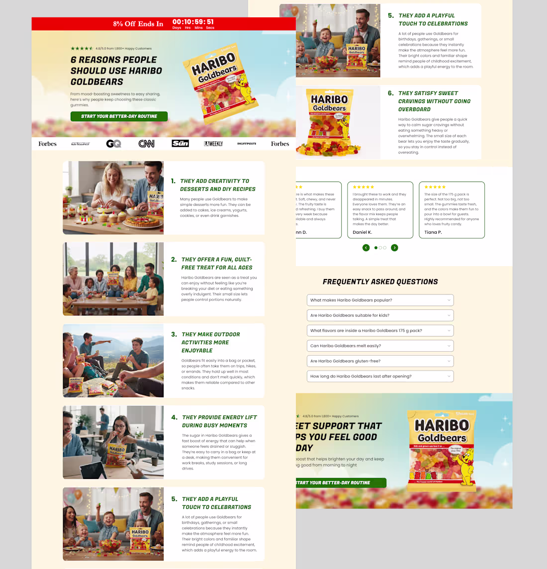
Just finished a conversion-ready listicle page for Haribo Goldbears.
This layout is built to guide shoppers smoothly, answer objections fast, and keep them engaged long enough to buy.
If your brand needs pages that turn casual visitors into customers, I’d be glad to help.
2
18
Your current landing page called.
It wants to know why it still looks like a 2022 Shopify theme.
Meanwhile I’m over here building these for brands about to do 7-figures Want your brand to finally look expensive in 2025?
Reply “EXPENSIVE” and I’ll send you the breakdown.
1
250
$40k+/day supplement brands all use this desktop listicle layout.
Full page below
Want this exact page on your store FREE before Black Friday? DM
1
260
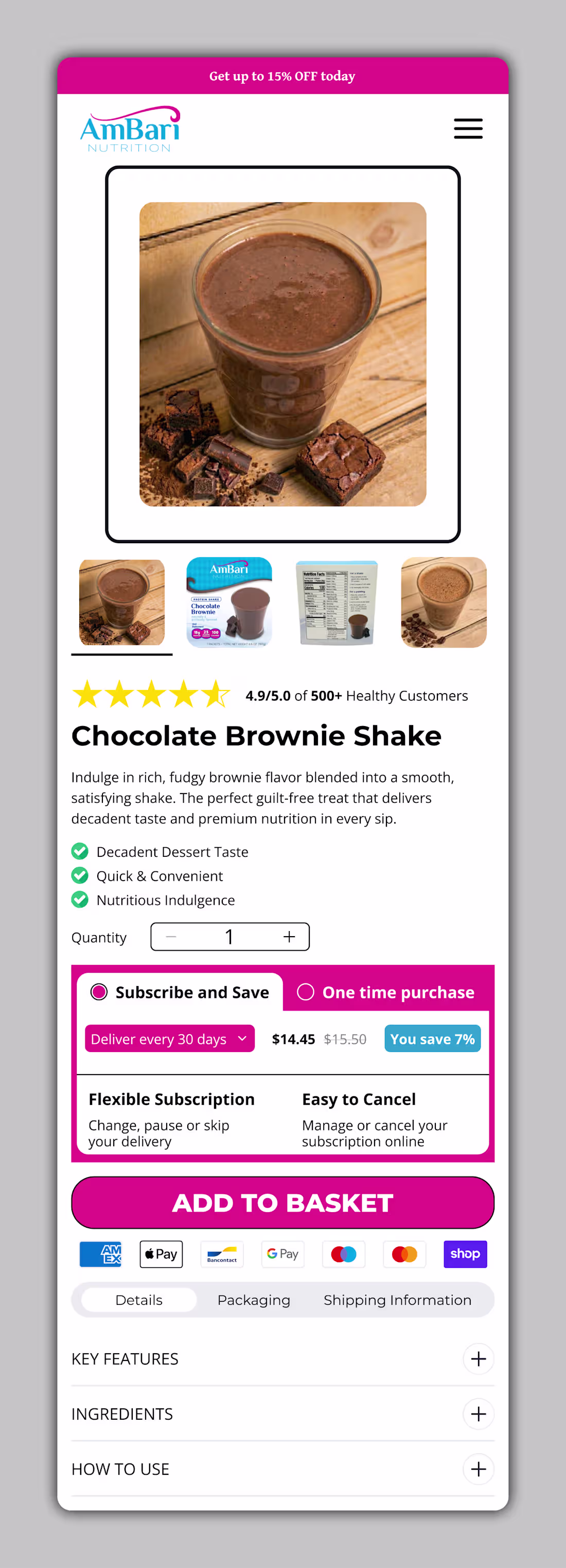
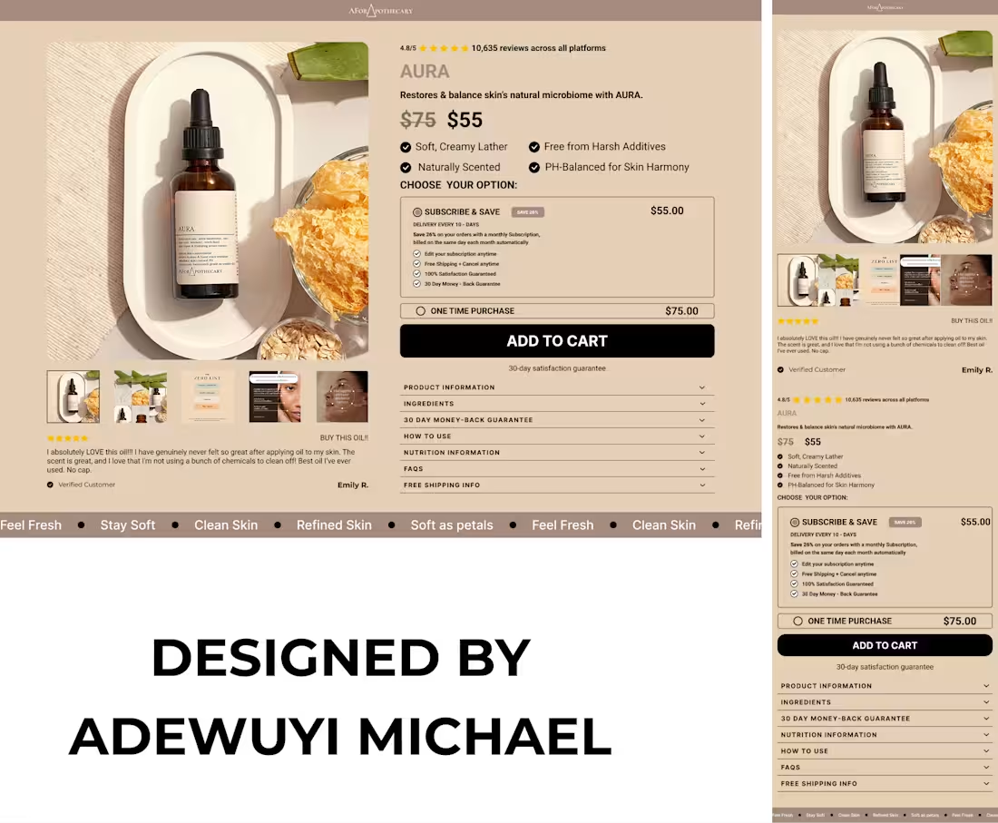
What are your thoughts on this mobile optimized buy box?
2
146
Your hero section starts your eCommerce conversion funnel. It grabs attention, shows value, and drives action.
If it doesn’t engage, you lose shoppers fast. Use clear visuals, strong headlines, and bold CTAs.
Test what boosts clicks and sales. #eCommerce #CRO #UXDesign
1
3
149
Here is a sales page I designed on @figma (https://x.com/figma) to turn browsers to buyers without getting them confused of where to take action and also educate them about the product to gain their trust Is your store draining you? Lets fix it
2
97
Is your CPM spiking up and your CVR and AOV decreasing?
Here is a presale page I designed to increase your revenue and not let CPM take all your money.
Having same issue? You are just a DM away to fix that.
2
79
Product page designed on @figma (https://x.com/figma) to create trust and urgency to the web users to make them take actions instead of hesitating. Kindly drop your thoughts about the design
2
91
Listicle page designed on figma to educate web users about the product before getting it, what are your thoughts about it?
2
82
This product page designed on figma to solve the problem of sloe-loading site, cluttered structure and not user friendly web page. What are your thoughts on it?
2
44
Product page redesigned for visual appealing and conversion-focused. Your thoughts are highly needed.
1
55
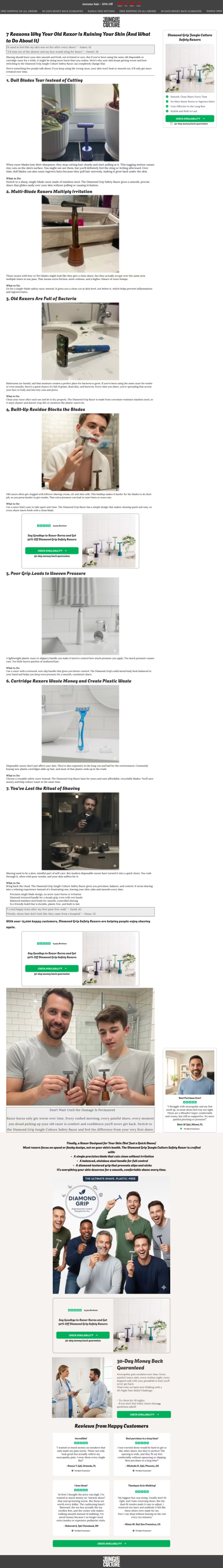
This advertorial page was designed in figma to empower the visitors or web users how the product works and what it can do for them before they purchase it. It is designed in a well structured pattern to load faster and cluster-free.
Kindly share your thoughts about it.
1
41
Just designed this advertorial page on Figma.
This page is optimized to drive CRO (conversion rate optimization) and boost CLV (customer life time value) by providing high value content that seamlessly transits to purchase. What are your thoughts?
4
4
214
Designed this listicle page to empower visitors about the product. Kindly drop your thoughts?
4
4
282
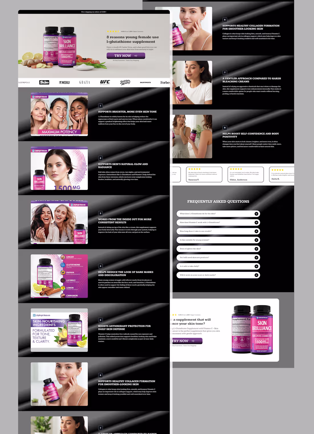
What are your thoughts about this listicle page?
2
5
109
Advertorial page successfully delivered
2
2
102
Designed this sales page to hook visitors and turn them to customers to increase conversion for the brand. Want to create one for your brand? You're just a DM away.
3
2
110
What are your thoughts on this product page?
4
5
158
Sales page designed, what are your thoughts about it?
2
35
I designed this product page on figma to walk the buyer around on what they want to buy and convince them to click on the cta to purchase the product
1
28
Product detailed page is used to convince buyers to take action (to buy). Here is one I designed, drop your thoughts in the comment section
2
27
What do you think about this sales page I designed on figma
1
28
A clean sales page designed on figma for clarity about the product to the web users in order for them to understand what they want to purchase.
Need a clean one for your brand? DM now
1
15
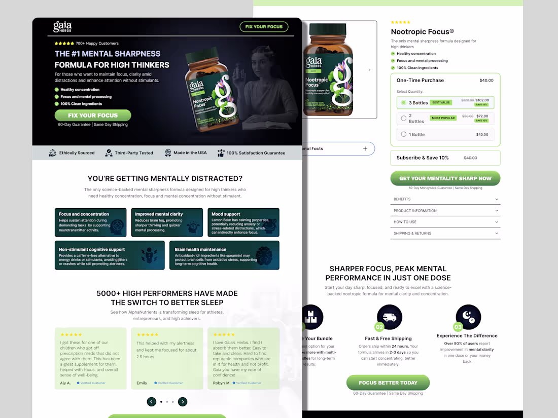
Sales page designed on figma for clear action to take
1
18
Home page hero section mobile view design
1
0
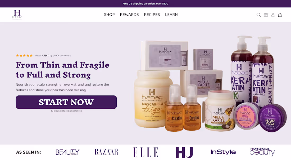
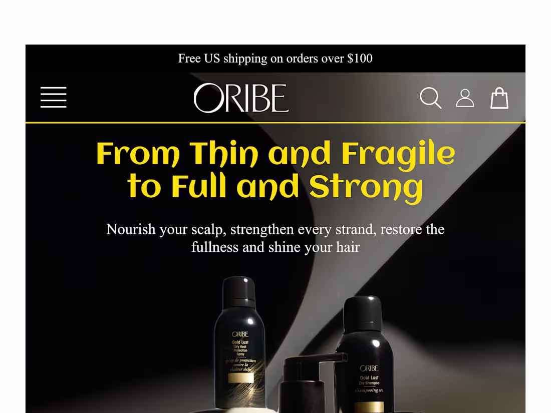
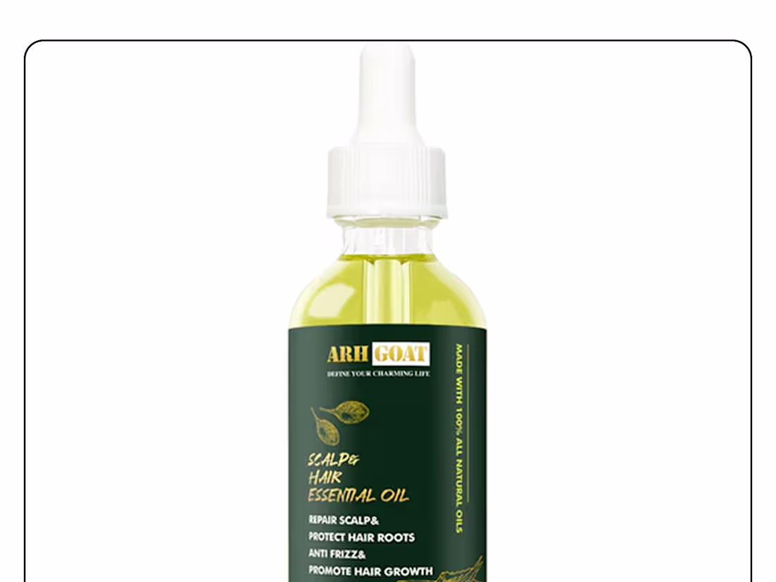
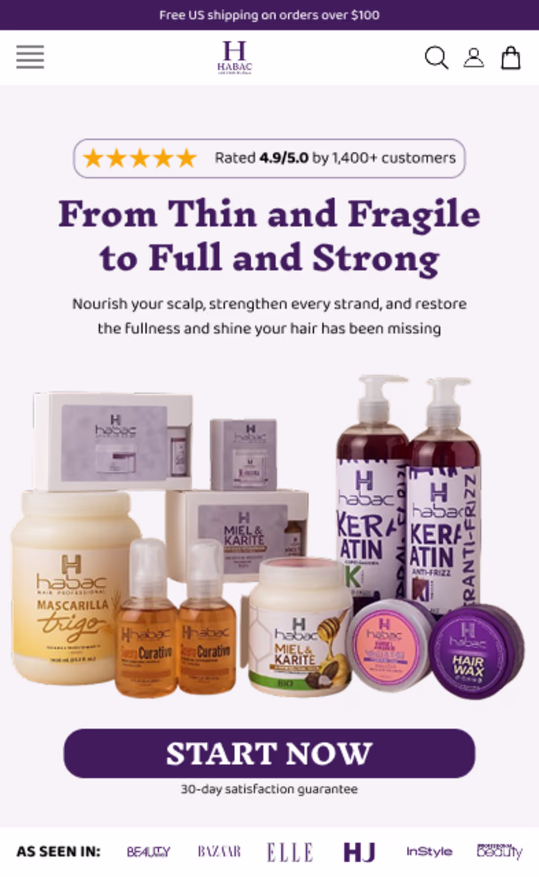
Hero section for hair product homepage
1
0
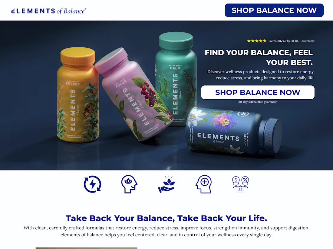
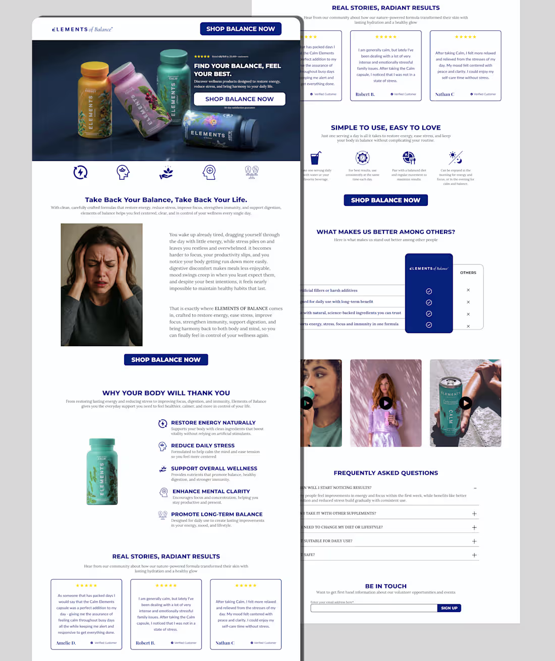
Redesigning of elements of balance homepage
1
0
Redesign product page
1
0
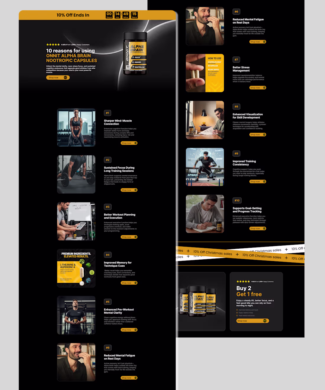
Listicle page design
1
0
Redesign product page
1
0
Home page design
1
1
A listicle page developed on framer
1
0
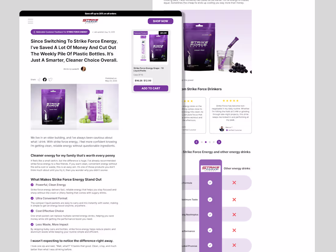
Redesign of a product detailed page
1
0
Building a Buy Box section
1
1
Listicle page design
1
1
Redesign of a product detailed page of a cloth brand
1
1
A redesigned product page
1
1
Redesign product page
1
1