
Casey Thomson
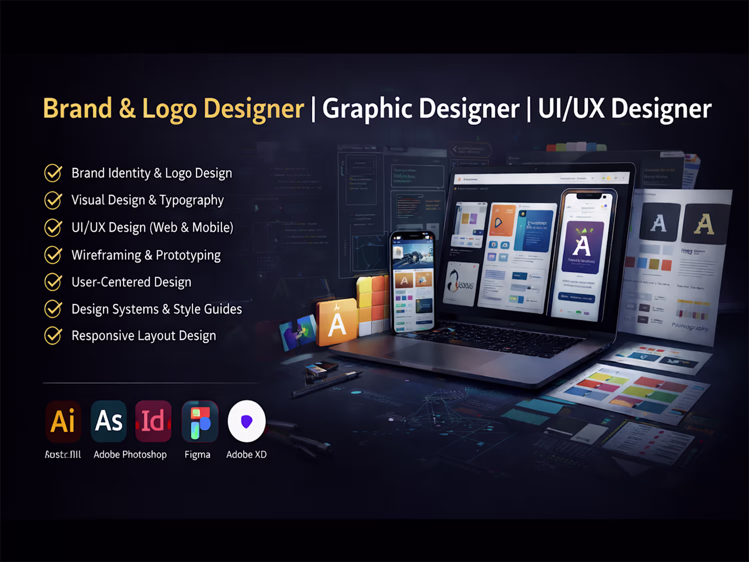
Brand & Logo Design | Graphic Design | UI/UX Design
New to Contra
Casey is ready for their next project!
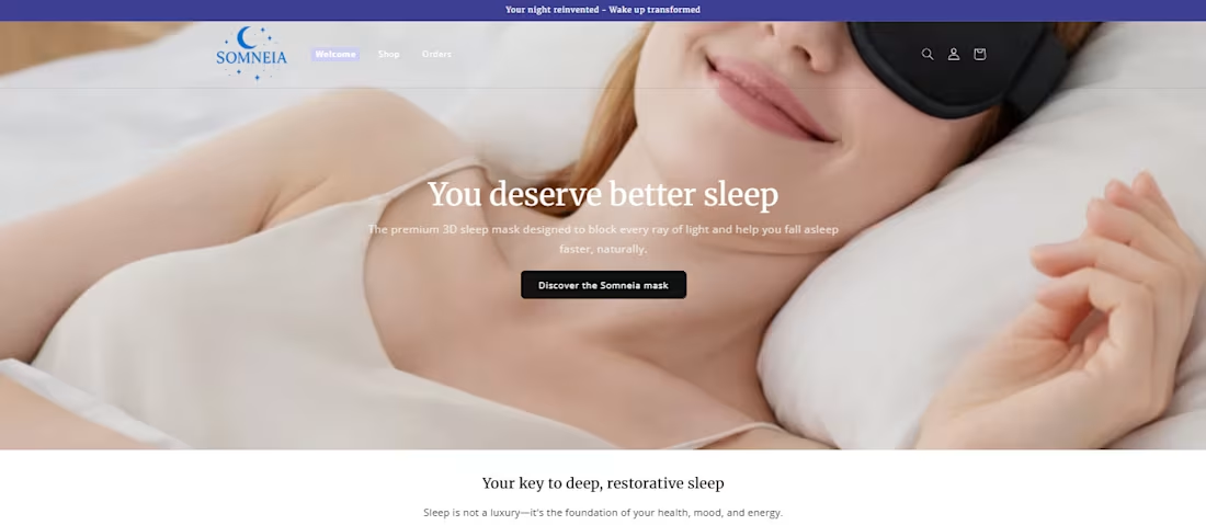
Elegant Night Boutique
Designed the full Shopify store layout, brand styling, and conversion-focused content strategy.
A premium sleep and wellness brand store built with a minimalist, elegant design approach. The project focused on creating a calming user experience, strong brand identity, and high-converting product presentation while keeping the layout fully editable within Shopify.
1
2
69
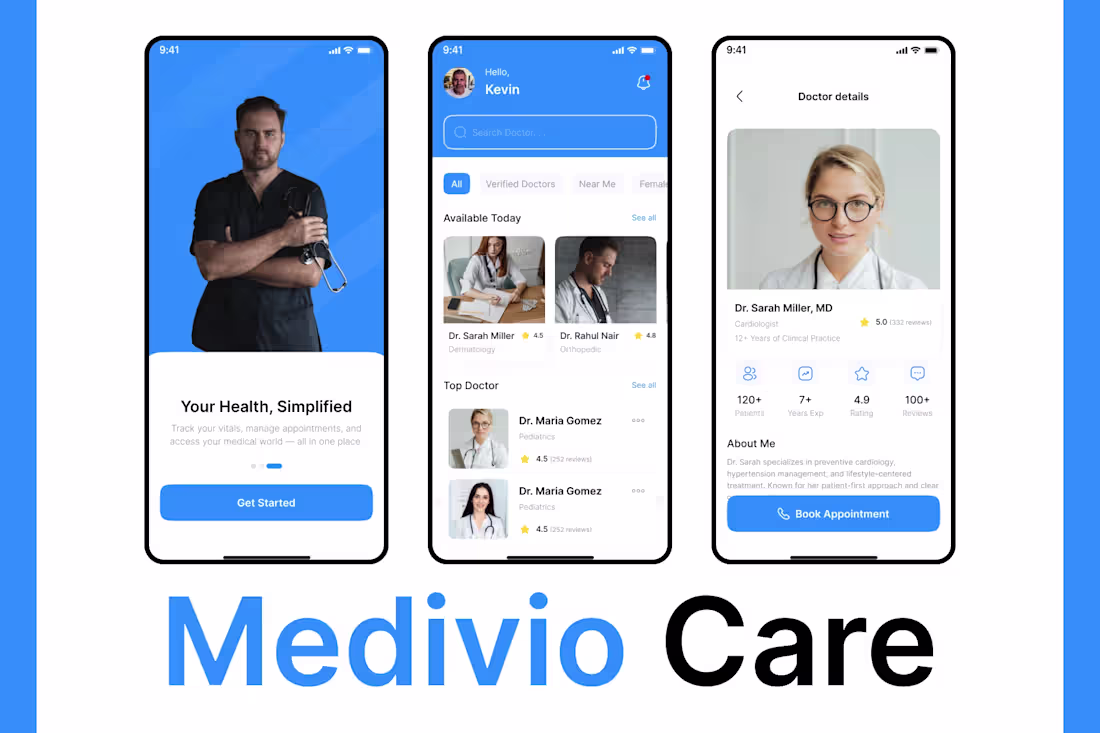
Medical & Healthcare Mobile App
I developed a healthcare mobile app that enables users to find doctors, view detailed profiles, and book appointments easily. The app is designed to feel professional, calm, and trustworthy-key requirements for healthcare products.
The UI focuses on clarity and accessibility, presenting medical information in a structured and reassuring way. Navigation is simple and intuitive, helping users make confident healthcare decisions.
Technically, the app supports secure authentication and scalable architecture suitable for clinics, hospitals, and healthcare startups. This project highlights my experience in HealthTech and user-centric medical app design.
1
3
84
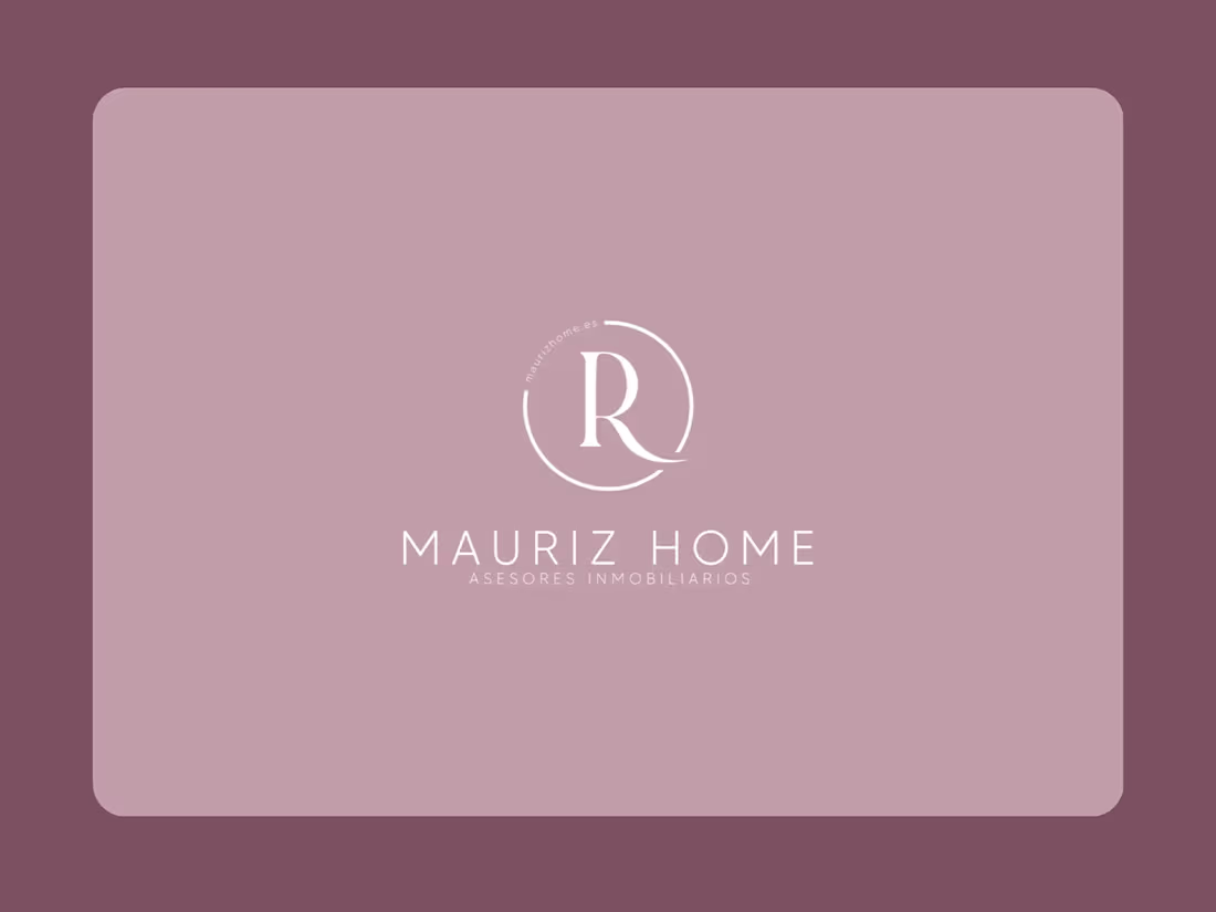
Brand Identity and Social Media Post
I developed a full branding suite and social media post design system for Mauriz Home, a luxury real estate advisory firm. The project focused on creating a refined, elegant brand identity that communicates trust, calm, and professionalism. This included logo design, a custom color palette with psychological intent, and multiple post templates that blend aesthetics with clear messaging. Each element aligns with the client's premium market positioning in the real estate sector.
Highlights of the project:
Sophisticated monogram logo (letter “R”) with minimalist circular geometry
Soft, elegant color palette reflecting trust, luxury, and calmness
Template variations for Instagram content (Q&A, informative posts, brand awareness)
Consistency in typography, spacing, and content hierarchy
3
4
105
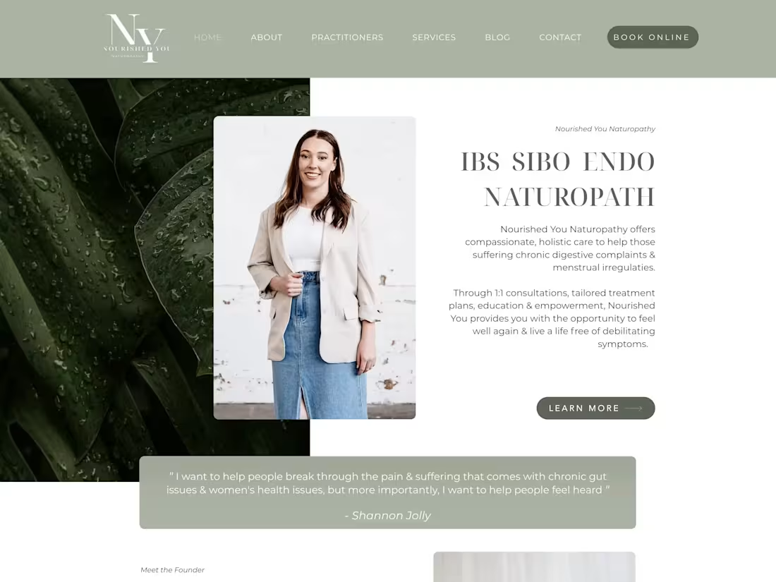
NourishedYou.com.au — Wix Website
Designed and built a clean, professional Wix website for NourishedYou.com.au (http://NourishedYou.com.au), focused on wellness and nutrition. Delivered a visually calming layout, intuitive navigation, and mobile responsiveness, all tailored to reflect the brand’s values.
1
2
118
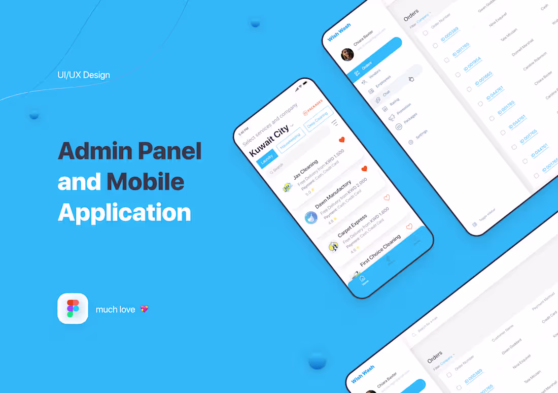
UX/UI Design for web and mobile app
UX and UI Design for web and mobile application different cleaning, laundry, wash and car wash services. There was design for customers app and vendor's services app.
0
84
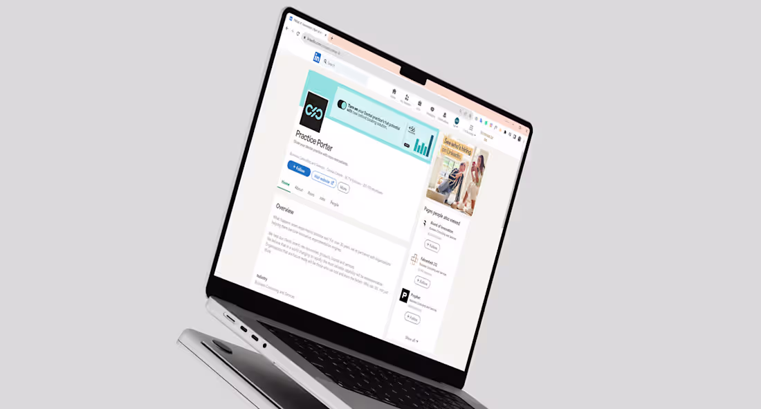
Graphic Designer | Logo | Brand Identity | Web Design | Branding
PracticePorter is a Canada-based software platform that supports health professionals in managing client care, communication, and documentation - all in one secure place. The brand needed a visual identity that would feel professional, approachable, and trustworthy, aligning with its mission to simplify healthcare operations while maintaining a human touch.
I developed the full visual identity system, including a clean and
modern logotype, color palette, and typography designed for clarity and digital-first use. In addition, I created marketing materials and a consistent LinkedIn visual presence to support their outreach and brand recognition across platforms.
0
102
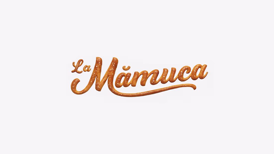
La Mămuca | Logo Brand Identity
LaMămuca is street-food pastry / pretzel, which offers fresh and tasty products for passers-by. Located in heart of the city, La Mămuca is loved and well recognised by every Chisinau citizen.
0
103
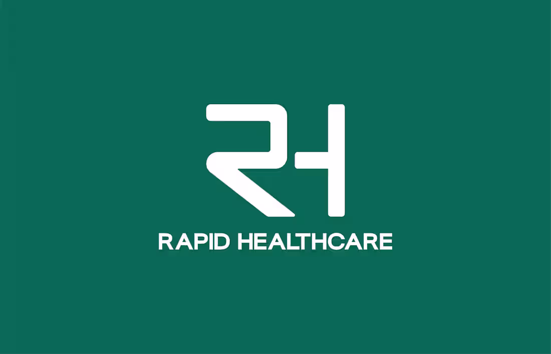
Rapid Healthcare - Branding + Identity Design
We created a clean, professional brand identity for Rapid Healthcare, a company specializing in healthcare equipment installation and maintenance. The branding focused on trust, precision, and reliability, delivering a cohesive visual system that positions the company as a modern and dependable healthcare services provider.
0
94
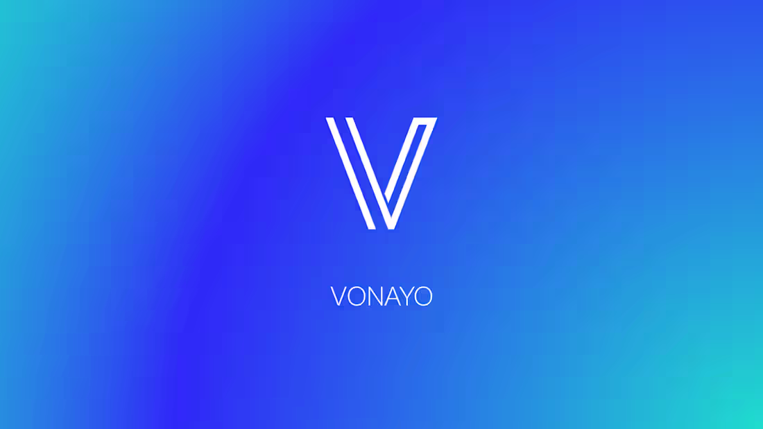
Vonayo CPaaS Logo and Brand Identity Design
Vonayo is a CPaaS startup (Communication Platform as a Service) which provides messaging options and communication options to softwares as an external resource
The 'V' represents Vonayo and the two lines besides the V represent a 'quote' or a 'comment' as most people would interpret. The project kickstarted with a brainstorming session for the logo with the client and we came up with a bunch of ideas of how to present the logo, this phase took a lot of iterations and a lot of different ideas. Through that chain of thoughts came this logo design.
For the typography, the font chosen for this is 'Cabinet Grotesk' and for the secondary font, we have 'Manrope'. Overall, this project was quite fun because I have never worked with a CPaaS before and it is a game changer for sure.
0
86