max
Carolyn Marie
Sparking Joy ✨ with Design & Framer Development
- $50k+
- Earned
- 15x
- Hired
- 4.96
- Rating
- 541
- Followers

SaaS = Software as a Self-soothing
Instacalm -- because there's always things we cannot control in life. Within just a few hours using Figma Make I was able to spin up an app to instantly create a calming meditation practice through the one thing we can control: our breath.
I...
- animated color theme and particles
- animated breath pacer for inhale & exhale cycles
- ambient background music
- optional affirmations
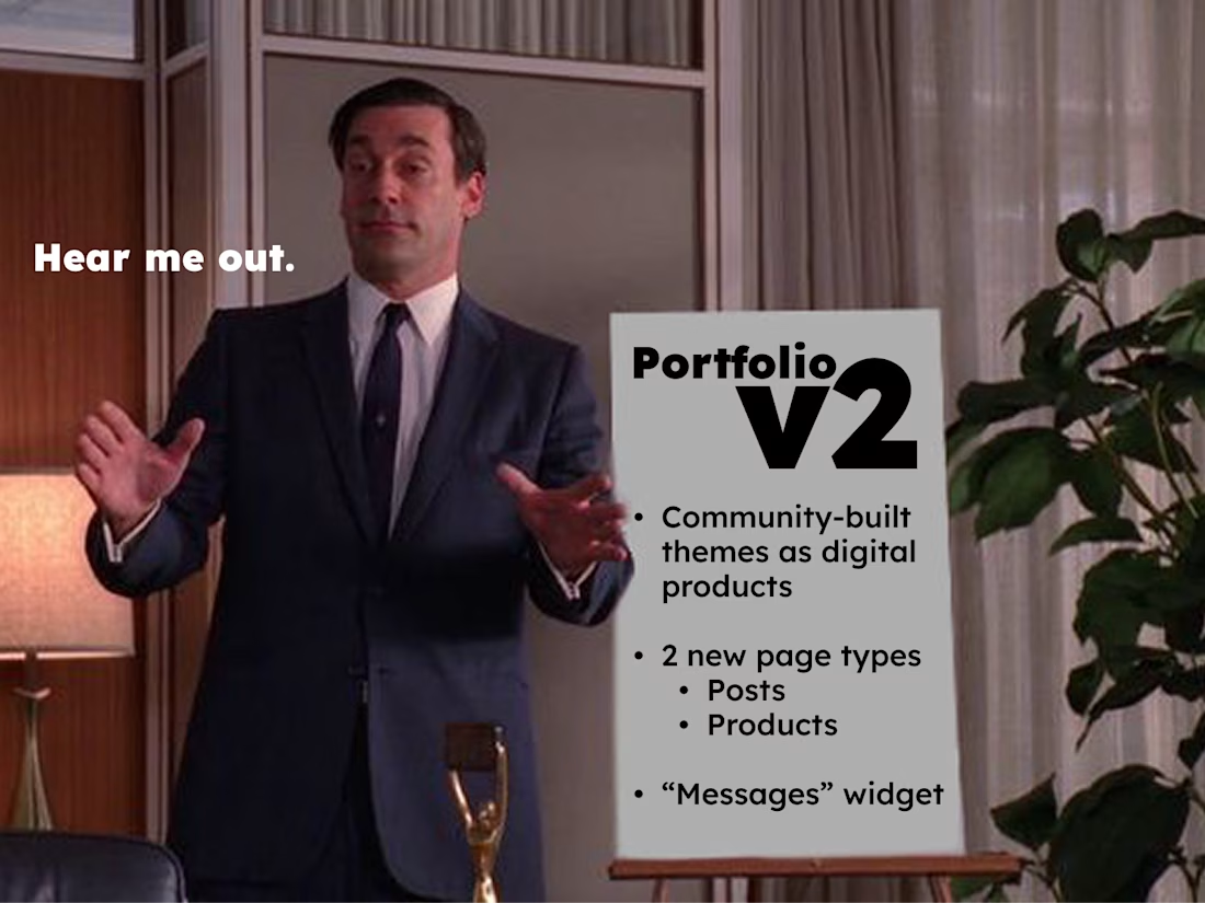
💡 Imagine creating & selling Contra Portfolio themes natively, inside Contra as digital products 🎨 listed on creator profiles & within the theme customization area.
The infrastructure's already there—Portfolio themes (templates) populate from Contra content (projects, services,...
The best part of the year in Contra community year was the upgoat revival. 🐐 My OG's (original goats) know what's up. 😊 Nice to have the goats back in the mix.
Besides that, I kinda have mixed feelings about sharing my wrap up (and generally looking back instead keeping my...
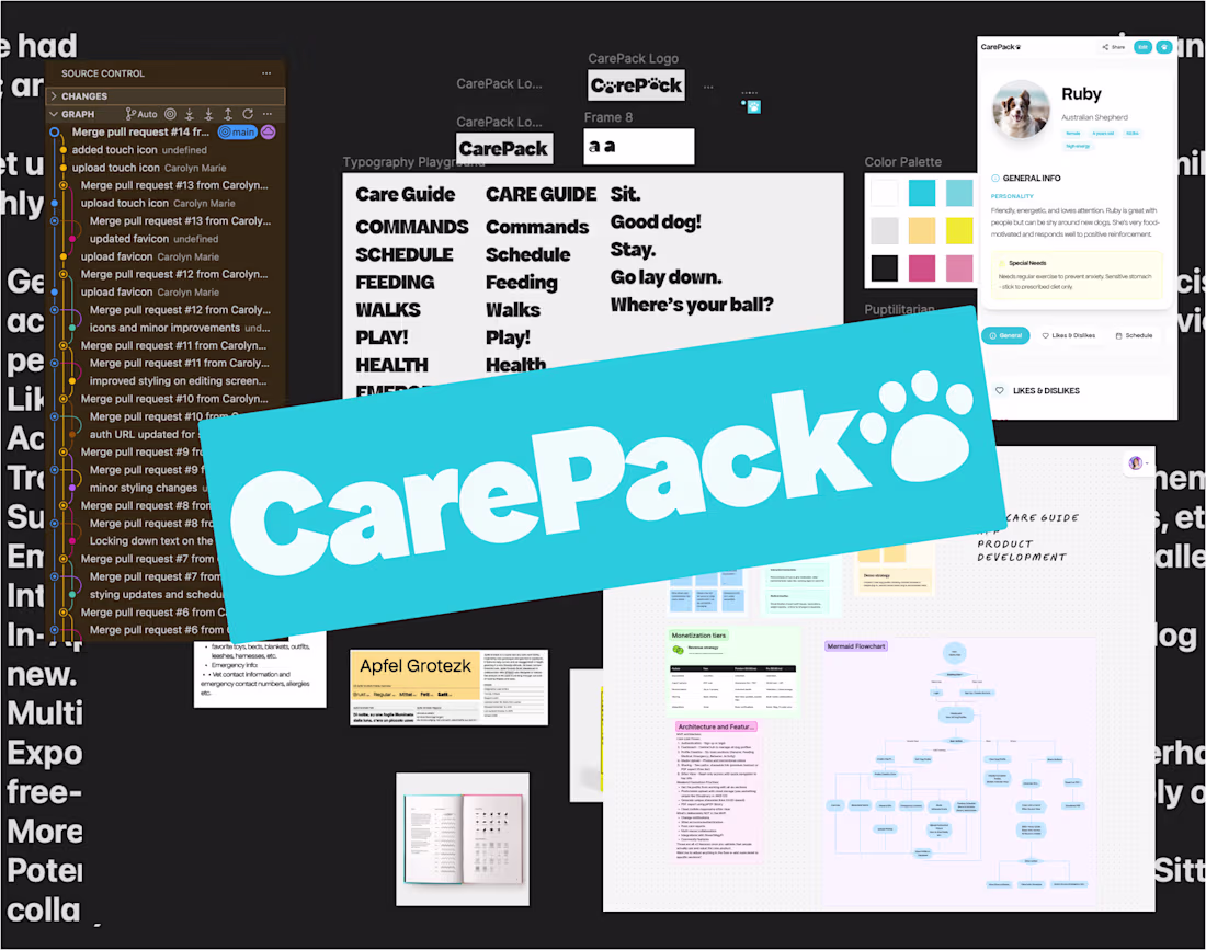
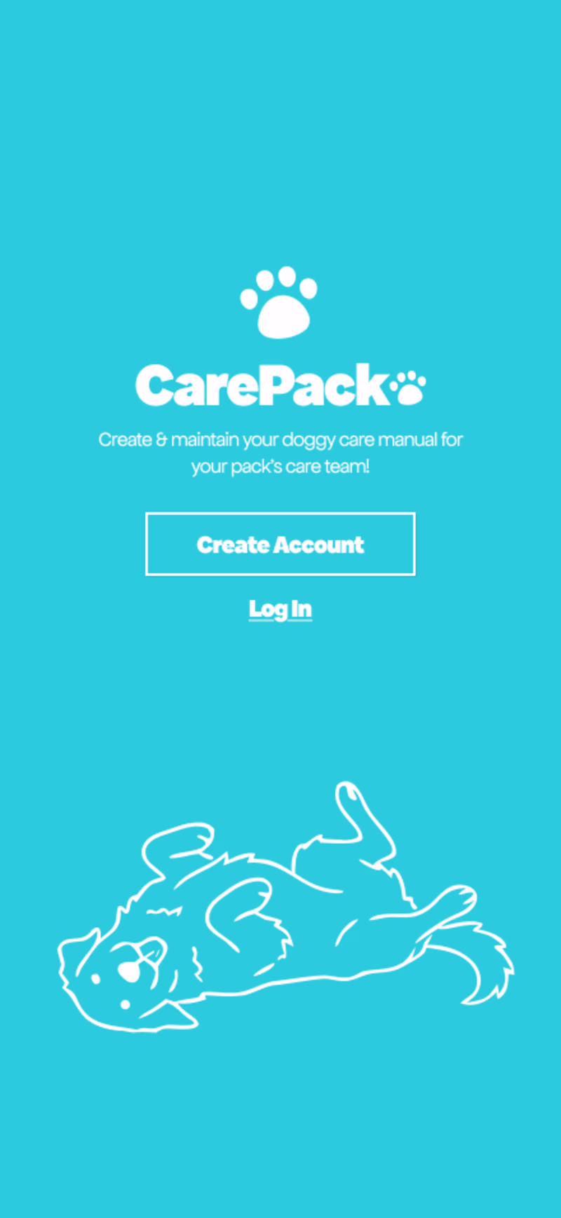
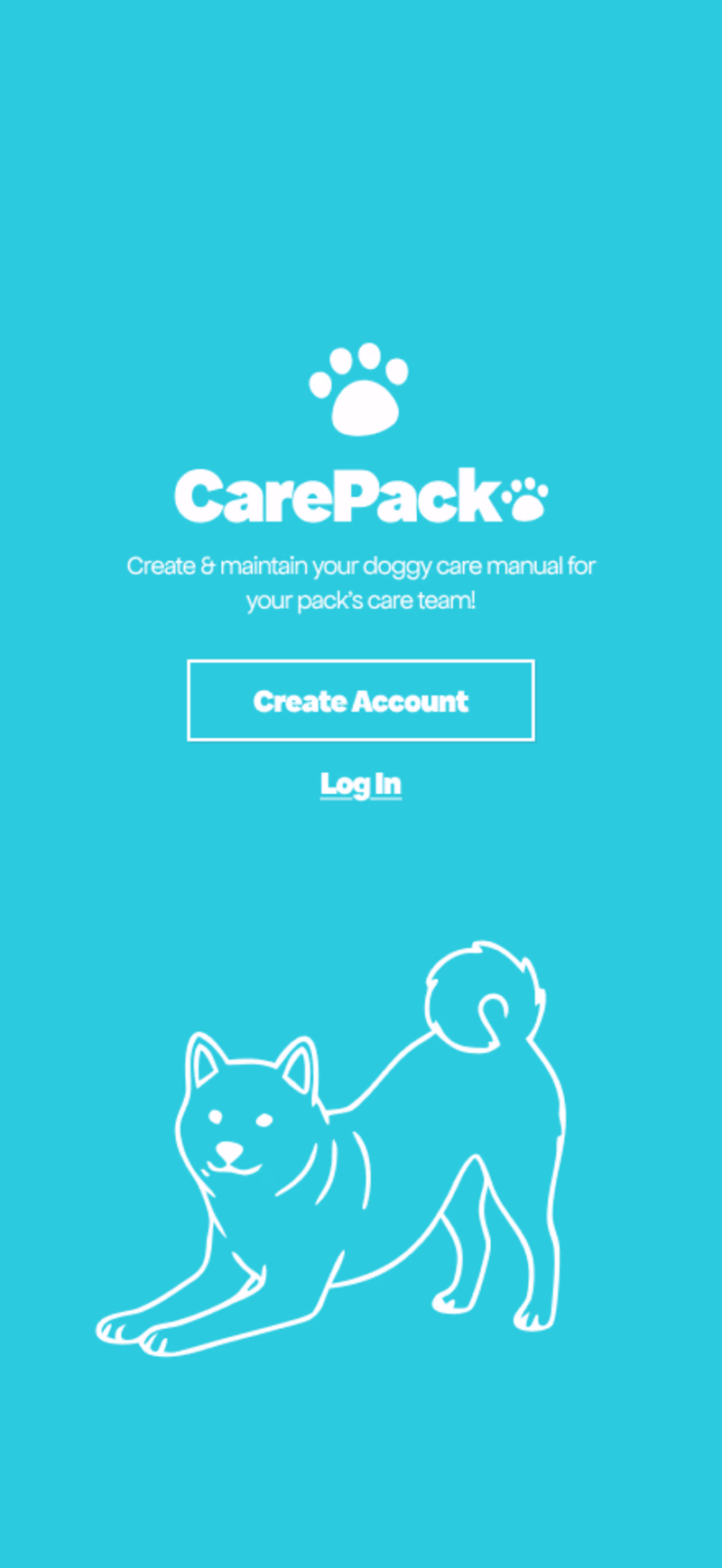
Starting to refine some design details in Figma for the app I created for the Tempo hackathon: CarePack 🐾 Help me pick a cover dog...
(TBH I might end up using an array of images and randomizing which image is served 😍 b/c how could I ever pick just one!?)
29 voted
36%
51 voted
64%
80 votes
Closed
Every dog owner texts the same doggy info 🐶 to sitters and dog walkers over & over again... 😵💫 In the US there are over 50 million doggy households, of which 22% of owners use dog walking services and 27% use doggy daycare. That’s a LOT of redundant texts, missed updates,...