
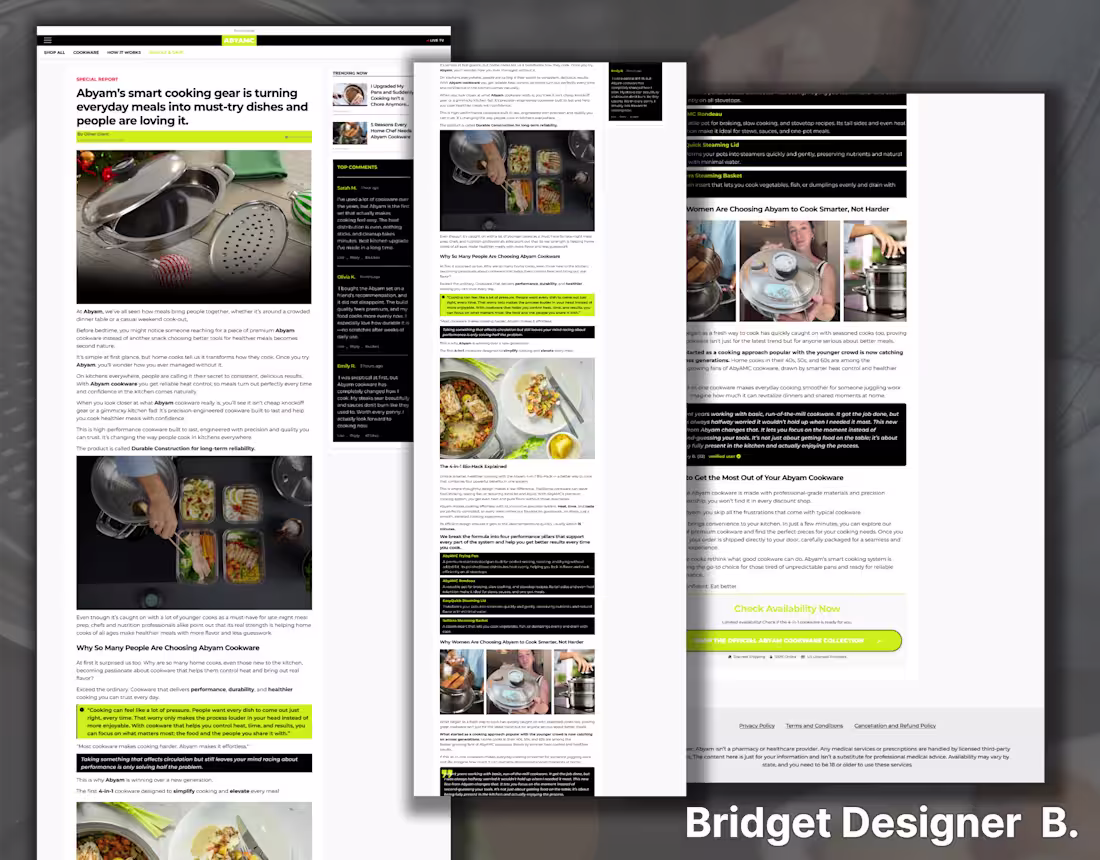
When redesigning the advertorial page in Figma, my focus was on psychology and flow. I broke the page into sections that mirror how people naturally consume advertorial content: hook, problem, discovery, proof, and solution. The design balances storytelling with clear product messaging so the page doesn’t feel like a hard sell but still drives conversions.
0
57
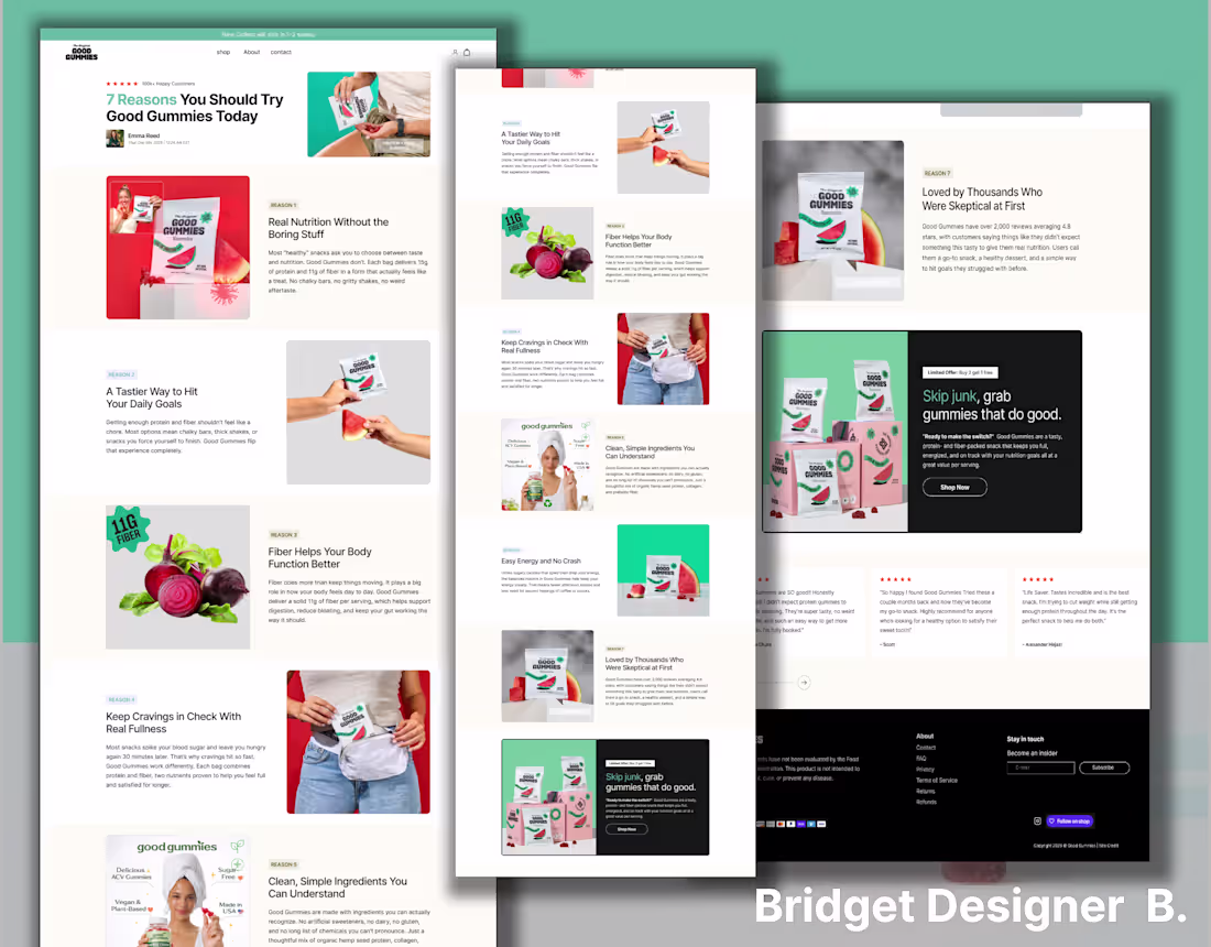
I redesigned this landing page in Figma with a strong focus on clarity and conversions. I simplified the layout, improved the visual hierarchy, and made sure the key product benefits stand out immediately. The goal was to guide visitors smoothly from the headline to the call-to-action without distractions.
0
61
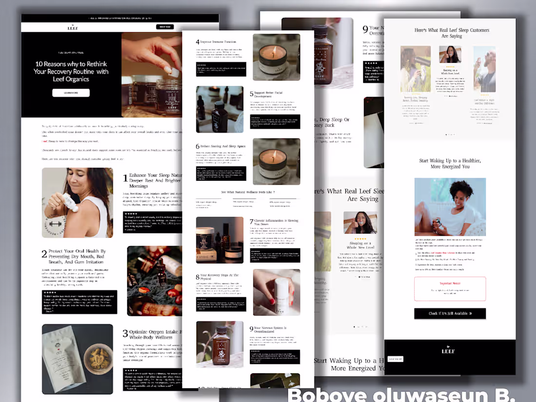
Leef Project
1
8
besque advertorial page
0
6
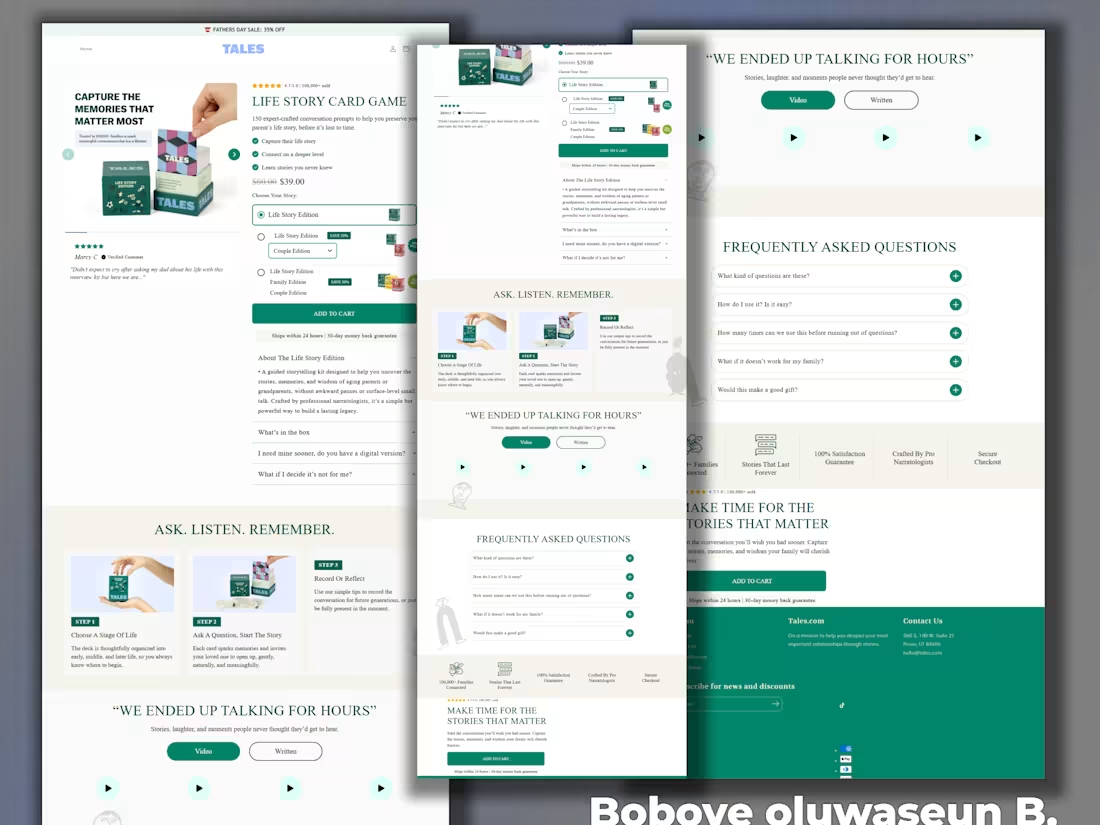
The Life Story Project
0
2
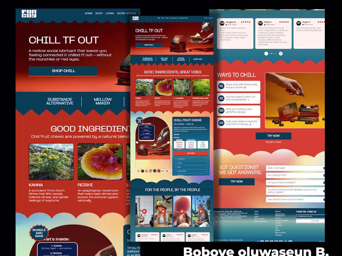
Homepage f Chill
0
7
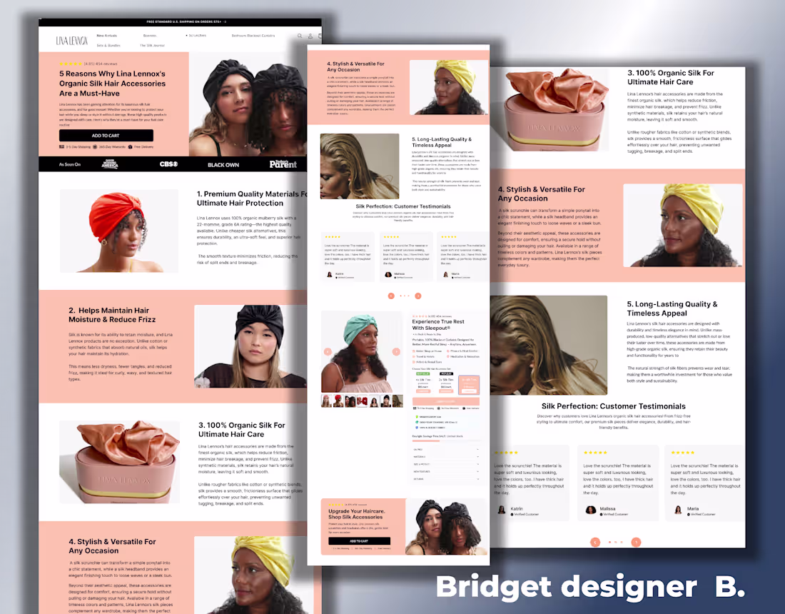
Lina Lennox Product Page Redesign
0
1

Snif Homepage Redesign
1
2
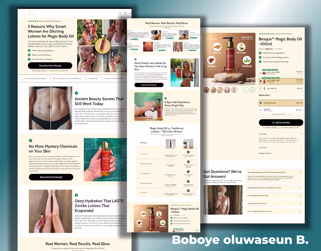
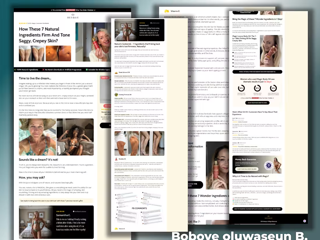
Magic Body Oil listicle Page Redesign
1
2