
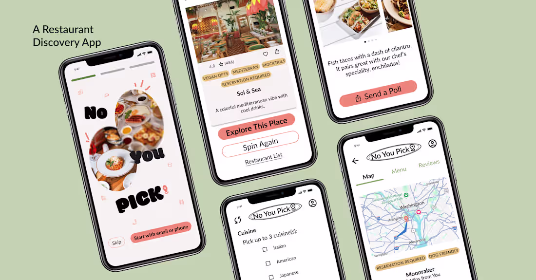
Hunger and indecision lead to a hangry group setting.
No You Pick is an end-to-end restaurant discovery app that solves this problem.
I designed the full experience: user research, flows, interaction design, visual branding, and dev handoff over 10 weeks in Figma.
The result: 88% of testers said they'd use it, and the app scored 76% on ease-of-use.
Built for foodies, indecisive groups, and anyone tired of scrolling through apps for 20 minutes just to pick a place.
24
170
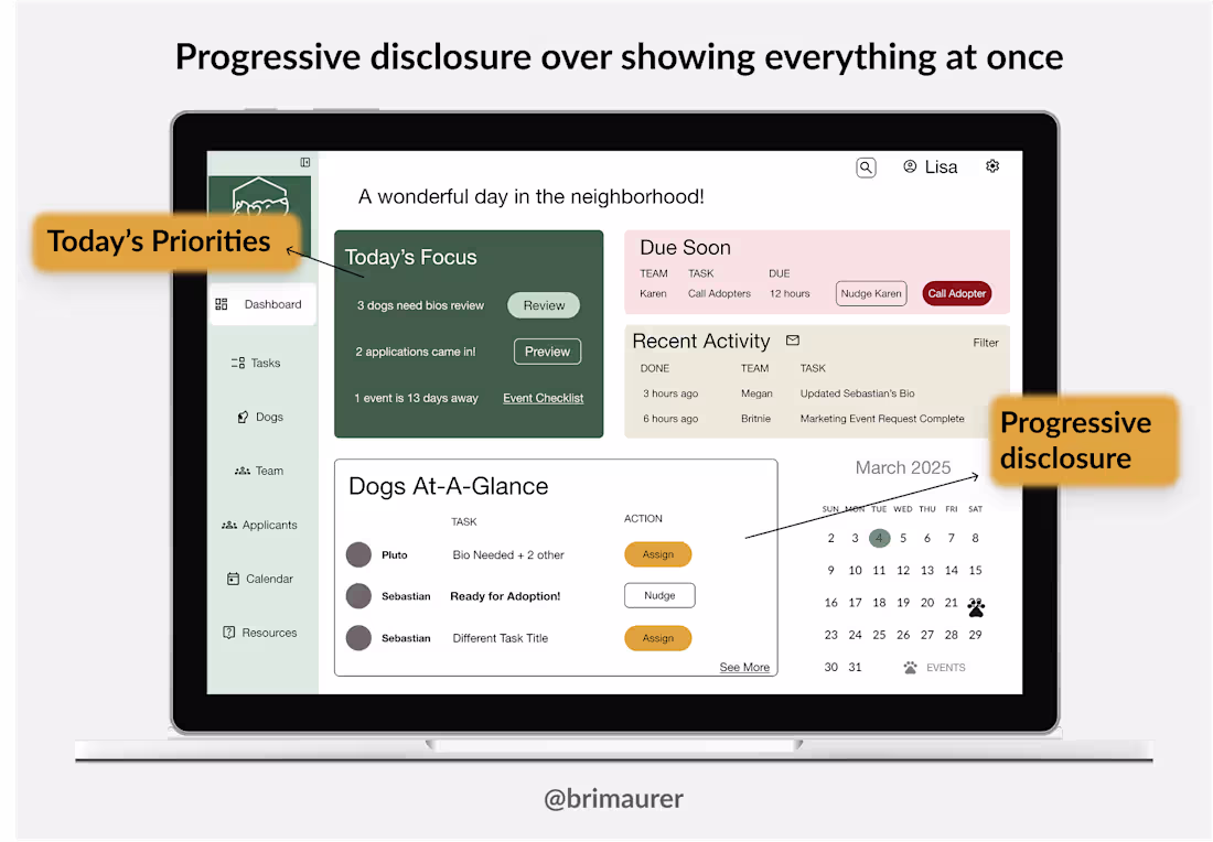
When I streamlined my service business from 5 platforms into one system, revenue grew exponentially.
That's when I realized: operational efficiency isn't sexy, but it's the difference between surviving and scaling.
For my first dashboard project, I applied that lesson to a nonprofit rescue drowning in fragmented tools:
93% ease of use rating
Tasks dropped from 5+ minutes to under 1 minute
Owner: "This freed up 10+ hours per week—time for fundraising and partnerships."
The visual design needs polish. I'm addressing that next. But the testing proved the strategy works.
Full case study: https://briannamaurer.com/nonprofit-dashboard
25
160
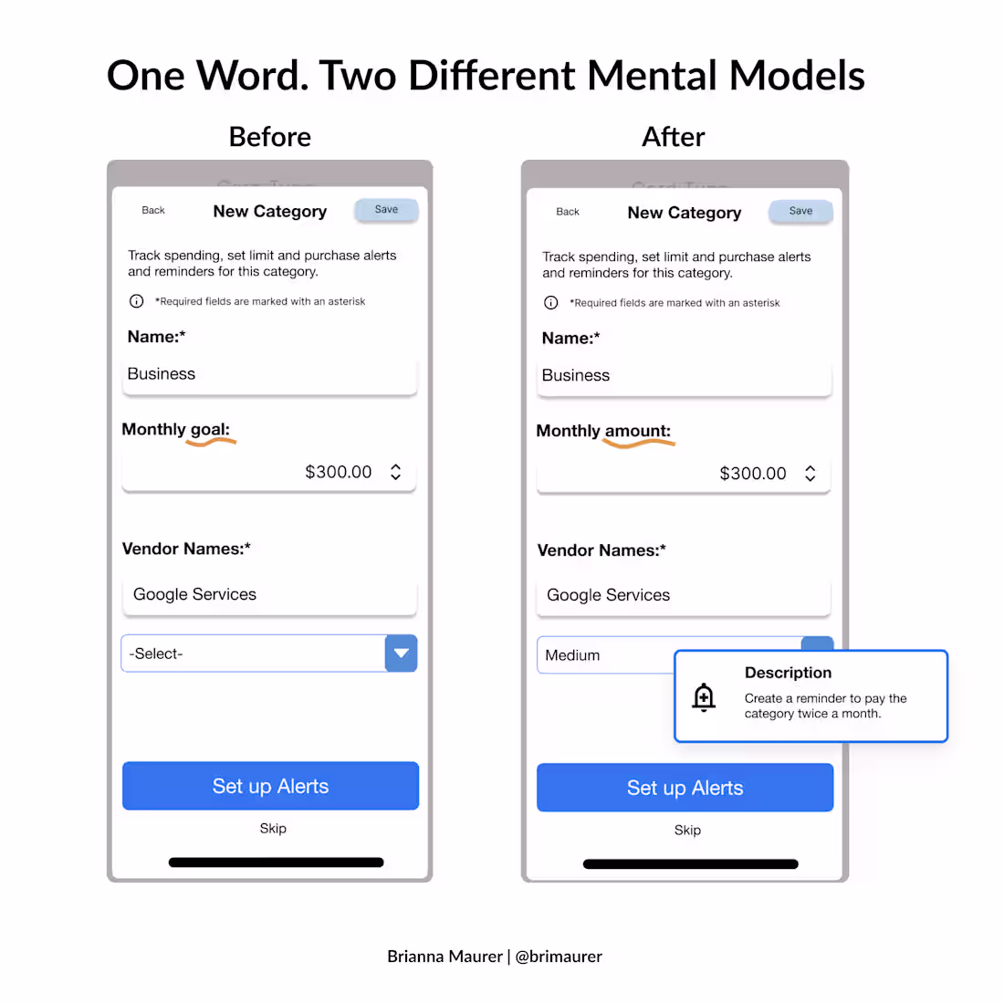
Your microcopy is broken. You just don't know it yet.
Words aren't just labels. They're instructions, triggers, and psychological cues rolled into one.
In finance UX especially, language matters because our money has emotional weight. Different knowledge levels of the topic create this ripple effect. "Goal" vs "amount." "Spend" vs "budget." "Limit" vs "target." Each word carries different psychological baggage depending on someone's financial literacy and relationship with money.
My process for getting microcopy right:
Draft labels based on user mental models (from research)
Test them in wireframes, not just final designs
Watch for hesitation, confusion, or misinterpretation
Iterate until the words disappear
The best interfaces don't just look intuitive. They read intuitive.
16
125