Brian O'Connor's Work | ContraWork by Brian O'Connor
Brian O'Connor

Brian O'Connor

Strategic Brand Identity & Logo Designer for Modern Brands.

New to Contra

Brian is ready for their next project!

Cover image for Building a brand isn't just
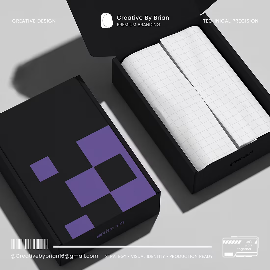
Building a brand isn't just about making things look "cool" it's about solving real problems. At Prism MM, I bridge the gap between creative visual identity and technical manufacturing. Whether you are launching a new product and need a dieline that actually fits, or you need a minimalist brand identity that cuts through the noise, I’m here to help you build a system that works. I don’t believe in over-complicating things. I believe in clarity, geometric precision, and designs that are ready for the real world—from your digital screen to the final packaging on a shelf. If you are a founder looking to turn your vision into a sharp, professional reality, let’s talk. Let’s connect: Creativebybrian16@gmail.com (mailto:Creativebybrian16@gmail.com) #BrandIdentity #PackagingDesign #PrismMM #GraphicDesign #FounderLife
0
13
Cover image for How do you translate premium
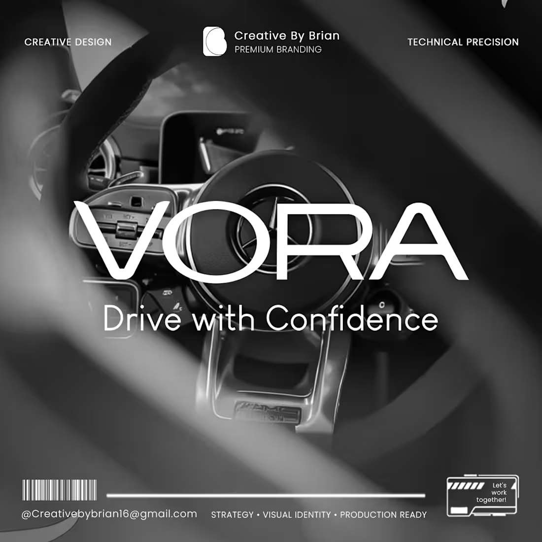
How do you translate premium into a visual language that commands trust the moment a customer steps into a showroom? For the Vora branding project, the goal was simple but ambitious: create an identity that feels as high-performance as the vehicles they sell. When we talk about "Driving with Confidence," it shouldn’t just be a tagline it needs to be the feeling a customer gets from the first point of contact. By blending minimalist design with technical precision, we’ve built a visual system that feels modern, reliable, and ready for the future of the automotive industry. Branding is about more than just a logo; it’s about shaping how your audience perceives your value before they ever sit behind the wheel. I’m really proud of how this identity came together. Does your brand’s visual presence match the quality of the experience you offer your clients? Let’s chat about elevating your brand identity. #BrandIdentity (https://www.linkedin.com/search/results/all/?keywords=%23brandidentity&origin=HASH_TAG_FROM_FEED) #GraphicDesign (https://www.linkedin.com/search/results/all/?keywords=%23graphicdesign&origin=HASH_TAG_FROM_FEED) #AutomotiveBranding (https://www.linkedin.com/search/results/all/?keywords=%23automotivebranding&origin=HASH_TAG_FROM_FEED) #CreativeByBrian (https://www.linkedin.com/search/results/all/?keywords=%23creativebybrian&origin=HASH_TAG_FROM_FEED) #VisualStrategy (https://www.linkedin.com/search/results/all/?keywords=%23visualstrategy&origin=HASH_TAG_FROM_FEED) #MinimalistDesign (https://www.linkedin.com/search/results/all/?keywords=%23minimalistdesign&origin=HASH_TAG_FROM_FEED) #BusinessGrowth (https://www.linkedin.com/search/results/all/?keywords=%23businessgrowth&origin=HASH_TAG_FROM_FEED)
2
31
Cover image for Design is about more than
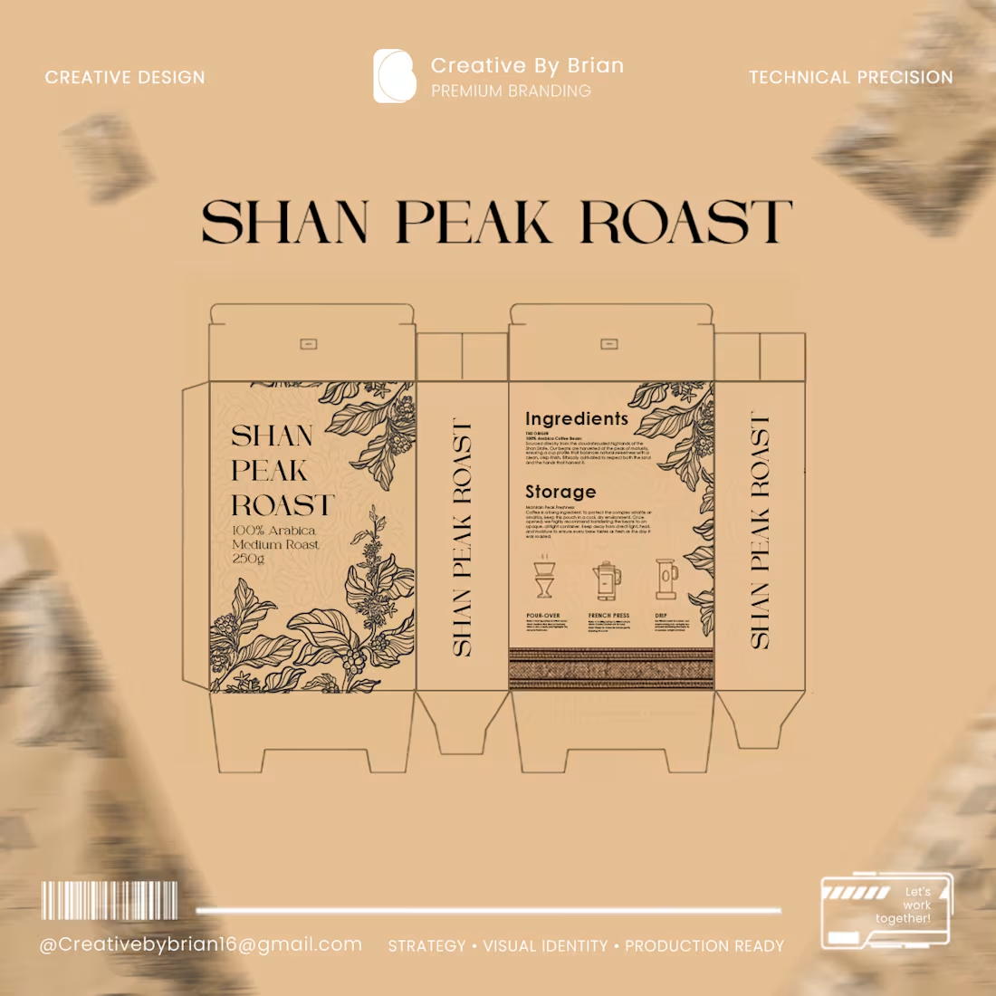
Design is about more than just looking good—it’s about how it performs in the real world. Hi everyone, I’m Brian. When I design packaging, I look beyond the screen. I consider how the product will appear on the shelf, how it will look when printed using Offset, Flexo, Rotogravure, or Digital printing, and the technical precision required for color accuracy, sizing, and font legibility. At Creative By Brian, I don’t just create logos and brand identities; I handle the entire print design process from start to finish. I work closely with clients to visualize their brand essence, ensuring that every design is perfectly 'production-ready' for the printing press. This meticulous attention to detail is what turns your product into a standout on the shelf. A huge thank you to Elizabeth for trusting me with the Shan Peak Roast project. If you want your products to reflect a standard of true quality, feel free to send me a message. Whether you need design concepts or a solution to a specific packaging challenge, I’m here to help you bring your vision to life. #CreativeByBrian #PackagingDesign #PrintDesign #BrandIdentity #GraphicDesign #ProductionReady
4
2
119
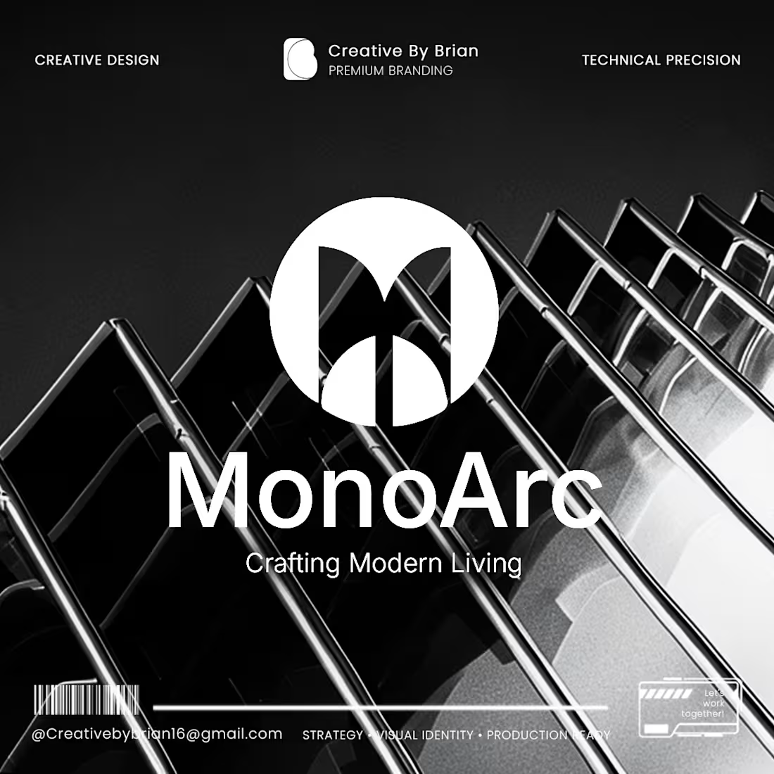
Cover image for Sometimes, the simpler the design,
Sometimes, the simpler the design, the more time and thought invested behind the scenes. Hello everyone, I’m Brian. Today, I’d like to share my experience working on the MonoArc branding project. Since MonoArc is an Interior Design brand, the biggest challenge was finding the perfect balance—ensuring the 'Modern Living' concept was clearly represented without over-designing, while avoiding a look that was too simple or lacked impact. I spent a significant amount of time contemplating how to create a design that instantly evokes a 'premium' feeling. Ultimately, by experimenting with angles and geometric shapes, I discovered the identity design I was looking for. By refining the visuals systematically based on a solid strategy, I was able to deliver the exact design the client envisioned. I would like to express my sincere gratitude to Ko Hein Min Htet, the Founder of MonoArc, for his trust and for collaborating with Creative By Brian from start to finish. When creating branding designs, I prioritize more than just drawing a logo. I always focus on how to effectively communicate the Brand Value and Brand Vision of your business to the audience. For me, dedicating time and synthesizing creative ideas to achieve great results is truly a joy. If you would like to discuss design solutions for your business, I am always ready to help. #BrandingDesign #BrandIdentity #InteriorDesignBranding #CreativeJourney #CreativeByBrian #VisualStrategy
0
17
Cover image for I see it all the
I see it all the time with business owners. There's this massive urge to cram everything into a single design—phone numbers, addresses, every single service. It feels like you're maximizing value, right? But biologically, our brains just instantly reject complexity. In psychology, it's called "Cognitive Load." When your visuals are cluttered, people don't read. They scroll past in milliseconds. Your ad budget wastes away, and that design becomes a barrier instead of an investment. Think about the market. Thousands of designs cross your screen daily, but you only remember a select few. Why? Visual Clarity. It’s the art of ruthlessly removing the noise so your core message hits the brain instantly. I’ve never operated as a standard order-taker who just moves text around a screen based on a checklist. With 4 years of industry experience specializing in minimalist, tech-forward, and geometric brand structures, I partner with businesses as a Strategic Visual Partner. Right now, I am actively looking for new brands to take on for Remote Freelance Projects. Let's stop trying to say everything, and start standing out. If you're ready to look at the bigger picture, I'm genuinely excited to hear your story. DM me today, and let’s talk about your brand vision. #CreativeByBrian #FreelanceDesigner #RemoteJobs #BrandIdentity #VisualClarity #CognitiveLoad #MinimalistDesign #StrategicPartner
1
34
Cover image for AMARA OASES — Premium Visual
AMARA OASES — Premium Visual Identity for High-End Hospitality In luxury hospitality, your visual identity is what allows you to confidently command premium room rates before a guest even steps onto the property. Today’s high-end travelers are moving away from loud, overdesigned logos; they look for "Quiet Luxury" and "Biophilic Minimalism"—spaces that feel elite, architectural, and deeply connected to nature. The Amara Oases project is built entirely around this shift. Every touchpoint—from the large-scale exterior signage to the clean typography on the staff badges and minimalist door hangers—is engineered to establish an immediate sense of elite standard. By utilizing disciplined negative space and structured layouts instead of heavy icons, the identity speaks directly to guests who willingly pay a premium for exclusivity and peace. Ultimately, it’s about transforming a physical property into a high-value brand that stands out globally. If you are a boutique hotel or luxury resort owner looking to elevate your brand's perceived value and attract premium clientele, let's connect. Feel free to send a direct message (DM) to discuss your upcoming project. #HospitalityBranding #LuxuryResort #BoutiqueHotelDesign #QuietLuxury #BrandIdentity #VisualArchitecture #MinimalistDesign #BrandStrategy #HotelDevelopment #CreativeByBrian
2
0
47
Cover image for When you’re designing for industries
When you’re designing for industries like civil engineering or architecture, the visuals have to feel just as solid as the structures they build. No gimmicks, no unnecessary fluff. Just pure stability. This is a concept I’ve been working on for APEX FORM. The whole idea was to strip away the noise and focus on raw geometric balance. If you look closely, the outer shape forms a sharp structural arch, while the inner line grounds the foundation. I paired it with a clean, heavy typeface and a high-contrast palette to make sure it commands presence, whether it's sitting on a tiny smartphone screen or on a massive construction site banner. At Creative By Brian, we look at branding as visual architecture. We don't just make things look good; we build frameworks that help businesses establish real authority in their market. If you’re ready to build an identity that actually lasts, let’s talk. Drop me a message and let's get to work. #LogoDesign #CorporateIdentity #Branding #CreativeByBrian #MinimalistDesign #GeometricLogo #ArchitectureDesign #BrandStrategy
1
32
Cover image for Designing a Timeless Logo and Premium Packaging for Pioneer ...
Pioneer Coffee needed a powerful visual system that celebrated its rich, established roots (Est. 2008) while appealing to the high-end, modern consumer market. The challenge lay in creating a detailed, authentic emblem that remained clean, scalable, and instantly recognizable on both massive physical store banners and tiny mobile screen icons. I engineered a timeless, symmetrical circular crest that wraps around traditional artisanal framing lines. By carefully stacking clean typography underneath a central, geometric coffee bean icon, the logo provides a grounded, trustworthy authority. For the packaging rollout, I created a premium, tactile layout utilizing sharp macro-photography rendering, gold accents, and organic leaf watermarks to maximize premium consumer perception and trigger higher conversion rates at the shelf.
2
1
59
Cover image for Merging the organic with the
Merging the organic with the geometric. I’ve always loved projects where I get to balance two opposing feels. For my latest project—The Lush Home Gallery—the goal was to make "nature" and "premium interiors" live together in one mark. I wanted the logo to feel "lush" without being messy. To do that, I integrated a leaf motif into a custom-serif 'L' and grounded the whole thing inside a clean, geometric house silhouette. It’s all about creating that sense of growth within a stable, high-end space. Seeing the identity come to life on the stationery and packaging (swipe to see the mockups!) is always my favorite part of the process. It’s where the strategy finally meets the real world. Curious to hear from my fellow designers—how do you handle blending organic shapes with sharp, geometric frames? Designed by Creative By Brian. #BrandIdentity #LogoDesign #InteriorDesign #CreativeByBrian #MinimalistDesign #VisualIdentity #BrandingCaseStudy
0
43
Cover image for Lann X is a visual
Lann X is a visual identity project focused on high-end minimalist aesthetics. As the Lead Designer, I developed a strategic brand system that balances modern technology with professional elegance. The process included crafting a unique visual mark that reflects the brand's core values, creating a versatile logo that maintains clarity across all sizes, implementing a refined color palette to position the brand in the premium market, and visualizing the brand's presence on digital interfaces to ensure a seamless user experience. This project demonstrates my commitment to quality and my ability to create timeless, strategic branding for global clients.
0
78
Cover image for Created high-impact visual assets and
Created high-impact visual assets and responsive design layouts for Makeup Revolution’s skincare line. The project focused on presenting product bestsellers through a clean, modern, and user-friendly interface. My goal was to enhance the digital shopping experience by combining aesthetic skincare photography with strategic typography and a responsive layout that works seamlessly across all devices.
0
81
Cover image for Visual identity and packaging design
Visual identity and packaging design for Pioneer Coffee, a brand focusing on high-quality Arabica and Robusta beans. The design captures the rich heritage and premium quality of the product through a sophisticated color palette and clean, modern typography. The goal was to position the brand as a leader in the premium coffee market, emphasizing flavor and authenticity.
0
85
Cover image for Mandalay Living is a high-end
Mandalay Living is a high-end lifestyle brand focused on modern furniture and interior aesthetics. My goal was to develop a minimalist visual identity that communicates luxury, comfort, and timeless elegance. The scope of work included a custom primary logo, a secondary mark for versatile usage, a refined color palette, and a clean typography system that aligns with premium market standards.
0
68