
Brian O'Connor
Strategic Brand Identity & Logo Designer for Modern Brands.
New to Contra
Brian is ready for their next project!


Building a brand isn't just about making things look "cool"
it's about solving real problems.
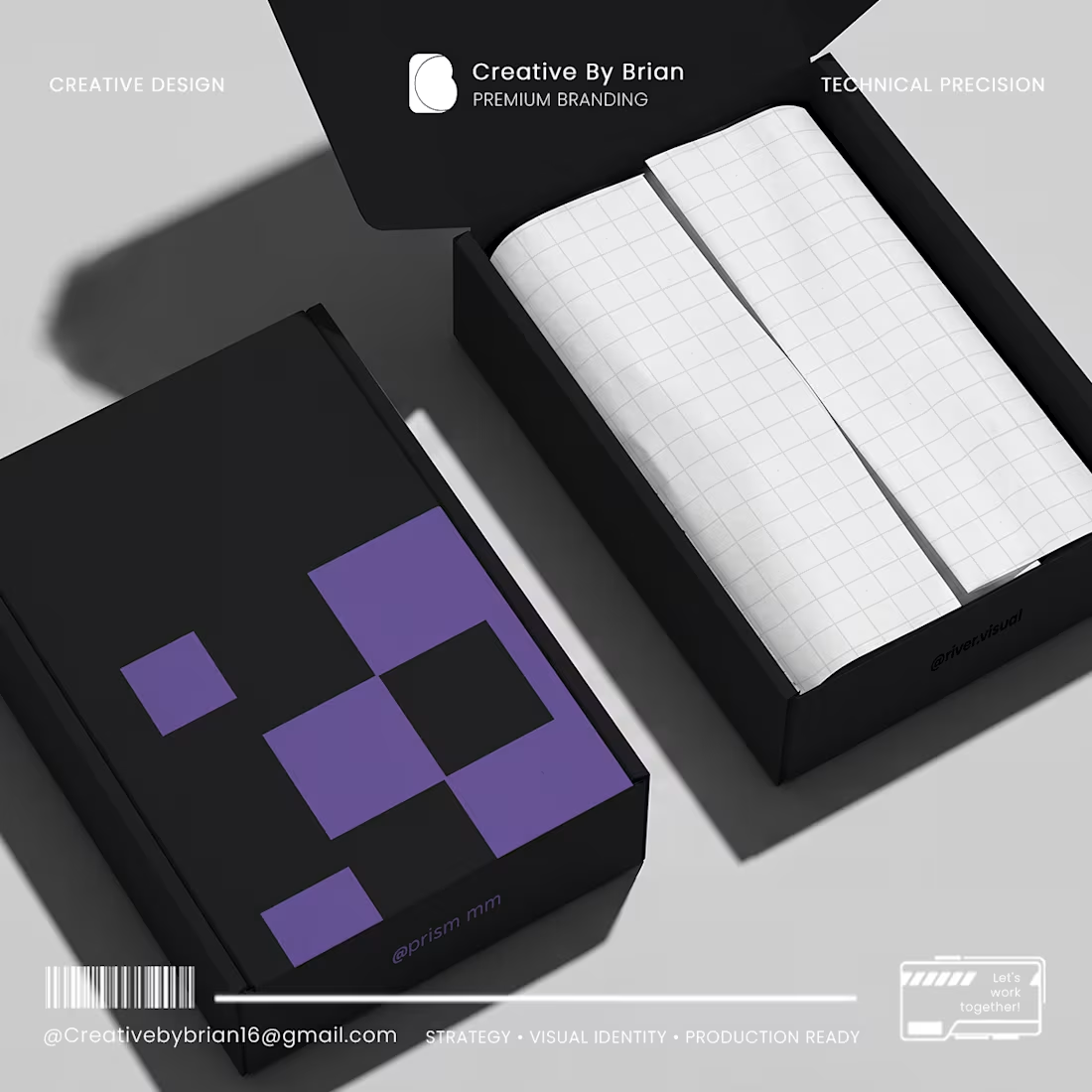
At Prism MM, I bridge the gap between creative visual identity and technical manufacturing. Whether you are launching a new product and need a dieline that actually fits, or you need a minimalist brand identity that cuts through the noise, I’m here to help you build a system that works.
I don’t believe in over-complicating things. I believe in clarity, geometric precision, and designs that are ready for the real world—from your digital screen to the final packaging on a shelf.
If you are a founder looking to turn your vision into a sharp, professional reality, let’s talk.
Let’s connect: Creativebybrian16@gmail.com (mailto:Creativebybrian16@gmail.com)
#BrandIdentity #PackagingDesign #PrismMM #GraphicDesign #FounderLife
0
29
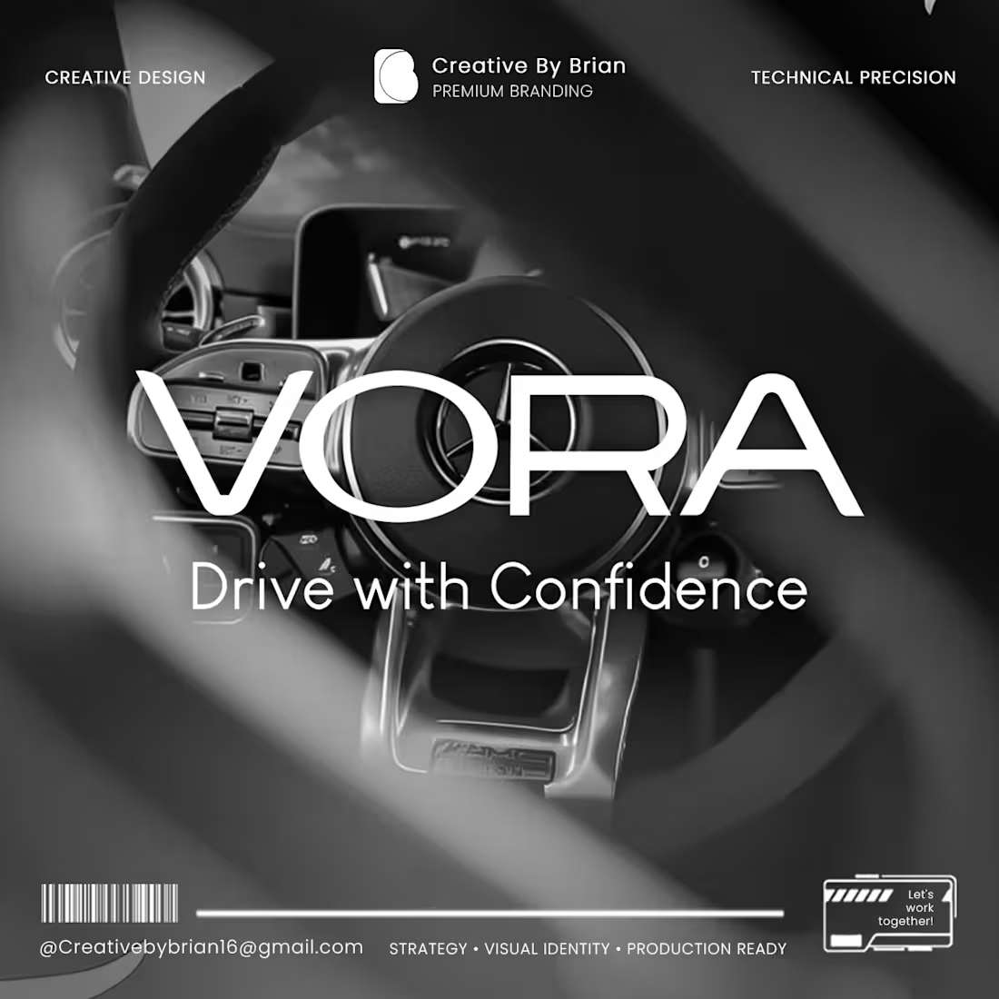
How do you translate premium into a visual language that commands trust the moment a customer steps into a showroom?
For the Vora branding project, the goal was simple but ambitious: create an identity that feels as high-performance as the vehicles they sell.
When we talk about "Driving with Confidence," it shouldn’t just be a tagline it needs to be the feeling a customer gets from the first point of contact. By blending minimalist design with technical precision, we’ve built a visual system that feels modern, reliable, and ready for the future of the automotive industry.
Branding is about more than just a logo; it’s about shaping how your audience perceives your value before they ever sit behind the wheel.
I’m really proud of how this identity came together. Does your brand’s visual presence match the quality of the experience you offer your clients?
Let’s chat about elevating your brand identity.
#BrandIdentity (https://www.linkedin.com/search/results/all/?keywords=%23brandidentity&origin=HASH_TAG_FROM_FEED) #GraphicDesign (https://www.linkedin.com/search/results/all/?keywords=%23graphicdesign&origin=HASH_TAG_FROM_FEED) #AutomotiveBranding (https://www.linkedin.com/search/results/all/?keywords=%23automotivebranding&origin=HASH_TAG_FROM_FEED) #CreativeByBrian (https://www.linkedin.com/search/results/all/?keywords=%23creativebybrian&origin=HASH_TAG_FROM_FEED) #VisualStrategy (https://www.linkedin.com/search/results/all/?keywords=%23visualstrategy&origin=HASH_TAG_FROM_FEED) #MinimalistDesign (https://www.linkedin.com/search/results/all/?keywords=%23minimalistdesign&origin=HASH_TAG_FROM_FEED) #BusinessGrowth (https://www.linkedin.com/search/results/all/?keywords=%23businessgrowth&origin=HASH_TAG_FROM_FEED)
2
51
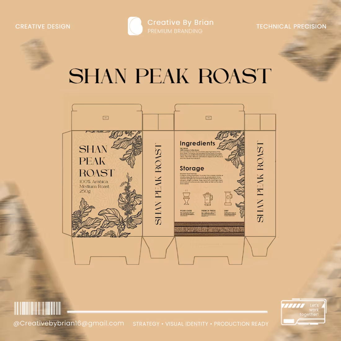
Design is about more than just looking good—it’s about how it performs in the real world.
Hi everyone, I’m Brian. When I design packaging, I look beyond the screen. I consider how the product will appear on the shelf, how it will look when printed using Offset, Flexo, Rotogravure, or Digital printing, and the technical precision required for color accuracy, sizing, and font legibility.
At Creative By Brian, I don’t just create logos and brand identities; I handle the entire print design process from start to finish. I work closely with clients to visualize their brand essence, ensuring that every design is perfectly 'production-ready' for the printing press. This meticulous attention to detail is what turns your product into a standout on the shelf.
A huge thank you to Elizabeth for trusting me with the Shan Peak Roast project.
If you want your products to reflect a standard of true quality, feel free to send me a message. Whether you need design concepts or a solution to a specific packaging challenge, I’m here to help you bring your vision to life.
#CreativeByBrian #PackagingDesign #PrintDesign #BrandIdentity #GraphicDesign #ProductionReady
4
2
118
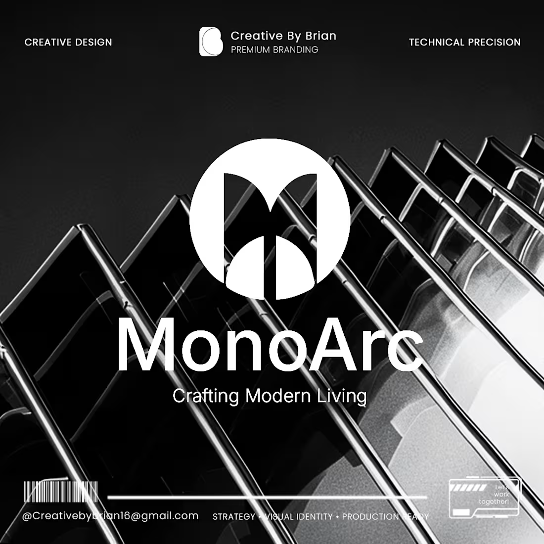
Sometimes, the simpler the design, the more time and thought invested behind the scenes.
Hello everyone, I’m Brian. Today, I’d like to share my experience working on the MonoArc branding project.
Since MonoArc is an Interior Design brand, the biggest challenge was finding the perfect balance—ensuring the 'Modern Living' concept was clearly represented without over-designing, while avoiding a look that was too simple or lacked impact. I spent a significant amount of time contemplating how to create a design that instantly evokes a 'premium' feeling.
Ultimately, by experimenting with angles and geometric shapes, I discovered the identity design I was looking for. By refining the visuals systematically based on a solid strategy, I was able to deliver the exact design the client envisioned. I would like to express my sincere gratitude to Ko Hein Min Htet, the Founder of MonoArc, for his trust and for collaborating with Creative By Brian from start to finish.
When creating branding designs, I prioritize more than just drawing a logo. I always focus on how to effectively communicate the Brand Value and Brand Vision of your business to the audience. For me, dedicating time and synthesizing creative ideas to achieve great results is truly a joy.
If you would like to discuss design solutions for your business, I am always ready to help.
#BrandingDesign #BrandIdentity #InteriorDesignBranding #CreativeJourney #CreativeByBrian #VisualStrategy
0
35