
Brian Kaduwa
Visionary Senior Brand & Communication Designer
New to Contra
Brian is building their profile!
Funeral Service Visual Identity
0
0

Learning from COVID-19, the world needs to prepare for respiratory pathogens that pose imminent threat to global public health. Thus I was tasked with branding a WHO department that would build global convergence post COVID-19, on pandemic preparedness planning. The brand identifier concept uses brackets ( ) and an upside down ⅄, to represent the guidance and explanation on what countries can or should do themselves in regards to planning for respiratory pathogen pandemic preparedness. This symbol echos human lungs and when animated the brackets expand and compress emphasising healthy breathing.
0
23

This website serves as a resource for policymakers, government officials, industry stakeholders, and computer science professionals, providing clear, credible information on AI capabilities to support informed decision-making, regulatory development, and the shaping of meaningful guidelines. The design strikes a deliberate balance: trustworthy, well-structured content paired with a clean, illustrated aesthetic that reflects the forward-looking nature of the subject matter. Across multiple AI literacy levels, each page is crafted to present complex information accessibly, ensuring no user feels overwhelmed, regardless of their technical background.
0
18
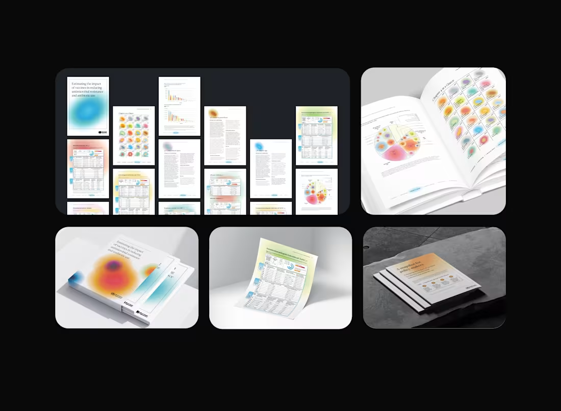
This project focuses on designing a layout report that estimates the impact of vaccines in reducing antimicrobial resistance and antibiotic use. The visual design employs custom color gradients to represent the 44 pathogens featured in the report’s scorecards, which show how each pathogen responded to various vaccines. Each vaccine adds a distinct color variation to the pathogens’ gradients, creating a visually engaging "color smoothie" that transforms a highly technical scientific document into an informative piece of visual art. The scorecard design was then adapted into an interactive dashboard, allowing users to filter results by vaccine and view specific impacts on individual pathogens.
0
14