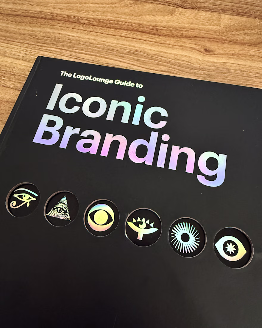
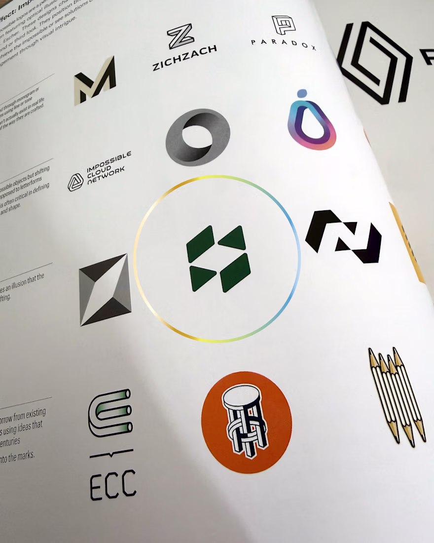
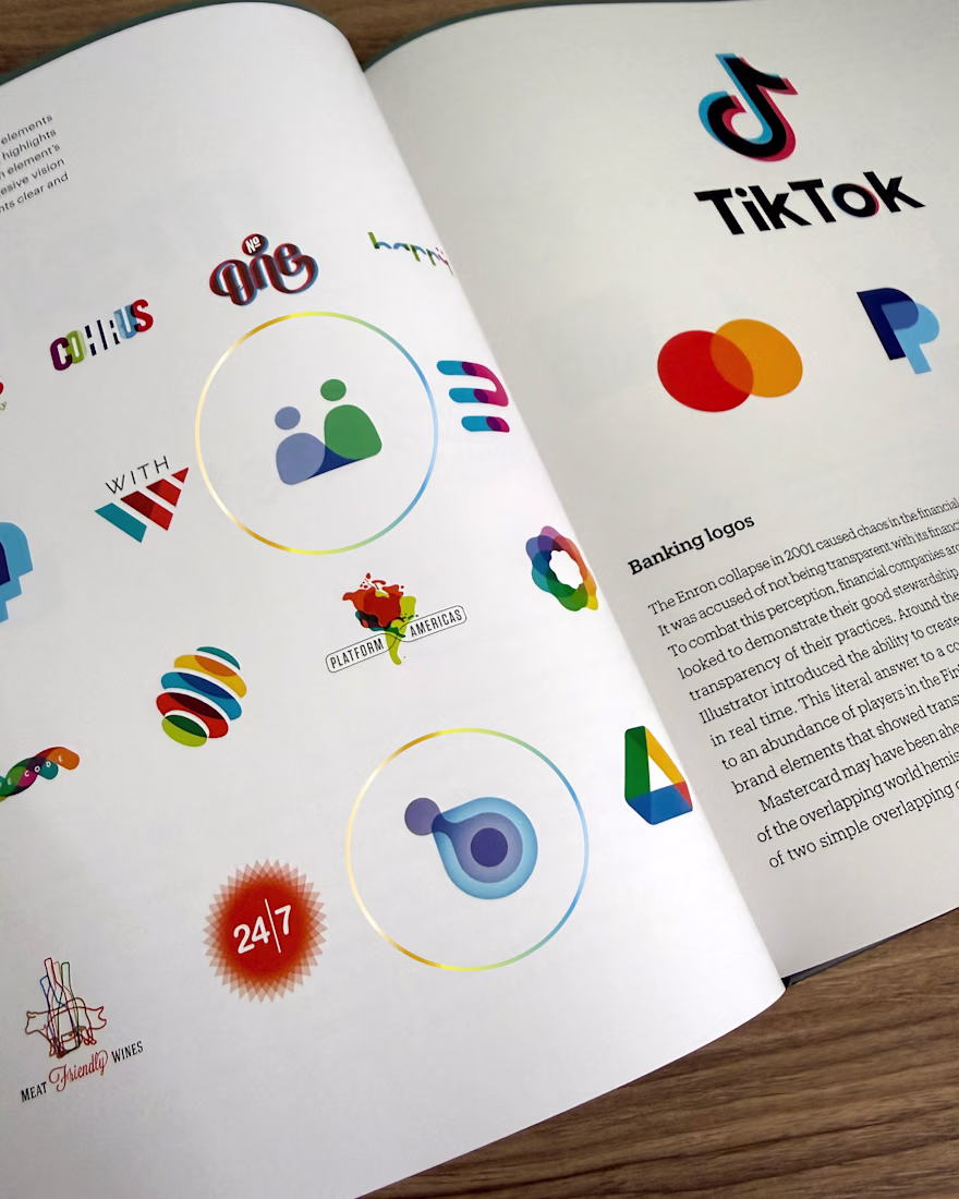
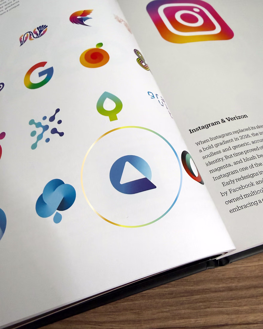
Featured in The LogoLounge Guide to Iconic Branding
Seven Brandforma logos are published in Bill Gardner's new book, selected from thousands of international submissions and printed alongside marks from Instagram, PayPal, Mastercard, TikTok, and Renault.
This is the eleventh...
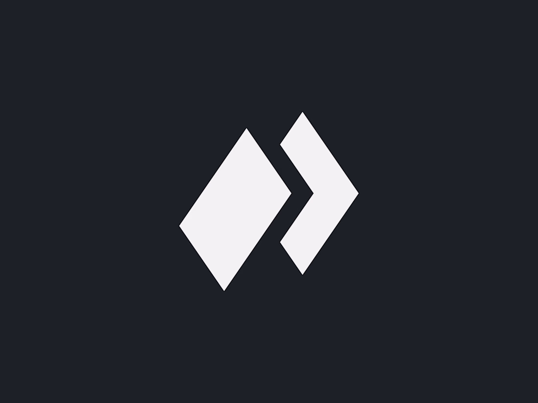
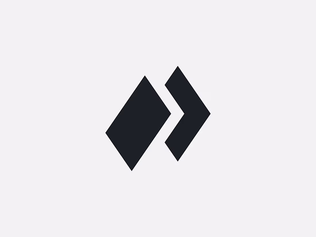
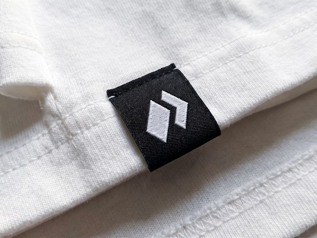
Exclusive premade P arrow logo — one buyer, full copyright transfer.
Two heavy angled blocks merging the letter P with a forward arrow: a foundational pillar and a chevron pulling the mark forward. Built for logistics networks, performance marketing agencies, and rapid-deployment...
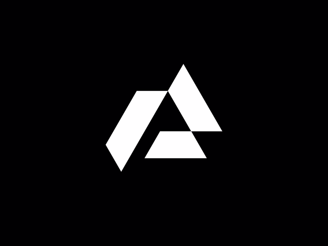
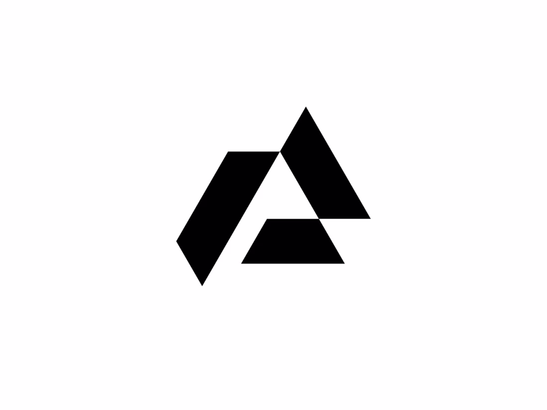
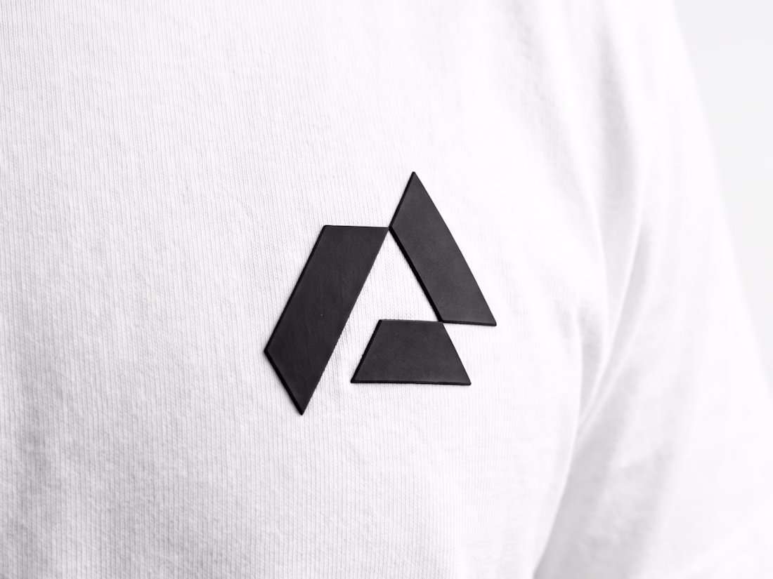
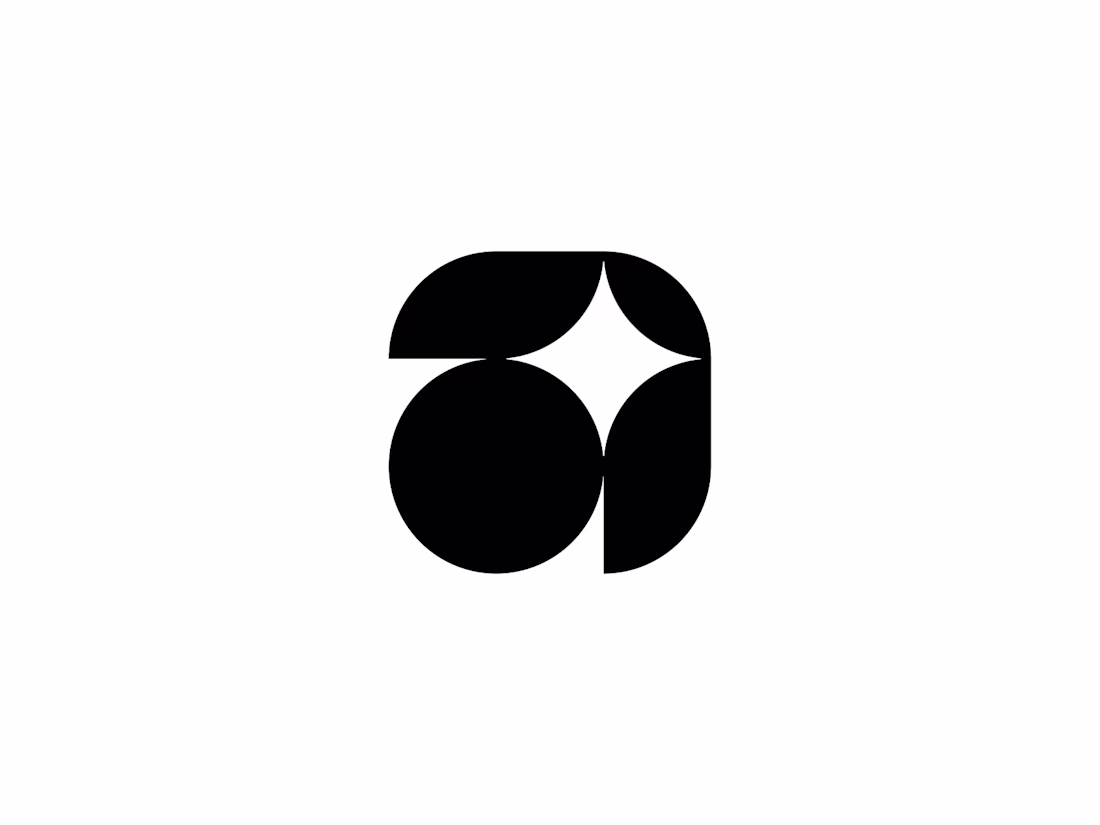
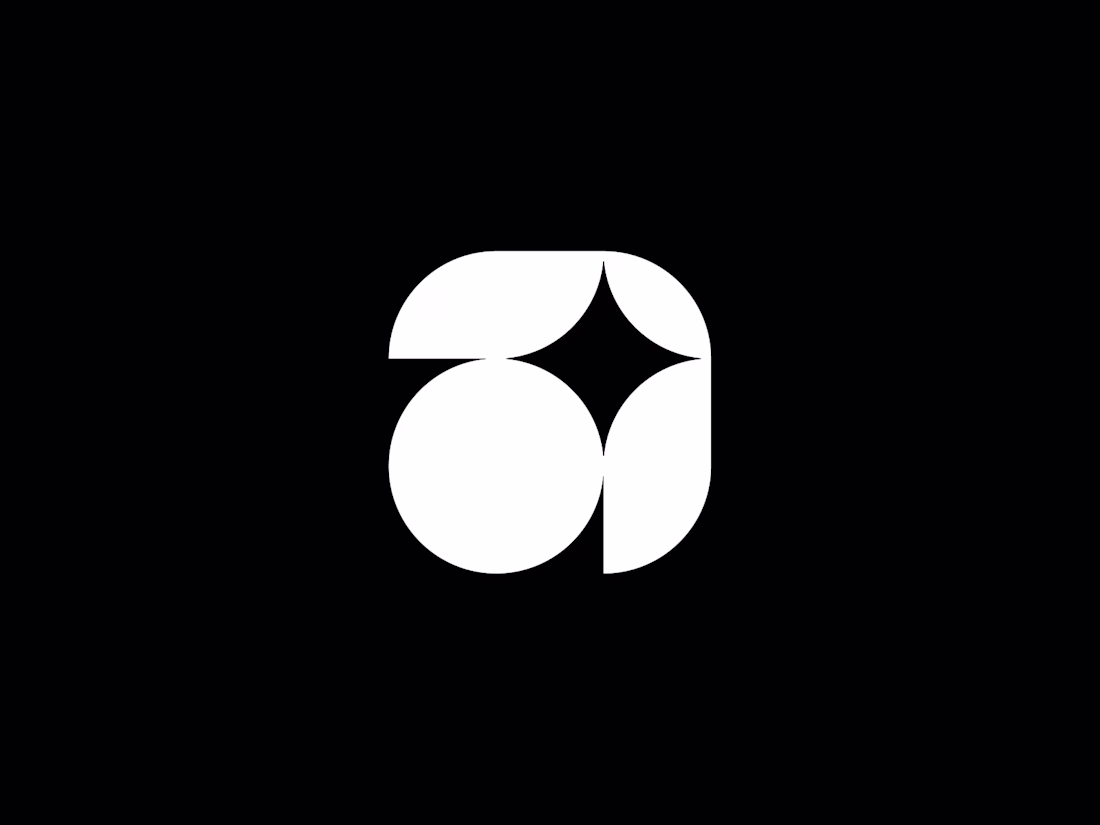
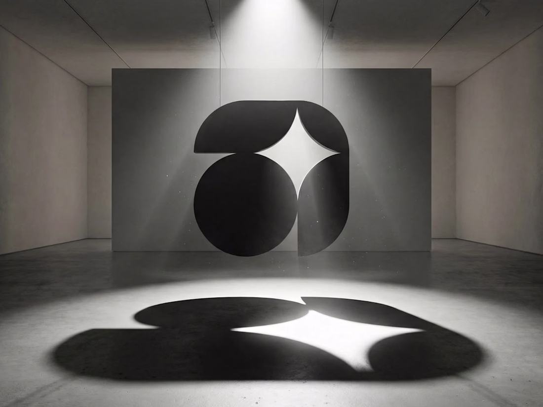
Exclusive Letter A With Spark Logo — available for purchase.
An abstract letter A crafted from clean geometric shapes, with a clever negative-space spark at the apex evoking innovation, insight, and rapid activation. Designed for AI startups, tech platforms, educational tools,...
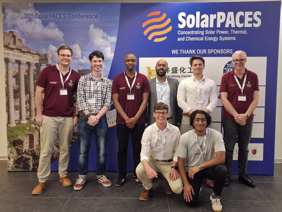
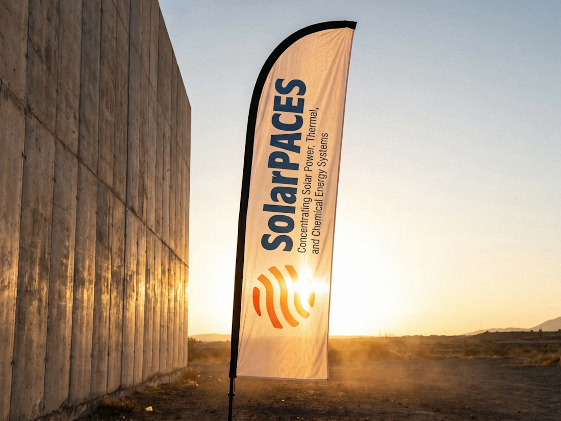
SolarPACES — brand identity for the international IEA research network advancing concentrating solar power.
An orange gradient globe built from flowing solar bands, developed as a full identity system: deep blue and orange palette, monochrome and reversed lockups, plus a vertical...


Exclusive premade PW monogram logo - one buyer, full copyright transfer.
Built with a brutalist mindset using heavy intersecting geometric slabs to create a dominant, mountain-peak silhouette. Perfect for commercial real estate moguls, heavy-industry innovators, and capital...