
Bobai Gajere
Graphic Designer and Video Editor building modern visuals
Ready for work
Bobai is ready for their next project!
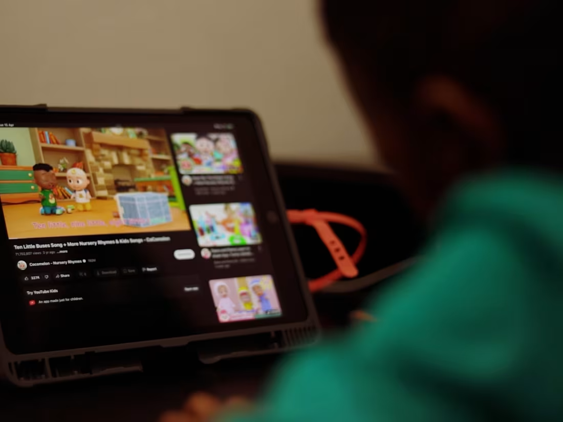
For a sustainable energy company, I filmed and edited this piece.
The advertisement's vision board showcased a portable power station and its ease of use, suggesting that even the youngest consumers could use it in the event of a power loss with the push of a button.
The goal of this campaign was to demystify sustainable energy. Portable power stations can often feel like complex "tech gear," but the objective here was to show that this product is a seamless addition to any home. We centered the narrative around extreme user-friendliness—proving that the interface is so intuitive, even a child can navigate it safely and effectively.
0
35
The Goal was to transform standard interview footage into a cinematic narrative that reinforces the subject’s authority.
Single camera, tight framing. Shallow depth of field. Neutral or dark background — let the face and the words carry the weight.
0
39
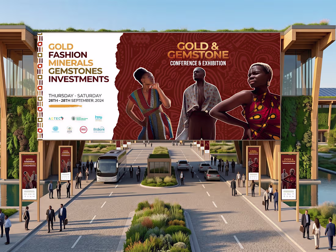
The Gold and Gemstone Conference and Exhibition is a trade event bringing together industry professionals, dealers, and specialists within the precious metals and gemstone sector. This project involved designing a series of event banners—presented in professional mockups—to serve as the visual anchor of the conference's physical presence.
Every design decision was made with the audience in mind: trade professionals who expect a high standard of presentation. The mockup presentation demonstrates how the designs translate from concept to real-world application, giving a clear picture of how the work would perform in the actual event space.
1
63
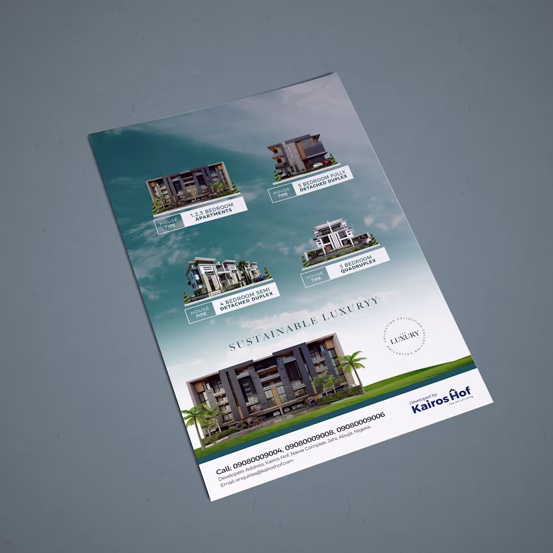
Kairos Hof is a luxury and sustainable real estate brand built on the belief that premium living and environmental responsibility are not a compromise — they are a standard. This project involved designing a set of print-ready flyers that communicate that dual identity with clarity and confidence.
The design work focused on translating Kairos Hof's brand positioning into tangible marketing collateral — balancing the visual language of high-end real estate with the clean, grounded aesthetic that sustainability demands. Every layout decision was intentional: structured compositions, refined typography, and a visual tone that speaks directly to a discerning audience.
The result is print-ready material that doesn't just advertise property — it sells a lifestyle and a set of values.
0
68
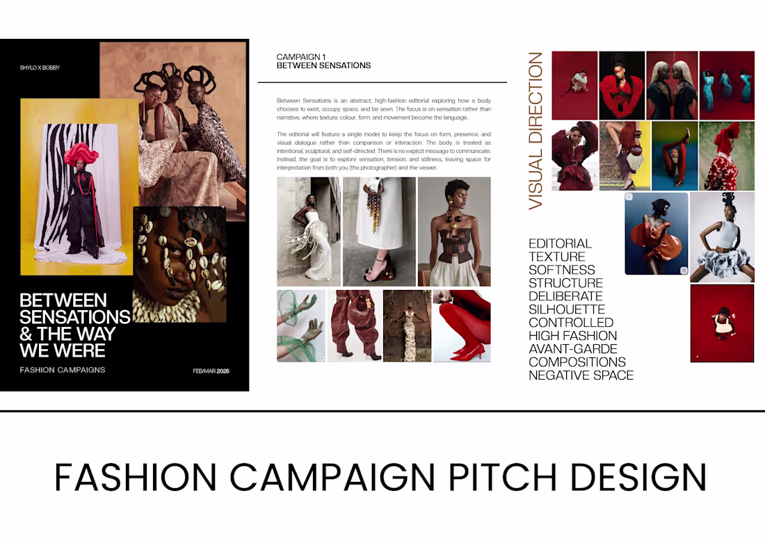
This is a self-initiated fashion campaign pitch exploring editorial art direction and high fashion visual storytelling. The project was designed as a concept lookbook—built to demonstrate how graphic design can shape the narrative and aesthetic identity of a fashion campaign from the ground up.
This project represents my approach to fashion design work: treating each spread not just as a layout but as a visual statement.
0
69
Exploring the future of fashion photography.
A deep dive into the intersection of fashion and technology. I created this series of AI-generated images to explore how emerging tech can elevate brand storytelling.
1
86
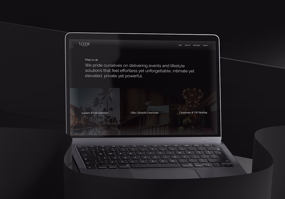
Luxury Concierge Website.
To make a digital interface that shows how great the service is at a high-end concierge. The goal was to make it feel like a "digital private club" that would appeal to wealthy people.
The Approach
Minimalist Elegance: A "less is more" UI that makes things feel more exclusive.
Lifestyle-First Imagery: Put high-quality images that sell the experience, not just the service, at the top of the list.
Seamless UX: Made it easy for clients who value their time above all else to get around.
1
95
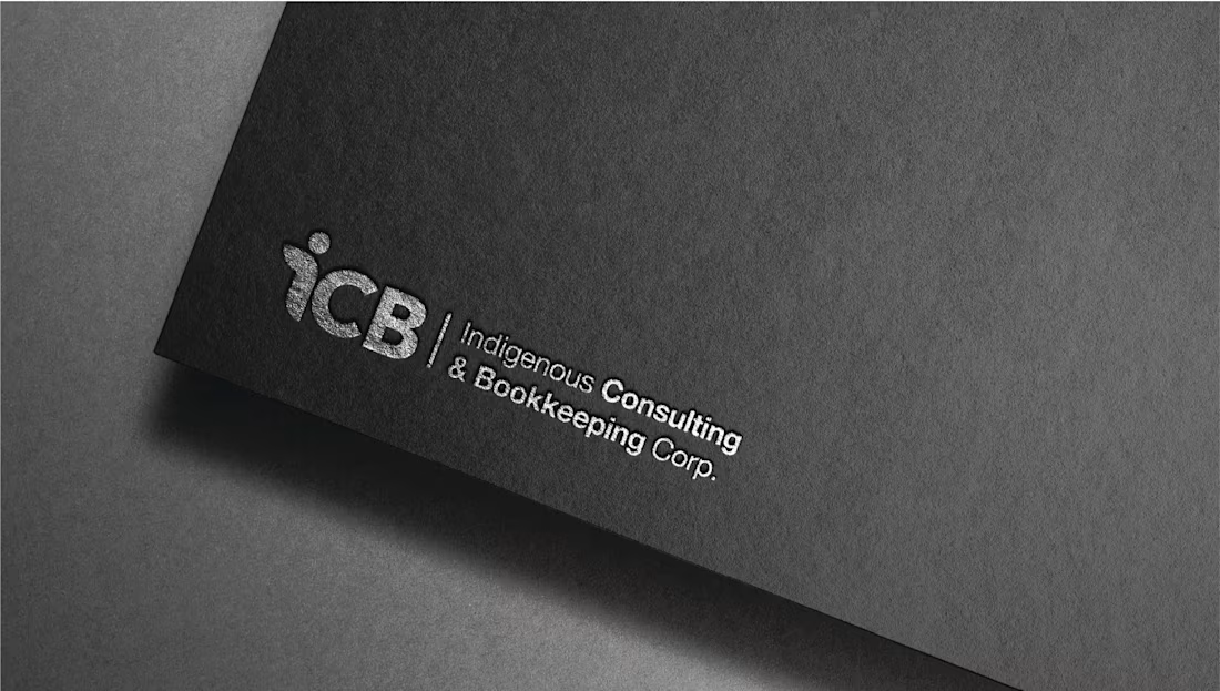
A Look at the Project
I was hired to create the basic visual identity for a Canadian company that does professional bookkeeping and financial services. The goal was to get rid of the "stiff and outdated" look that is common in the accounting industry and make a brand that small business owners and entrepreneurs can trust deeply, feel modern, and be mathematically accurate.
The Problem
The "trust factor" is what financial branding is all about. The identity had to convey accuracy and stability without coming across as cold or unwelcoming. The client wanted a look that would stand out in a professional LinkedIn feed but also make a business owner feel safe when they gave them their financial records.
1
106
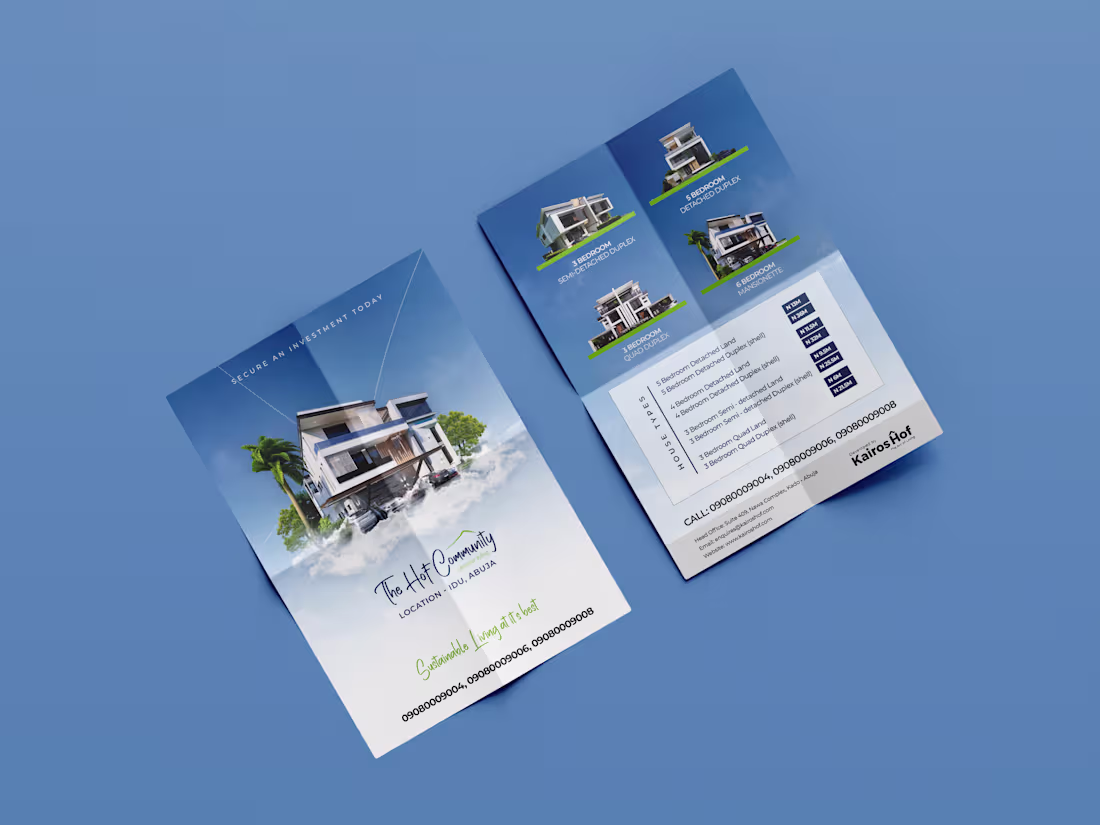
Overview of the Project
I made a set of high-end printable flyers for a Sustainable real estate company to use at open houses and private property showings. The goal was to get rid of cluttered, "salesy" templates and make a more sophisticated, editorial-style document that potential buyers would want to keep.
The Problem
Real estate flyers often have too much information, like too many pictures, too much small print, and loud "Call to Action" buttons. The task was to put important property information (square footage, amenities, prices) into a neat, structured layout that looked more like a page from an architectural magazine than a regular ad.
1
106
Project Summary
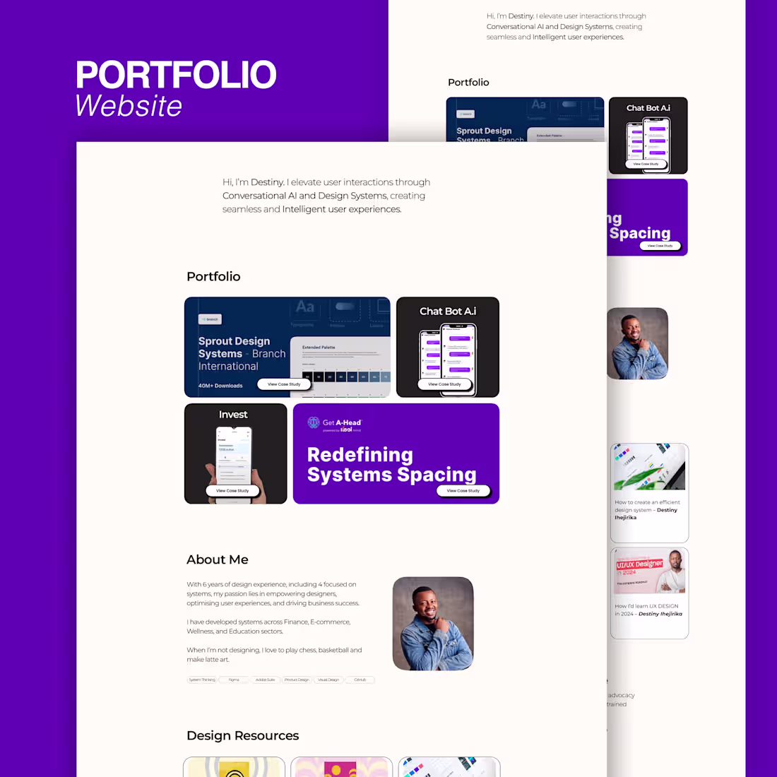
A Senior Product Designer hired me to make and build a digital portfolio for them. The goal was to make a "digital gallery" that looked and felt high-end and invisible. This way, the client's complicated UX case studies and UI prototypes could be the main focus without any visual distractions.
Key Features
Interactive Case Study Templates: Modular sections for "Problem," "Process," and "Solution."
Light Mode Strategy: A refined color palette that supports high-contrast accessibility.
High-Speed Performance: Optimized all image assets and prototypes for near-instant load times.
0
106
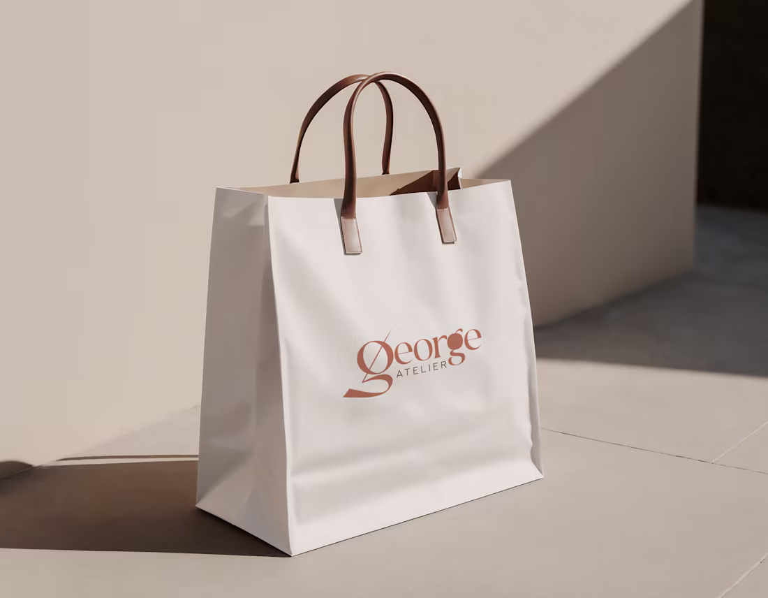
Project Overview
The goal was to develop a visual language that balances editorial elegance with commercial appeal, ensuring the brand feels at home both on a clothing label and in a high-traffic e-commerce storefront.
Deliverables
Full Logo Suite: Primary logo, secondary stacked version, and a simplified monogram.
Typography System: A pairing of a high-fashion display font and a highly readable functional font for web descriptions.
Brand Pattern: A repeating motif based on the logo for use on tissue paper and inner garment linings.
Social Media Kit: High-end templates for "Collection Launches" and "Behind the Atelier" content.
1
112
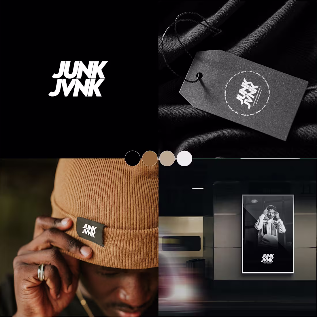
Identity for junkjvnk—where high fashion meets the grit of the street. ⚡️
The name is loud, so the branding had to be disciplined.
Simplicity is what I was looking to achieve.
What do you think?
2
119
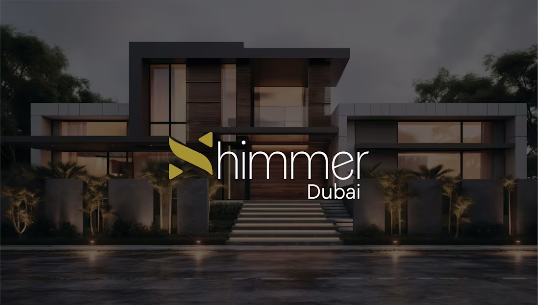
Project Overview
I was commissioned to develop a comprehensive brand identity for a high-end real estate firm based in Dubai, specializing in off-plan luxury villas and penthouse acquisitions. The goal was to create a visual presence that felt as premium as the multi-million-dollar properties they represent, targeting high-net-worth individuals globally.
Deliverables
Primary Branding & Logo Suite: Including specialized versions for gold-foil printing and digital watermarking.
Social Media Kit: A 20-piece template library for Instagram and LinkedIn, optimized for high-engagement property reveals.
Digital Brand Guidelines: A comprehensive manual on maintaining visual "airiness" and luxury spacing across all marketing collateral.
1
104
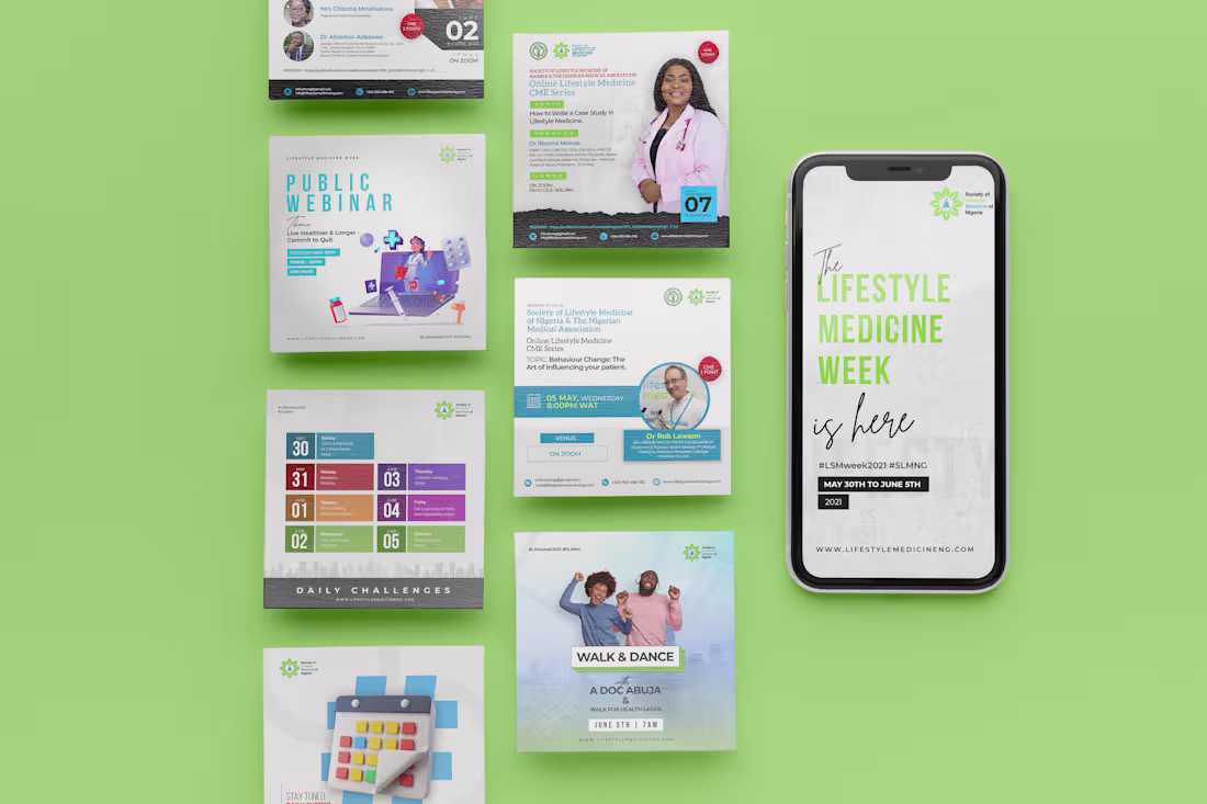
Project Overview
I collaborated with the Society of Lifestyle Medicine of Nigeria, a lifestyle health and wellness brand, to define and execute their social media visual strategy. The objective was to move beyond generic "wellness" imagery and create a sophisticated, high-trust digital space that resonates with a modern, health-conscious audience for their events.
Strategic Solutions
Aesthetic Direction: Developed a "Breathe & Balance" visual theme
Educational Infographics: Translated complex health benefits and ingredient lists into clean, "saveable" carousels that users could refer back to, increasing the brand's organic reach.
Community Engagement Assets: Designed interactive Instagram Story templates for "Wellness Check-ins" and "Q&A with Experts" to foster a two-way conversation with the brand's community.
1
99
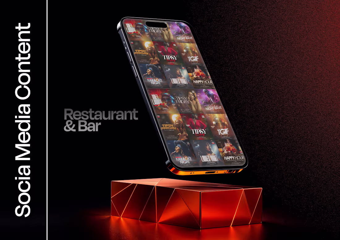
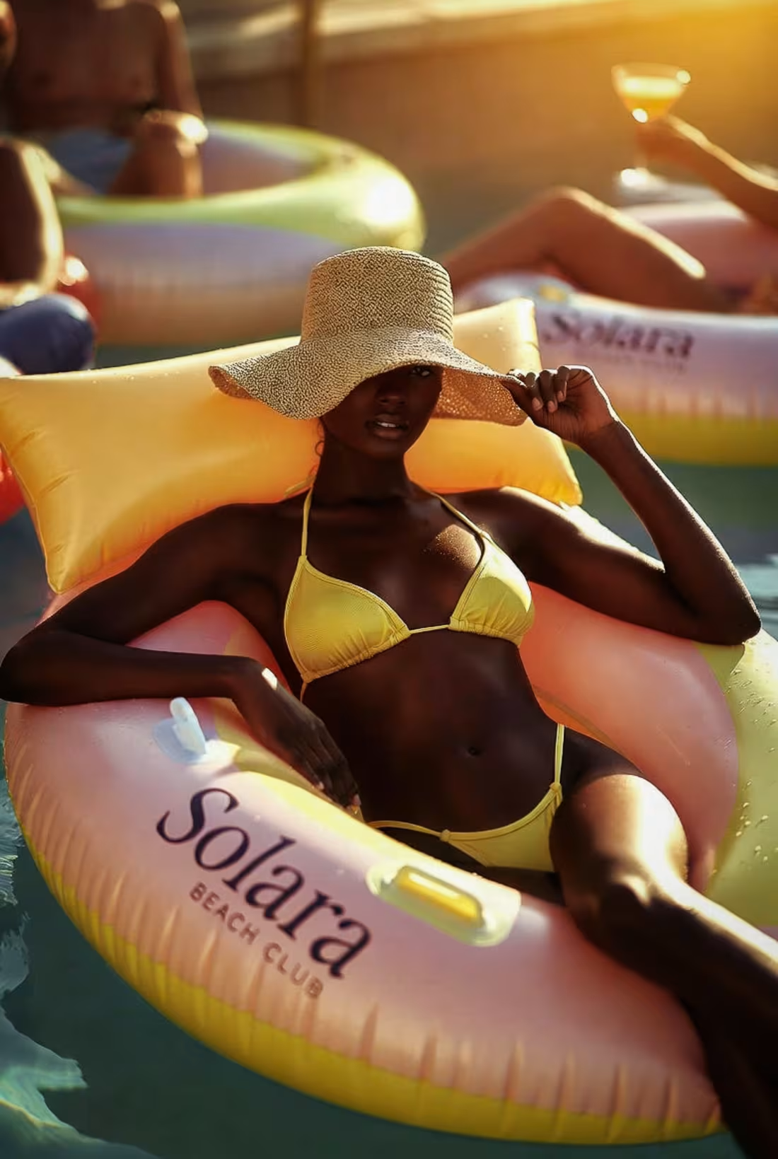
Visual Identity & Social Media Growth for Restaurant & Bar
Project Overview
The goal was to bridge the gap between their high-end physical dining experience and their online persona, ensuring that every post felt as inviting as walking through their front doors.
Strategic Solutions
Unified Visual Language: Established a "Signature Edit" moody lighting and deep shadows to emphasize the textures of the food and the bar.
Content Pillars & Templates: Designed a suite of reusable templates for "Weekly Specials" and "Happy Hour" to ensure brand recognition.
Event Promotion Strategy: Created high-impact posters for themed nights and guest DJ sets.
Grid Curation: Managed the aesthetic flow of the profile, balancing "hero" food shots with lifestyle "vibe" shots to tell a complete story of the guest experience.
0
129
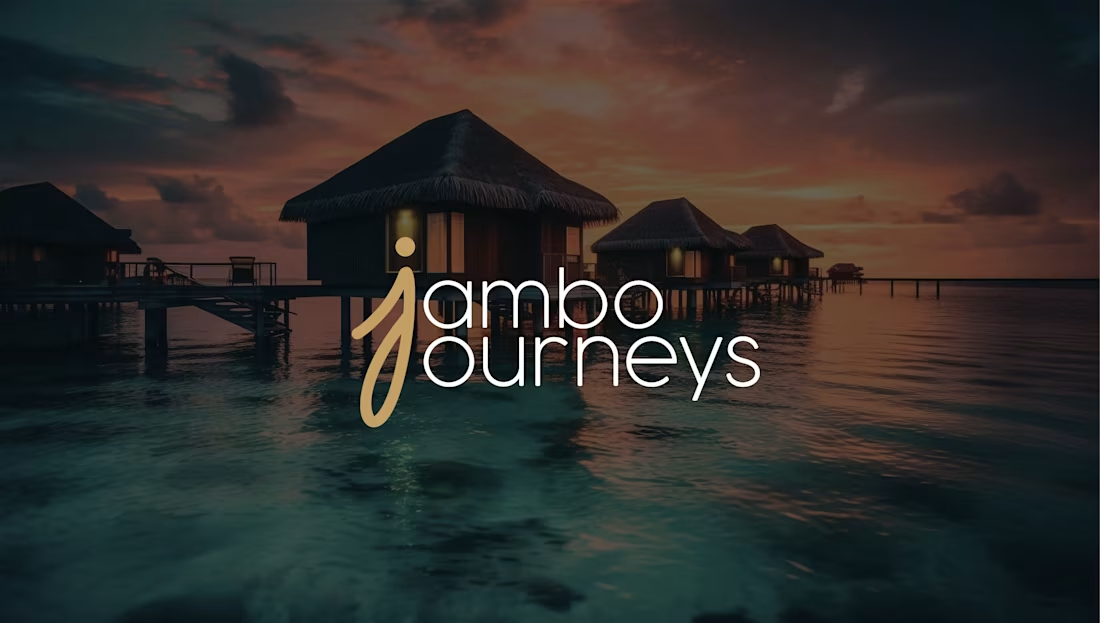
Brand Identity & Logo Design for Jambo Journey
Project Overview
A premium travel and tour agency specializing in curated African adventures. The goal was to build a brand that feels both adventurous and trustworthy, welcoming travelers to explore new horizons with confidence.
My Creative Process
Logo Concept: I developed a custom wordmark and icon that balances organic shapes with professional geometry. The "J" in the logo subtly mimics the path of a journey.
Color Psychology: I curated a palette of Earth Tones to reflect the natural landscapes of the tours while ensuring high contrast for digital legibility.
Typography: Selected a pair of fonts—a bold, adventurous heading font for excitement and a clean, sans-serif body font for travel itineraries and booking details.
1
113
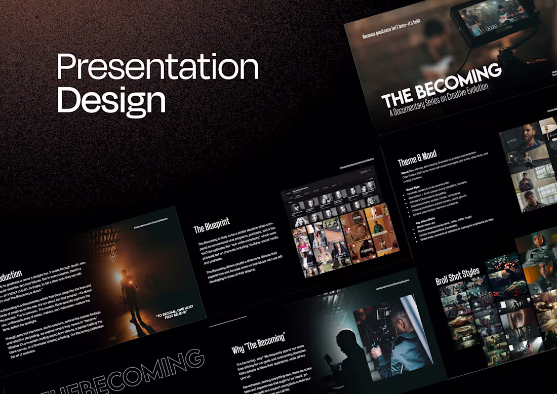
Documentary Pitch Deck & Visual Treatment
Project Overview
The goal was to create a compelling visual narrative that would secure funding and production partnerships by clearly articulating the film's mission, visual style, and emotional core.
The Challenge
Documentary pitches often deal with dense information and heavy themes. The challenge was to organize complex research, character bios, and production timelines into a deck that felt cinematic rather than corporate. It needed to move the audience emotionally while proving the project's feasibility.
5
3
169
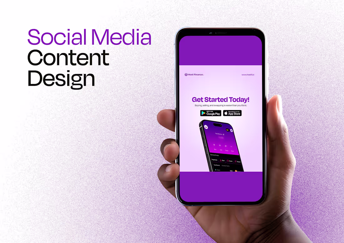
Social Media Content for HostFi
HostFi is a rising Fintech platform. HostFi simplifies the digital economy by allowing users to buy/sell crypto, swap assets for free, and use virtual cards for global payments. My goal was to translate these complex financial services into visually engaging, easy-to-digest content that builds user trust.
The Challenge
The crypto space is often seen as intimidating or overly technical. HostFi needed a visual direction that felt "Secure, Simple, and Smart"—their core brand pillars—to appeal to both seasoned traders and crypto beginners.
As the Lead Graphic Designer/Editor for this project, I developed a consistent "Tech-Forward" aesthetic with brand colours and clean typography.
1
126
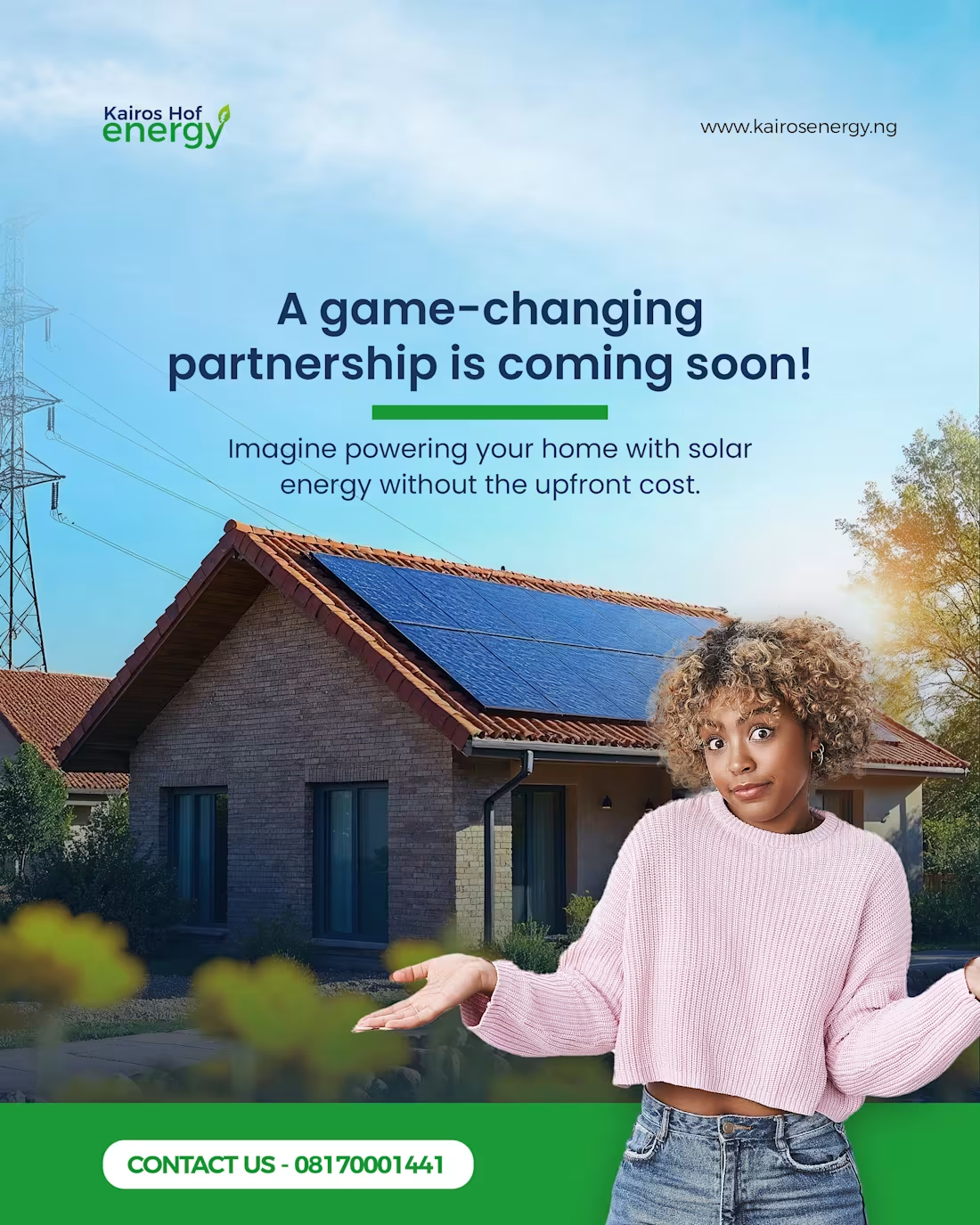
Project Title: Visual Content for Sustainable Power: Kairos Energy
The Goal: To translate complex green energy technology into engaging, consumer-friendly visual content. The objective was to launch two flagship products—a Mini Portable Generator and a Lithium Inverter + Solar System—positioning them as essential tools for modern, eco-conscious living.
The Result: A cohesive content library that builds trust through transparency and educational value, driving both engagement and informed sales.
2
173
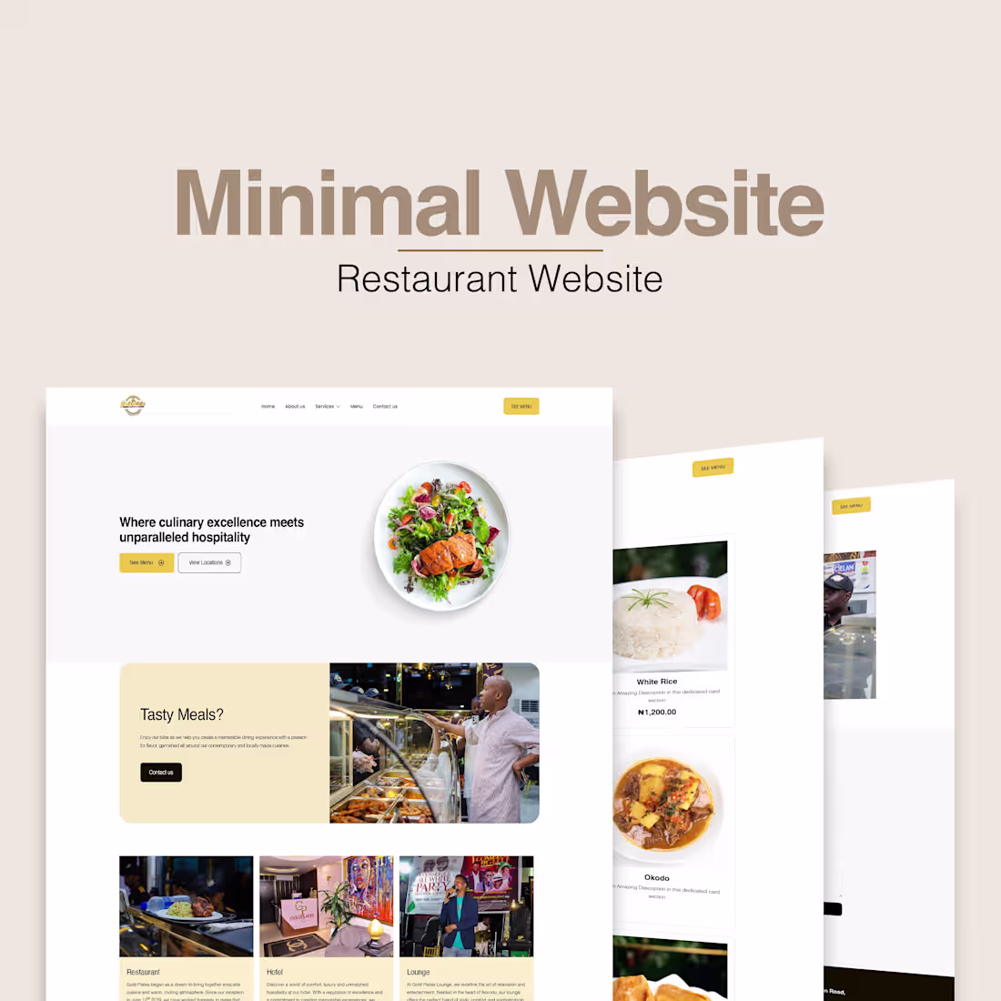
Project Title: Hospitality Platform: Goldplates Feast house
The Goal: To create a unified digital home that balanced their culinary excellence with their luxury accommodations. The challenge was to create a seamless user journey where guests could browse the menu, explore different locations, and learn about the hotel offerings without feeling overwhelmed.
The Approach
Unified Brand Identity: Developed a design system that works for both high-energy dining and calm, luxury lodging.
Interactive Menu Catalog: Built a visually-driven food catalog designed to drive "appetite appeal" through high-resolution imagery and intuitive categorisation.
2
164
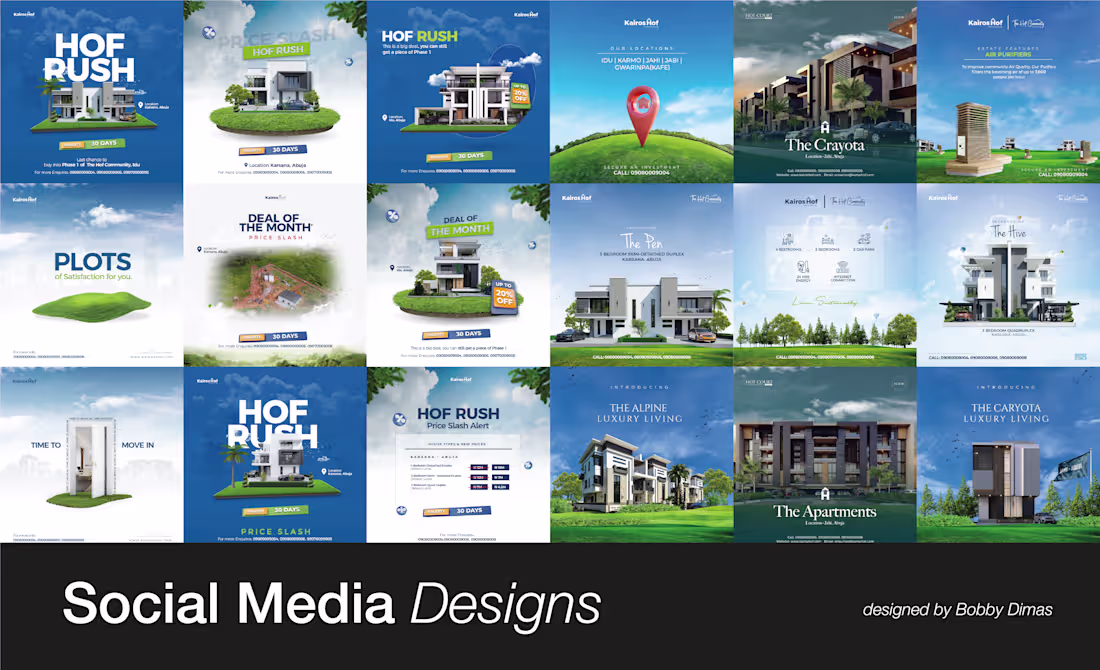
Premium Social Media Identity for Kairos Hof :
The Challenge: The real estate market is saturated with generic "Just Listed" posts. The client needed a sophisticated visual system that conveyed market expertise and high-end service, moving away from cluttered, "amateur" templates.
The Solution: I developed a cohesive social media design system focused on minimalist layouts and bold typography. By prioritizing high-quality architectural photography and clean white space, we created a digital "open house" experience on Instagram and LinkedIn.
Key Features:
- Property Showcases: High-impact "Just Listed" and "Sold" templates.
- Strategic Hierarchy: I used high-contrast colors and clear "Action" buttons in the designs to guide the viewer’s eye toward the contact info.
4
158
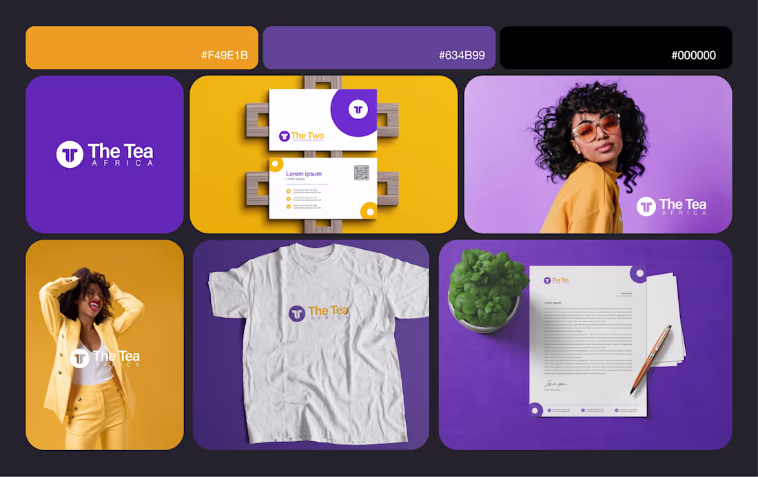
Project Title: Logo Design & Brand Identity for The Tea Africa
The Goal - The Tea Africa came to me with a challenge: they were fresh in the market and needed a brand identity that felt fun, energetic, digital-first, and disruptive—reflecting the fast-paced nature of the modern creator economy.
The Approach
Concept: I focused on the theme of "Connection."
Design System: I moved away from static imagery and created a dynamic grid system that allows the talent’s work to be the hero while the branding stays recognisable.
The Deliverables
Primary & Secondary Logo Marks
Social Media Brand Kit
Brand Style Guide (Typography & Color Theory)
2
152