Blue Meridian Studio
Helping brands move from confusion to clarity.
Ready for work
Blue is ready for their next project!
OK...how come NO ONE expressed how straightforward and awesome jitter is!?
We just started playing around with it, and it's a game changer
1
13
159
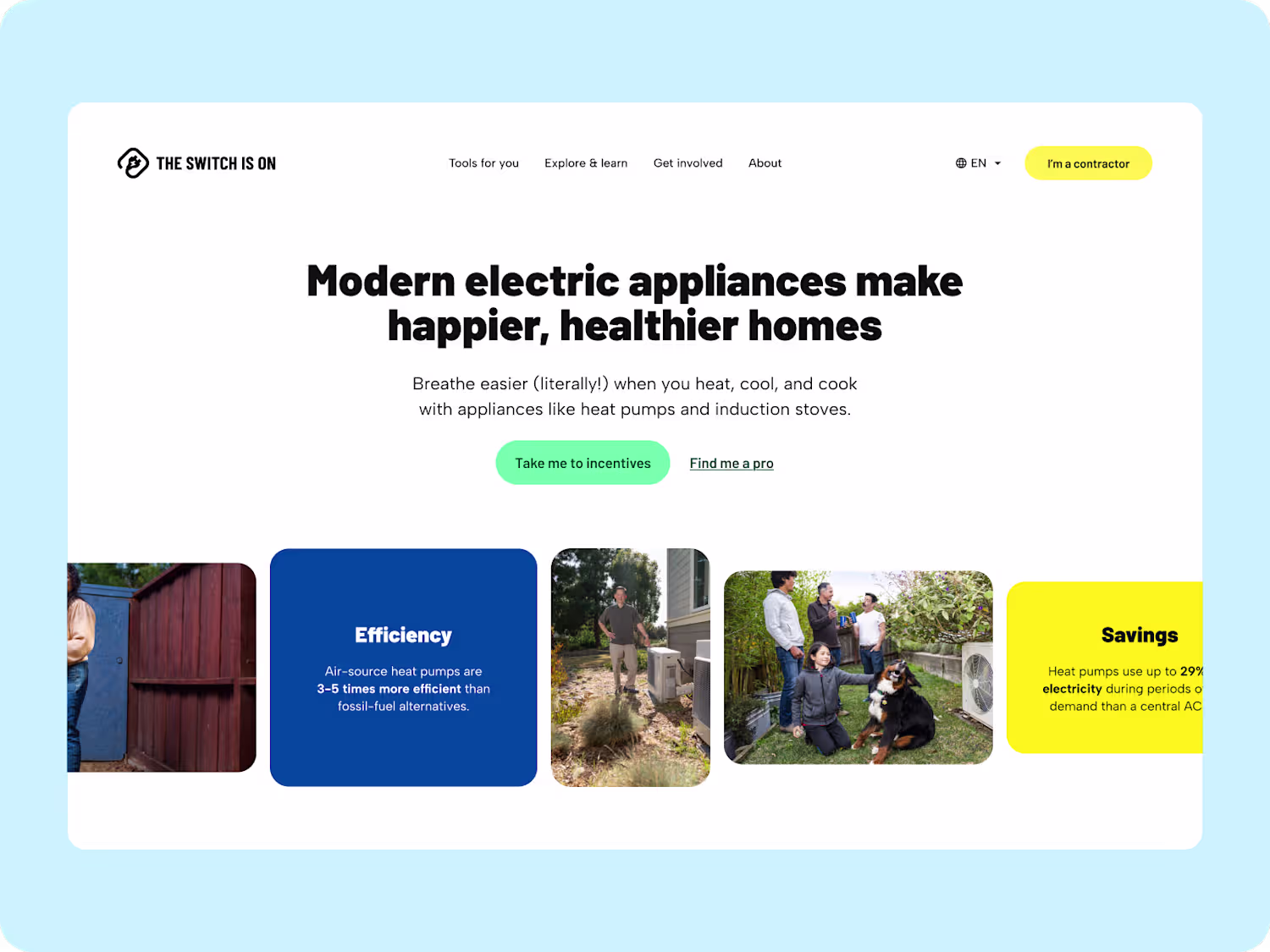
We’ve been quietly refreshing The Switch Is On: evolving how the brand looks, feels, and speaks.
The updated system introduces a more grounded tone of voice, cleaner visuals, and a refreshed logo family designed to carry across programs, states, and partners.
It’s still the same mission, helping people make the switch to clean, electric living: just with a sharper identity to match where the movement is headed.
⚡ New tone. New visuals. Same purpose.
2
2
109

Almost ready to launch the refreshed brand for the Switch Is On: very excited with the output
33
247
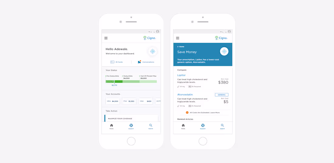
Back in December 2017, we had the opportunity to collaborate with EY and Cigna Health to redesign the Cigna Health OneGuide: a digital healthcare experience focused on improving how patients track and manage chronic back pain.
Our work included designing the system architecture, over 60 healthcare sensing scenarios, and a full set of mobile app interfaces to make the experience more human, responsive, and intuitive.
We also assisted in three rounds of patient testing and refinement with over 40 participants, ensuring the new experience was as empathetic as it was effective.
0
89
A concept born from one of our members, years in the making. With AI, we finally brought it to life.
Meet K.O.B.E — Kill Or Be Eaten (sound on 🔊).
32
238
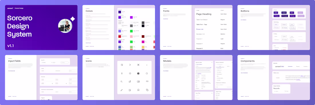
We turned Sorcero’s fragmented design patterns into a living system.
One source of truth across 4 platforms, 6 teams, and a growing AI-driven product suite.
Design became invisible. Momentum became visible.
More to come soon.
14
148
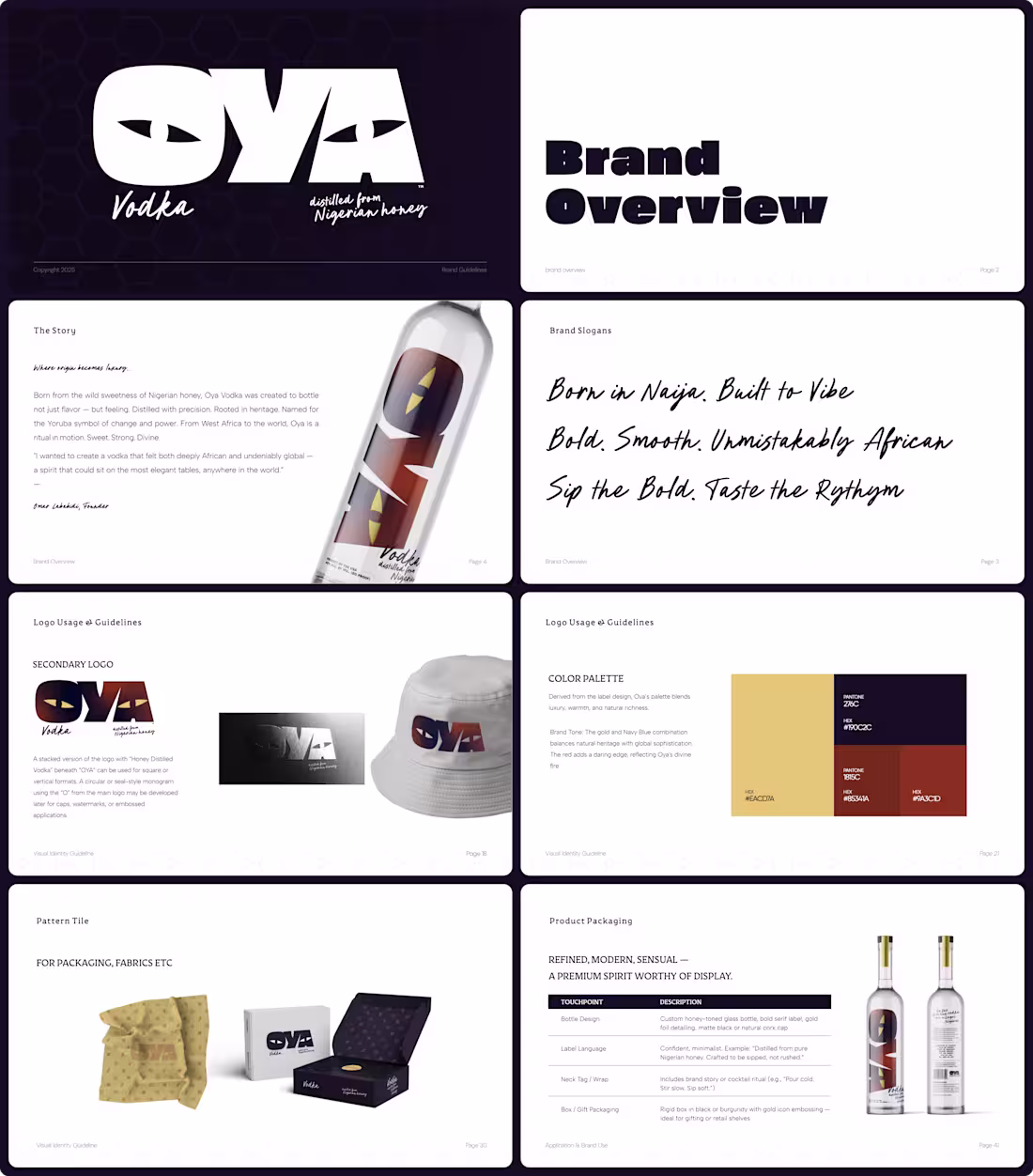
Oya Honey Vodka
Bold. Smooth. Unmistakably African.
We didn’t design the logo, but we built a world that gives it meaning.
Rooted in Yoruba symbolism and refined craft, Oya was art-directed to feel like luxury re-imagined: from Lagos lounges to global fashion weeks. Every touch-point was designed to carry presence, rhythm, and ritual.
Born in Naija. Built to Vibe.
3
2
104