Bia Silva
Brand Identity Designer & Strategist
New to Contra
Bia is ready for their next project!
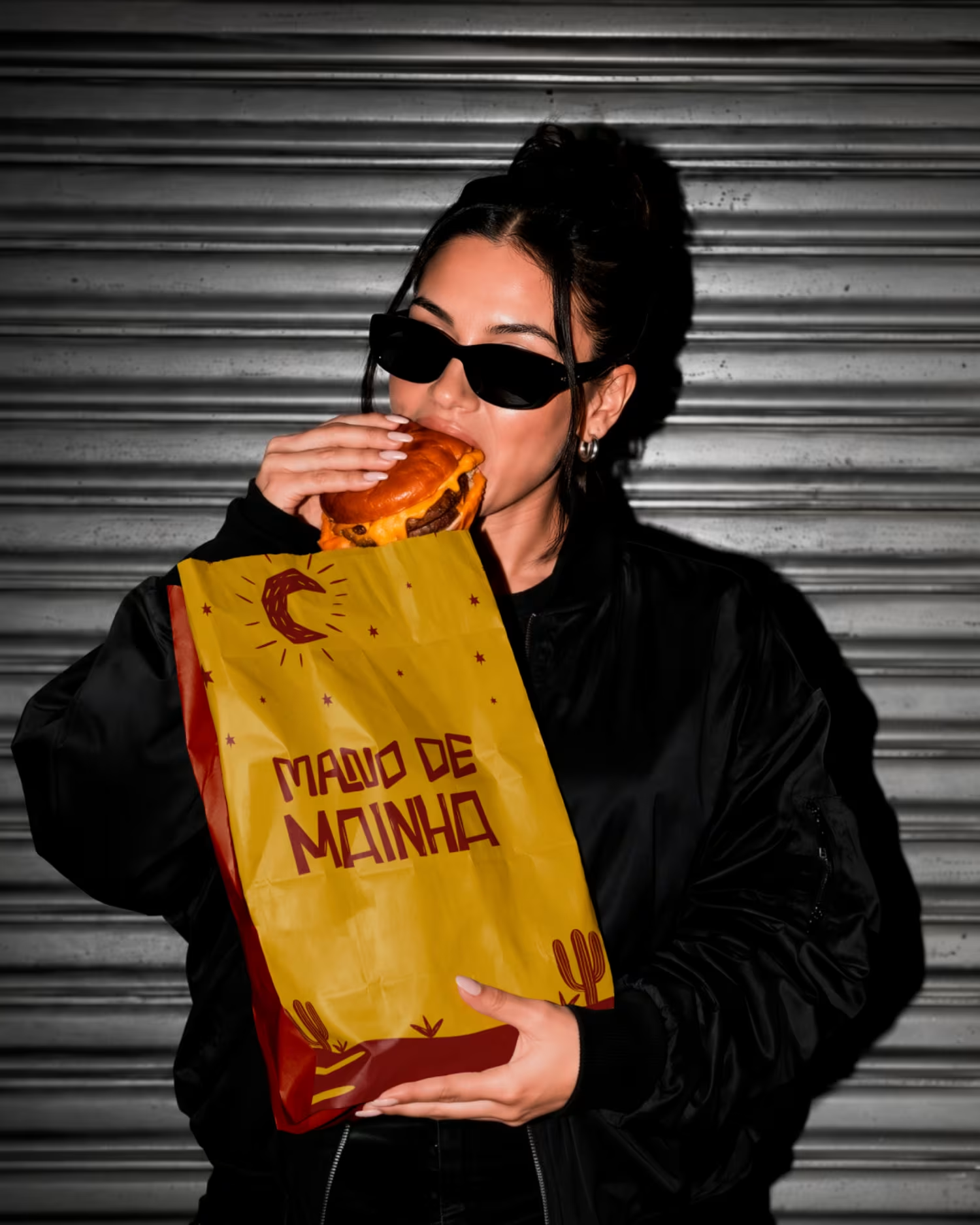
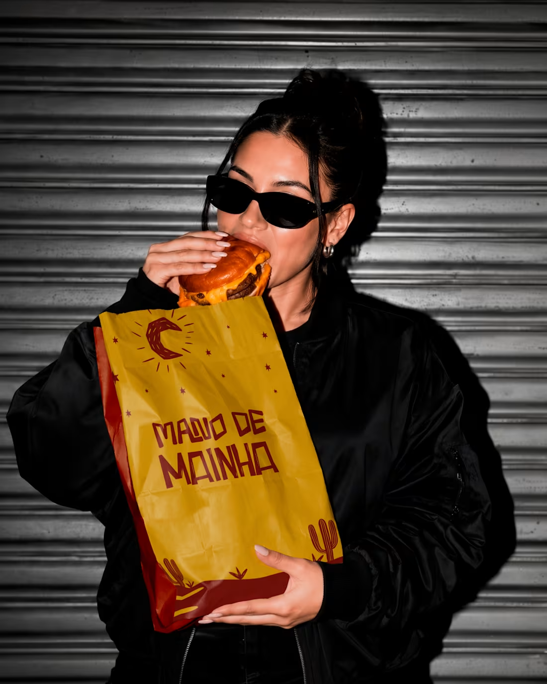
Sharing a project I had a lot of fun working on: Mano de Mainha
It’s a visual identity concept for a culinary brand rooted in Northeastern Brazilian heritage. The main goal was to blend warm, authentic cultural storytelling with a clean, modern aesthetic that holds up on store shelves and digital touchpoints.
I focused on creating a warm palette, custom graphic elements, and a flexible packaging system that feels inviting and memorable.
Would love to know what you think! How do you usually balance cultural heritage with a modern look in your brand projects?
3
55
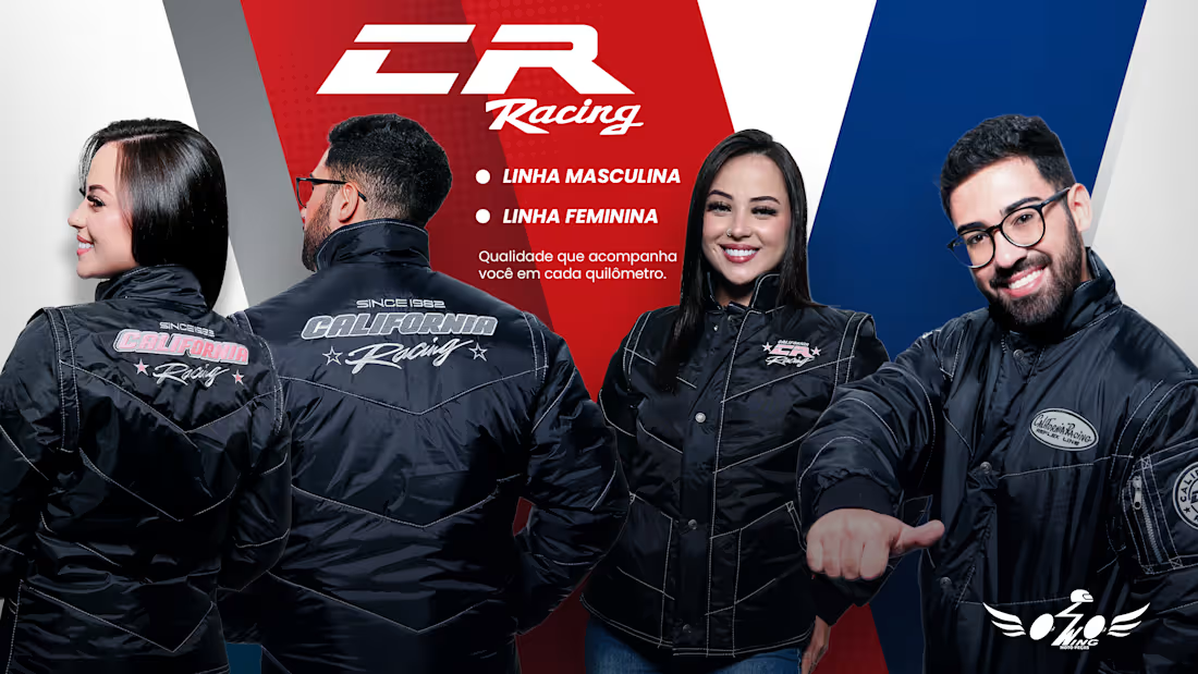
Comprehensive design suite developed for Wing Motos, focusing on retail marketing, e-commerce assets, and B2B wholesale collateral.
E-Commerce & Service Banners: High-impact digital banners designed for conversion, including product feature highlights (CR Racing jacket line) and fast-delivery service announcements (SuperFlash delivery).
Wholesale & Promotional Assets: Visual collateral created for B2B clients and physical retail, featuring dynamic geometric pattern compositions (Tabela Atacado) and clean, structured promotional flyers (Pit Stop Quick Service).
0
12
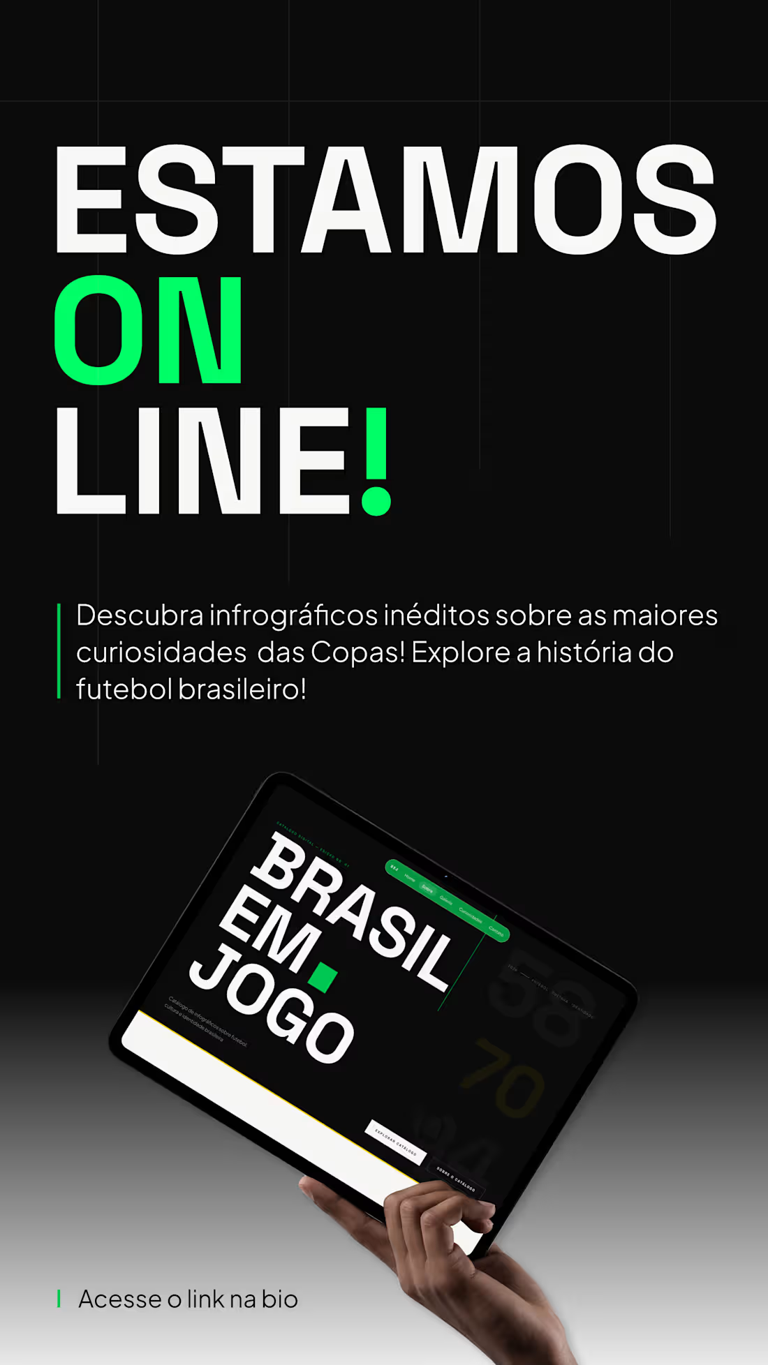
Digital design assets and promotional campaigns focused on engagement and visual hierarchy. Includes interactive web launch banners (Brasil em Jogo) and institutional social campaign artwork (Junho Vermelho).
0
19
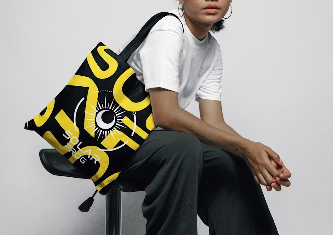
Solarprog – Clean Energy Brand & Visual Identity ☀️⚡
Visual identity created for Solarprog, a modern clean energy brand. The project focuses on translating sustainability, technical reliability, and green innovation into a bold and functional B2B visual identity system.
Key Deliverables:
Logo Design & Visual Identity System
Brand Color Palette & Typography Guidelines
Digital Assets & Corporate Brand Applications
Designed by Bia Silva | Brand Identity Designer & Strategist
0
27