Bia Mughal
High-end web design focused on quality and precision.
New to Contra
Bia is building their profile!
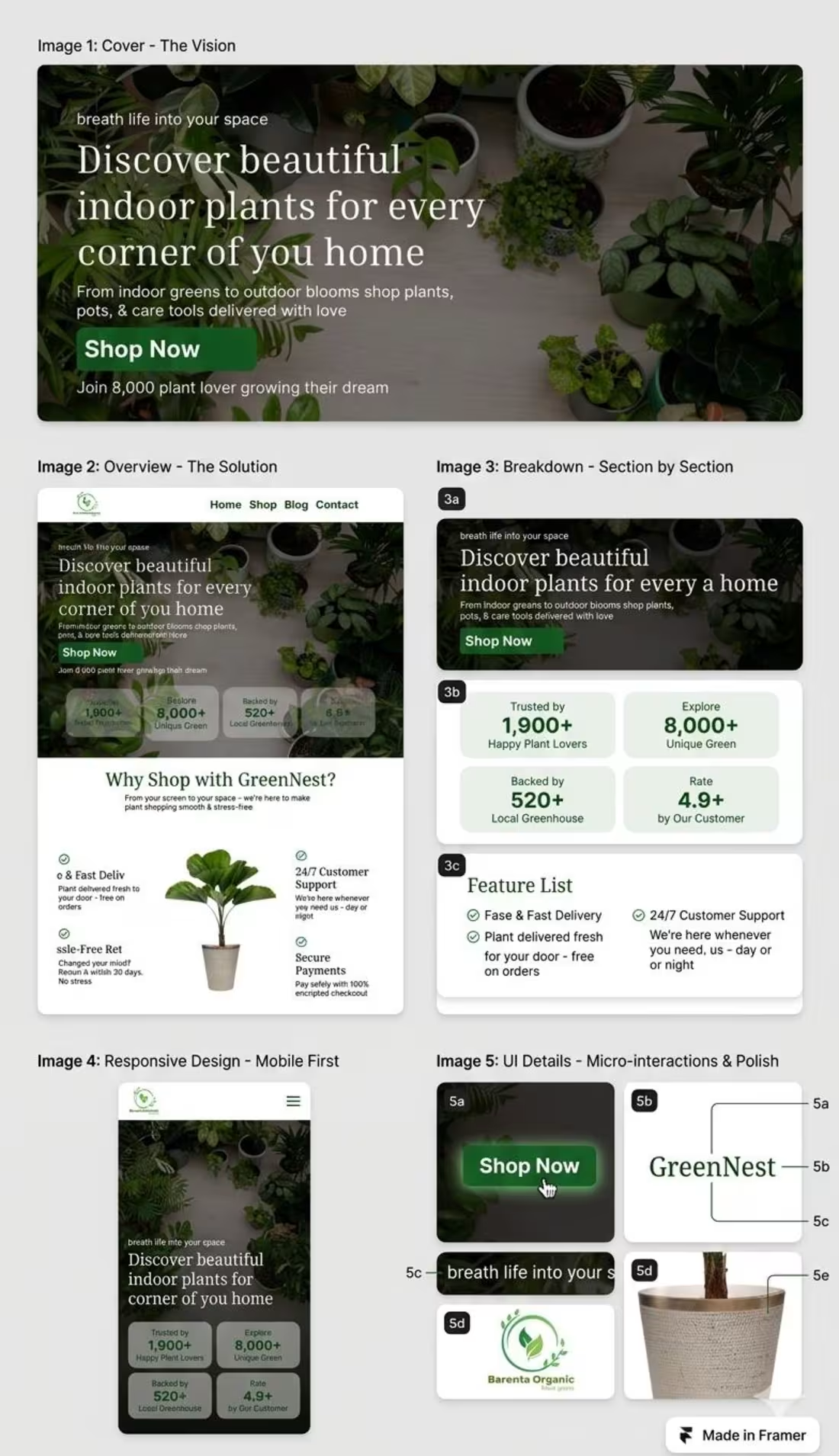
GreenNest — E-commerce Landing Page Design
The Challenge
The goal was to design a clean, nature-inspired landing page for an indoor plant brand that feels fresh, trustworthy, and easy to navigate. Most e-commerce sites feel cluttered, so the challenge was to simplify the experience while still driving conversions.
The Solution
I designed a minimal, conversion-focused landing page with a strong visual hierarchy and a calming green aesthetic.
• Clean hero section with clear value proposition and strong CTA
• Trust-building stats to increase credibility and confidence
• Well-structured sections for smooth user flow
• Simple feature highlights for quick scanning
• Nature-inspired color palette for a fresh, organic feel
UI & Experience
• Soft green tones with clean white space
• Clear typography for readability
• Mobile-first responsive layout
• Smooth micro-interactions for better engagement
Tools Used
Framer (Design & Development)
UI/UX Design
Responsive Design
Role
UI/UX Designer & Framer Developer
Focus
E-commerce Experience
User Trust
Conversion Optimization
0
6
PixelDose — UI Design Case Study
The Challenge
The goal was to design a visually striking, high-end UI that instantly captures attention while maintaining clarity and usability. Most portfolios look generic, so the challenge was to create a bold, futuristic design that stands out and still converts.
The Solution
• I created a modern, dark-themed UI design with a strong visual identity, focusing on hierarchy, contrast, and interaction.
• Bold hero section with high-impact visuals and typography
• Clean layout with clear content hierarchy for easy navigation
• Glassmorphism UI elements for a premium, modern feel
• Smooth micro-interactions to enhance user engagement
• Strong CTA placement using color contrast and spacing
Design System
• Dark UI with purple accent for a futuristic look
• Consistent typography and spacing system
• Visual hierarchy to guide user attention
Tools Used
Framer (Design & Development)
UI Design
Interaction Design
Role
UI Designer & Framer Developer
Focus
Visual Experience
User Engagement
Modern Aesthetic
0
8
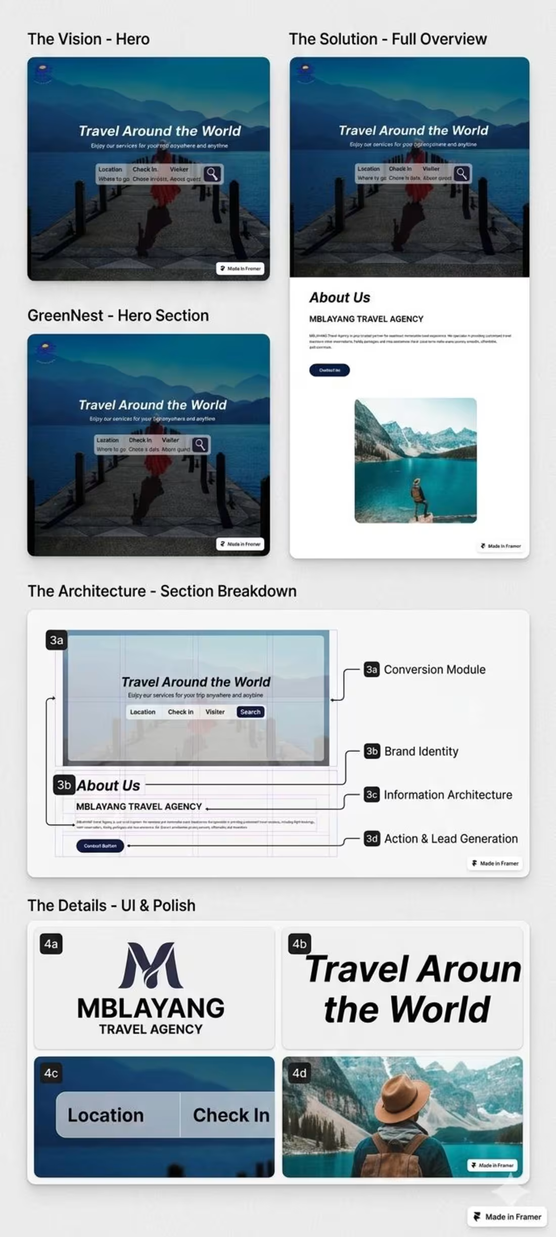
Travel Agency Landing Page — Premium Framer Design
The Challenge
Mblayang Travel Agency needed a modern landing page that looks premium and drives conversions. The goal was to replace cluttered, outdated travel websites with a clean, trustworthy, and visually engaging experience.
The Solution
• I designed and developed a high-converting landing page using Framer, focused on simplicity, clarity, and user flow.Conversion-focused hero section with a strong visual and search module
• Clear structure for About and Services to guide users smoothly
• Smooth micro-interactions with modern glassmorphism UI
• Consistent brand identity with clean typography and layout
Tools Used
Framer (Design & Development)
Brand Identity Design
UI Optimization
Role
Framer Designer & Developer
Focus
Lead Generation
Visual Storytelling
1
18