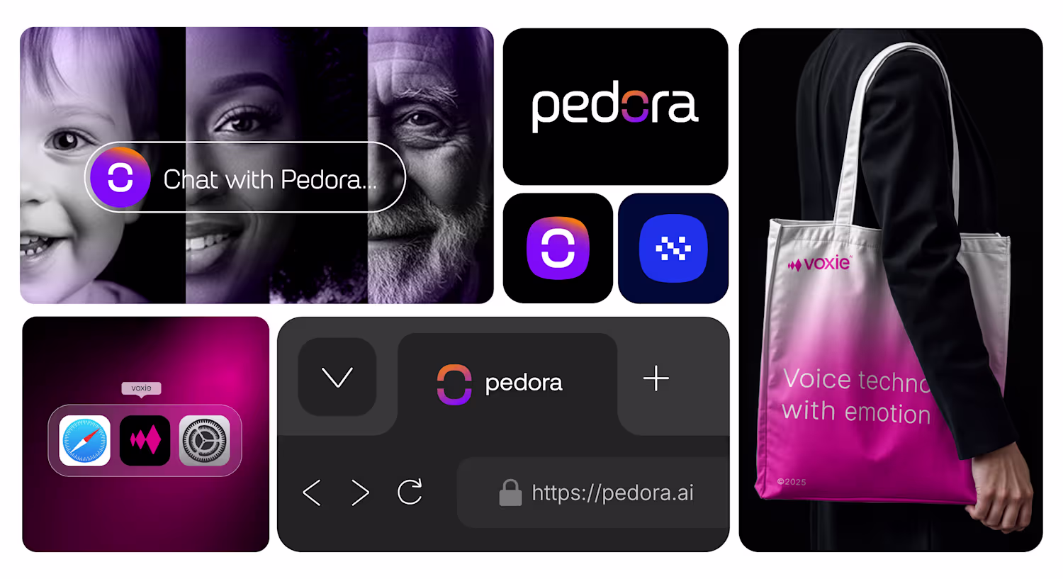
Snippets of Voxie AI Visual Identity Design.
Brand sprint for NeuralNest, an AI coding companion for faster development.
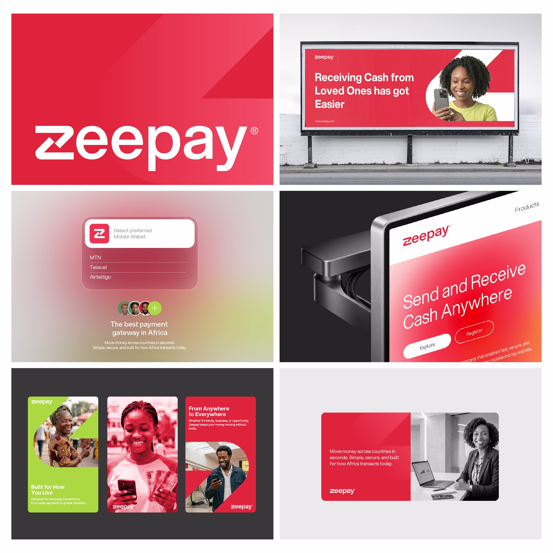
Zeepay Reimagination
I reimagined Zeepay with a simpler, sharper identity.
I designed a clean wordmark and crafted the “Z” using up and down arrows to reflect sending and receiving money.
Built a flexible visual system around it using bold red and lime accents.
Clear. Fast. Functional.
Thoughts?
I reimagined Zeepay with a simpler, sharper identity.
I designed a clean wordmark and crafted the “Z” using up and down arrows to reflect sending and receiving money.
Built a flexible visual system around it using bold red and lime accents.
Clear. Fast. Functional.
Thoughts?
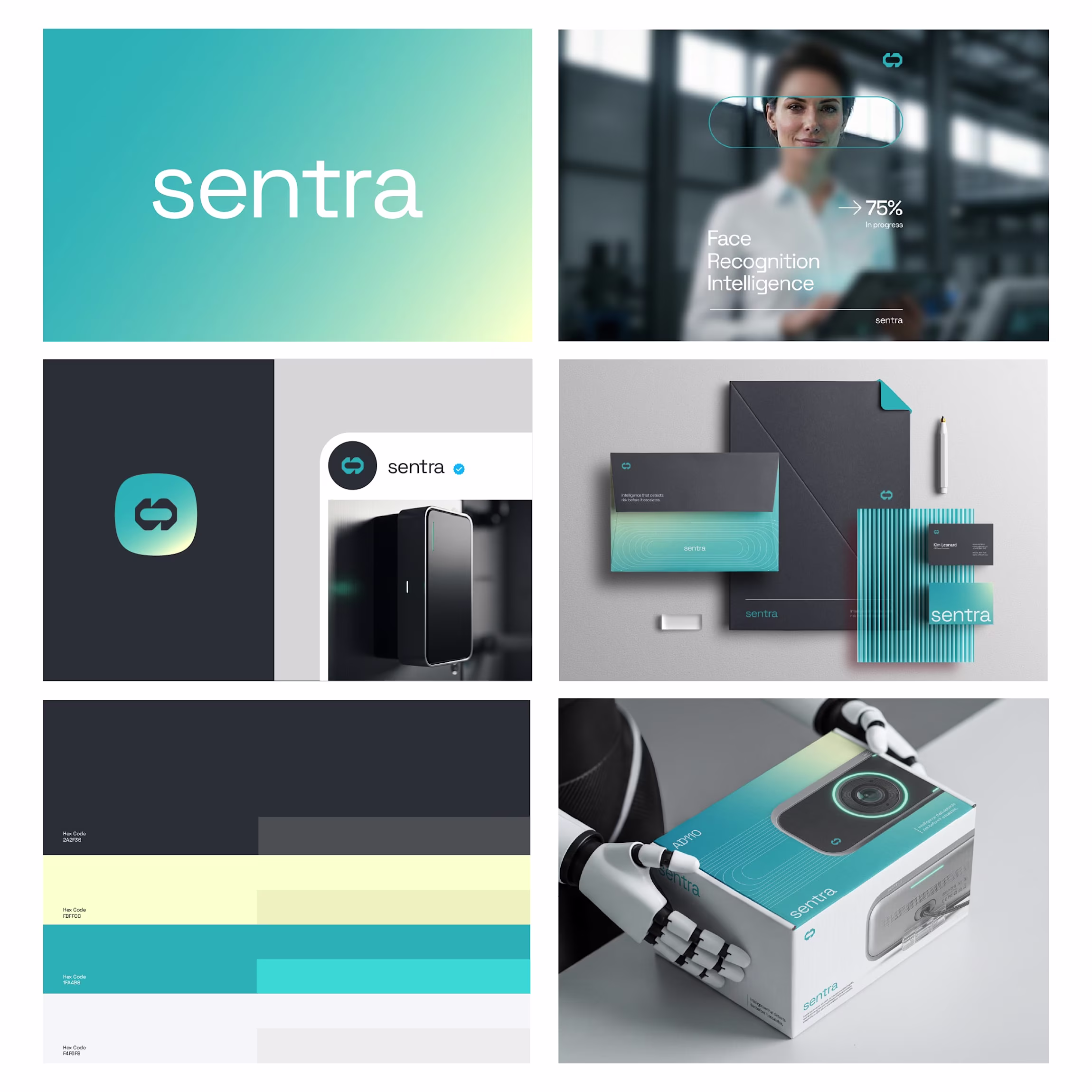
Designed the identity for Sentra AI, an edge intelligence brand focused on monitoring physical environments with precision and restraint.
The goal was to move away from loud, fear-driven security visuals and create something calm, intelligent, and trustworthy.
A system that works...